TAKEAWAY: What a pleasure to revisit the front pages of newspapers in which I was involved, in some cases decades ago!
Why their front pages are still viable and effective today.

I was in the process of preparing a workshop for editors with one of my existing projects. The subject: how can we make the front page of the printed newspaper look and read current, with second day headlines that project the story to the future, as opposed to repeating what readers have already found out via digital media. Or, with visuals that capture the spirit of the story many people may be talking about.
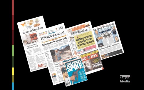
As I often do, I turned to Newseum’s gallery of front pages for Wednesday, July 17, and picked about 13 random front pages that did the trick. In all of these pages, the front page editor/designer had managed to get me interested in a story by the way the headline/photos appeared.
When it came time to do the presentation, I realized that six of the titles I was using, I had the honor of being involved with, some many years ago.
But it didn’t matter. The moment I saw the front pages there, I could remember the process of redesigning each, and I felt the pride that an obstetrician probably feels when he suddenly in front of a young adult that he delivered as a baby.
All of these newspapers had evolved since the redesign, all in a good way, and, several redesigns later, they were still here, still doing the right thing and, particularly, writing headlines that made their front pages look vital and visually appealing.
Sometimes a trip down memory lane can be therapeutic. The newspapers I revisited are, St. Joseph News-Express (Missouri), Las Vegas Review Journal, San Francisco Examiner, Sydney Morning Herald, Newsday, San Francisco Examiner and Philadelphia Daily News.
Why these front pages worked
In each of these front pages there was a headline written as a second day headline to advance the story, or the lead visual was compelling and enticing.
Sydney Morning Herald: Origin III: The Decider—feature about a player who follows in the footsteps of famous father athlete, and is key in that night’s game.
St. Joseph’s News & Express: Health law’s rule delay could hamper enforcement—The headline uses “could”, which advances the cause/effect element of the story as it thrusts it into the future for an event that has already taken place.
Las Vegas Review Journal: “Trout Canyon residents count blessings in charred landscape”—the sequel to the story of a fire.
Newsday: Gas Prices Spike, powerful visual, and also teaser headlines to the story inside, including a list of the lowest prices for gas locally.
San Francisco Examiner: Chilling details emerge from horrific attack—the sequel to a story already covered digitally.
Philadelphia Daily News: Powerful image and headline, Separated at Rebirth, concerning how some older residents of a facility may lose their homes to give way to a sudden surge of new construction.
Pages we like


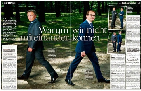
Our Europe blog correspondent, Frank Deville, sends these two double page spreads from Sunday’s Bild am Sonntag.
The first one, about politicians who can’t see eye to eye shows how a clever editor/art director can solve what may be a problematic topic to handle visually.
The second one, with the headline Hands Up shows up a roster of famous German goalkeepers and their hands.