This is the weekend edition of TheMarioBlog and will be updated as needed. The next blog post is Monday, December 9.
Update #3: Buenos Aires, Argentina, Sunday, Dec. 8, 07:49
TAKEAWAY: Sampling a variety of European dailies while passing through the Zurich airport.
My fascination with newspapers always takes me in interesting directions and , sometimes, even into pleasant detours.
You could say that I have been a loyal student of newspapers since I can remember, and will probably be to the end. In fact, my early recollections of newspapers date back to the 1950s and Havana . While my mother enjoyed reading Prensa Libre, my father was a fan of Diario de la Marina, one that stands erect in my mind to this day as it was one of Cuba’s first papers to print on the rotogravure presses, giving at least one of its sections—-I believe it was the society pages—-a brownish tint that differentiated it from the the rest.
I am talking printed papers here. Put me in front of a newspaper and, regardless of language or format, I study it, making mental notes (elegant, boulevard, too many colors, too gray and serious, fun, a good textbook example of what to do or not to do), then, upon seeing a page I like, an instant mental x-ray, or a quick screen shot with my iPhone, to study that which works. If , however, I see something that did not quite work, I reach for a napkin or my iPad to sketch what I would consider a better solution.
Nothing beats a live laboratory for a great, lifelong learning experience. It is pure design gymnastics, and I recommend it.
So let’s see what catches my eye this Thursday in Zurich:
The give-it-your-all front page
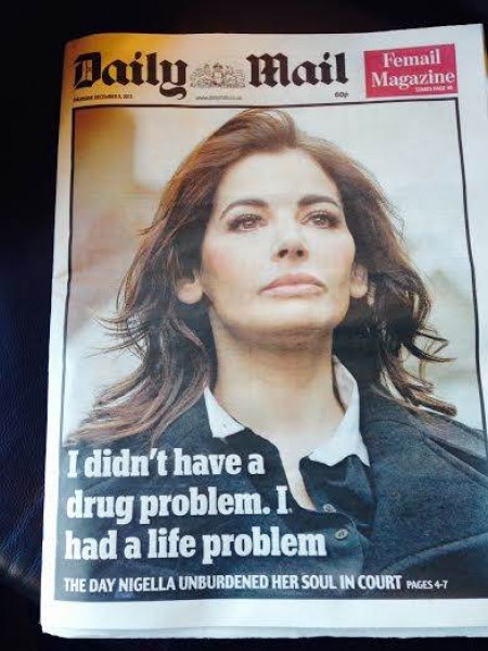
The Daily Mail puts all its tokens into the story of Nigella Lawson, the celebrity TV chef, whose trial for drug abuse is a recipe made in London tabloid kitchen heaven. She admitted to occasionally snorting cocaine and smoking marijuana on Wednesday during an extraordinary court appearance in which she offered the first account of the notorious photograph that led to her divorce from advertising baron Charles Saatchi.
A quote is the only headline, and the photo of a tired looking Nigella is all this front page needs to appeal,or so the editors hope.
I still think you need to promote at least two other stories, just in case Nigella’s woes are not of interest to me.
The expose-it-all front page

Every European city has its bare it all tabloid, and, in Zurich, it is Blick. It tries to emulate its sister paper, Bild, in Germany . It is loud , colorful and it will be a Garcia Media project in 2014. Stay tuned for what we do here!
Humor on Page One
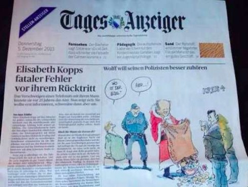
The serious and always surprising Tages Anzeiger of Switzerland leads visually with a cartoon on Page One, something we are more likely to see in Europe or Latin America than in the US. Yet, American newspapers of the 19th Century thrived on editorial cartoons on their front pages. I hope editors are reading this: at a time when so many of the images we see on front pages have already been seen digitally, it is a great idea to bring cartoons to the front page.
Looking to discover examples to showcase here. Send them to me.
The German cousins
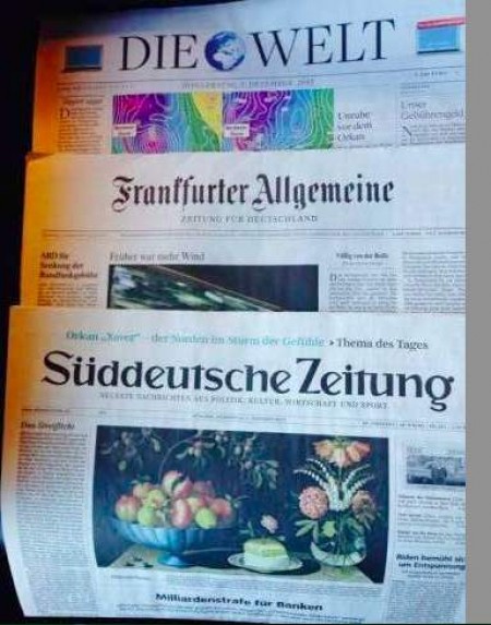
The quality German dailies all seem to wear the same uniform! It tends to be gray, modular, rigid to perfection and unchanged from day to day, as wee see here with Die Welt, Frankfurter Allgemeine and Suddeutsche Zeitung.
In ten seconds, the reader gets an impression of an authoritative, credible and precise report of the day’s news, with German precision.
All that is good and honorable, but could these dailies not try to create a more distinct look and feel? The one that is most likely to do it should be Suddeutsche Zeitung.
Selling your front page real estate
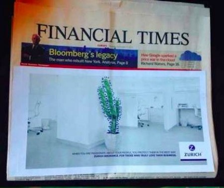
The Financial Times covers top half of its front page with an easy to remove ad flap. Revenue is important, too, as we know well.
Here, too, European dailies tend to be more inventive and resourceful. American newspapers need to borrow some of these innovative advertising ideas.
Story in a bubble: USA Today
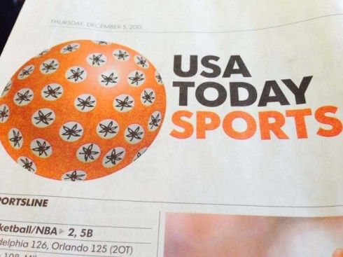
It is always fun to look at that USA Today circle in the logo and try to guess what image will occupy it. It’ s a soccer ball this Thursday, for the sports section logo, celebrating the introduction of the Brazuca, the name given to the soccer ball just unveiled by Sdidas for the World Cup to be held in Brazil next summer.
That circle must be quite demanding each day for an editor and art director who must think of what to put in it. I can already imagine a book of the future, where USA Today captures it’s most memorable circle moments
The good news
These printed papers are picked up here in the lounge,even by well suited business types armed with iPhones and iPads. Also encouraging that these papers continue to innovate and to try to keep current .
And, for that fellow traveller who asked me if my professional future was secured as a newspaper designer?
You bet, I am counting on it.
When I disconnected (not by choice)
I disembarked in Zurich from Swiss flight 65 Monday and upon arriving realized that my MacBookPro was missing. Picture my stress as all my presentations were on that Mac and I had a workshop scheduled with Ringier the next morning.
Efforts to find the Mac failed, and I still have not reunited with it four days later.
Thank God for iCloud, Dropbox and those sticks where I routinely put my presentations just before giving them just in case something happens to the Mac.
With the help of my able team. I have been able to rescue the most important documents, conducted the Ringier workshop without problems and learned a lesson I pass on to you: back up your files, put your most precious documents on sticks, and, if possible, have a back up Mac that you can summon for service at a moment’s call.
I am glad to be back on my back up Mac. I confess it is not so easy to do extensive text on the iPad keyboard.
Nelson Mandela: 1918-2013
Will be updating this segment during the weekend to show as many pages honoring the great Nelson Mandela. Send me yours, too!
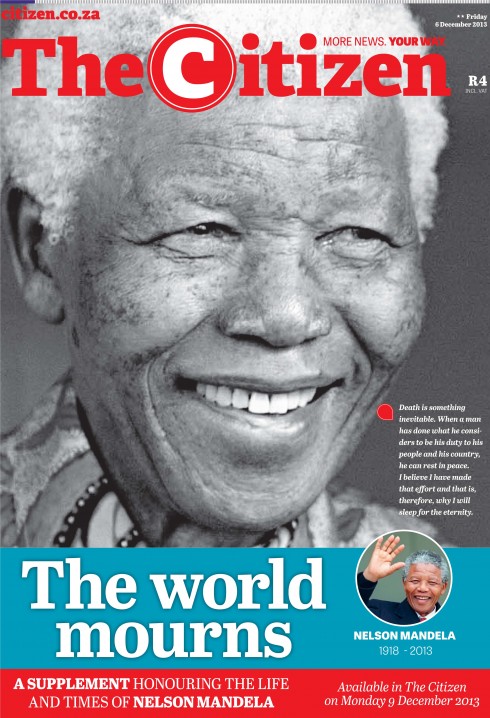
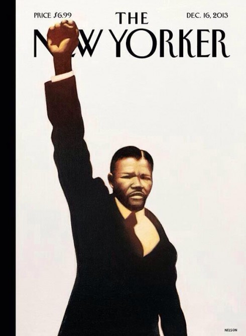
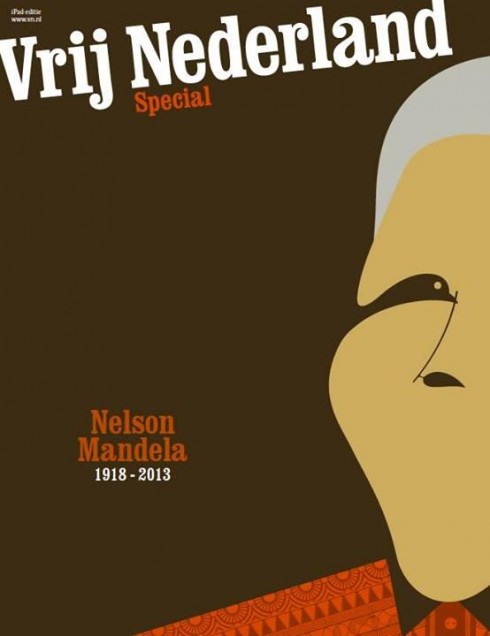
Walter Buchignani, iPad editor of the Montreal Gazette, was kind enough to send me how a number of iPad editions are treating the Mandela story.
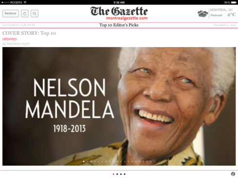
Montreal Gazette
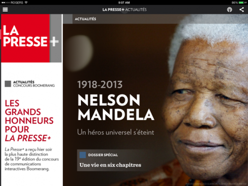
La Presse
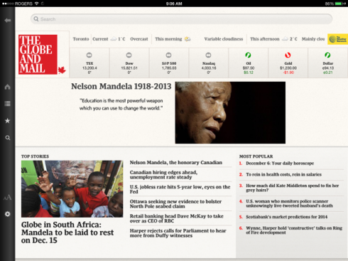
The Globe & Mail
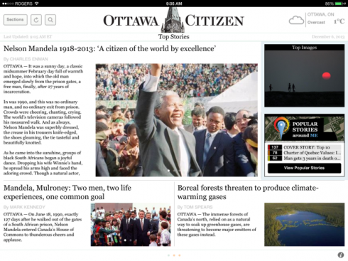
Ottawa Citizen
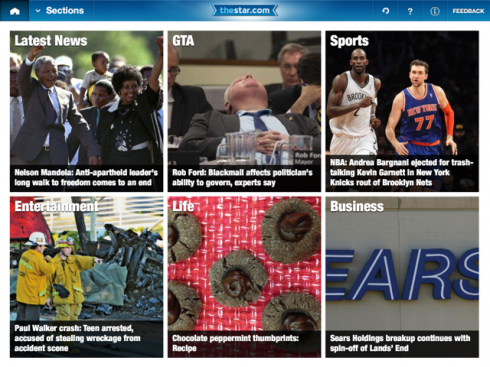
The Toronto Star
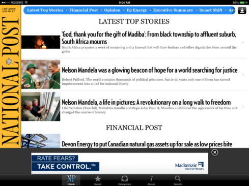
National Post
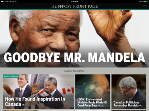
The Huffington Post
Pages we like
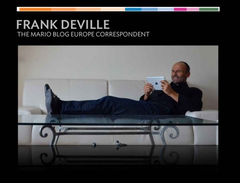
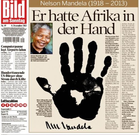
In today’s Bild am Sonntag, a special page about Nelson Mandela sent to us by Frank Deville.
Pages we like
How can one resist this cover from W magazine for its December/January edition?
Design Director: Johan Svensson
Photo Director: Caroline Wolff
Photographer: Emma Summerton