This is the weekend edition of TheMarioBlog and will be updated as needed. The next blog post is Monday, Feb. 10
TAKEAWAY: It is a new and logical next step for the People Newspapers of Dallas as they transform themselves from weeklies to monthlies.
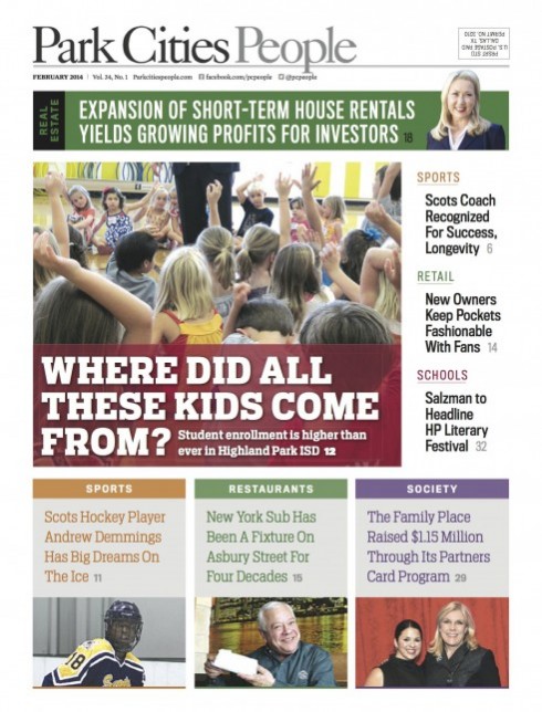
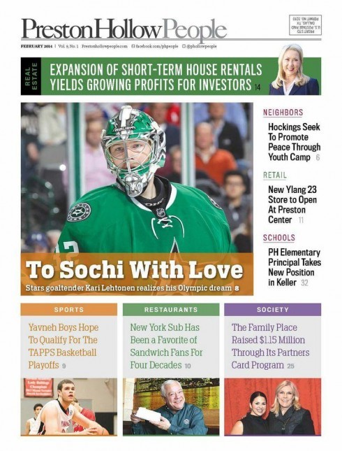
Publications globally are taking a close look at frequency and adapting to the many changes that a digital world has introduced.
Frequency of publication is becoming less important than the here and now of presenting information across platforms in accordance to what that particular platform can deliver.
We increasingly see continuous coverage and constant updates on mobile devices, with more “lean-back” content for print.
The two Dallas newspapers of People Newspapers, which are distributed in the suburbs of the major Texas city, are undergoing changes which involve turning from weeklies into monthlies.
If we see the printed newspaper as the lean-back platform that allows us to disconnect, to sit back and to take a breather from the constant flow of news and information that are what we seek in digital platforms, then People Newspapers’ move to monthly is right on target.
We at Garcia Media worked closely with the editors and art director of People Newspapers to rethink Park Cities People and Preston Hollow People, retaining a timely and informative content philosophy, but optimizing for a lean-back mode.
To that effect, as Reed Reibstein, who was art director for this project, and I approached the project, we did so conscious of two important facts:
1. We know that readers welcome People Newspapers titles into their homes each week as a dear friend, as part of the family. Readers look forward to finding out more about their community and its people. That, readers can rest assured, has been maintained, although the visitor will now appear once a month.
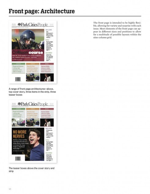
2. We also know that readers bring a digital mentality to the publications they read in print, so we have designed a front page that is a giant navigator to the best inside content. It is a very visual front page. It has immediacy and style, and it invites the reader inside.
With this change, People Newspapers now join publications worldwide that are doing print happily, not abandoning it—adapting to meet current audience demands. While readers will get constant updates through the Park Cities People and Preston Hollow People websites, we hope that they will look forward to that day of the month when they get their print copy.
In our work with People Newspapers we have made sure that one thing remains constant: a sense of localness, total commitment to the communities it covers, credibility and the reader as the most critical focus.
Publisher Pat Martin wrote about the new thinking behind the change of frequency in an introductory column:
“The strength of our product comes from the communities we serve…As a monthly, our content is still timely and informative, but is intended to be enjoyed in the way you read a magazine or other periodical. We’ve just launched our new weekly Police Report e-newsletter, so you can stay safe and up to date with this popular feature. And, of course, we have our websites with daily updates and breaking news.”
The new typography
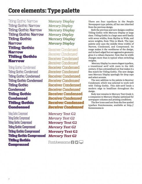
The People Newspapers’ type palette
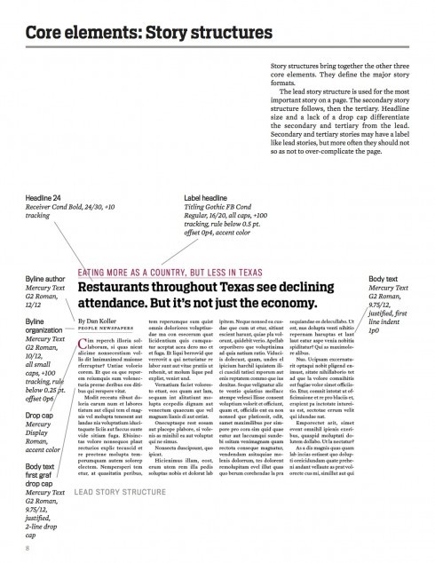
There are four typefaces in the People Newspapers type palette, all but one inherited from the previous design.
Both the previous and new designs combine Titling Gothic with Mercury Display at large sizes. Titling Gothic is a large sans-serif family with seven widths, from Skyline to Wide, and seven weights, from Thin to Black. The type palette only uses the middle three widths of Narrow, Condensed, and Compressed. Its range makes it the workhorse of the design, and its hard-edged but not aggressive geometry gives it a robust character. Note that its width changes more than is typical when switching weights.
Mercury Display is a more elegant typeface, a transitional serif with roots in the 18th century. It has a streamlined cut that makes it a fine match for Titling Gothic. The new design uses Mercury Display sparingly for drop caps and select accents.
The new addition to the palette is Receiver Condensed, which was selected to work well with Titling Gothic. This slab-serif lends a modern edge to headlines throughout the design.
Body text remains in Mercury Text Grade 2, a companion to Mercury Display optimized for newspaper columns and printing conditions.
The few icons used are from the free symbol typeface FontAwesome.
Flip through the pages of the new newspapers
http://issuu.com/pcpphp/docs/pcp_0214web