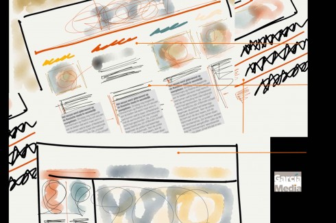
TAKEAWAY: That first moment when a design concept is created is special, important and unequaled in what it means for a project.

These scribbles lead to the next idea
It has been a wonderful full day of just designing and conceptualizing for me Monday. No interruptions. No meetings in between. No workshops waiting to be conducted.
Just the pure, exhilarating experience of sketching a concept from the start: the full glorious palette of possibilities in front of me.
At moments like that, one is not thinking of what those to whom this concept will be shown will say. In fact, I try to mute their voices in my head. I know what they are likely to say, but at this moment of conception, I avoid including these suppositions in the process.
I constantly remind the young art directors working with me to do what comes naturally, to let the ideas flow. I tell them: don’t censor yourself, don’t let the most conservative aspects of the briefing keeping you from moving forward with your own unrestricted ideas.
Experience shows that if an idea hits it big with someone in authority, it’s likely to stay. In a majority of my projects, this has been the case, and I remember (with pride) what that idea was, and how we seized the moment to incorporate it. And it all begins with the sketching process.
In his book “Prototyping,” Todd Zaki Warfel writes:
Sketching is the generative part of prototyping. As part of the generative nature of prototyping, your goal is to get the ideas out of your head and into a more tangible format.
The goal of sketching isn’t to flesh out your ideas fully—you’ll do that during the prototyping stage of the process. The goal is to generate a number of concepts, get them out of your head as quickly as possible, and move on.
Sketching allows you to sell your idea to yourself first, before you develop it further to sell it to others.
The cascade of ideas
Getting those ideas out of my head. That’s exactly why I did Saturday. It was one hour of just sketching on my iPad (thanks to Paper 53, that handy and marvelous app), putting ideas down on the screen: large strokes of an idea, or the most minute detail in another. Ideas cascade in big and small strokes, in an undisciplined manner. Get them all down as you go, there will be enough time later to refine, to discuss, to eliminate.
Don’t let editing get on the way of your own initial sketching.
As I worked on these concepts Saturday I was thinking that not much has changed since those days in the late 70s when I would sit at my drafting table to sketch on paper, to dream of what could be.
The biggest change? I don’t put a single stroke on the concept without asking myself how this will apply to the various platforms of the media quartet.
In fact, I must confess that many “digitally thought” ideas land in print.
Could I say that I am designing digitally first?
Not really, although maybe unconsciously. It is hard not to think that our audience moves from platform to platform, so why shouldn’t we? It’s more like creativity first.
However, I admit that we are designing under the influence of such strategies as ease of navigation, efficient and fast visual seduction, a sense of brand unity while paying particular attention to the role of color and typography.
Good visual storytellers always worked under such influences, long before the word digital got into our vocabulary.
Of related interest:
Todd Zaki Warfel. Prototyping. Rosenfeld Media, 2009. iBooks.