Update 2: Toronto, Thursday, April 25, 08:49 EST
TAKEAWAY: Today we continue our conversation about what makes for the ideal look & feel for a newspaper tablet edition. It is a topic that generates great interest—-as it should. Take a look at Denmark’s Berlingske
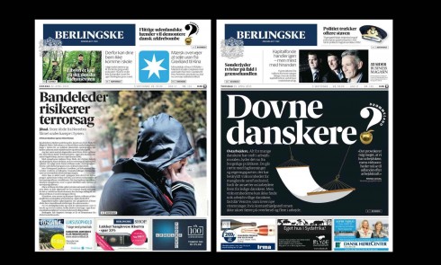
Here are two recent print editions of Denmark’s Berlingske
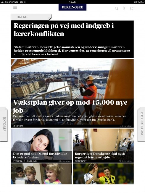
Sample screen from today’s morning edition of the Berlingske tablet app
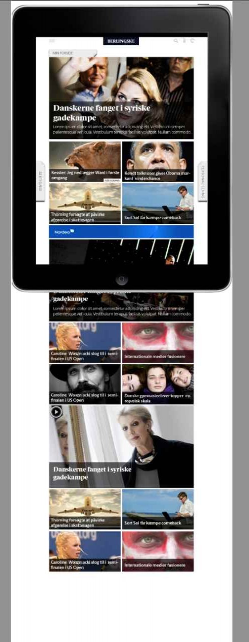
Morning edition shown in rolling screen mode
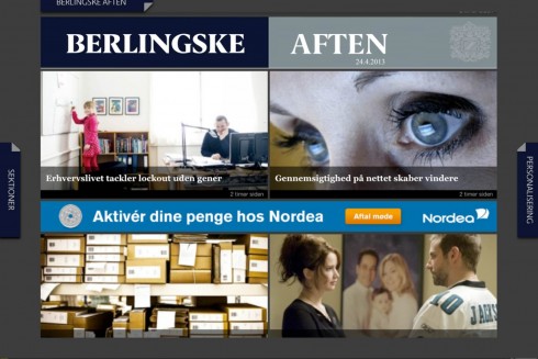
Opening screen for the Berlingske afternoon edition, published daily at 5 p.m.
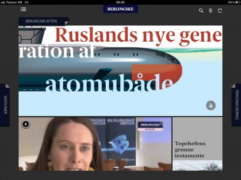
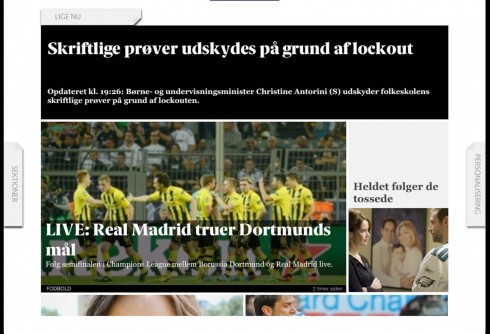
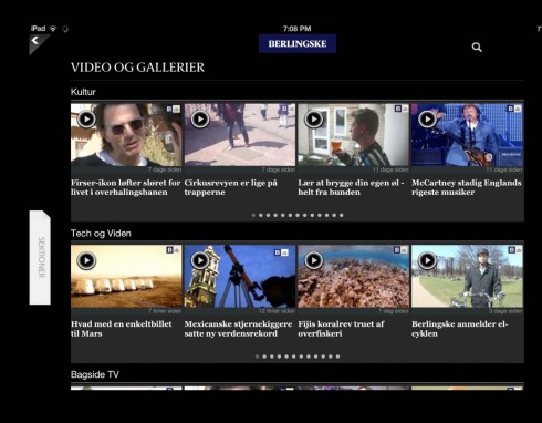
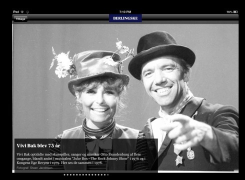
Image courtesy of the Berlingske
For the past two days we have reviewed the new tablet edition of Canada’s La Presse: I mentioned that while it is visually seductive, with great photos and easy, pictorial navigation, it is not as newsy as it should be, especially for a product delivered at 5:30 each morning, and one which, as management has mentioned, could one day replace the newspaper’s print edition.
We have also shown Wednesday what the options seem to be for those embarking in the creation of a news tablet app: the classic newspaper look, the pop up driven, or the more Flipboard like approach.
Today, we take a look at Denmark’s Berlingske , which seems to have achieved that balance that I think is key: make it newsy and give it a sense of freshness, while also incorporating the more pictorial and preferred style navigator.
A conversation with Jens Jørgen Madsen
To find out more about Berlingske ‘s news app, I had a chat with digital editor Jens Jørgen Madsen
Jens tells me that the evening (Aften) Berlingske app is totally new, developed two years after the first morning app was introduced to the market. It is published each afternoon at 5 p.m.
“Our evening tablet app includes only unique content and one daily interactive graphic everyday,” Jens says. “The idea about the evening edition is to give our users a more lean back experience. Something that last all evening. Ready for their commute home or at home. It is compact. Contains about 13 elements – stories, graphics and web-tv…. not too much to overwhelm you – but the right size to give you an excellent reading/watching/graphic experience.”
The morning edition, however,is newsier.
Both tablet editions are part of what subscribers to the Berlingske get as part of their subscription package.
Jens tells me that the printed newspaper edition is available in a digital format every evening around 10:30 as part of the Berlingske app.
“During daytime, it’s more like rolling news. At 5 pm I get the Berlingske Aften (evening) – our exclusive selected collection of articles, web-tv and the interactive infographic of the day. And then at 10:30 pm I can read the whole paper (of next day) before I go to bed. It has actually let to the fact, that I read much more of tomorrow’s paper than I normally would, since I take the digital edition of next days paper (on iPad) with me to bed. No rush in the morning.”
This has led to another change, says Jens, in that the printed newspaper now carries much more content in the form of in depth stories, analysis, background and opinion.
Two questions for Jens Jørgen Madsen
Mario:
Jens, what is the real differentiator between your morning and evening tablet app editions?
Jens:
Well, we know that in the morning commuters want to get all the news we can provide, so the morning tablet edition is definitely newsy. The feedback we get is that readers like it that way. In the evening edition we go for the most exclusive stories we can provide, the editors’ choice, for the evening commute and for a more lean back experience.
Mario:
What changes did this approach require in the newsroom?
Jens:
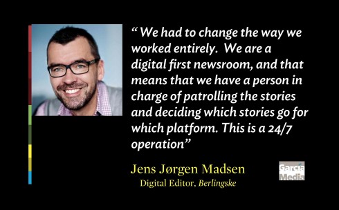
“We had to change the way we worked entirely. We are a digital first newsroom, and that means that we have a person in charge of patrolling the stories and deciding which stories go for which platform. This is a 24/7 operation. The online editors handle online, mobile, iPad. But there is one person who keeps an eye on all stories being processed. And a very important point: all journalists have to publish their content in a digital platform first, before it goes into print. Rarely will anything appear in the print edition first here. Each desk, for example, Culture, handles how its own stories get into the digital platforms. This has been revolutionary, but it works well.”
See the tablet’s interactive graphics here:
http://www.b.dk/grafiskset
Those morning tablet editions
A year ago, the majority of curated newspaper tablet editions were designed to be a good, lean back evening read.
For the past six months we have begun to see more newspaper tablet editions created as morning vehicles for information. This, in my view, changes the dynamics for content and presentation.
Especially if the content will appear simultaneously on tablet and mobile, a sense of immediacy, which is what we seek in that first hour after we wake up each morning, must be evident.
I have said it before: news tablet editions are only in their infancy at the moment. Perhaps moving to the toddler stage, but still works in progress, concepts in the midst of constant change and adaptation.
It is this that makes the subject so challenging and fascinating.
To be continued, for sure.
Of related interest:
https://www.garciamedia.com/blog/articles/pa_news_app_look_feel_and_what_it_says_p