TAKEAWAY: We see it appearing more often, in all platforms (including print). Flipboard pioneered it, but now we know that users like to look at images and click on them to gain access to stories: the ultimate navigator.
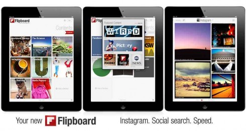
Here is the real Flipboard concept
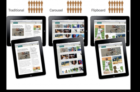
Three styles were tested: traditional, Flipboard and carousel. Image courtesy of Poynter’s Sara Quinn
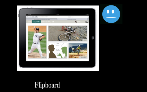
Flipboard style: images lead to navigation
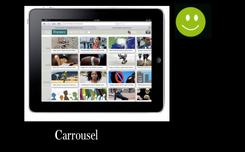
Carousel: visual navigator with swipe gesturing. It is a Flipboard approach but with more and smaller photo entry points
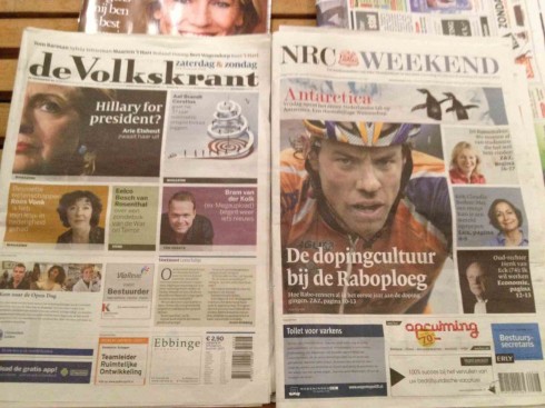
Two Dutch newspapers sport Flipboard approaches on their front pages (weekend editions)
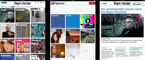
Users have the option of looking at app content through a pictorial navigator, a la Flipboard. The default navigator is a more traditional newspaper look
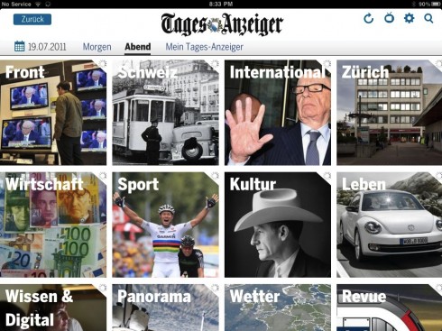
A visual way to navigate the app
TAKEAWAY: It should come as no surprise: we do like to look at images in whichever platform. But, lately, we are finding out that we prefer to click on them, too.
Flipboard, that very visual and interesting collection of stories that so many of us gravitate to often, seems to do it first: the use of images as main navigational elements.
Since then, the concept has taken off with the speed and agility of Usain Bolt at the start of a race.
So much so, that, in my own vocabulary, Flipboard has become a verb.
“Let’s Flipboard it,” I tell designers working with me.
And you know that when nouns start acting as verbs, a trend has started, and usually one that has long legs and sustainability.
I am not surprised that, during a visit to the Netherlands recently, I saw weekend newspapers that had Flipboarded the entire front pages. Almost like click and go, except in print.
Flipboarding works for all platforms, one of the few things that does.
Readers simply like the easy approach of looking at an image and then proceeding to touch it or to click on it to go to where the story that goes with the image will take them.
Sometimes, not many words are needed. In fact, the Swiss newspaper Tages Anzeiger, which offers a Flipboard version of his home page on its tablet app, simply labels the photo with the topic (sports, culture, news). The click does the rest: once inside, you find yourself in the desired section and ready to read the chosen story.
Do readers like the Flipboard approach?
Yes, they certainly do. And, if we use the evidence from the 2012 EyeTrack for Tablet study from The Poynter Institute for Media Studies, in which three styles of home pages were chosen for a tablet edition: classical news, carrousel (very visual and much like a Flipboard) and Flipboard, with larger images and fewer of them in the navigator, users gravitated to the carrousel, with a larger number of images a click away from access to the stories.
As we continue to learn what works to seduce readers and users, we can rest assured that the Flipboard style navigators carry the lead.
With that comes a demand for designers and photo editors with the skills to select the most clickable images. In essence, photos as the most effective navigator and seducer.
Never too late to redesign
It took all of 203 years, but Wales’ The Carmarthen Journal has recently launched its first redesign ever.
Without even knowing it first hand, I can only imagine the reactions from its readers, some of whom probably preferred it the way it was. It would be interesting to hear from the folks at The Carmarthen Journal and know more about their redesign and its reception.
We are all ears here.
http://www.holdthefrontpage.co.uk/2013/news/new-look-for-weekly-paper-after-203-years/
New compact in the US
It was a long time in the makings, and it’s finally ready to launch: a new compact premiering in Ohio.
– USA: Cincinnati Enquirer set to go compact in March
http://www.newsandtech.com/news/article_9ebca958-6973-11e2-b677-0019bb2963f4.html
http://www.poynter.org/latest-news/business-news/the-biz-blog/201072/new-compact-format-newspaper-will-debut-monday-in-ohio/
Interview on Malaysian TV
During the course of a recent WAN IFRA Asia conference in Kuala Lumpur, Malaysia, I was interviewed for one of the local TV stations. Here is a video of that interview in which I discuss storytelling in the age of the tablet, summarizing key points of my presentation there.
Where’s Mario?
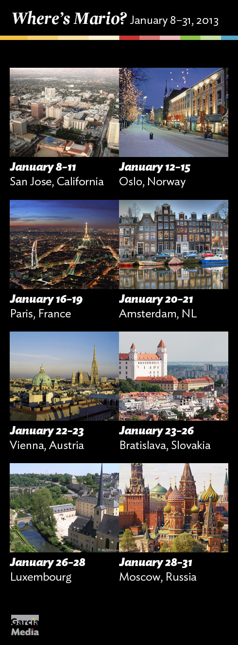
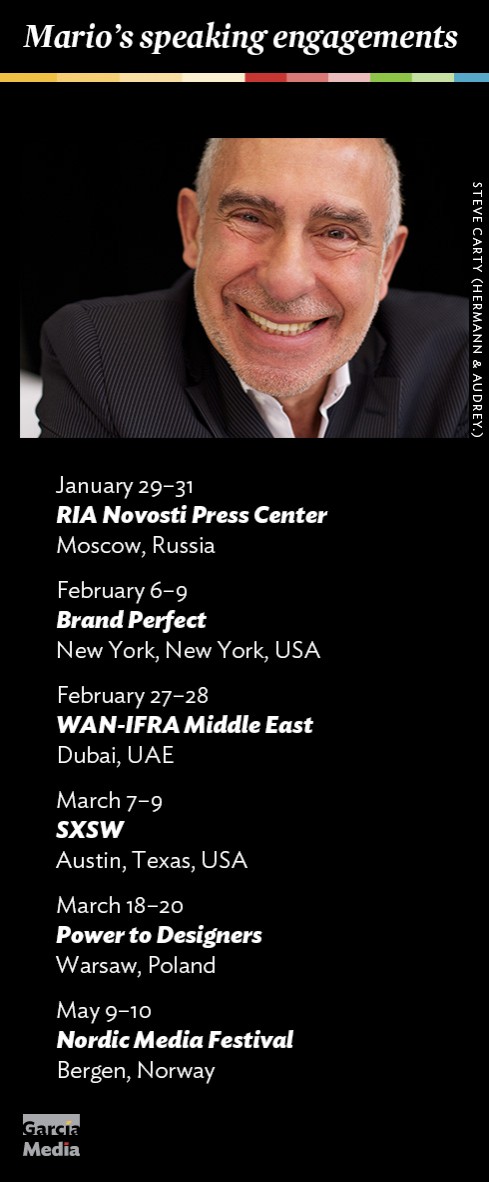
Mario’s upcoming speaking engagements
Take advantage of our iPad Design/Ad Lab workshops
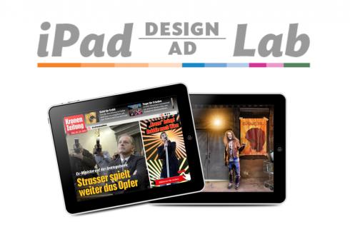
Do you want to take your brand to the next level by creating a tablet edition? Garcia Media can help. We now offer one- to two-day iPad Design Lab workshops on demand to jumpstart your presence on this exciting new platform. We also offer iPad Ad Lab workshops to develop engaging advertising models for your app. Contact us for more information.

Purchase the book on the iBookstore
iPad Design Lab has been given the QED Seal
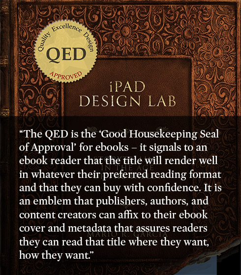
The QED (Quality–Excellence–Design) Seal is bestowed by the judges of the Publishing Innovation Awards after “a thorough, professional 13-point design review with an eye towards readability across multiple devices and in multiple formats.”
Learn more about the QED Seal here.
The EPUB version of book is HERE:
Now available: The EPUB version of  iPad Design Lab: Storytelling in the Age of the Tablet, ready for download via Amazon.com for Kindle:
http://tinyurl.com/8u99txw
Here is how you can get iPad Design Lab book:
The original version of the book is the multitouch textbook version available on the iBookstore for iPad (iOS 5.0 and up):
https://itunes.apple.com/book/ipad-design-lab/id565672822
This version includes video walkthroughs, audio introductions to each chapter, swipeable slideshows, a glossary and a sophisticated look and feel.
Apple only sells multitouch textbooks in certain countries at this time, unfortunately. Copies are available in at least the following countries: Australia, Austria, Belgium, Canada, Finland, France, Germany, Great Britain, Greece, Italy, Latvia, Luxembourg, The Netherlands, Poland, Portugal, Romania, Slovakia, Spain, and the United States.
For those in other countries and without an iPad, we have made the book available in a basic edition for other platforms. This basic edition includes the full text of the original, along with the images and captions, but lacks the other features such as audio and video. It is available on the following platforms in many countries:
Amazon Kindle:
http://amzn.to/SlPzjZ
Google Books:
http://bit.ly/TYKcew
Take a video tour of iPad Design Lab
“iPad Design Lab” trailer on Vimeo.
Read the Society of Publication Designers’ review of The iPad Design Lab here:
http://www.spd.org/2012/10/must-read-ipad-design-lab.php

Keep up with Mario Garcia Jr.. via Garcia Interactive: helping transform online news since 1995.
www.garciainteractive.com