TAKEAWAY: We used to cater to scanners in the 1980s and beyond; now they have given way to mobile device users with “continued partial attention”. Seduction and retention become moire difficult, but not impossible.
Reading a book with a most appropriate title, Mobile Frontier, by Rachel Hinman, and with much necessary content: all about mobile devices and designing for what she describes as the “everywhere-ness” of them. I will write a proper blog post about Hinman’s book. Today, however, I wish to share with you a reference she makes to “continued partial attention”, a phrase coined by Linda Stone, but which offers much material for thinking about the way we create and design content for today’s audiences.
Stone is “a visionary thinker and thought leader” with a special interest in the physiology of our relationship with technology and how our relationship with technology can evolve.
Stone describes continued partial attention as follows:
Continuous partial attention describes how many of us use our attention today. It is different from multi-tasking. The two are differentiated by the impulse that motivates them. When we multi-task, we are motivated by a desire to be more productive and more efficient. We’re often doing things that are automatic, that require very little cognitive processing. We give the same priority to much of what we do when we multi-task — we file and copy papers, talk on the phone, eat lunch — we get as many things done at one time as we possibly can in order to make more time for ourselves and in order to be more efficient and more productive.
To pay continuous partial attention is to pay partial attention — CONTINUOUSLY. It is motivated by a desire to be a LIVE node on the network.
First, there were those scanners
In my opinion, this is at the core of what we need to understand when designing for mobile audiences and for today’s impatient, sophisticated and rapidly distracted users. As I read about continued partial attention, my thoughts took me to the 1980s, when we first realized that a growing number of newspaper and magazine readers were turning into mere scanners.
Our first Poynter Institute EyeTrack studies of that era proved it, too. Here is one of the conclusions of the findings of the EyeTrack study I conducted with my colleague Dr. Pegie Stark Adam. This shows a scanner at work:
Images (photos and graphics) were viewed more than text. Photos and artwork were looked at the most, followed by headlines and advertising, then briefs and cutlines. Text was read the least.
As a result, we began to edit and to design for what I used to refer to as “two reading tracks”: the immersive track (devoted readers who took their time and savored it all with gusto), and the scanners’ track (eyeballs jumping around the page, grabbing photos, headlines and captions, mostly, with a lead paragraph of a story here and there).
It was during that time that we began to see more secondary readings: pulled quotes, highlights, summaries, one column locator maps, the info graphic that related the quick 1-2-3 of an accident. Scanners loved those tidbits of finger reading material.
Those scanners’ children are now holding on to their mobile devices and are experts at the business of not just scanning, but grabbing the essentials here, diving for a bit of depth there, and moving on to the next task, repeating the action several times during the course of a day.
What is an editor/designer to do?

This is also at the heart of what I believe is the way we need to look at information processing today. The audience wants the constant flow of information, the reassurance that their mobile devices will keep them informed of the latest right when it happens, but they also want that moment of more individual attention, the one minute when they dive in for selected content, perhaps curated especially for them, a little relief in the midst of the avalanche of data.
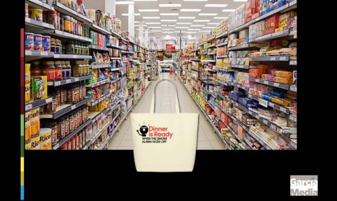
I think it is like a visit to the supermarket. Imagine that it is 7 pm, and you had a busy day, and you have no idea what to make for dinner. You enter the supermarket and it is a sea of possibilities. Aisle after aisle of what dinner could be. Just picture that, right at the door, someone realizes your dilemma and hands you a bag containing a carefully prepared version of what could be dinner tonight! Yes, it is reassuring to know that the entire supermarket’s offerings are there for the buying, but, right now, what a relief to know that you have what you need right this moment.
I hope we will see the concept of continued partial attention analyzed and explored further, especially for how we create content and design the way it will be presented on mobile devices.
Remember, those scanners we met in the EyeTrack studies of the 1980s are still around carrying mobile devices today, and they have also produced a new generation of media consumers who are experts at continued partial attention.
We might as well pay continued total attention to them.
Of related interest:
Hinman, Rachel. “The Mobile Frontier: A Guide for Designing Mobile Experiences.” Rosenfeld Media, 2012. iBooks.
Linda Stone: What is continuous partial attention?
Poynter EyeTrack Studies
http://www.poynter.org/extra/Eyetrack/previous.html