This is the weekend edition of TheMarioBlog and will be updated as needed. The next blog post is Monday, December 10, and I will be reporting from Vienna.
Sometimes a visual surprise is exactly what the reader appreciates.
I believe the editors of the regional German newspaper, Sudkurier, one that we are proud to call our client through the decades (most recently in 2017 when we collaborated with its digital team for a total mobile first approach). decided this story was worth breaking away with the usual page one template.
Surprising, indeed.
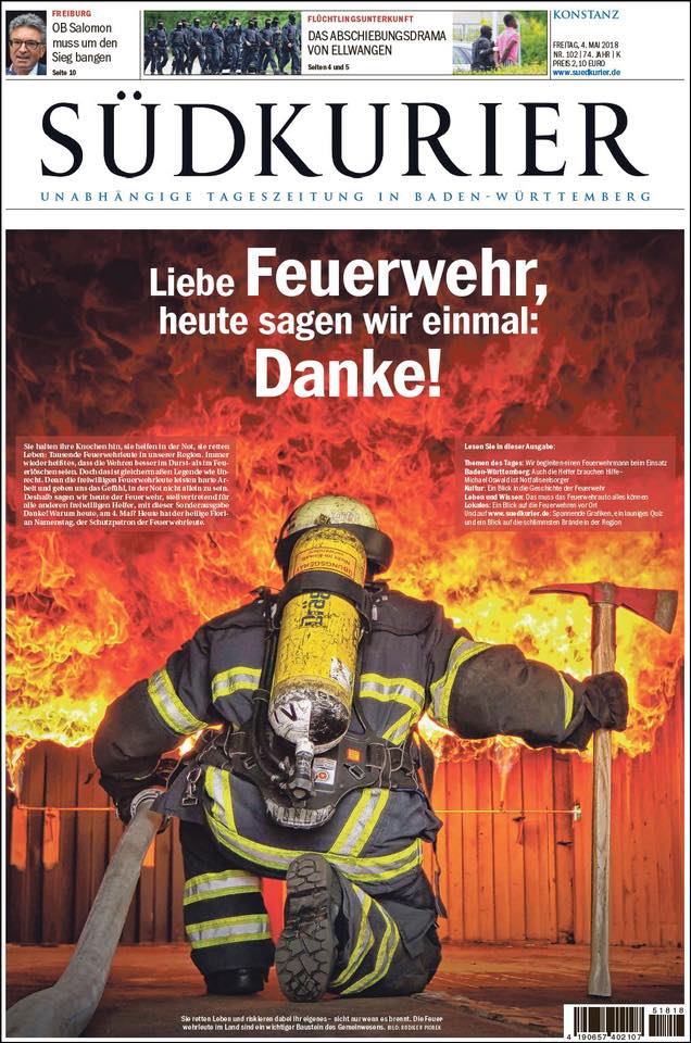
Here is how a typical Sudkurier front page may look like:
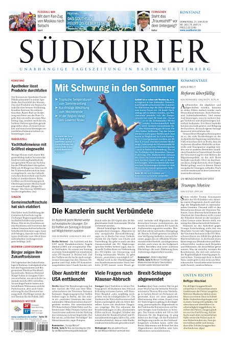
The story behind the cover
I asked Stefan Lutz, a dear friend and editor in chief of Sudkurier, to tell me more about how this front page and story came to be. This is what he told me:
“In May we celebrated the name day of “Florian”. The holy St.Florian is the patron saint of our firefighters. In all of our small cities and villages the firefighters do their work as volunteers.. At that special day we wanted to say “Danke” to all of them and praise their work. Not only at the front page, we made a Special Edition with lots of content inside. Special content with really local and different views.”
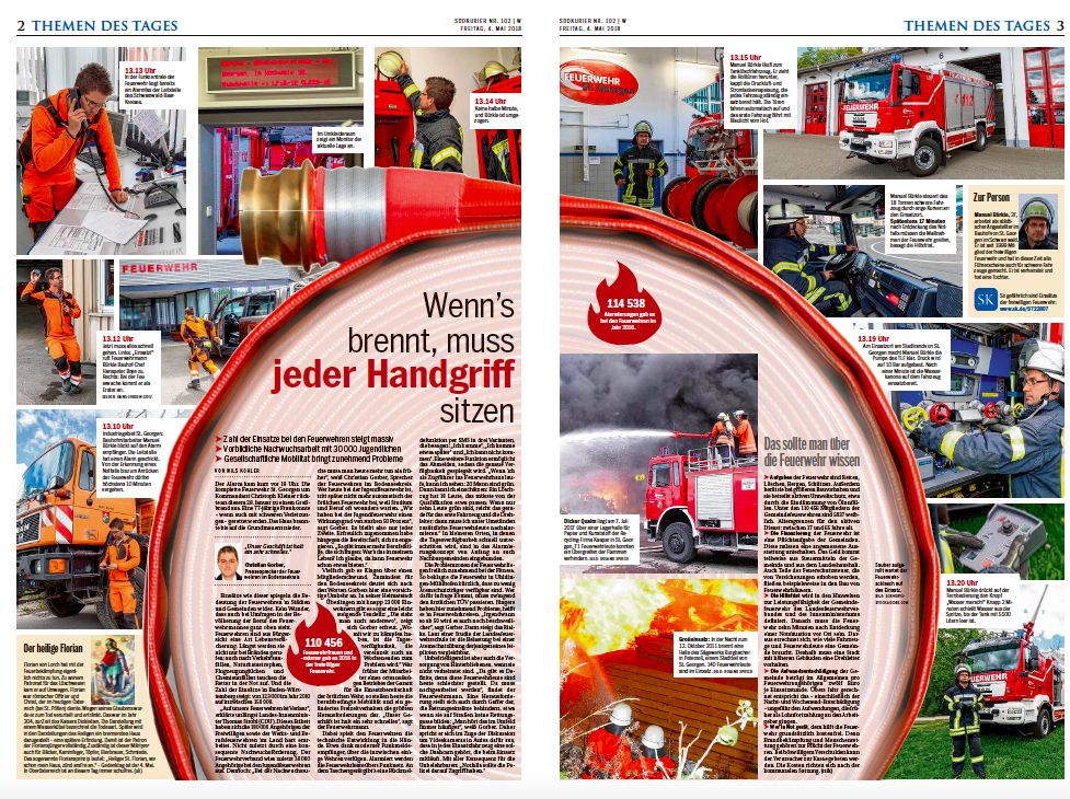
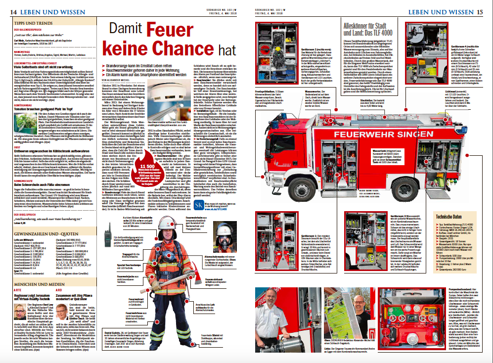
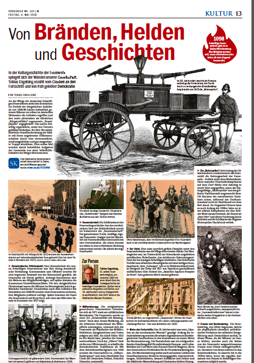
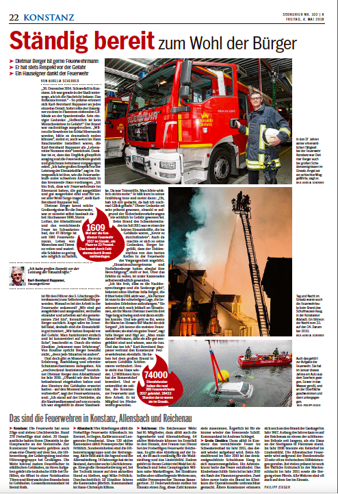
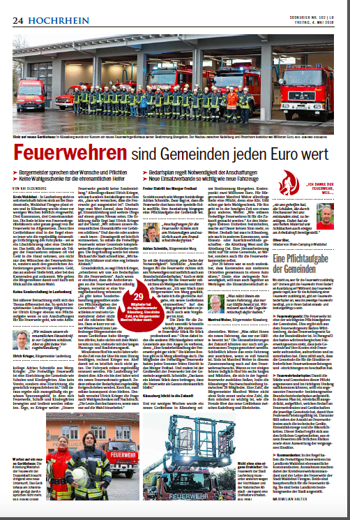
The Inside Pages
The Digital Presentation
Previously about Sudkurier
Germany’s Sudkurier: the digital “shift”
https://www.garciamedia.com/blog/germanys-sudkurier-the-digital-shift/
Germany’s Sudkurier: workshops for digital transformation
https://www.garciamedia.com/blog/germans-sudkurier-workshops-for-digital-transformation/
TheMarioBlog post #2967