TAKEAWAY: It takes only 10 seconds to convey what your news app’s focus is: which is the best way to go? Surprisingly, it is a sort of compromise between newsy and magazinish. Striking the right balance is the key. An iPad Design Lab segment examines just that.
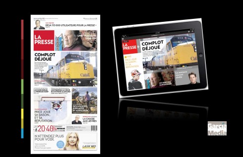
Our review of La Presse’s new tablet app prompted many reactions leading to today’s blog post: here are today’s print and tablet editions of La Presse.
In our Tuesday blog we took a look at the new app for Canada’s La Presse. It is stunning in its visual presentation, but perhaps missing a harder and newsier edge.
Yes, I know this is a matter of opinion and I have received my share of notes from La Presse’s many fans in Canada who tell me how much they love it just as it is. Some refer me to the print edition which is, indeed, very Flipboard like, pictorial, attractive and visually seductive, but, alas, as we can see in the comparison shown here today, print has a harder edge, with headlines to stories inside. This is precisely what their home page needs in the tablet edition. It is a quick fix to make as the app evolves, but only if it agrees with whatever focus and philosophy the editors wish to attach to their tablet app.
What’s the ideal newspaper tablet edition?
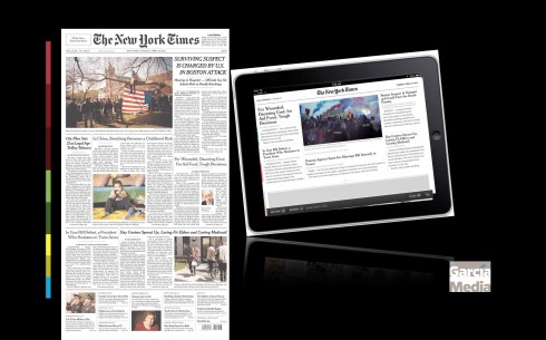
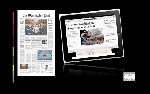
The New York Times and The Washington Post: playing it safe with the classic newspaper look & feel
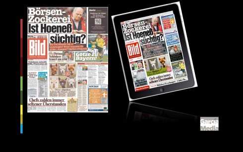
Germany’s Bild: The print edition that comes alive with pop ups and finger happy engagements
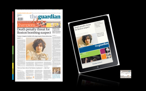
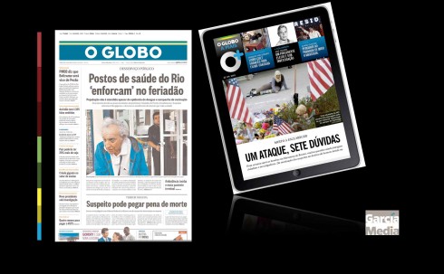
The pictorial but newsy openers, as seen in the UK’s The Guardian and Brazil’s O Globo
I am happy to say that the Tuesday blog and my review of La Presse has prompted more than a dozen emails, some with the question: what makes for an ideal look & feel in a newspaper tablet edition?
Nobody has the precise answer to that. Just as I have always said about the design of newspapers generally: each product is different and must adapt to its specific needs, the community in which it publishes and what it wants to project.
Nobody can predict what a newspaper tablet app will be even two years from now. In mid 2013, it is a sure bet that variety is the key, but we seem to be going in the two extremes of the classic copies of the printed newspaper edition—-as what we find with The New York Times and The Washington Post, for example. Or, we have pop up versions of the print editions, where the look & feel of the app is 80% close to the print product, but with pop up moments selected for some stories, which provide the fun and the differentiator. Then there are the more pictorial ones, such as The Guardian of the UK, and Brazil’s O Globo.
In a way, La Presse’s tablet falls into the category, but, we we can see in the examples here from Tuesday’s editions, The Guardian and O Globo, while visually powerful, still hold on to a newsier selection of stories on their home page.
Who got it right? In a sense, they all do, if their users approve.
Don’t forget the news
In my view, it is all about compromise: news must be a component of a newspaper tablet edition. And, if as we suspect, these tablet editions will evolve and grow up to be replacement for the print edition habit of many readers, then let’s not forget that it is news that made them come to us in the first place.
This, I believe, will be one of those hot topics of discussions in workshops globally as more newspapers develop tablet editions. Those potential readers are telling us: give me the latest news, surprise me visually,and guide me quickly to the best choices of stories for today.