Illustration by Reed Reibstein
TAKEAWAY: It’s been a year since the publication of my digital book about tablets: so what’s happening with newspaper tablet editions today? This is Part 2 of our four-part series, What’s Trending with Tablets. Today: Let’s talk a little history of what has happened with tablet editions since 2010.
When the first iPads emerged in 2010 they were followed by much excitement and long lines outside every Apple store in the US, where they were first distributed.
It was The New York Times and The Wall Street Journal, along with TIME Magazine, that first came out with their tablet editions. In each case, we recognized the iconic brands immediately, as in the transferring of the print product to the tablet screen. But we were so excited to read anything on our tablets that it was a momentous occasion.
Then along came, with lots of fanfare, the first newspaper entirely created for the tablet. Indeed, there was NO print edition for The Daily, Rupert Murdoch’s baby, and one that got tremendous attention in its first few days—-but not much after that. The Daily never even got to the toddler stage, as it published its last edition December 15, 2012.
Meanwhile, in Germany, that most colorful and daring of newspapers, Bild, stepped into the tablet spotlight with what became the best pop ups in the industry. We saw Marilyn Monroe’s famous skirt go up while standing on Lexington and 52nd Street, and Jennifer Lopez derriere moved sideways at the tune of a salsa, not to mention a variety of many other pop ups in which the users’ fingers were happy, but apparently the newspaper’s accountant was not.
So, Bild took a couple of steps forward to recreate its vibrant newspaper with more live coverage, an increase in the number of videos and photo galleries.
In fall 2011, editorial designer Mark Porter worked with a team at The Guardian to launch its daily app, a beautiful experience that reinterpreted the newspaper’s visual heritage for the tablet. The Guardian’s app showed the power of sophisticated templates that engage the reader with those critical, timeless tools of grid, color and typography.
Along the way, the Scandinavians have produced their own versions of day and night tablet editions, chief among them Denmark’s Berlingske, which has made a clear differentiation between morning and evening edition, but has innovated through its publication of the print edition, via pdfs, on the evening tablet edition, as soon as the printed edition is completed each night.
In the process, we have seen a sort of bridge to what will be happening next: a newspaper tablet edition that is a combination e-paper, live coverage, lean forward and lean back.
The Times of London’s tablet edition does just that. It opens with a curated story that is very much tablet driven, but you are one click away from a more traditional newspaper looking screen that leads to news content.
In Canada, La Presse’s stunningly beautiful tablet edition leaned back too far and I am sure it is a matter of time before it bridges the gap between the live news that we know tablet readers want, and the curated material that is fun and should be included as well.
Now, The Virginian-Pilot’s Evening Pilot emphasizes the importance of tablet use in the evening hours, but provides full access to breaking news as well. We will devote Wednesday’s installment of this series to the Evening Pilot.
It’s difficult to imagine that all of this has happened in a short three years. I imagine that the next year should count for about five. For those newspapers that have not yet gone tablet at all, the examples cited here should provide inspiration and models to emulate.
The good thing is that we continue to experiment, to see what works and to focus our energies on a model that works for our specific needs, as we are seeing with the so called “bridge” newspaper tablet editions.
It will be a crowded bridge out there in Tabletland, and we are likely to see a variety of examples all of which adapt to their geographic and economic realities. We are watching with interest and adapting our own workshops to what’s trending with the tablets.
The New York Times, The Washington Post
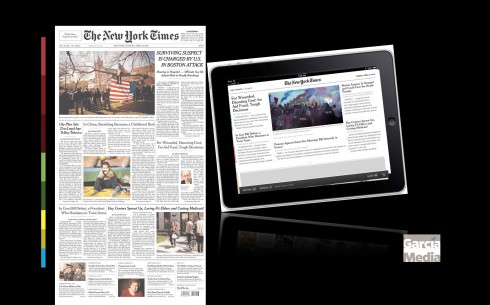
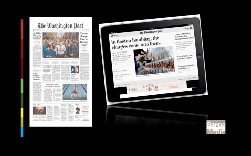
The New York Times and The Washington Post: continue to play it safe with the classic newspaper look and feel
Bild Zeitung (Germany)
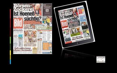
Germany’s Bild: The print edition started with pop ups and finger happy engagements before it switched to its existing version
Take a short tour of the new Bild app
Here is a short video tour of the Bild pop up advancing the story of Felix Baumgartner, who will climb more than 120,000 feet into the atmosphere inside a capsule attached to a helium then take a free fall to earth. Video created by Frank Deville
La Presse (Canada)
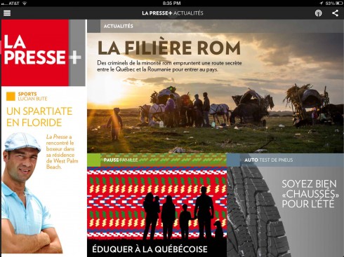
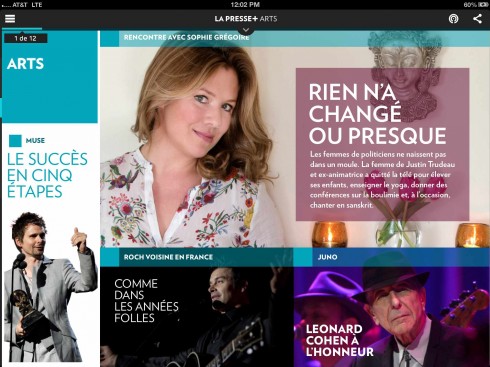
A great design for La Presse’s tablet edition, but perhaps too lean back?
The Guardian (UK)
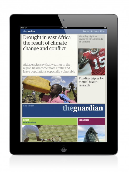
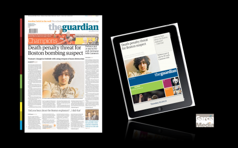
The pictorial but newsy openers, as seen in the UK’s The Guardian
The Times of London (UK)
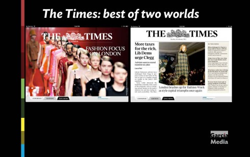
Perhaps the Times of London tablet app became the first of the bridge newspaper tablet editions, offering us the best of two worlds: entrance thru what is definitely curated material for this edition, but one click away from the more familiar Times print edition.
Evening Pilot
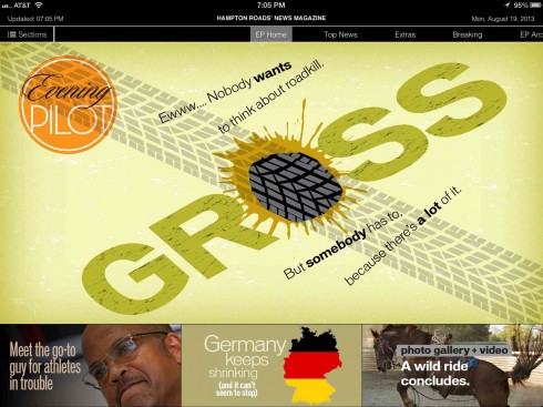
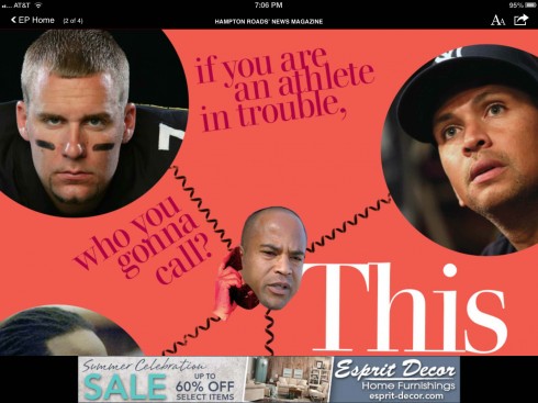
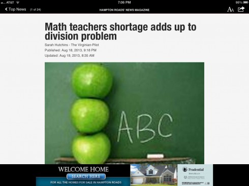
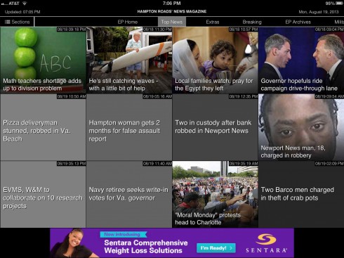
One of the newest arrivals in the newspaper tablet edition landscape, Evening Pilot: one of the first of the “bridge” mode, compromising between curated and regular news content
What’s Trending With Tablets?
Coming up in TheMarioBlog:
Wednesday: We take a look at Evening Pilot, the new tablet edition of The Virginian Pilot
Thursday: A conversation with Joe Zeff and Michael Eder about where newspaper tablet editions are headed