TAKEAWAY: Here is one reason why editorial/advertising types need to talk to each other. More importantly, an editor/layouter placing a story on a page must have an idea of what else appears on that page, including advertising. PLUS: Pure Design download, White on Black
We often discuss here the placement of advertising, usually seeking innovative ways to display those ads. trying to get away from the routine that somehow makes readers grow immunized to commercial messages.
TAKEAWAY: Here is one reason why editorial/advertising types need to talk to each other. More importantly, an editor/layouter placing a story on a page must have an idea of what else appears on that page, including advertising.
Who would you like to be for Halloween?
We also know that newspaper editors and advertising departments don’t usually work close together. From time to time, a newspaper everywhere has suffered from the embarrassment of running an ad for a whiskey or beer brand next to the headline of about an accident with fatalities caused by a driver who was driving under the influence of alcohol; not to mention the swimming pool advertisement next to the tragic story of a toddler who drowned in his home’s swimming pool.
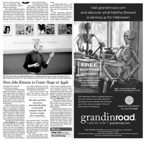
It has happened again. this time on the Sept. 10th edition of The Wall Street Journal, which showed an ad promoting Halloween decor by Grandinroad.com and displaying two skeletons inserted next to an article entitled “Steve Jobs Returns To Center Stage At Apple”, featuring a shot of the gaunt Jobs on stage at the company’s big iPod event. One embarrassing moment for the WSJ execs, for sure. And we wonder why Jobs had to say.
While everyone was happy to see Apple’s Jobs make a grand appearance, it is no secret that everyone discussed how skinny and gaunt he looked. Without saying it directly, the WSJ juxtaposition of ad/story/photo said it all.
Pure Design download: White on Black
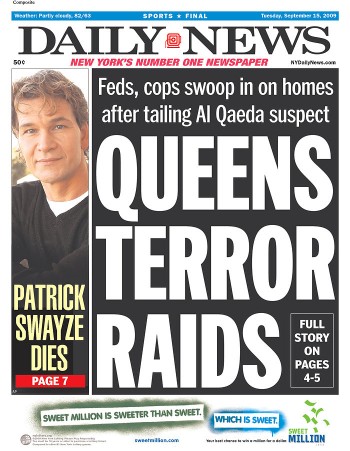
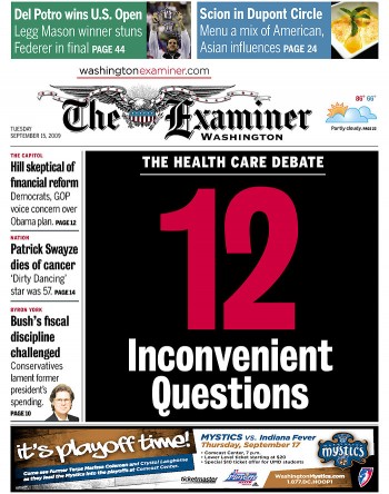
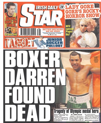
These front pages in classic tabloids show the power of those WOBs:New York Daily News, The Examiner (Washington DC), Irish Daily Star
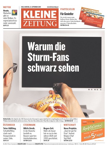

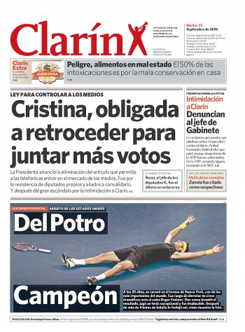
Front pages showing that WOBs can have life outside of the huge tabloidy treatments and, indeed, be elegant : Kleine Zeitung (Austria), Publico (Portugal), Clarin (Argentina)
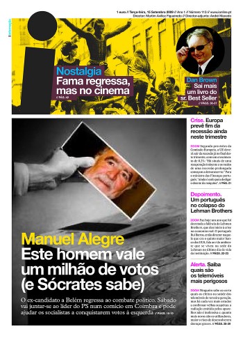
And for anyone who ever questioned the power and elegance of white type against a darker background, here is the new ‘i”, from Oeiras, Portugal, a thing of beauty
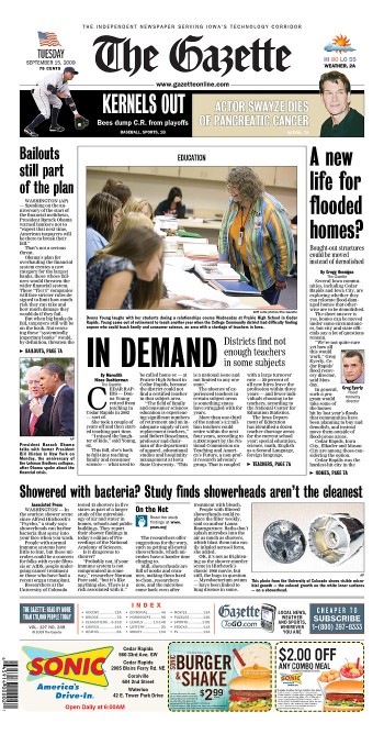
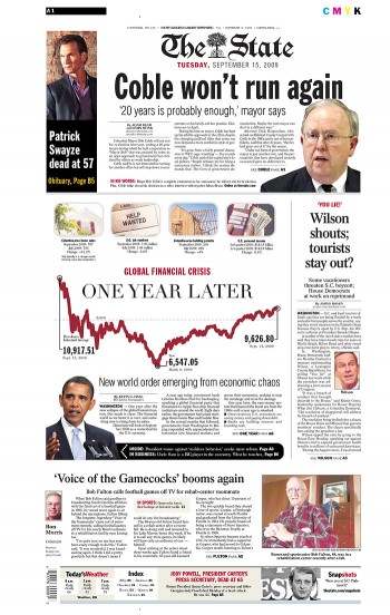
Sometimes a touch of a WOB, just a little moment on the page where white type touches a black background: The Gazette (Cedar Rapids, Iowa), The State (Columbia, South Carolina)
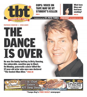
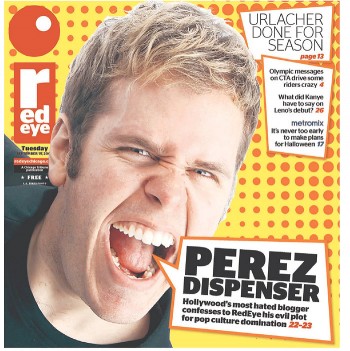
These pages show that a black headline set against a white background can also pull a heavy punch: tbt (Tampa Bay, Florida), Red Eye (Chicago)
Real macho men tabloid editors call them WOBs—-as in White On Black. WOB headlines are the daily stuff of those British, Australian and New York City tabs. Make it a big headline, starting at 280 points, all caps, white on a black background, and the masses will flock to buy that newspaper. If the word MURDER is there, then add another 5000 readers, so goes the myth inside the newsrooms of the world’s most legendary tabloids. We show you here that WOBs are still very much in vogue around the world.
However, I personally think that WOBs don’t have to shout, and they can be effective as little moments on the page, at 48 points or smaller. Try them.
TheMarioBlog posting #367