While speaking to the audience of editors/publishers and media managements during the PANPA 08 conference in Australia, I had several people asked me about online advertising and how U.S. newspapers dealt with it.
Interesting question, and a relevant one as well. Although print continues to be the revenue producing medium in a majority of media publishing houses worldwide, the gap is, indeed, widening in online advertising.
Depending on what conference you attend, and what expert you listen to, online advertising will be where the profits are going to be between three and five years.
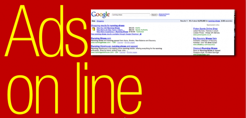
The Wall Street Journal reports that spending on Internet advertising is climbing at a healthy clip—-rising 20% in the U.S, in the second quarter—and the forecasts are for further growth, despite the weak economy.
The same report is quick to point out that a lot of the gains is in the area of simple search ads, those text-only announcements that appear on search-resuilt pages. The WSJ reports that search-ad spending is on track to reach $10.4 billion this year.
And , of course, the primary beneficiary of such trend is Google Inc. , which has made the simple text ads that appear to the right of the screen its main turf. Yahoo and Microsoft, on the other hand, have banked on the more sophisticated and graphically elaborate display ads, with which they had hoped to gain ground on Google. It Is not happening.
However, spending on display ads is forecast to reach $5.2 billion this year, compared to $4.5 billion in 2007.
The Internet: simplicity over flash
Advertising is not the only area where the simple, direct approach succeeds over flash.
Take general design, for example: news websites must be designed to emphasize good navigation and overall functionality, over perhaps more aesthetically pleasing designs that are not easy to use.
We continue to believe that words are the key online. We react quickly to words and we click to move on to the next bit of information we desire to obtain. All the evidence we have indicates that online requires the best wordsmiths.
Two of this week’s postings prompted interesting replies and we take a chance to publish them here;
The new WSJ magazine
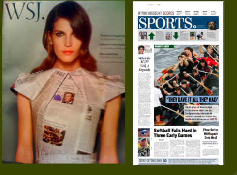
Bob Newman, New York City-based magazine designer, gives us his view on the new Wall Street Journal magazine. By the way, we will present a Three-Minute Interview with Bob this week on TheMarioBlog:
I was just reading your blog posting about the new WSJ. magazine and thought I’d drop you a note. I think I may not be as generous as you in my thoughts about the design, although I do think you nailed it when you talked about how easy it is to get through (and how fast). It has none of the coolness factor of the Times’ T magazine, but given the audience that’s probably appropriate. I found the whole thing a little canned feeling, barely one step beyond a prototype (but of course, this one was filled with ads!). I think the typefaces, white space, etc. are fine, but it just feels a little characterless and soulless to me, lacking in energy and excitement. I know that comes with that type of design, but I guess I expected something a little more cool British/European-looking. It may actually be more of a content problem than a design problem, but the whole thing just left me flat, and did not feel competitive visually with T, the TImes magazine, Departures, Conde Nast Traveler, and other upscale publications. And the cover photo, I thought was just totally generic, like a newspaper person’s idea of what a cool fashion magazine would look like.
Yale Daily News—sports pages
Alexandre Giesbrecht takes a look at the YDN’s sports page and wonders if there is a trend to make the typography of sports bolder than that of the rest of the newspaper. Here is his comment:
What is this current trend of adding sans-serif fonts to headlines in sports sections? Nothing against it, but I see it being ever more common.
Mario responds:
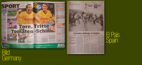
I personally believe that, indeed, sports pages need to have their own personality, to do justice to the high energy content that they usually cover. In the case of the Yale Daily News, which follows a classic, elegant design for most of its sections, we wanted to make sure that we played some trombones here, instead of string instruments, as in the news pages, thus the use of the bolder Verlag font for headlines. The examples shown here from today’s Bild Zeitung, of Germany, and El Pais, Madrid, Spain, demonstrate how, in the case of Bild, which is already a bold newspaper on every page, the sports page increases the size of type, and uses even bolder fonts; El Pais, with a very soft typographic palette for its news section, goes sans serif bold for Sports.
![]()
www.wsj.com
(The gap is widening in online advertising, Sept. 5-7, 2008)
www.yaledailynews.com