This week reporting from Sydney, Australia
Update #4: Monday, Oct. 29, (New York, 2:30 p.m.)
Purchase the book on the iBookstore
“iPad Design Lab” trailer on Vimeo.
The EPUB version of book is HERE:
Now available: The EPUB version of iPad Design Lab: Storytelling in the Age of the Tablet, ready for download via Amazon.com for Kindle:
http://tinyurl.com/8u99txw.
Read the Society of Publication Designers’ review of The iPad Design Lab here:
http://www.spd.org/2012/10/must-read-ipad-design-lab.php
Read the review from Dr. Pegie Stark Adam in her blog
http://pegiestarkadam.com/
TAKEAWAY: Celebrating print never had a bigger platform Upon Paper, a magazine that is the size of a poster you hang on the wall, with huge (and beautiful) photos and seemingly bigger ambitions for the role of ink on paper. ALSO: Embracing your reader AND: Pages we like from Bild am Sonntag
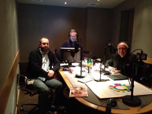
Take a look at a copy of Upon Paper on the table as we taped The Stack, the Monocle 24 Radio that airs Nov. 3: from left Richard Spencer Powell, Tyler Brulé and I
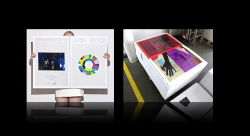
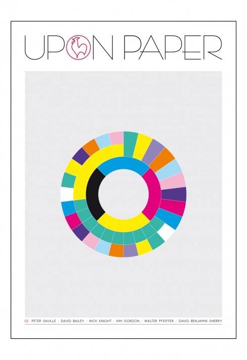
The second edition is all about a celebration of color in print, and displays a color wheel on the cover
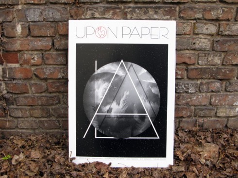
The first edition of Upon Paper was devoted to the city of Los Angeles
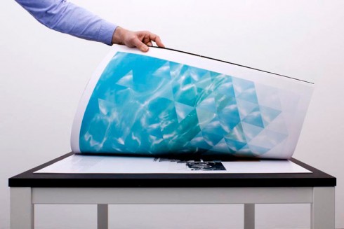
Flipping through the pages of Upon Paper: table required
It is the largest size printed magazine I have ever seen, although I am told, not the biggest magazine ever. That honor was to Visionaire magazine, two meters high and 1.5 meters wide, or 6 feet high and 4.8 feet wide — so large that it has entered history in the Guinness Book of World Records.
But, back to Upon Paper. There it was, a huge magazine (49 x 69cm) called Upon Paper, occupying one third of the table where we would engage in a discussion of magazines for another episode of The Stack, the new and already popular Monocle 24 Radio show hosted by Tyler Brulé.
Upon Paper is a catchy and appropriate name for this enormous version of a magazine which is more like a collection of posters. Some pages, however, are giant versions of what you might see in a normal size mag, including columns of text in a four column grid.
Upon Paper is, in its own description, an object of desire. It is more: “Each issue features a leitmotif, thematically linking an outstanding ensemble of artists, designers and creatives with a curious eye and fresh insight. What unites them is not their fame, but the quality of their practice and their contribution. “
Then there are those gorgeous photos, ready for hanging on the wall, and a double page of just white space with the tiniest photo of a postal stamp sitting in the middle, commanding all of our attention.
A celebration of print
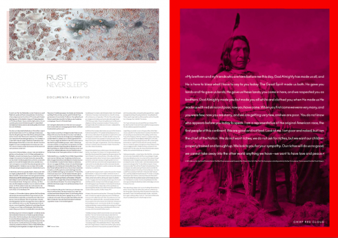
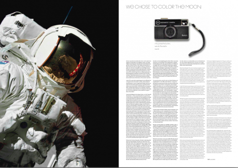
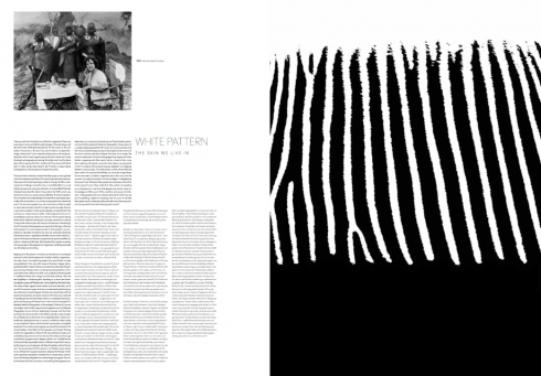
Several inside page spreads from the latest edition of Upon Paper
The concept for Upon Paper, which is published in Germany, seems to be a celebration of print and all the good things that happen when ink touch paper, something which is enormously well achieved here.
It is also a celebration of paper. The company behind Upon Paper is Hahnemuhle, a manufacturer of high quality papers for artists, photographers and the graphic design industry.
Upon Paper ‘s challenge may be the issue of portability, as you can imagine. This is not the publication you take with on your next flight, or that you read while riding in a crowded commuter train, but it would provide for a grand coffee table conversation piece, once you were able to get it there, that is.
I know that I wanted to take the one in the studio at Monocle 54 Radio, except it would not fit in my suitcase.
At a time when we continue to be amazed by the power of the smallest screens, such as that of an iPhone, for newspaper and magazine content, Upon Paper presents us with not just a full celebration of print, but a uniquely sized one which may be seen as perhaps a touch of rebellion, a call to arms for ink and paper devotees and a reminder of the power of print to engage us visually in a fully disconnected way.
What makes my discovery of Upon Paper all the more interesting is that in the past few days we have witnessed the announcement from Newsweek that it will cease publishing its print edition Dec. 31, and National Geographic takes its beautiful photographic coverage of places to the small screen of the iPhone in new app, but in Germany, the publishers of Upon Paper enter the stage proclaiming that not only are magazines not dying in print or becoming microscopic mobile phone versions, but that they can be also be bigger——and printed.

We have asked the creative director of Upon Paper, Helder Suffenplan, two questions about this massive undertaking:
Mario: What prompted you guys to do this incredibly creative and forward looking product, but in print! To me it is a celebration of print.
Helder:
It is not only a celebration of print but of the multi-sensual, physical world in general. We love the internet and the fast and easy exchange of contents in real time. But we felt that with the trillions of images in 72dpi it was about time to do quite the opposite: An object with a strong physical presence rather than a magazine. So Holger Homann (publisher and editor-in-chief), Paul Hetherington (editorial director) and I (creative director) developed this concept which is fundamentally unwieldy: UPON PAPER magazine is not easy reading, and it demands the full attention and involvement of its readers. We are especially happy that this idea is particularly appreciated by the artists we work with. They seem to be thrilled to finally have a stage to show their work in an adequate quality and format.
Mario: What is the biggest challenge when producing and art directing this concept in this format?
Helder:
In the beginning it was not easy to develop a feeling for the size of a double spread: What would be the right font size, how much white space can you have in a layout before it falls apart, these kind of questions. By now with the second issue completed, we have developed a pretty good sense for the format, I guess. Production wise, quite everything is a challenge because there is nothing standard-like about UPON PAPER. To collect the sheets for each copy and to put it into the box, the printer had to develop special trolleys. And they had to evacuate their staff canteen for two weeks because they needed the space for the working process. But we have great partners for production and together we managed to handle all obstacles so far.
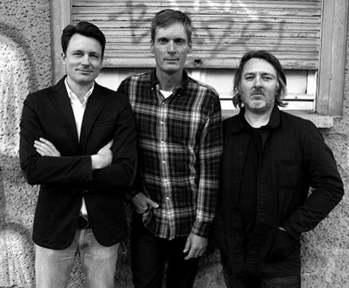
The people behind Upon Paper: from left to right, Helder Suffenplan (creative director), Holger Homann (publisher/editor-in-chief), Paul Hetherington (editorial director)
Upon Paper gets coveted award
Apparently we are not the only ones who like Upon Paper: Helder tells me that the first issue has been awarded the red dot grand prix,. Here is a link explaining the award and online exhibition:
http://red-dot.de/cd/online-exhibition/work?code=06-1581&y=2012&c=0&a=2
The typography of Upon Paper
Upon Paper uses a font called Ano by Gareth Hague. “This is a font with many styles of which we use only some, very cautiously. We were looking for a geometric grotesk in the tradition of Futura but with a contemporary touch and a higher readability. The fancy style we use only in the headlines for just one character or a word,” Helder writes me.
Monocle 24 Radio:
Hear our discussion of print magazines, both old and new, and including Upon Paper, on Monocle 24 Radio, The Stack, at 10 o’clock London time, Saturday, Nov. 3. The show is moderated by Tyler Brulé and the other guest is Richard Spencer Powell, Monocle creative director.
Maybe NOT this embrace
For years, I have admonished editors in my workshops and seminars to embrace the reader.
Put your arm around the arms of the reader, and have an across the fence chat with him. Chat, don’t converse, make it informal and personal.
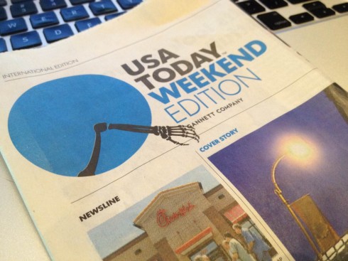
Maybe the embrace concept has gone a little too far with USA Today’s Weekend edition, celebrating Halloween.
That blue circle logo that tells stories has the image of a skeletal arm, not the kind we wish to be embraced by.
But, heck, it’s Halloween, and this is fun, and I am not surprised that the blue circle did this to get people in the mood for the night of goblins, witches and black cats coming up this week.
I am sure the designers are already busy at work with turkeys and Norman Rockwell style scenes of Thanksgiving.
But, first, November 6 and the Presidential Elections. We look forward to what they do for that important and historic day, although we have an idea what the logo will do when we know who the next President of the United States will be.
Pages we like
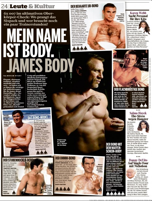
It’s a lot of James Bond coverage these days, as the 007 Agent movies turn 50, and a new film in the sequence premieres. So, leave it Bild am Sonntag in Germany to put together a full page titled James Body. I am Body. James Body.
The pictures shown depict the physique of the various James Bonds through the past five decades.
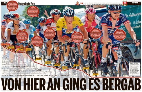
The second example from Sunday’s Bild is a double page spread with the headline “It goes down from here”, noting that not only Lance Armstrong but many of those around him were also allegedly using enhancement drugs.
 =“490” height=“338” />