Update #4, Tuesday, Feb. 23, 11:19 EST
TAKEAWAY: It is a sleeper of a story for most, but not for the Argentineans, so it is interesting to see how British and Argentinean newspapers are covering the story of the Falkland Islands and the likelihood of finding oil there. AND: London’s The Observer’s redesign: something new, something familiar . We go into the Garcia Media attic and what do we find? PLUS: Spanish magazines: marketing in a bag AND: London’s The Observer’s redesign: something new, something familiar

Front page story here, inside page story there!
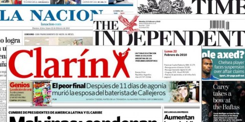
A sampling of Argentine and British newspapers yesterday
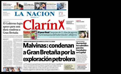
Front pages of Argentina’s La Nacion and Clarin, both with lead stories on the Falkland Islands story
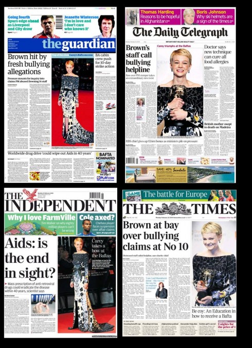
Meanwhile, the British newspapers ignore the Falkland Islands story totally.
Those old enough to remember the Falkland War know that it came and went in a flash, starting on April 2, 1982, and ending with a defeat for Argentina June 14 of the same year.
Las Malvinas, as they are called in Spanish, has always been a sore topic for the Argentines, who claim that the territory of the islands in the South Atlantic are rightfully theirs; the British disagree. I recall American coverage of this short war, and how my fellow Americans were making a geographic discovery, and wondering why the big fuss was over an island populated mostly by sheep and rocks.
Well, let’s move ahead to winter 2010 and now a British oil rig has started drilling off the Falkland Islands in a move likely to provoke further tensions between Argentina and the UK over the disputed South Atlantic territory. According to CNN, in a statement to the London Stock Exchange, British oil and gas exploration company Desire Petroleum said the Ocean Guardian rig had begun drilling an exploration well in the North Falkland Basin, some 100 kilometers (60 miles) north of the islands. What’s the take?
Desire estimates that the North Falkland Basin could contain 3.5 billion barrels of oil as well as having “significant gas potential.” The exploratory drilling is expected to last around 30 days.
Page One coverage
So, we turn to the front pages in the UK and Argentina to see what impact this potentially explosive story has.
For the newspapers in Argentina, this is the stuff to lead with on Page One. There is national pride and patriotism involved, not to mention reviving the fervor about the old gripe: Las Malvinas are ours, say the Argentine editors, echoing the feelings of the population.
Then you turn to the British press, and the story does not make it on Page One, and hardly anywhere. The front page editors apparently do not consider the story of any consequence, sending it to the inside bottom corners.
Our Rodrigo Fino, of Garcia Media Latinoamerica, calls it “indifference” and he writes about it in his blog of today (in Spanish).
Stay tuned for what’s ahead with this story. If I were an art director, I would have my info graphics people dusting off the old maps and getting ready to use them——maybe on Page One.
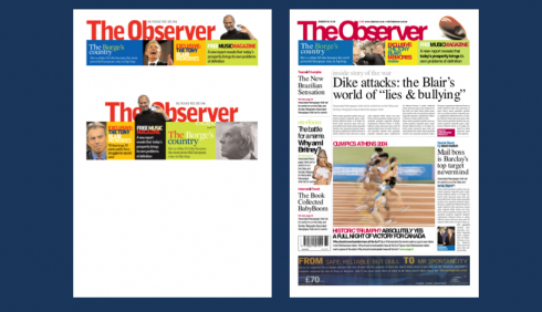
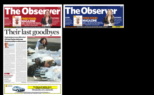
The Observer: looks familiar
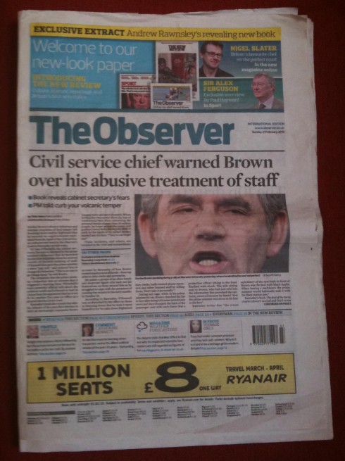
Front page of The Observer, London
In 2005, Garcia Media’s team had the privilege of working with a talented group of editors and designers at London’s The Observer, the oldest Sunday newspaper still in existance. Just recently, The Observer has undergone some changes in its design. Of course, we are curious and wanted to see what this new chapter in the newspaper’s graphic history would be.
We are happy with what we see, a design probably executed in house. In fact, many of the elements that we see as part of the news page design are elements that we had created for the Review section. Some nice uses of type, and great use of photos, which has always been a landmark of The Observer’s offerings.
Evolution is what it is all about, and for The Observer, I feel that this was the right next step. Considering that we kept reading about the paper’s possible demise not too long ago, we are happy to see that it is still here, strutting its stuff and doing it well.
For case study of the Garcia Media redesign of The Observer in 2005:
https://garciamedia.com/blog/articles/the_observer_of_london_redesigning_a_classic
Our Observer redesign: visiting the files
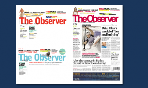
These are dummies for sample pages we tried as we found our way through The Observer and tried to find the right formula for its front page, logo and navigation.
We would experiment with various colors for the top logo/navigator
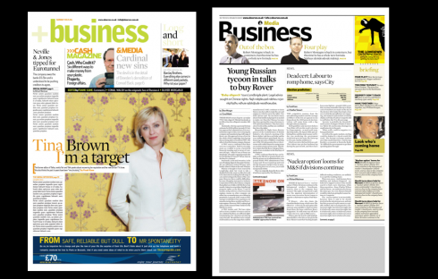
Two versions of Business section opener: my favorite was the one on left, but the newsier one won the day!
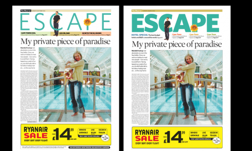
The travel section Escape: we did the logo in bold and light (my preference was for light, but the bold prevailed)
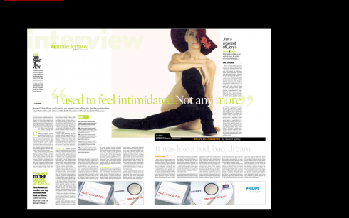
One beautiful spread to show how to do an in-depth profile: this page sang as beautifully as Annie Lennox
Looking at the new layout of The Observer tempted me to dig into our archives to reminisce about that wonderful project. I remember that we tried to come up with different versions for a logo—-more color, a variety of pastel hues, with the idea of changing it every Sunday (no, that did not go over so well, but it was worth trying——which is the spirit of the early prototype stages for every project). Some front pages were too newsy, others not newsy enough. We had tremendous fun experimenting, as you can see with these front pages, none of which was considered beyond 15 minutes as we put them on the board for a “gallery walk”.
My tip here: don’t ever get too attached to your ideas, because others may not find them so fascinating when you present them. This may lead to extreme disappointment. I usually give myself 30 minutes to confront disappointment, then put those pages out of my sight, and concentrate on creating the new ones.
But, I look at these pages six years after we created them, and I tell my team that they are still interesting. Revisiting one’s work is a good exercise. I recommend it. Just don’t dwell on it. Sort of when you go into your attic and discover your high school yearbook, or the picture of you as a 4-year-old learning to ride a bike, or Aunt Clara’s wedding tiara. Take a look, smile upon the nice memories, and get out of the attic soon——the present is waiting. If you are like me, your hunger for the now is so much stronger than for what was!
The Oklahoman: SND Award of Excellence for Redesign
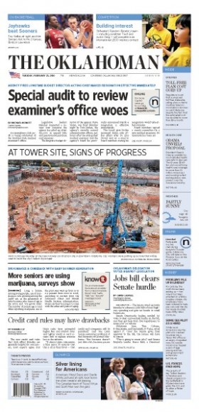
Front page of today’s The Oklahoman
Congratulations are in order for our friends at The Oklahoman, of Oklahoma City. They have won an Award of Excellence from SND for the redesign we completed together in 2008.
For The Oklahoman’s story, go here:
http://newsok.com/article/3441494
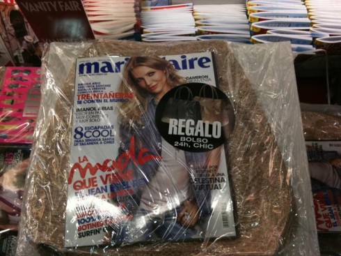
It’s in the bag
Magazines, like newspapers, are going through tough times seducing readers into buying them and reading them.
So, for Spanish magazines, it is all in the bag——the big bag that they offer as a gift to lure customers. While in Paris, and looking through those fabulous press kiosks on the Champs Élysées, one can’t ignore—-isn’t that the point?—- the big magazines inside those huge plastic wrappers that include the magazine, the bag and extras. On a rainy day like today in Paris one wonders if the umbrella offering will be next.


TheMarioBlog post #490