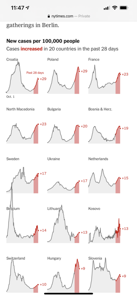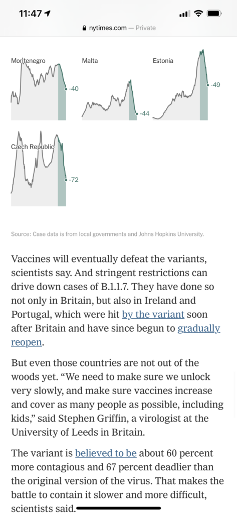
The story: How more contagious variants of Covid19 keep tearing across Europe.
The template: The New York Times is using an all graphics template here . There are no photos or videos to accompany the piece.
What we need to look at here;
While the text of the story remains identical for both the print and digital versions of this story, what is different is the placement of the graphics.
Here is the print presentation:
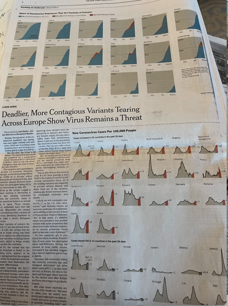
As is correct for print, the text stands separate from the graphics. Nothing interrupts the text.
Now let’s take a look at how the story flows for mobile:
Notice that a key graphic, small but essential, appears at the top of the first screen:
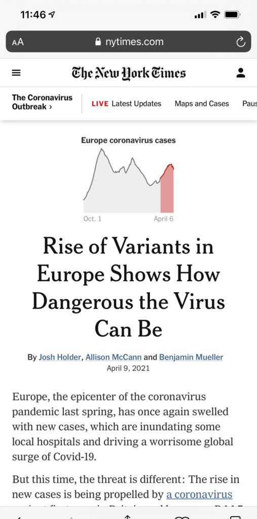
As the story continues, an animated time line graphic comes early enough in the sequence:
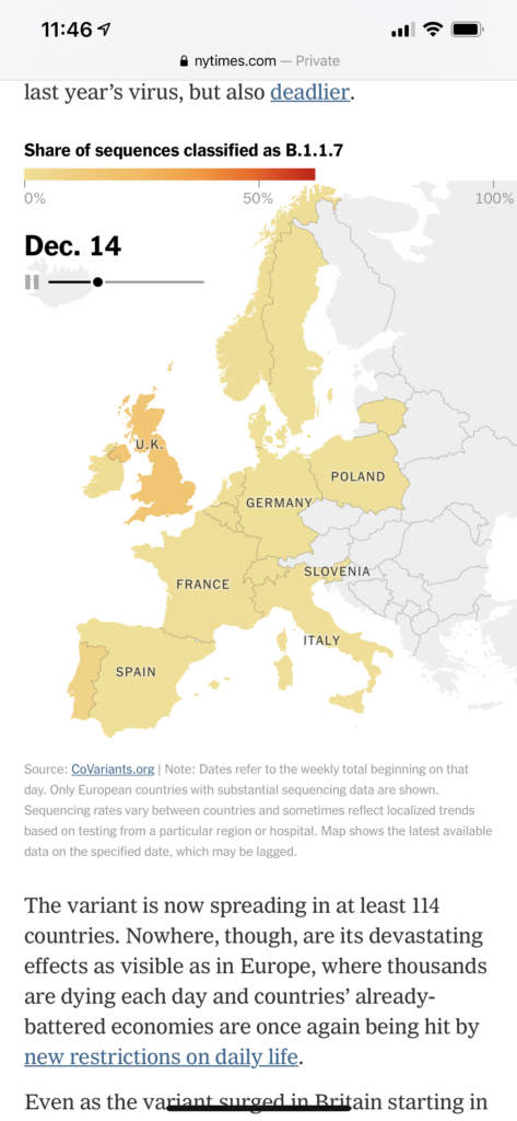
As the narrative continues, the graphics come at precise points in the story, unlike the print version where they are clustered separate from text:
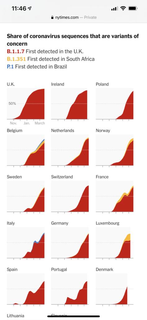
Why it matters:
This is a simple story told via graphics. I find it interesting and worthy of analysis because it shows how simple it can be to craft stories with small changes that make it easier to read in a given platform. In this case the text is identical, but it has been accommodated differently for print and mobile.
https://www.nytimes.com/interactive/2021/04/09/world/europe/europe-coronavirus-variants.html
Our mobile storytelling workshops now available remotely

Professors: get your review version of The Story on time for fall classes
As an academic, I know the importance of having the right tools to advance our students, especially on the important subject of mobile storytelling. Please drop me an email if you would like to sample The Story in its digital edition: mario@garciamedia.com
Start writing or type / to choose a block
The full trilogy of The Story now available–3 books to guide you through a mobile first strategy. Whether you’re a reporter, editor, designer, publisher, corporate communicator, The Story is for you! https://amazon
TheMarioBlog post # 3306
