I am sure there are reasons why this isn’t so, but none that is obvious to me.
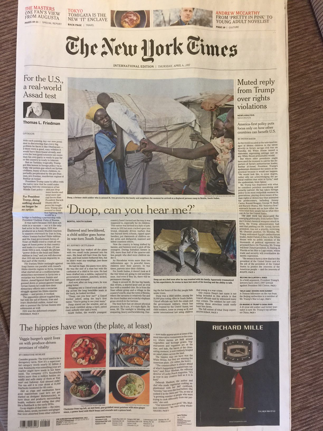
The front page of the international edition of The New York Times offers a true lean back approach to the presentation of news. It is inviting and the content, too, signals that this is not a page where the editors are trying to break news. Quite the contrary, the page invites us to relax, to sample what is there, a combination of opinion, features, a news story (of course), and the lifestyle offering that we rarely may see on the edition of The New York Times back home.
Let us take a look at a recent front page of the international edition in print. Take a look at the entire page first:
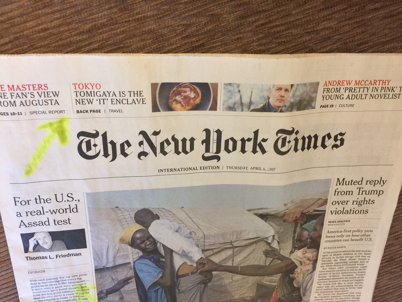
First thing that catches our eye are those promos at the top of the page, a good navigator to the inside of today’s edition.
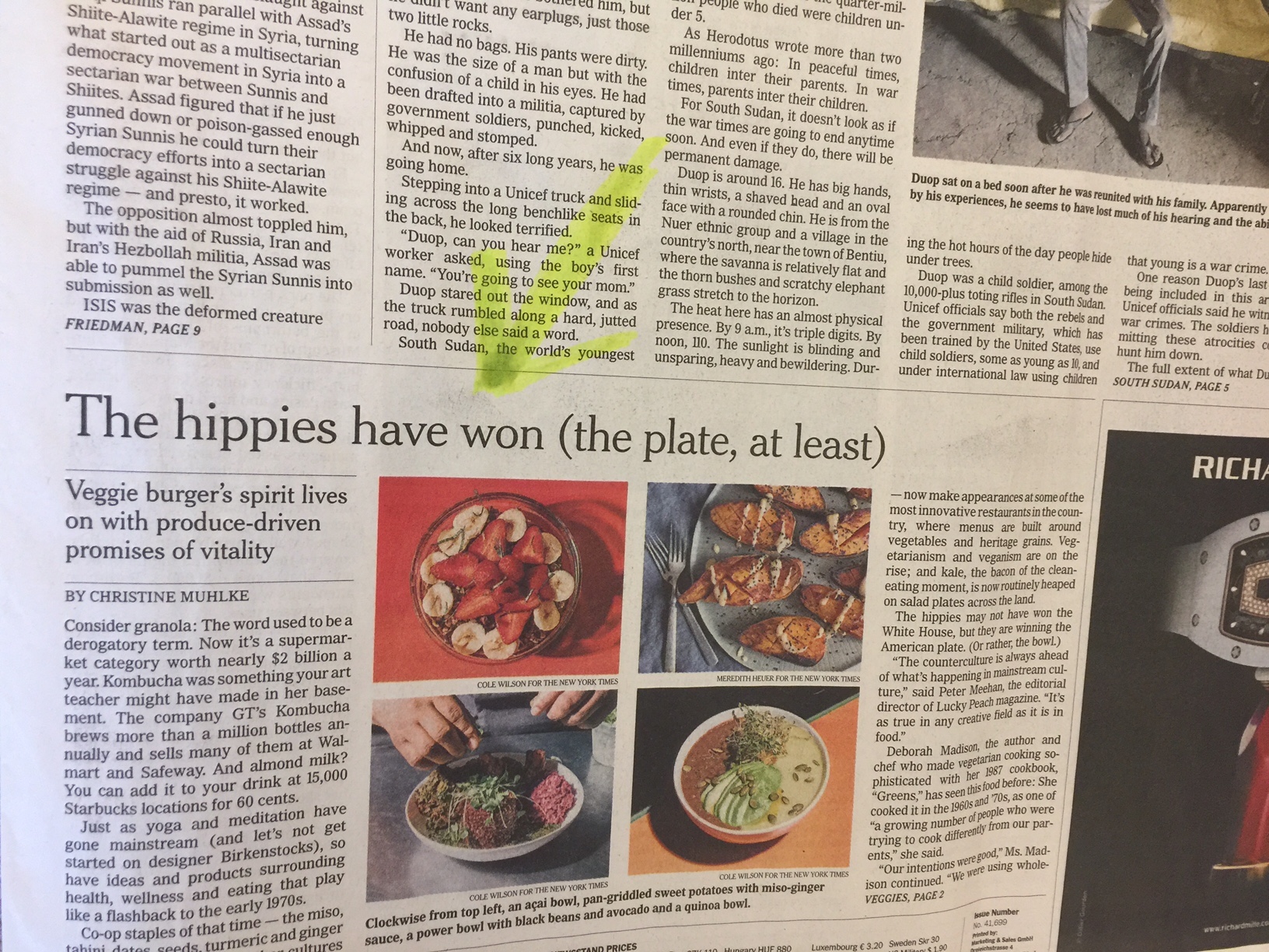
Then one element I like a lot and which should appear on the front page of every printed edition of a newspaper everywhere—a column or commentary. This is always going to be new content that readers may not have seen or heard before.

Then I like that there is a lifestyle story which surprises and is another element to make us feel that we are in for a lean back, relaxing experience with this print edition of the Times.
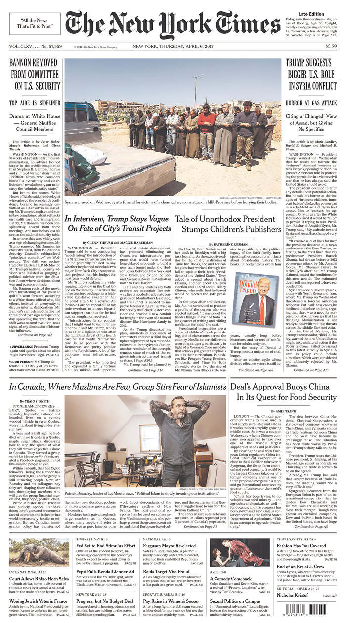
The front page of the US edition
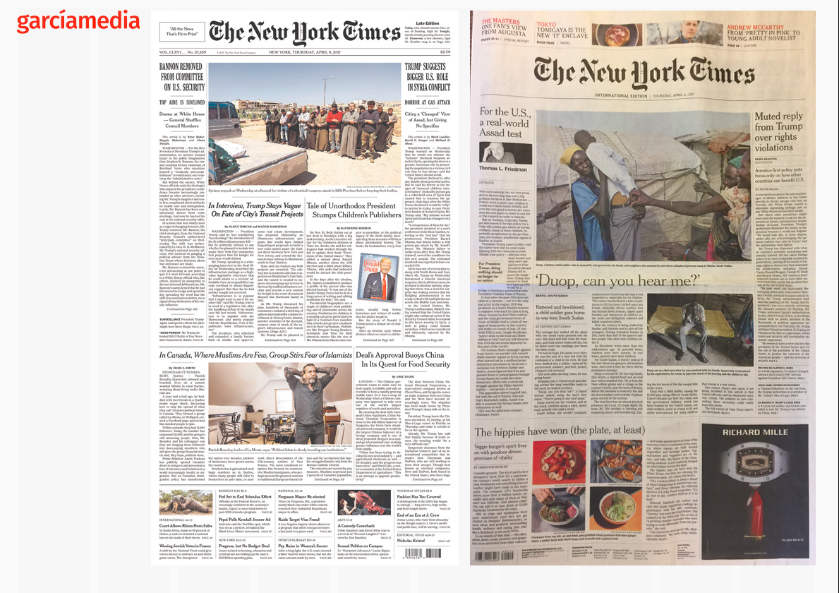
Here we see a typical front page from The New York Times as it appears in its domestic editions.
And here you can see the two front pages side by side, and notice that there is a more generous story count (19 items) in the US edition, with a promo/navigator at the bottom of the page, as opposed to the more attractive visual presentation of promos at the top in the international edition and only 7 items.
The lessons
–The front page of the printed newspaper should offer a pleasant visual environment that invites for relaxed reading.
—The presence of a column/commentary allows the newspaper to offer its best writers up front, with content that may be exclusive and that the readers have not seen prior to finding it here.
–Notice the use of white space around the page (something that we don’t see as much of in the US editions).
–Finally, go light with content, and surprise me with a story that has nothing to do with the news of the day, but may have a lot to do with my lifestyle.