This is a textbook example from The New York Times on how to make a story that tends to be complicated quite simple to follow.
I can only imagine how this story, an analysis of various possibilities and outcomes in the Robert Mueller investigation of alleged intervention by the Russian government in the US 2016 Presidential Elections.
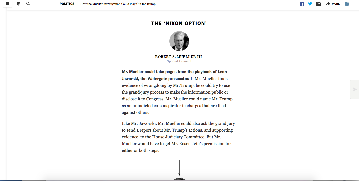
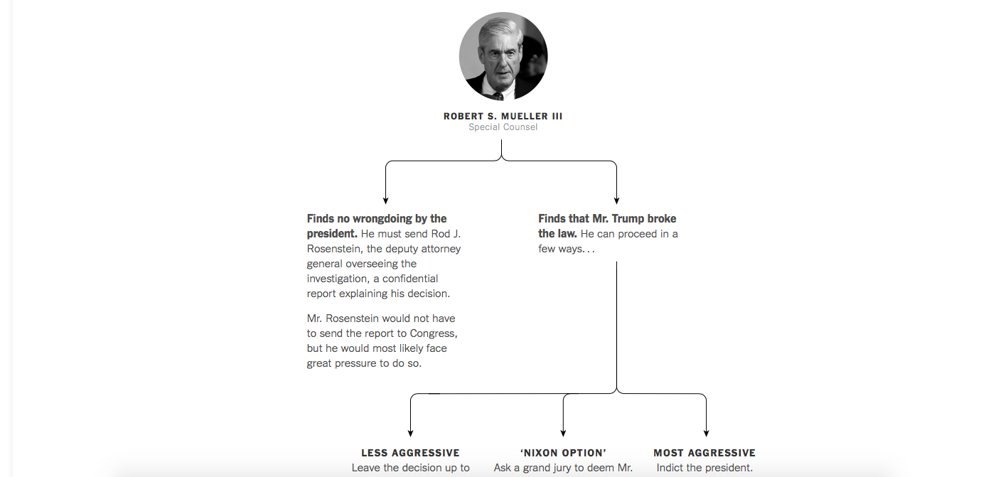
While this is a story told primarily through text, it is the way the story has been structured, with texts divided by categories, such as “The Nixon Option”.
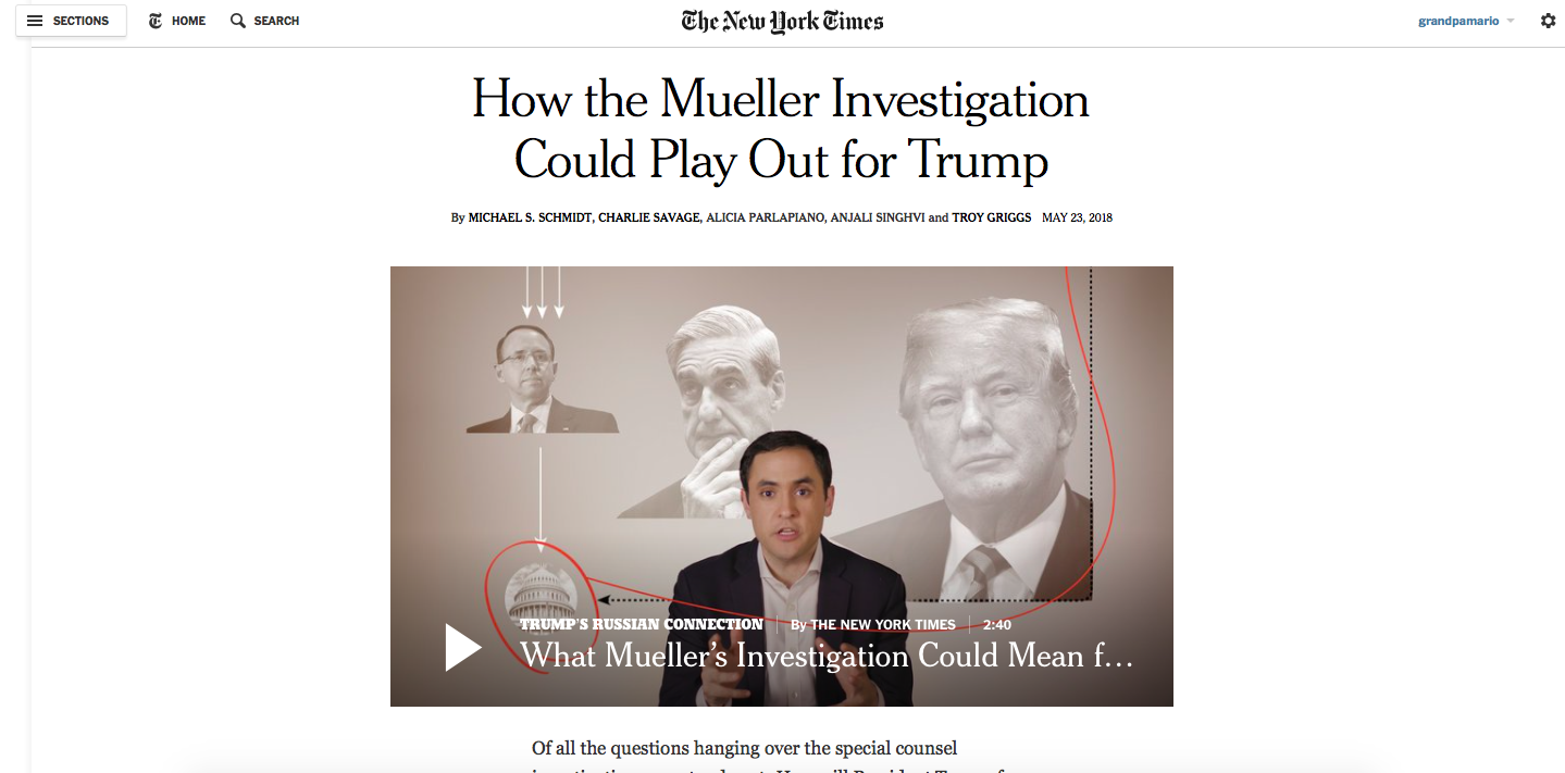
Introductory texts flow well as they lead us to information presented more like an informational graphic to help us consider various outcomes in the investigation.
Why this story matters
Beyond its journalistic value in taking a complex analysis and making it easier for us to comprehend, what this story means, as a “story structure” that we should all learn for is, in my view, a matter of intent.
Someone in the newsroom envisioned that this story be presented as it is.
Someone, perhaps the writer, or maybe an editor, took extra time to think of presenting this analysis in a way that defies the traditional format (a headline, a summary and text), to take advantage of new visual storytelling strategies that are key in the digital age.
However, intent is one of the most difficult areas to tackle in newsrooms today. How stories are planned and conceived, the discussion that precedes the writing of the story, is where we should center our attention, especially if we remember the high number of our readers who are consuming the information on mobile devices.
Pages we like
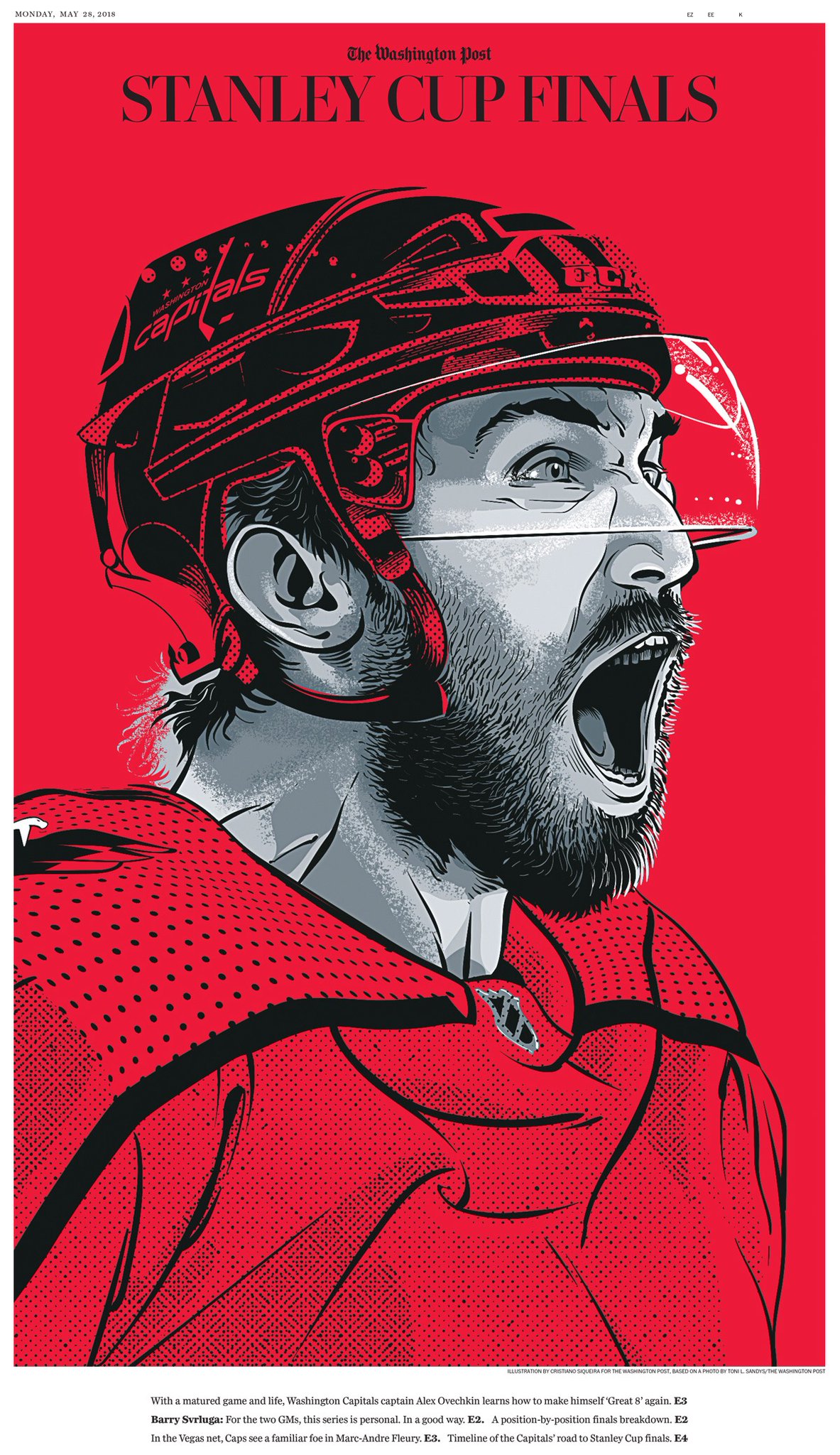
This is definitely a wonderful example of the power of red on Monday’s Washington Post print edition which includes this spectacular special section ahead of the Stanley Cup finals. Illustration by Cristiano Siqueira based on a photo by Toni L. Sandys. Art direction by Virginia Singarayar. @vsingarayar
Bravo!
All the final Columbia student projects here:
Columbia final projects, Spring 2018
https://www.garciamedia.com/blog/my-columbia-stud…rojects-part-one/
https://www.garciamedia.com/blog/my-columbia-students-final-projects-part-2/
https://www.garciamedia.com/blog/my-columbia-students-final-projects-part-three/
https://www.garciamedia.com/blog/my-columbia-students-final-projects-part-four/
Mario’s Speaking Engagements

June 7-8—WAN-IFRA World Congress, Lisbon, Portugal
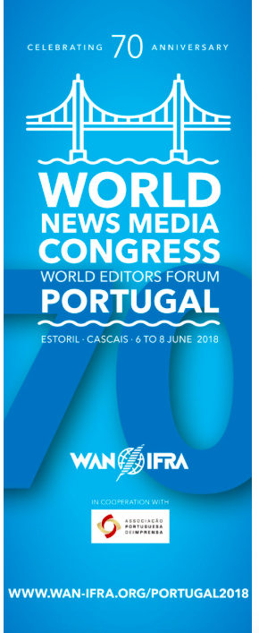
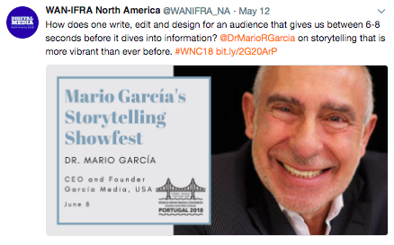
For more: http://events.wan-ifra.org/events/70th-world-news-media-congress-25th-world-editors-forum
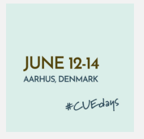
June 12-14, CUE Days , Aarhus, Denmark
http://www.ccieurope.com/news/6738/Video_What_is_CUE_Days_2018
August 2, Digital House (Facebook workshop), Buenos Aires

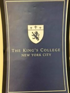
October 6, 20, 27–King’s College, New York City
The Basics of Visual Journalism seminars
Garcia Media: Over 25 years at your service
TheMarioBlog post #2848