?
TAKEAWAY: The current edition of Newsweek takes back to 1965. Really? Not so sure I want to go back there again.
1965: it was a very good year…..or, was it?

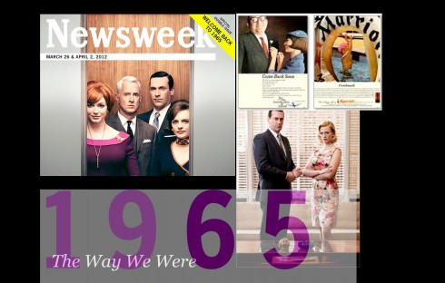
It is a special edition of Newsweek for March 26-April 4, with the cast of the popular retro show, Mad Men, on the cover and an attention grabbing yellow slanted strap on the right hand corner that reads Welcome Back to 1965.
God, really. 1965? I graduated from Miami Senior High School that year, an 18-year-old full of dreams, ambitions and enthusiasm, plus two part time jobs and, in the still status of Cuban refugee, not a penny to attend my first choice of a college, University of Missouri, (where, coincidentally I returned last fall), or even my second, University of Florida.
This edition of Newsweek is cleverly designed with the magazine’s logo of the era, the same typography (clunky and poorly spaced headline type) and vintage styled photos of the magazine’s current editor and columnists ( see famous editor Tina Brown in pearls with a Rose Marie hairdo).
Nostalgia runs through every page, including a Romney piece, not about Mitt, but about his dad, George. There are Sonny and Cher, Vietnam, Braniff Airlines’ fashionista flight attendants, a sexy and pouty Brigitte Bardot and even era ads including one for the little Volkswagen Beetle .
Nice to take a look at 1965 through the pages of Newsweek, but I am not sure I want to go back, except through those wonderful episodes of the well crafted Mad Men, now returning for a fifth season.
I was reminded of this not long ago when my best friend from my Miami High years, Annie, and I, decided to go together to one of our class reunions. Annie’s husband, Manny, from our same class—-always the smart one—-decided he was staying home.
At the class reunion: some things never change
Annie and I entered the banquet room where our gray-haired classmates had just sat down to dinner, while the band played Can’t Take My Eyes Off of You.
We certainly took our eyes off the entire scene quickly. We exchanged “where have you been” comments with many friendly classmates, both Anglos and Cubans. It was obvious, however, as it probably is at all class reunions that the same click that ran the clubs and student government at Miami High in 1965 still ran the reunion. Some people are born to be lifetime organizers and their 15 minutes of high school fame makes an appearance at every reunion.
Annie and I also observed, with a smile, that the same ones who never liked their fellow students with Cuban accents still did not like us 45 years later, as if our professional achievements as adults and contributing members of the American society, plus decades of exposure in an ever changing Miami, or the US, had not made a difference.
So, as soon as we had said hello and exchanged small talk with the ones we liked and vice versa, we abandoned the premises and decided that reminiscing while doing dinner for two at a favorite Miami Cuban restaurant would be much more fun.
And it was. Annie and I laughed, gossiped, compared notes on those classmates whom we did get to see during our brief period at the reunion.
More importantly, Annie and I made a pact that night: we were toasting the good memories, our lifetime friendship and all the wonderful things—and teachers and good friends—that Miami High gave us, but we were bidding farewell to 1965 as we raised our glasses of bubblies over a delicious Cuban dinner.
Suddenly it is 1965 again, oh, no…
But , alas, here is 1965 again, courtesy of Newsweek. I admit that the editors and designers did put a lot of effort to recreate it and did it well. In the words of Tina Brown, editor:
We ‘ve retrofitted this issue to the restrained design style of those times.
Design style was not all that was restrained in 1965, Tina, but you may be too young to remember. Or, maybe not, as you were already 12 years old then!
Must read: Bob Newman’s master class on Magazine App Design
Lessons in magazine iPad app design with Robert Newman
http://engage.tmgcustommedia.com/2012/03/7-lessons-in-magazine-ipad-app-design-with-robert-newman/
Here is required reading for anyone designing magazine (or news) apps. Bob Newman does it again:
simple, direct and extremely useful tips.
Highlight:
Lesson 3: Add Bells and Whistles—But Not Too Many
Take advantage of the goodies. An iPad app allows you create this sort of dual experience where you can just go through and read and look at the pictures. Or you can dive deeper in and get all this rich media and resources. Given the parameters of budget and how long it takes to download, we try to layer in as much extra stuff as possible. You know: push-button interactivities, slideshows, video, hotlinks, additional material. We try to do it both ways and make it simple enough that you can just read it, but also give enough opportunity on every other page for some other kind of experience.
Art and Press exhibit in Berlin


Last week we reported the opening of the new Art and Press exhibit, a celebration of newspapers, in Berlin.
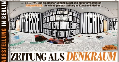
Frank Deville, our blog correspondent in Europe, sends us this page from today’s Bild, still covering the Art and Press exhibit that opened last week in Berlin.
This page shows an image of a piece the exhibit calls The Newspaper as Thinking Room.