Purchase the book on the iBookstore
“iPad Design Lab” trailer on Vimeo.
The EPUB version of book is HERE:
To all of those who are writing to let us know that you can’t buy iPad Design Lab: Storytelling in the Age of the Tablet, in your countries, or for your tablet or phone, the good news is that we have completed the EPUB version and it is ready for download via Amazon.com for Kindle:
http://tinyurl.com/8u99txw.
Read the Society of Publication Designers’ review of The iPad Design Lab here:
http://www.spd.org/2012/10/must-read-ipad-design-lab.php
Read the review from Dr. Pegie Stark Adam in her blog
http://pegiestarkadam.com/
Newsweek’s demise for print edition not the end of the newsmagazine genre
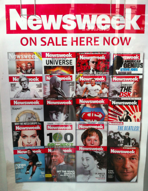
Here is image of Newsweek magazine on sale at a kiosk in the Champs-Elysees, in Paris (photo by Olivier Royant, editor of Paris Match, who ponders the question: But for how long?)
TAKEAWAY: As Newsweek announces that it will cease publishing its printed edition in the US, going digital only, let’s not kill the newsmagazine format, but, instead, study ways in which it can become relevant for our times.
In the midst of all the Presidential Election coverage, the Newsweek magazine story—it will not appear in print anymore after Dec. 31—-managed to get in there somewhere, commanding plenty of coverage in all platforms, with media experts either declaring the death of print (have we heard that tune before?), or citing the anachronistic characteristics of the newsmagazine as a genre , all with a sense of gloom, doom and the inevitable I told you sos.
Some of you have sent me emails asking if I have an opinion on the subject. As it happens with daily blogs, sometimes there are events that must be covered on a specific date, and such was the case with TheMarioBlog, since we were unveiling the results of the Poynter EyeTrack Tablet research Friday at Northwestern University’s Medill School of Journalism , and that obviously dominated my time and the blogger’s space.
However, I do have some definitive thoughts on the demise of Newsweek in print.
Please don’t kill the newsmagazine genre—reinvent it
This is not about the “genre” of the newsmagazine been a dinosaur. Not at all. Not any more or any less than saying that the printed newspaper as a platform has no place in today’s society.
It is not about ink on paper, in my view. It is more about what we use that ink and paper for: what we put on the page.
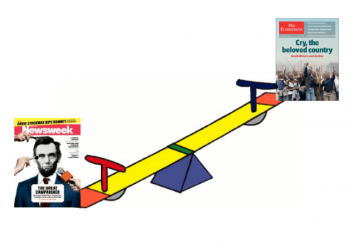
Why, if the newsmagazine genre is what needs to be eliminated, is The Economist thriving? And not just in the UK, but in the US, as well as globally. The Economist’s circulation passed the 1.5 million mark in 2012, fueled by an increase of its digital subscribers. In the past 10 years, North American subscriptions account for close to 900,000. The Economist has experienced 100% circulation growth. We are aware that The Economist is a specialized, niche publication, while Newsweek is a general interest magazine. Both are newsmagazines, in fact, although The Economist calls itself a newspaper, a description that has always confused me a bit. I am told that this is because that is how it started more than a 140 years ago.
However, perhaps because The Economist considers itself a newspaper, the design itself reflects it: there is NOT one bit of wasted space as one article follows the other, and, while typographically pleasing to the eye, there is no abundance of excessive art direction, as if the art director spends most of his time on the cover concept (usually very masterfully executed, seductive, meaningful). If we draw an analogy between design and punctuation in a sentence, The Economist seems to string together its stories according to sections (Europe, The Americas), creating a long sentence that is separated by semi colons, not periods.
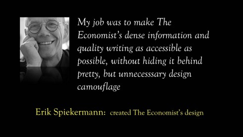
In fact, the man who designed The Economist, Erik Spiekermann, tells me something fascinating about this point:
My job was to make their dense information and quality writing as accessible as possible, without hiding it behind pretty, but unnecesssary design camouflage. Most of the changes we made had to do with making the text very legible, changing the design of the typeface, carefully adjusting details like letterspacing, leading and hyphenation.
Take a look at the design of Newsweek, and TIMEyou will find more use of white space, a variety of sizes for headlines, and an abundance of art directed spreads.
In my view, as the newsmagazines reinvent themselves to remain viable in print, the design will have to undergo scrutiny as well: simple grids, smaller but better written headlines; fewer art directed spreads.
Reinventing the newsmagazine genre for print
In the process of reinventing the newsmagazine genre, it seems as if the word “news” gets in the way, I know, because nobody comes to these magazines to get news.
They come to get reaffirmation and explanation of the news they already know. But also to find discovery type of stories, those invisible and surprising stories that lie under the surface, waiting for an enterprising editor/writer to uncover them. At The Economist, it is a weekly fest of reaffirming with gusto and discovering on almost every page.
The Economist succeeds because it becomes vital if we wish to have a true understanding of a variety of stories. For example, recently when Venezuela’s Hugo Chavez was reelected, I already knew that when I got my copy of The Economist, but its story that week gave me a greater understanding of how the Chavez win makes sense within the context of the Latin America of today: I reaffirmed what I already knew, but, oh, there was so much discovery in the piece. And it wasn’t a cover story, or a long narrative either. At The Economist, writers guard each word as if it was a treasure. In addition, there is a strict hierarchy for how the information is presented, according to Spiekermann:
“We made changes to the “wayfinding”: 2 pages of contents, with article heading plus a short subline, mini-contents on each section divider and a very precise hierarchy of headlines: as soon as an article goes over a certain amount of lines (say: 200), the headline moves up from single-column to double-columns, and then to all 3 columns. The reader will always know what to expect, how much time he or she will need to invest.”
Readers become the beneficiaries.
How newspapers became daily newsmagazines

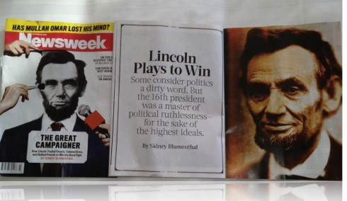
This week’s issue of Newsweek takes the cover story over 7 pages
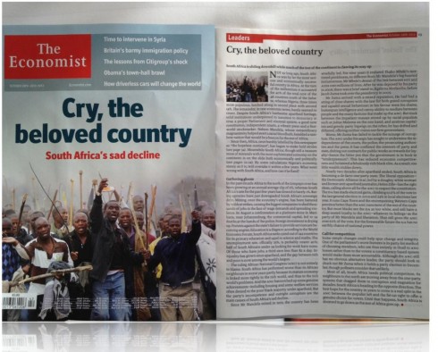
The Economist seems to be economic in the way it allows space too: cover story is a single page, with three pages for a related story inside
This brings me to one of the reasons newsmagazines need to undergo therapeutic rethinking (not elimination) . The daily newspapers now do centerpiece “cover” stories a la news magazine daily, so the news magazines need to up their game, and provide what The Economist does so well: robust, meaty pieces that are not necessarily long narratives.
I knew, when I began to see those verbless headlines in newspapers across the world, that the dailies had slowly penetrated into the realm of the newsmagazines, one headline at a time. Headlines like: The Competitor in Chief, Muslim in America, The New Iraq have become standard. What is a newsmagazine editor to do once a week with this out of luck and out of time platform?
Reinvent.
The reinvention includes hiring the best headline writers.In this issue of The Economist, headlines that seduce: “Obama’s town-hall brawl,” “How driverless cars will change the world,” “No help, please, we are Buddhists,” “Small, furry creatures from Alpha Cantauri”
But it is not just the headlines: those are the tapas that impact your appetite, once you open the magazine It is as if you had a mini cover story on every page. The heads are small, the photos or illustrations barely larger than a passport photo, but we are not complaining. Each serves a purpose.
This is what those news magazines need. Whether digital or in print, the formula for success is the same: more of what is substantial and needed, less of the visually superflous.
Time for those American news magazines to do the reinvention. This is not about print versus digital. This is about a genre that has lost its effectiveness and attraction as what it was, but can still do well adapting to the new rules of the game.
Under Tina Brown’s editorship, Newsweek, attempted to assume various personalities: often tabloidy and down market, sometimes titillating like US Weekly, and each week reinventing itself, either lighter or meatier, depending on the subjects. It tried to shock. It tried to educate. It tried too hard. The essence of Newsweek appears to have gotten lost in the process, along with readers and advertisers.
They did not run away from the newsmagazine as a genre. They escaped from a shapeless compilation of pages that had ceased to be of service to them.
The lessons of Newsweek
Those business and editorial lessons must be well learned for other newsmagazines, and, for Newsweek, as it tries to reinvent itself as a digital only publication.
This will not be the last such story we are likely to hear in the future. For the newsmagazines in business, there is still time to react, to rethink and to apply what we have learned as we dive deeper into the world of the media quartet.
It can be happy music with the right composer who understands how each instrument contributes to the overall symphony.
Of related interest
Joe Zeff renders tribute to Newsweek, and shows some memorable covers that he and his team illustrated. Must see!
http://joezeffdesign.com/r-i-p-newsweek/
A provocative Andrew Sullivan take on the Newsweek story:
“I chose digital over print 12 years ago, when I shifted my writing gradually online, with this blog and now blogazine”
http://andrewsullivan.thedailybeast.com/2012/10/why-not-do-away-with-print.html
Great quotes from a variety of prominent Newsweek protagonists
http://www.poynter.org/latest-news/mediawire/192205/diller-newsweek/
“Newsweek’s decision to stop publishing a print edition after 80 years and bet its life entirely on a digital future may be more a commentary on its own problems than a definitive statement on the health of the magazine industry”
http://abcnews.go.com/US/wireStory/newsweek-unique-troubles-industry-recovers-17514935
Follow up to previous blog post
In one of our previous blog posts, we were happy to see that a newspaper group had named a Vice President for Audience.. The honor went to Steve Yelvington, of the Savannah (Ga.) Morning News.
I have now received this reply from Steve Gray, of the Morris newspaper group, which owns the Savannah Morning News.
“Actually, Steve (Yelvington)—while he will be a great one—is the seventh or eighth VP of audience at the Morris newspaper group,” Gray writes me.
More on why Morris has taken this important strategic direction here:
http://mediareset.com/2012/09/30/figuring-out-this-audience-thing/
