Update #2: Wednesday, Nov. 9, Kuala Lumpur, Malaysia, 15:37
TAKEAWAY: As the countdown to 11-11-11 gets closer, we devote this week’s blog to the rethinking of the new New Straits Times of Malaysia. Today: the role of color Tomorrow: Rethinking the digital side of the NST
End of Silvio Berlusconi era?
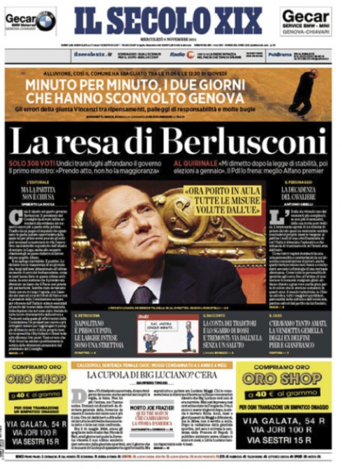
Front page of Il Secolo XIX carries two major stories of the day: a national political story dealing with the Berlusconi vote, along with a local/regional story of deadly floods in Genoa
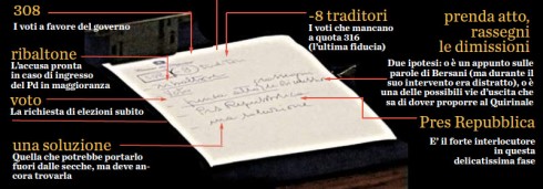
Graphic dissects Berlusconi’s scribbles during the proceedings, rating everyone from votes in his favor (316) to so called “traitors” (8).
To hear Massimo Gentile, design director of Italy’s Il Secolo XIX (of Genoa), this is only a delay tactic on the part of the colorful Prime Minister and king of the bunga bunga parties, to consolidate his power in Parliament. Berlusconi is saying he will resign in 20 days after the vote
on the austerity package that the European Union demands of Italy.
Massimo sends us today’s front page for Il Secolo and tells us that the mini poster captures yesterday’s vote in Camara dos Deputados, where the government failed to get the 316 minimum required votes to govern. Massimo explains the difficulties of dealing with this major political event, along with a natural disaster taking place in Genoa, as heavy rains have caused deadly floods.
I found a very interesting bit of visual storytelling here in the close up of Berlusconi’s notetaking during the proceedings: his scribbles relate to the number of votes in his favor (316), but also to 8 votes whom the Prime Minister described as those of “traitors”. This is the type of “whispers” of a story that readers appreciate very much.
Massimo ends his note to me with this:
“We will go through a period of total confusion now here in Italy. It will not easy to get rid of Berlusconi.”

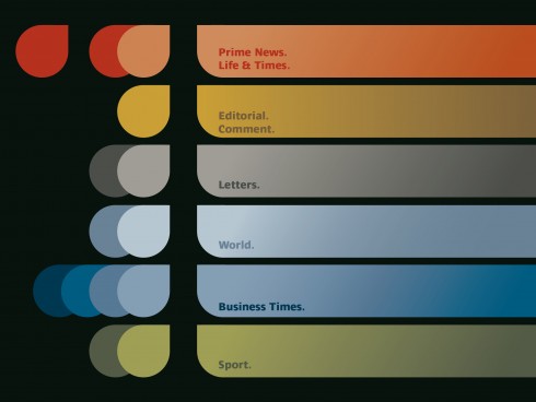
Here is the final draft of the New Straits Times color palette
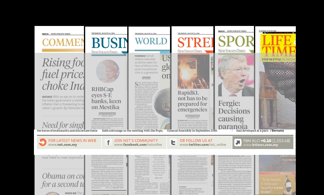
Here is how the color coding of sections works
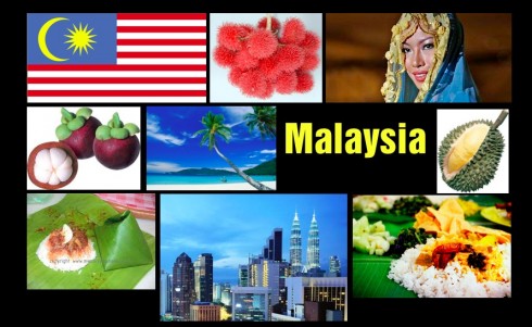
Elements to inspire our color palette for the New Straits Times
Color is so often taken for granted in our ever so colorful world.
I notice that as we read case studies of media design—-regardless of platform—few references are made to color. Yet, aside from typography, it is color that offers us an important part of the first 10-second impression whether we are looking at a printed front page, a home page of an online edition, or the tablet.
Perhaps there is a generation of designers out there—the younger ones—-who don’t remember what it was like to work just in black and white (I still love black and white pages, however).
To me, once the story structures are decided, and typography selected to dress them up, then the next logical step is the creation of a color palette.
The color palette of a daily newspaper evolves as a result of various
decisions: for me, I start with my surroundings. What is the color palette of this city, this country? That is the first step. For Malaysia, I was a mix of strong colors, with red dominating, but also orange. Look at the composite I have put together here: the sights, the food, the fashion. It all comes together to offer the designer an idea of what hues to create for the pages of the newspaper.
In some cases, however, the editors wish to use color to create an identity for the newspaper, NOT one inspired by the surroundings of the place where it is published. As a result, pastels may be utilized for a newspaper that wants to appear serious, authoritative, while bright yellows may serve the downmarket tabloid well, regardless of geographic location.
In my view, however, it is better to let the surroundings inspire you.
For the new New Straits Times, we have come up with a color palette that includes bright, warm colors. As sections are color coded, we have red, blue, green, gold and orange as the primary colors in the palette.
The softest pastels include a champagne shade and a soft grey for infoboxes.
The infographics use primarily a top line in the color of the section in which they appear, with a sandtone for background.
Our previous New Straits Times posts
New Straits Times relaunch: The Typography
https://www.garciamedia.com/blog/articles/new_straits_times_relaunch_the_typography
Creating some basic pop up moments in your tablet
https://garciamedia.com/blog/articles/creating_some_basic_pop_up_moments_in_your_tablet/
Emphasizing the New in the New Straits Times: Part 3
https://garciamedia.com/blog/articles/emphasizing_new_in_the_new_straits_times_part_3_—a_new_tablet_edition/
Emphasizing the New in the New Straits Times: Part 2
?https://www.garciamedia.com/blog/articles/em
Emphasizing the New in the New Straits Times: Part 1
?https://www.garciamedia.com/blog/articles/monocle
Tomorrow: The new New Straits Times tablet edition
A page we like
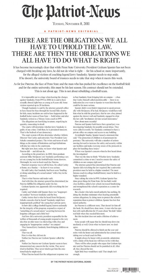
Alas, the editorial on Page One.
It makes a strong statement for its unusual placement.
It signals that this is not your ordinary everyday editorial tucked away in some hidden corner of the Commentary page.
That is the case in this front page from Pennsylvania’s The Patriot News covering a major local story about a popular ex college football coach accused of sexually abusing boys in his trust.
We like how the words (and the typography) carry the page.
Of special interest today
Barnes & Noble Nook Tablet: pictures, video, and hands-on impressions
http://www.theverge.com/2011/11/7/2543578/barnes-noble-nook-tablet-pictures-video-and-hands-on/in/2306571
In the news recently: The Nook Tablet is very similar to the Kindle Fire—same screen resolution, both running Android, aiming to have the same kind of content. Could this provide the Kindle Fire a strong second competitor—after the popular iPad?
The single story sports front
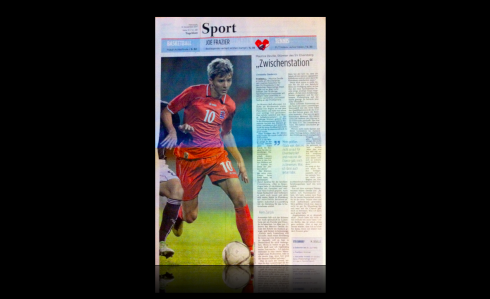
Who says the single story section front is dead? Not in Luxembourg, anyway. Take a look at this sports front from the Tageblatt, sent to us by Frank Deville, whose son Maurice Deville, a football player in Germany (who also plays for the Luxembourg national team) was profiled with a complete story here.
Few newspapers afford themselves the luxury of single story fronts these days, so it is good to see it happening here. The top of the page is devoted to promos to the inside.
Now, if only the Tageblatt could do something about that Sports header, which is weak and lacking in boldness to carry the page.