TAKEAWAY: Those German regional newspapers: they are on a roll about changing their look, and they all go classic and elegant; must be the trend: PLUS: The art director of Thailand’s The Nation pleas for peace in his violent-stricken city of Bangkok. AND: Poynter extends deadline for The Power of the Tablet conference till May 26. Apply now.
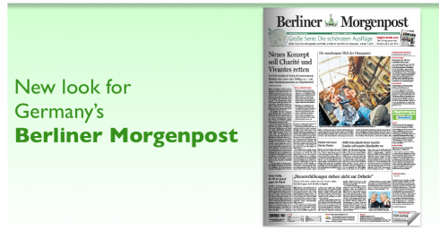
The new, classic Berliner Morgenpost

This week one of Berlin’s most popular newspapers, Berliner Morgenpost
, introduced a new look, one created by the talented German designer Anja Hjorn. The new look of the BMP is all about elegant use of typography, unaltered six column format for the broadsheet, and a heavy emphasis on text.
We had seen a similar approach recently when that other regional newspaper in the Axel Springer group, Hamburger Abednblatt, also introduced a look heavy on the text, high on the classic, stylish (should we say Germanic?) look, and a return to the formal newspaper with the look that immediately says: come here to read, enter the library.
There are no frills here in the new BMP. Even the headers for sections like Wirtschaft (Financial) are bare and minimalist, but elegant, of course. Columns, headlines and photos align to the last millimeter, giving each page a perfectly rectangular shape. It is obvious that here the effort has been on clean organization more than any wow effects. Usually, there is ONE major visual image per page, and the bottom of the page, as we saw in the Hamburger Abendblatt, is reserved for text, an invitation to read.
Maybe this regional newspapers are setting the trend and saying, through their design, enough of newspaper design as an exercise in window dressing, let’s get down to tacks here and the business of making a newspaper look like newspapers looked in the golden era of newspapers: texty, perfectly modular, words marching like soldiers on the page, in perfect formation, a big photo to invite you in, but not an overabundance of visuals. The newspaper of the future, German style, may have arrived.
And, Jan Kny, our Garcia Media senior art director, who was involved as a freelance designer with the redesign of the Hamburger Abendblatt reports that this look has been successful for them there, with both readers and advertisers taking to the new look.
For pages of the new Berliner Morgenpost, go here:
http://www.myvirtualpaper.com/doc/Axel_Springer/2010-05-17_bm-hp1/2010051701/
Berliner Morgenpost facts at a glance:
Circulation: 135,000.
Newsroom: Shared newsroom in Berlin with Die Welt and Welt am Sonntag
Goal of the new look: Attracting the educated, youngish Berlin middle class reader
“Please pray for peace for our city”
As readers of this blog know, I have been in daily contact with The Nation’s art director, Leroy Sylk, who has been kind to send us pdfs of the pages produced during the past few days.
The city of Bangkok continues to be besieged by confrontations between protestors and the government, with no end in sight. Now, the protesters have allegedly threatened the newspapers, including The Nation.
Here’s Leroy’s report tonight Wednesday:
“……the protests have spread and now a curfew has been clamped over all of Bangkok. The Nation has been one of the targets of the anti-government protesters, so we had to rush off a few pages—just one section today—and scoot home before the protesters show up in force or before the curfew takes effect. Our page one has one massive photo (of thick smoke rising over parts of the city) and several short kickers/blurbs, but no text. The page 1 headline is huge, reading: FIERY ANARCHY. There was no time to write any story for page 1, we really had to rush. So the kickers will give readers the general story. Our back page is a photo page. Our lone English competitor isn’t even publishing for tomorrow—they too were threatened. Sadly, I didn’t even have time to save page 1 and post it on twitter or facebook as i usually do because we were told to get it done FAST and get the hell out—we had only 2 hours to bring out one section of 12 pages. So, please continue to pray peace descends on this lovely but unfortunate city.”
Apply for the Poynter The Power of the Tablet conference
Many calls and emails are coming in rather late inquiring about the Tablet conference, so Poynter has extended the deadline to apply until May 26.
The Power of the Tablet conference will take place June 14-15 and includes a thorough discussion of all aspects of getting a newspaper/magazine ready for the iPad or other tablet editions.
Go here to apply:
http://www.poynter.org/seminar/seminar.asp?id=5515&catid=