Keynotes at Mediamixx 09 Congress
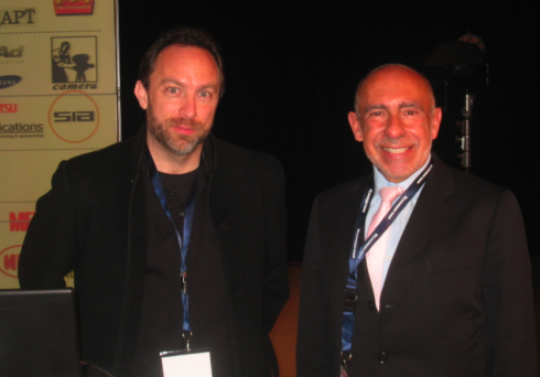
With Jimmy Wales, founder of Wikipedia, this morning at the Mediamixx 09 Congress in Bulgaria
I am in Bulgaria today, doing a keynote for a presentation titled : The New World—-from Miami via India to the East. Another keynote here today is by Jimmy Wales, founder of Wikipedia, with whom I just had a nice chat. It’s a small world: Wales lives in Tampa Bay area in Florida, just like I do. We had to come all the way to the Black Sea to meet.
Jimmy’s keynote is titled: Wikipedia, Wikia and the Future of Free Culture
Wikia is Jimmy’s new project and he says: “I am working hard on this one now”.
Will be Tweeting from the conference today at www.twitter.com/tweetsbydesign.
A second full bath for Newsday
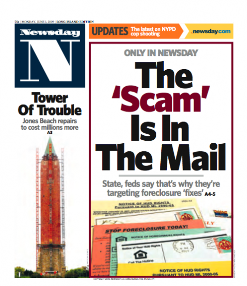

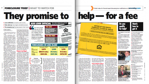
Front pages of the new Newsday: narrower format, more of the mini-poster look, catchy headlines
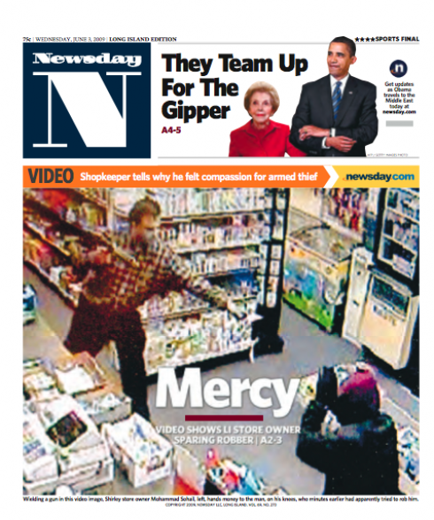
Introducing the new look; single news page
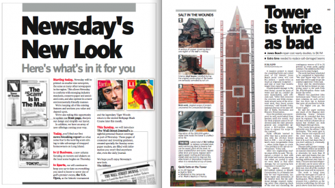
Double page spread with a single-topic story package

Covers of feature sections LI (Long Island)
Five years later, Newsday goes into the bathtub again for a good scrubbing—-and a smaller format as well, moving to the 48-inch web—-which is becoming the industry standard in the United States.
In 2004, it was Jack Millrod who carried the ball when we worked with him and his team on making dramatic changes to Newsday, the suburban New York daily that competes with the other city tabs, New York Post and New York Daily News.
Millrod is still at Newsday and this time joined a team headed by his design director, Arturo Jimenez, on the changes introduced last Monday to the newspaper.
I talk to Jack about the recent changes.
Mario: Jack, how would you describe the changes, or the bath you gave Newsday this time around?
Newsday launched a new design Monday pegged to our move to the 48-inch web that’s becoming an industry standard. We held on to our 54.5-inch web—and our 12.8-inch deep page—for years because the other metro area tabs hadn’t budged and had a number of common advertisers. But when the NY Post reduced its page size, it was just a matter of time before we followed. In any case, we saw this as an opportunity to freshen up the 2004 look we developed together in what feels like another lifetime.
Mario: did you apply to this redesign any of the lessons we learned from the 2004 exercise?
Indeed, John Mancini and I were talking yesterday about how our experience and lessons from the last redesign—the “full bath” as I remember you describing it at the time—helped us this time. For example, though we finally did kill our stock listings (I think I remember someone saying back in 2004 that they’d probably be gone in 5 years, so we had that right), we did it the month before the redesign and web-width reduction to make sure that didn’t color how people received the changes. We also made a special effort to retain all of the other regular features—every comic, every TV station in the grids (we actually added 8 stations), right down to the blurb on today’s birthdays. Looking back, I remember your concern about our decision to junk our Sunday TV book at the same time as we launched the redesign and clearly that was a tactical error.
Mario: how about changes in your feature sections?
The Explore LI launch last year set the stage for this redesign in another respect—embracing new, more visual ways to tell stories. With some special exceptions—investigations, enterprise work, for example—stories are shorter and we’ve virtually eliminated jumps. Moreover, the 4-5 spread from Monday illustrates how we’re trying to find new ways to break things down for readers and tell stories in different ways. We haven’t had many complaints—far fewer than the number we heard from when we killed the stocks and nothing at all like the 2004 reaction—and most of them complained that the type is smaller (which, of course, it isn’t).
Typographically speaking:
At the time of the 2004 redesign, we introduced the font Whitney as a secondary, sans face. Now, Whitney has become the dominant headline face in both news and features. Design director Arturo Jimenez worked with Judi Yuen to introduce a much tighter kerning of Whitney to create the look and feel of all news headlines.
Accordiing to Millrod, the introduction of sans serif heads in the 2004 redesign helped set the stage for this move.
While much has changed—all of the standing heads, the navigational devices and, of course, the front page flag—we’re still using the same set of fonts we introduced in that redesign, along with the five-column grid, standard column width and body type. Our new color palette still includes pumpkins, champagnes and burgundy, but we’ve shifted to a lot of the brighter, primary colors our 2004 redesign moved away from. That began a year ago with our Explore LI section, which replaced Part 2. There we use color to make a stronger connection to the Explore LI Web site.
Overall:
It is always interesting for a designer to see how the original concept evolves, how the various elements that are introduced——in this case through a very difficult process that irked many readers at the time; I remember it all, and so does Jack Millrod—-can continue to serve as the backbone of a design. This is the case here. What I see is a Newsday that adapts to the realities of today, with a front page that is a combination mini-poster and navigator, but that seems more relaxed than the ones we were instructed to produce in that other “full bath” of five years ago (but that, in terms of the industry and history is more like 20 years).
Whitney is well used here, imparting a robust presence to all headlines, and so is color. I am happy to see this new Newsday. Not to mention that the logo with its prominent N is the big surprise here. We could not have even proposed such a change five years ago. Not only has the design evolved, obviously; perhaps Newsday’s audience has also moved on to become more permissive and accepting of changes in its favorite newspaper.
Experimentation, the Newsday editors apparently understand, is the key. This was a full bath, indeed, with some hard scrubbing, bubbles, and a choir singing in the shower.
Let’s not wait five years to do it again, guys. The modern newspaper changes all the time, with good, robust showers between full baths.
TheMarioBlog: first year anniversary coming
Time has gone very fast, and we will celebrate the first anniversary of this blog June 17. To that effect, I would like to hear from you, who honor me with your daily visits, and find out what you like about this blog, and ways to make it better. That is our aim. It has been a year of experimentation for someone new to the platform. Several of you have asked me to re-post some special entries, and I will be happy to do so. Others would like follow ups for stories which I covered. Let me hear from you. You can post your comments here or email me directly at mario@garcia-media.com.
Waiting to hear from you.
Follow the Marios

Two Marios. Two Views.
Follow Mario Jr. and his blog about media analysis, web design and assorted topics related to the current state of our industry.
http://garciainteractive.com/
Visit Mario Sr. daily here, or through TweetsByDesign (www.twitter.com/tweetsbydesign)
:
To read TheRodrigoFino blog, in Spanish, go:
https://garciamedia.com/latinamerica/blog/
TheMarioBlog posting #278