Updated Wednesday, Feb. 18, 2009—-9:05 EST

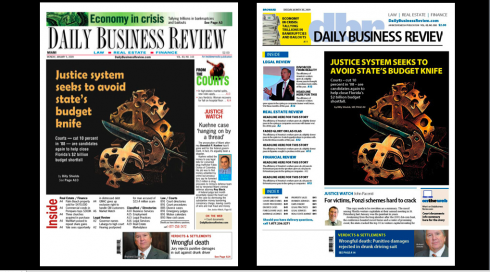
Today’s DBR front page, and an inside page

Before (left) and after front pages done during redesign process
Each day, business people, lawyers and real estate experts turn to the newspaper they call the “DBR” for valid information on how to conduct their business. As a newspaper of record, the DBR carries lists of legal proceedings and business transactions. Beyond that, however, the newspaper has always attempted to be a “who’s who” in the business communities of Dade, Broward and Palm Beach counties—-the lower region of the Florida peninsula.
As we proceeded to rethink the DBR, we kept in mind how important it is for these busy people to find information fast. At the same time, a business daily in the midst of a recession and the worst economy Florida and the world have witnessed in decades needed to make changes without altering what people have come to expect from their business newspaper.
“When many newspapers are cutting back and offering less, the DBR is doing the reverse, “said executive editor Eddie Dominguez.
Joining me on this project was our Creative Director for Garcia Media, Kelly Frankeny who said:
Not only did we design DBR to cater to readers who are looking for easier ways to access content, we also addressed how the publication is organized. We created front page navigation to direct readers to the main sectors they cover each day – Legal Review, Real Estate Review and Financial Review. Those sector pages are also templated with events, people on the move and compacts on the left column with news and features stories on the right.
Here is the story that ran in today’s DBR explaining the redesign:
Since South Florida’s premier business tabloid debuted eight decades ago as a courthouse chronicle, the Daily Business Review has undergone a number of transformations but probably none as dramatic as the one unveiled today.
In essence, readers will find the new Daily Business Review an easier read.
The index on the front page is expanded to included summaries for easy navigation. Graphics are improved, whether they be illustrations, charts, graphs, summaries of core issues or quick profiles of newsmakers.
Look for photographs to jump off the page. The DBR — as it is called in many professional circles — aims to illustrate its stories with the cult of personality that dominates the business world, as well as attorneys and consumers dealing with the economic upheaval.
When many newspapers are cutting back and offering less, the DBR is doing the reverse, said executive editor Eddie Dominguez.
But the newspaper’s core mission is unchanged.
Readers will find that same in-depth coverage of law, real estate and finance in Miami-Dade, Broward and Palm Beach counties that has made the newspaper a must-read.
“Content is king in my mind,” publisher Chris Mobley said. “You have to present it to people in a way that is appealing to them, attractive to them, enticing to them and doesn’t throw obstacles up in their way when they try to consume it.”
One of the most obvious changes is the paper’s well-known DBR acronym displayed in the nameplate. Mobley said the emphasis on the DBR name is an effort to solidify the Daily Business Review brand, make it stand out from competitors and recognize the shorthand of younger readers.
Some new features have been rolled out in recent months. Longtime business contributor Mike Seemuth’s Current Accounts column, which debuted Jan. 28, will run every Friday and focus on the region’s roiling economic issues. Seemuth previously wrote DBR’s Insider Trading column.
The newspaper also plans to reintroduce a popular column written anonymously by a South Florida attorney on issues affecting law firms and their unsung worker bees.
The newspaper’s most popular daily features — Opinion & Commentary, After Hours, Dealmakers, Verdict & Settlements and Current Accounts — will now be easy to find, rotating each day on the back page.
The new design offers a more seamless view of stories and transitions to additional content such as interviews and court documents on the newspaper’s Web site, www.dailybusinessreview.com, which is in line to get a redesign of its own. Editor-in-chief David Lyons is producing radio spots for “The Biz,” WZAB-AM 880.
“The time of writing stories and putting endless text on a page is over — even in our older, well-educated demographic,” Dominguez said. “The way people read has changed. Their expectations have changed. We are adapting.”
He called the new design “more of a re-engineering” geared to new, younger readers.
“The Daily Business Review does a phenomenal job of retaining readers. Even in this economy, our renewal rates are to be envied. We are not doing as good a job of attracting new readers and younger readers,” Dominguez said. “This re-engineering is designed to speak to those readers whose expectations are the most evolved, whose attitudes and expectations are more affected by the Internet and are typically from a younger generation.”
The DBR hired the famed newspaper design consultants at Garcia Media to help it reinvent itself. The design firm has designed newspapers, magazines and Web sites worldwide, including the Wall Street Journal, Kansas City Star, Paris’ Le Match and Thailand’s newest daily Xpress. The Tampa-based company helped the staid Journal transition to color photographs to complement its trademark profile illustrations.
Mario Garcia Sr., the creative juggernaut behind Garcia Media, said the new DBR index and story summaries are akin to the Journal’s long-time What’s News front-page box.
But he said the DBR’s new look is more than just a redesign.
“This one is really recreating itself, rethinking itself,” Garcia said. “Look at the change, from the left to the right. This is beyond Botox. This is really one helluva change.”
Surveys of all kinds and focus groups helped mold the new look.
Mobley said the top reason offered by professionals for not subscribing was simple: not enough time.
With the changes in presentation, readers will be able to get through the DBR five to seven minutes faster, “and that is money in the bank,” Garcia said.
The feedback after early trials has been positive.
Mark Sell, a Daily Business Review staffer in the 1990s now with the Miami public relations firm Wragg & Casas, was a member of one focus group.
“The real trademark of the DBR is incisiveness, sophistication and depth, and there is no question we are in turbulent times. And with that, it becomes more a must-read,” he said. “The redesign will certainly make it easier to navigate, and I hope that it enhances that sophistication and depth on the Web. Journalism like that is not just desirable, it’s vital.”
Mobley said the redesign presents new opportunities for advertisers with new positions offered on the front page and sections fronts.
“We have to be financially healthy in order to have the kind of news-gathering force that we need,” he said. “We certainly have seen from the actions of our brethren in this market a significant decline in their reporting abilities based on the declines in their revenue.”
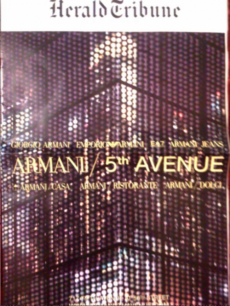
Armani and International Herald Tribune: wrapped around each other

Georgio Armani has opened its much-talked-about Firth Avenue store in New York City, but one could feel the impact of it all the way to Europe, where the International Herald Tribune (the global edition of The New York Times )wrapped its entire Tuesday, Feb. 17, edition with a glossy ad about the event. Armani very appropriately chose Fashion Week by opening a new 5th Avenue store. What a red carpet photo opportunity that was:
The new, glitzy mega store on 5th Avenue attracted a paparazzi’s dream list: Victoria Beckham, Leonardo DiCaprio, Caroline Kennedy, Alicia Keys and Mira Sorvino, among others.
The ad wrapped around the front and back pages of the IHT leaves no doubt that this new Armani project is all about glamour and glitter. And, yes, there was a regular IHT front page on this day, but it was actually Page 3.
Soon to come in the Armani camp: the opening of his first ever Armani Hotel, in Dubai. We will get ready for that wrap around ad in newspapers worldwide.
For complete information about Armani’s Fifth Avenue store opening:
http://www.thefirstpost.co.uk/people,,giorgio-armani-marks-fashion-week-by-opening-a-new-5th-avenue-store,74427
Armani Fifth Avenue website worth checking out

By the way, while on the subject of Giorgio Armani, don’t miss this new and vibrant website created especially for the opening of his mega store in Manhattan.
From the music to the video to the texture, it is a must see. I recommend it. Armani may inspire many designers with the way his people have handled the information architecture here.
Go for it.
http://www.armanififthavenue.com/
List of 10 Best Newspaper Web Sites of 2008
The Bivings Group took another look at The Use of the Internet by America’s Largest Newspapers , and compiled a list of 2008’s top ten Newspaper sites.
They are:
The New York Times
The Washington Post
The Wall Street Journal
The Florida Times Union, Jacksonville, FL
The Philadelphia Inquirer
USA Today
The St. Paul (MN) Pioneer Press
The Atlanta-Journal Constitution
The Arizona Republic
The Columbus Dispatch
Two that are NOT on the list, which I think are quite good:
The St. Petersburg (FL) Times
http://www.tampabay.com/
The San Jose Mercury News
http://www.mercurynews.com
For complete list and article:
http://www.bivingsreport.com/2009/2008-top-ten-best-newspaper-websites/
:
To read TheRodrigoFino blog, in Spanish, go:
https://garciamedia.com/latinamerica/blog/
TheMarioBlog posting #197