I like what New York Magazine does, one of the few magazines that I continue to subscribe to. As a New York City resident, I like the information it provides about my city, and the agenda of what to do. Cover stories sometimes appeal, often not. But there is utility to be found in NY Magazine, and, often, fun as well.
So now the editors have announced last week a new look for the nymag.com home page design, with what what they describe as
“….a cleaner, more modern look, to better showcase content from across the New York Media network, which includes Intelligencer, the Cut, Vulture, Grub Street, and the Strategist. The launch is in tandem with New York’s digital subscription product, also going live today (November 28) , as well as a new network-wide navigation.”
The NY Magazine DNA stays intact here, from the type to the images and the flavor of the headlines. I do see a more open home page, with greater use of white space, a calmer presence (look at how symmetrical the images and text blocks appear), with visual presentation remaining fresh and appealing.
Take a look here:
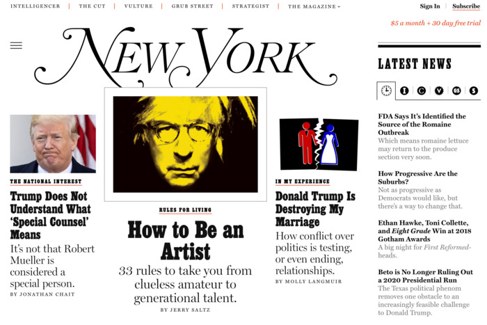
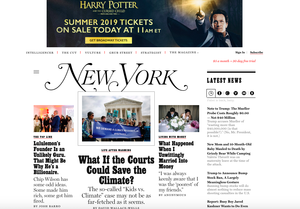
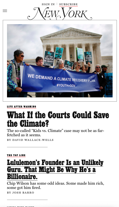
And here is the most recent cover of the print edition of New York Magazine:

By the way, one always finds variety in the design of New York Magazine covers. Take a look at this one from a couple of weeks ago, with a type attack strategy that works for the content of the story:
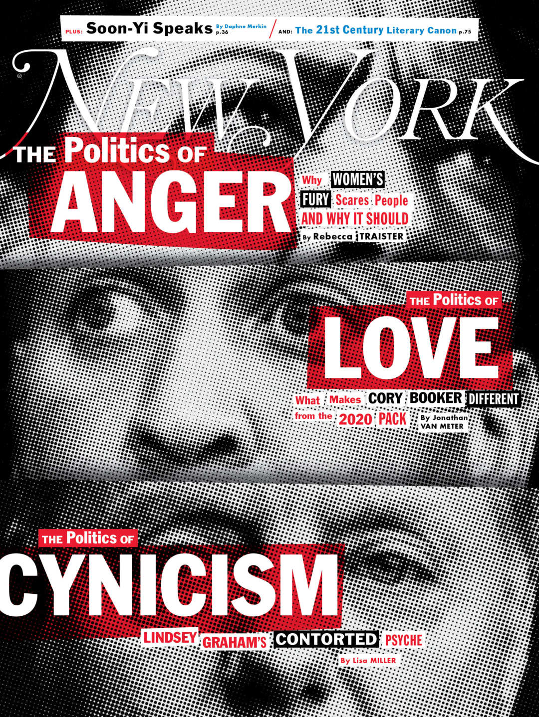
TheMarioBlog post #2965