This is the weekend edition of TheMarioBlog and will be updated as needed. The next blog post is Monday, May 6.

Cover concept: Petr Van Blokland and Erik Van Blokland, typographical brothers, are working here in the Design Design space in Delft to try a cover image for this issue. Projected is Tania Reposo’s classroom picture of Gerrit Noordzij, mentor of all three.
In the foreground is Erik’s remarkable model of the famous Noordzij cube.
The photograph didn’t quite make it to the cover, but what a wonderful try!
I asked magazine creator and editor Roger Black to tell me about what’s in this new issue of Type.
The cover story is Gerrit Noordzij, the godfather of parametric typography. His landmark book on the theory of letterforms, De Streek (“The Stroke) 1985, his early interest in computers for type, and his tutelage of a crowd of smart students makes him on the of the biggest influences on type today.
There is an exclusive interview by the well-known Dutch writer, Jan Middendorp. And there are some companion pieces. This the description in the “contributors” page:
The Dutch Issue
No, it isn’t. We don’t do themed issues at TYPE, and there are stories in this magazine that don’t have much to do with Holland. Admittedly, we have a few related stories each issue. In No. 1, there were pieces on the 19th century. No. 2 brought us to the mid-20th. For No. 3, it seemed that it was time for the 21st. If you think about contemporary type the Netherlands quickly comes to mind. So much innovation has happened there. Back in the 1980s, when Gerrit Noordzij started explaining the stroke, we didn’t get that he was accurately predicting the future of type.
Understanding Noordzij is essential if you are to understand contemporary type design, and so we turned to the author of Dutch Type,* Jan Middendorp. A book designer and teacher in Berlin, he’s worked for type foundries and distributors, and written books such as Hand to Type and the typographic primer Shaping Text.
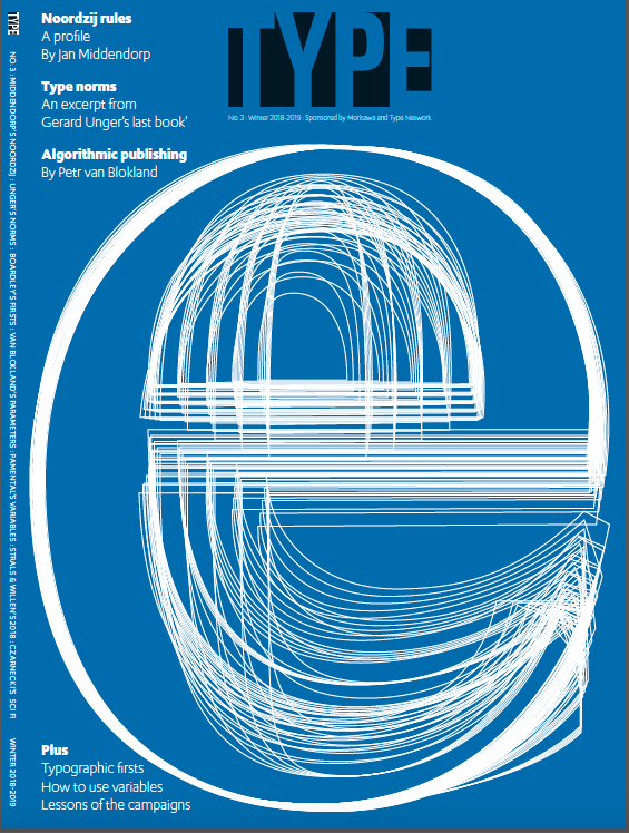
On the cover, Erik Van Blokland’s composite of weights and widths of a Noordzij typeface. There are 125 outlines of the character, e, that make up the full 5x5x5 Noordzij cube. Eight masters were digitized from Petr van Blokland’s original interpolations for Noordzij—made with ufoProcessor and drawn with DrawBot.
Not all of Dutch typography revolves around the Royal Academy of the Hague (KABK). Gerard Unger, perhaps the best known and well liked type designers in Holland taught at the rival University of Reading. Unger designed Gulliver, the typeface commissioned by USA Today. Other families include Swift, Flora, Vesta, and Capitolium. A prolific designer, he was also a big thinker about letterforms, deeply informed by history. His last book, Theory of Type, published just before his death in November, is one of the clearest explanations of type design ever written. TYPE is proud to excerpt it.
The Dutch trifecta in this issue is completed by Petr Van Blokland, whose fonts are used to set the issue. Moreover, his new design program, PageBot, produced the article he’s written about parametric design. Van Blokland’s Type Lab has become a fixture at the Typographics conference, and is a great place to watch his type, design, and teaching skills up close. He’s a partner in Type Network.
Roger points out that one article in the magazine was produced by an AI design app
Also in the issue, “Typographic Firsts” by John Boardley, and a roundup of political campaign type by Nolen Strals and Bruce Willen.
How to get your issue of Print
The only way to get the print edition of TYPE is to become a member: https://TYPEmag.org/join
Mario’s speaking engagements
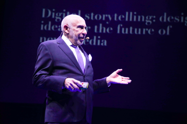
Mario doing a keynote presentation at Newscamp 2018 in Augsburg, Germany
Here are places where I will be taking the message of mobile storytelling in the weeks ahead:
May 15 INMA, New York City International News Media Association’s Mobile Storytelling Workshop
May 25, Milan, Italy, EidosMedia Annual Customer Meeting, Keynote: Mobile First Strategies for Publishers
June 12, NEC Media City, Bergen, Norway, Storytelling workshop for Editors
June 13, Fortellingens kraft 2019, Bergen, Norway, Long form Mobile Storytelling for Writers
July 11, Florida Media Conference, St. Petersburg, FL, Keynote for editors: The mobile first newspaper strategy.
Mario’s weekend rituals…..
Monocle interviews me about what I do on a typical weekend (is there such a thing? Not for someone like me who is seldom in the same location twice. But I gave it my best shot, for what may come as a normal weekend, when I am home in New York! Enjoy.
https://monocle.com/minute/2019/04/27/
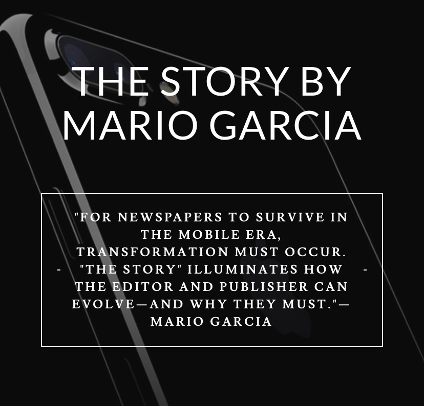
Pre-order The Story
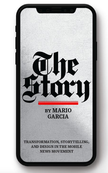
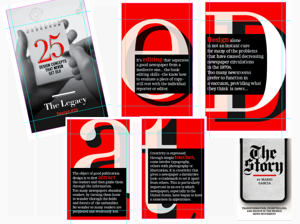
The newspaper remains the most powerful source of storytelling on the planet. But technology threatens its very existence. To survive, the Editor must transform, adapt, and manage the newsroom in a new way. Find out how, pre-orderThe Story by Mario Garcia, chief strategist for the redesign of over 700 newspapers around the world.
Order here:
https://thaneandprose.com/shop-the-bookstore?olsPage=products%2Fthe-story
An interview of interest
http://www.itertranslations.com/blog/2019/3/11/fd60ybflpvlqrgrpdp5ida5rq0c3sp
TheMarioBlog post #3044