TAKEAWAY: These gray ladies refuse to change their look and , in the process, become fashionably chic with that retro and gravitas-inspiring appearance.


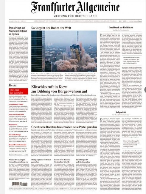
Germany’s classic daily: Frankfurter Allgemeine

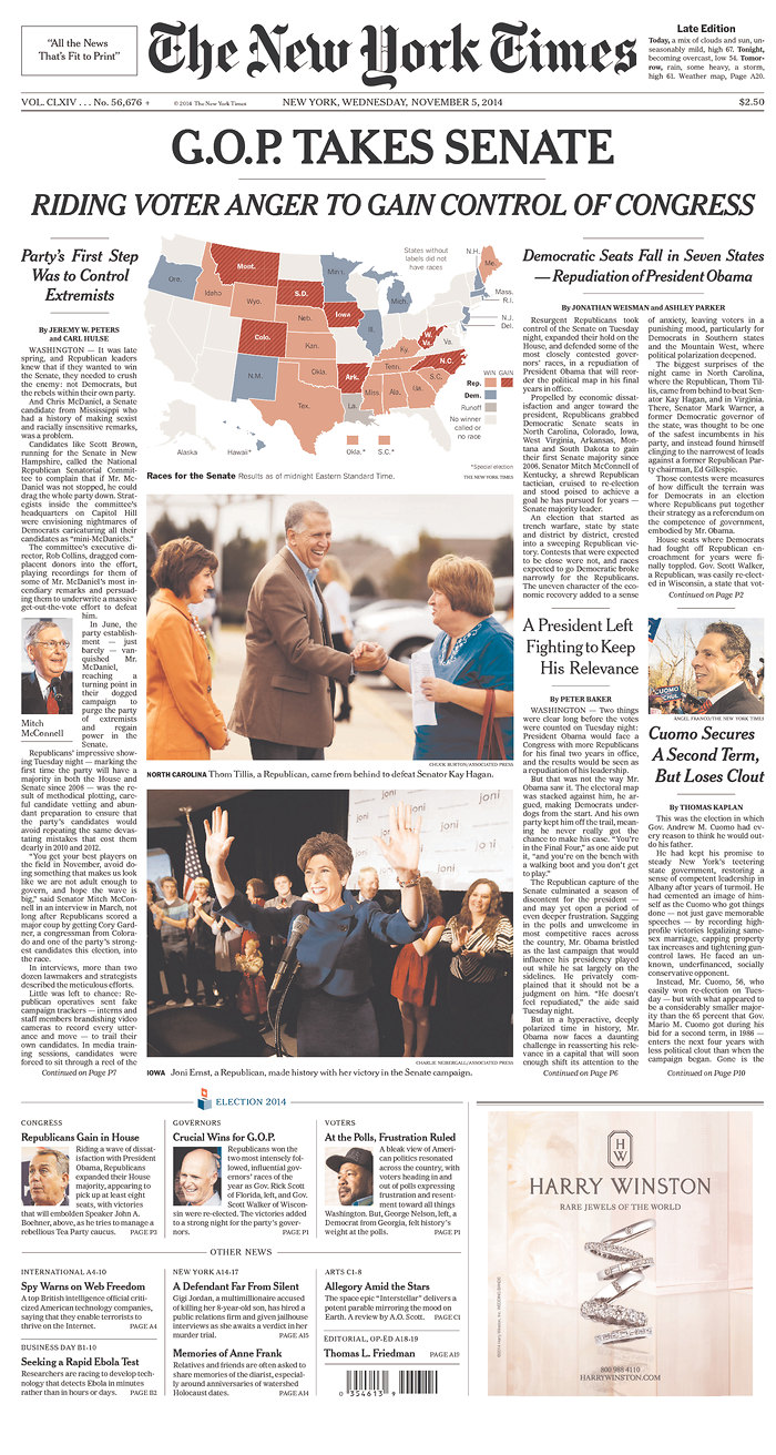
The New York Times: perhaps not as gray a lady as the ones above, but still the classic one in the US
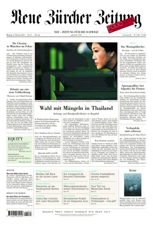
In Zurich and looking at Neue Zürcher Zeitung, a classic newspaper that thrives on the three magic G’s: it is gray, it has gravitas, its journalism is good.
But, if reaction in those first ten seconds rule applies, and if you are a visually minded reader, in those first ten seconds you run to do something other than to read it.
This reminds me of a story that Joanne Lipman told my Columbia University class last week when she appeared as a guest speaker.
Joanne is a former Wall Street Journal editor, who went on to become editor-in-chief of Portfolio, a Conde Nast gorgeously designed magazine that became a casualty of the bad economy.
Joanne mentioned that she was exposed to The Wall Street Journal since she was a child, as her dad subscribed to the paper and had it delivered to his front door at 6 each morning.
“I never once looked at it,” she told the class. “It was forbidding to look at, full of text and just too imposing.”
But, she added, as a college student working on her first summer internship in New York City, and commuting with her dad on the train, she started reading the WSJ.
“That changed my impression of the newspaper,” she said. “I realized that under all that gray look were great articles, wonderful writing, lots of surprises. It was then that I decided that I would want to work for The Wall Street Journal.”
And she did, becoming one of its front page editors, and, eventually the brains behind the creation of the highly successful Weekend Journal and then the daily Personal Journal.
The same can probably be said about Neue Zürcher Zeitung, and also of Germany’s Frankfurter Allgemeine. It is interesting to note that in both cases, the online editions of these two classic newspapers appear more visually exciting than what they do in print, although the FAZ does wear a more contemporary and colorful hat on its Sunday editions, which the NZZ does not.
Every time I come into Switzerland I sit with my copy of the NZZ and wonder: what does the future hold for a newspaper that looks like this? How many readers under the age of 30 are reading the NZZ on a daily basis? Would a more lively appearance make a difference? Ultimately, and assuming I was involved with this particular newspaper: what would I recommend?
Perhaps, as some may believe, it’s good enough as it is, a monument to a glorious past and a repository for the storytelling of today with the words as the real protagonists.