
TAKEAWAY: If you like the taste of those great coffees made and sold by Nespresso, then you will probably also enjoy the flavor of its lifestyle magazine, which you can also download now PLUS: Gulf News, revisiting and critiquing the newspaper three weeks after it converted to Berliner format.
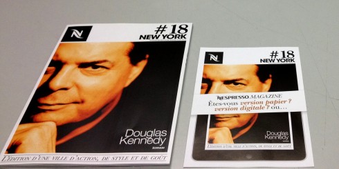
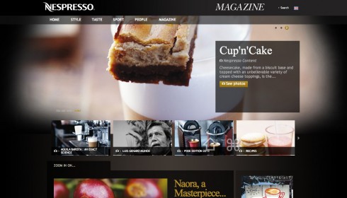
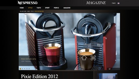
It’s more than just capsules with delicious coffee for Nespresso, and maybe I am the last person to discover its magazine, available through three platforms: online, print and now as a tablet app.
Although I am the proud owner of a Nespresso coffee machine, and turn to the website to order those capsules on a monthly basis, I was not aware of their lifestyle magazine, in several languages. Now, with a tablet edition, they are asking customers whether they prefer to get the paper or tablet edition. The website is quite attractive too, a real lifestyle magazine that communicates leisure, the good life and the traditional style pieces of travel, food and people that we would expect from a brand that has had actor George Clooney as its spokesperson.
The Nespresso tablet app goes the Flipboard style with its navigation. And if you are a member of the Nespresso Club, you can shop right off the app (very convenient and easy to do).
Gulf News revisited
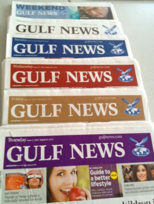
These are the various nameplate colors selected for Gulf News
It has been some three weeks since Gulf News switched to the Berliner format, and I am working with Miguel Gomez, design director, and our Garcia Media art director, Reed Reibstein, on finalizing the Styleguide, critiquing several issues, and doing the fine tuning that is a never ending process after these changes.
I will go more in details about our work with the Styleguide in Friday’s blog.
One of the most interesting aspects of this project has been, beyond the change of format from broadsheet to Berliner, the fact that the nameplate changes colors daily, but based on a set color palette.
The illustration here shows how the various colors here have appeared so far.
Tune in tomorrow for more about the Styleguide, a first of a kind, produced as an iPad app.
It’s what it is and its spelling is not right
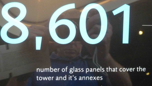
Photo by J Ford Huffman, whose reflection you can see in the image
It was the one most common mistake my editing students would make and I would be a billionaire if I had a $10 bill for everytime I circled an “it’s” that should have been “its” (or vice versa) on student papers and projects.
Apparently, the difference between the two continues to baffle people at all levels.
My friend and colleague, J Ford Huffman, the ultimate editor (also an artist!), was in Dubai recently and took a ride up to the top level of the world’s tallest building, the already iconic Burk Kalifa, and what a surprise to find a huge sign where the “it’s” was used instead of “its”.
I know how J Ford must have felt. He took a picture, which I received today, along with this message:
“ I went to the top of the Burj Kalifa on my last day there (in Dubai). Found a misspelling in the signage in the ground-floor lobby area. “It’s” for “its.” …..How can you build the world’s tallest building and allow misspelled
words?”
Good thought, J Ford. I hope the maintenance of those elevators that take one almost one kilometer up in the air has been more carefully orchestrated!
Of special interest today
– Why a reluctant Murdoch is splitting up News Corp and what it means
http://www.guardian.co.uk/media/greenslade/2012/jun/26/news-corporation-bskyb
– News Corp split could be part of bigger masterplan
http://www.telegraph.co.uk/finance/newsbysector/mediatechnologyandtelecoms/media/9357699/News-Corp-split-could-be-part-of-bigger-masterplan.html
– News reader app Pulse offers premium WSJ content channels
http://www.journalism.co.uk/news/news-reader-app-pulse-offers-premium-content-with-the-wall-street-journal/s2/a549698/
– Pulse vs. Flipboard: Which will win, subscriptions or ads?
http://gigaom.com/2012/06/26/pulse-vs-flipboard-which-will-win-subscriptions-or-ads/
– 10, 15 free web articles a month: Is this a mistake? (Yes!)
http://steveouting.com/2012/06/23/10-15-free-web-articles-a-month/
The iPad Design Lab: Storytelling in the Age of the Tablet
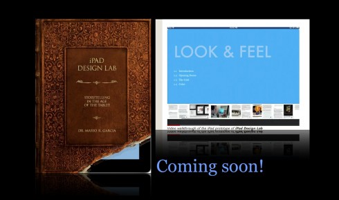
Video walkthrough of the iPad prototype of iPad Design Lab
