TAKEAWAY: The question is: how much should the iPad app resemble the printed edition? We discuss it in Moscow PLUS: The new Washington Post iPad is clean and easy to use AND: The master of disconnect, William Powers, signs an iPad during book tour
Creating the iPad app for Moscovskiye Novosti
This is the third report during our week of work in Moscow, creating the rebirth of the iconic Moscovskiye Novosti..
As we get closer to nailing what the look of the printed newspaper will be, we turn our attention to the digital side of the project——with the online and iPad app edition development. The new MN is scheduled to appear in February 2011.
The question that prevails in those first iPad app development workshops: how much should the app resemble what we are doing in print?
This is a topic I have covered here before, but it is always worth repeating, as many of our readers are working on app development for their newspapers or magazines, or will do so, no doubt, in the months ahead.
In the case of the Moscovskiye Novosti, which has a tradition as a serious periodical for the thinking man, we can imagine that the printed version will be text driven and will present the look of authority right on its front page. The app will have to match this but that is where the similarities end. When one creates an app, one is dealing with a totally new platform for a new generation of readers, one that tends to be more visually demanding, regardless of how intellectual they may be.
The app, however, affords newspapers like the MN a great opportunity to emphasize the long narrative—-the app, remembers, is closer to the book than to anything else. People will come there to read. So in our early sketches, we emphasize the narrative mode as an important component. But there is more: we will be able to go from the narrative to audio, video or photo galleries that enhance the reading experience.
As such, from screen one, the MN app must convey that visual feeling to the users. Indeed, our early sketches emphasize that you come here to read, but also to see, to watch, to experience.
It is, I am sure, what those readers of the MN of the 1980s would have loved: to hear the interview with the famous author, or to see the video of the group protesting, to get up close and very familiar with the subjects that helped the MN to make history.
We keep working on it. For the obvious reasons, we cannot share images of our work with you at the moment, but that will come with time. Continue to follow us on this one of a kind experience of taking the Moscovskiye Novosti to its next destination as a daily for the new Russia.
The Washington Post’s iPad app
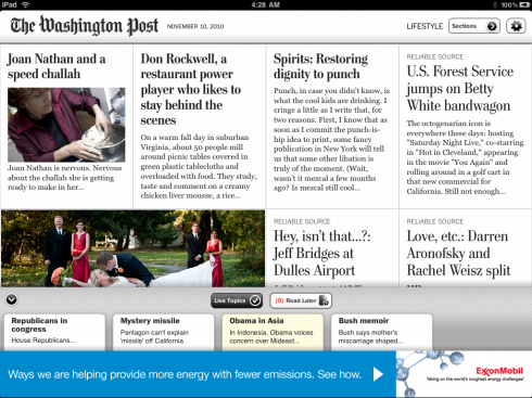
The Washington Post app: a four column grid prevails, except when in article reading mode, which switches to two.
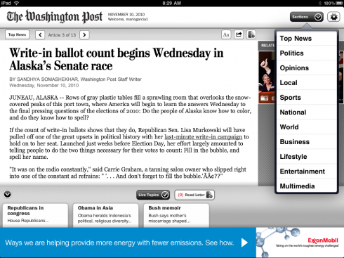
Here is reading article mode screen, with pop up navigator, right
The Washington Post’s iPad app was definitely not the first out of the gate back in the days——-God, it seems like years——when the iPad made its grander than grand entrance into an eagerly waiting world. But perhaps taking their time, the Post’s editors were able to contemplate, to study how others did it, and to come out with a product that, although I am sure is the 2.0 version, definitely pleases.
Editor Marcus Brauchli and I have been exchanging emails on other topics, and he asked me about the Post’s iPad: I have had a chance to review it and I like a lot of what I see.
Mainly, I like that it is extremely easy to navigate. Perhaps there are not a lot of tricks, bells and whistles (think Wired app) here. This is more Topeka than Vegas, but it is there that the Post’s app excels in my view.
The grid is four columns and the typography, the architecture and the overall look and feel are brand familiar 100%. If anything, and I mentioned this to Marcus, the logo of the newspaper is rather miniscule here, and there is no difference between the size of the logo on the opening screen or the inside ones. I would make that logo a tad larger in the opener.
The typography, which I know was retooled for the iPad version by the folks at FontBureau, is as crisp as I have seen on an iPad, with few size or weight variations. Thin rules are used to separate stories, a nice touch reminiscent of those printed newspapers of the 1960s. The late Edmund C. Arnold, that first and unique guru of newspaper design, is probably smiling in heaven when he sees all those elegant rules separating things on the screen. Nice touch.
A highlight of this app is its simplistic navigation. A bubble called Sections appears constantly at the top right of the screen, tap it and a larger index bubble pops up with the sections, just click and go.
Simplistic, highly utilitarian and does the job without fanfare.
Multi media has its own section, with photo galleries and videos in abundance .
All in all, one of the most refreshing newspaper apps to come along, and I am sure there will be more pop up moments in store as the Post’s guys evolve. We know they are patient, so perhaps we, the users who get it free for a limited time, should be as well.
Almost forgot to say that the “greeting screen” with an image of the Washington monument is a powerful, but serene, way to say hello to the user while placing us right in the spot where it all happens.
Autographing the iPad
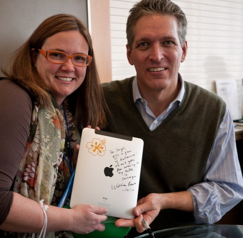
William Powers poses with Leigh Graves Wolf and her recently autographed iPad: a first for the bestselling author—-signing an iPad
It was a first for William Powers, bestselling author of Hamlet’s BlackBerry. He was in Chicago, another stop on his national book tour to promote Hamlet’s BlackBerry. Suddenly, a young woman, Leigh Graves Wolf, approached him asking him to sign her iPad. William was a little hesitatnt at first because it was an indelible marker, but she said she really wanted him to do it. She has a nice comment about the book in her own words just beneath the photo.
Here is what she wrote: “If you haven’t read Hamlet’s Blackberry yet – do so now!”
When I asked Powers about how it felt signing an Ipad, he emailed this thought:
What’s really interesting isn’t me or the book, it’s the idea of the iPad as something an author can sign. If anyone doubts tablets are approaching the status of books, this is all they need to know. But I think they still have a ways to go!
For our previous blog posts about William Powers and his book:
William Powers interview: disconnect is the ultimate luxury destination
https://garciamedia.com/blog/articles/william_powers_disconnect_is_emerging_as_the_ultimate_luxury_destination
Write down that date, please
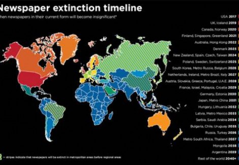
Source: Ross Dawson
Depending on your geographic location, you can look ahead as to how long you can expect to have a job at your newspaper, all courtesy of futurist Ross Dawson, who has drawn up the newspaper extinction map (above), with precise deadlines for when newspapers may cease to exist in your part of the world.
My friends in Dubai are happy since, according to Dawson’s predictions, they are guaranteed newspaper jobs in the UAE till at least 2030. Relief!
But, oh, my American friends, you are not so lucky, and you better go shopping for another job if you believe these predictions: your days are numbered and your “due date” is near 2017.
The map indicates newspapers will be “insignificant” in 52 countries by 2040, with India and Saudi Arabia as the last hold out posts in the world.
We tend to disagree and strongly.
As I sit here in Moscow, across from Red Square, this Thursday morning, November 11, I am in the process of creating the rebirth of a newspaper. It has a future. Its editors dream of a long run, as do
newspaper editors I know globally for their respective titles.
Extinction is at the doorstep of newspapers that fail to reconnect with their readers, to assume their new role in a multiplatform environment and in those houses where a hip publisher decides that it is “digital first”, but not in places where print is nurtured, revitalized and given the necessary kick in the butt to get it going again. Sorry, Mr. Dawson, we are on the side of those who think that print is eternal.
For an exclusive Gulf News interview with Ross Dawson:
http://gulfnews.com/business/media-marketing/the-extinction-timeline-1.710549