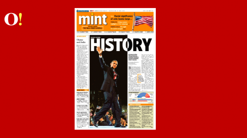
Raju Narisetti, editor of India’s MINT, a financial daily, discusses how he and his art director went about preparing for the front page of the Obama victory.
Go here:
http://blogs.livemint.com/blogs/romanticrealist
This is the final page they came up with:
These pages show something unique
Here, a very gracious Dr. Pegie Stark Adam shares her thoughts about the front pages she evaluated:
Overall, as I cruised through newseum.org I noticed four major categories of headlines:
‘Change’
Historic’
‘Yes he did!’
And then simply one big word OBAMA – some with an exclamation point, some without.
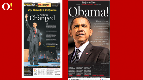
The Patriot News
Of all the pages I saw the one that stood out to me was The Patriot News.
This page displayed a strong connection between word and image. Instead of using the predictable photo of Obama waving to the crowds in Grant Park, we see another Obama – a large close up of his face – pensive and serious, powerful – looking ahead – with concern and with strength.
By his side is not the main story but words of Obama and Rev. Martin Luther King. The famous King quote that includes ’ . . they will not be judged by the color of their skin but the content of their character’ sits above. Beneath that is Obama’s quote from his acceptance speech:
‘If there is anyone out there who still wonders if … the dream of our founders is alive in our time, tonight is the answer.’
These two quotes bring the past to the present and present a look to the future. According to John Kirkpatrick, the publisher of The Patriot News, ‘We were trying to capture both the news and the emotion/historic nature of the moment.’ I think they did it in a beautiful and powerful way.
The Bakersfield Californian
Under the headline ‘A Nation Changed’ is Obama waving to the Grant Park crowd during his acceptance speech.
Using the ‘Obama waving’ photo juxtaposed next to the important except from his acceptance speech ‘If there is anyone out there who still doubts that America is a place where all things are possible …’ starts the quote and ‘That’s the true genius of America: that America can change’ ends the quote. Perfect words for the headline and image. A powerful blend of words and image.
There is no narrative, just Obama’s words. This seems so powerful yet understated. And I realize that the pages that stood out for me as the most impressive were the most simple ones. One head, one image, one quote. These three powerful elements said it all.
We can learn from this. Sometimes we don’t have to put everything out there. Sometimes, especially during an historical moment like this, simplicity is the answer.
The only thing that in my opinion needs a bit of an adjustment on this page is the use of bright yellow. It’s such a vibrant and powerful color and it pushes forward in the space so loudly, that it draws a lot of attention to itself. Perhaps a more subtle golden yellow would have been more appropriate to match the ‘spirit’ of this page.
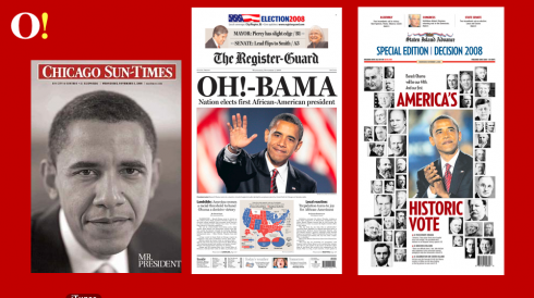
Chicago Sun Times
Well, who could disagree with Oprah! She said of the Chicago Sun Times and how they displayed Obama’s win—“It was the best paper of all the papers in the world,” on her show yesterday.
Here it is – a portrait of Obama with a simple two words: ‘Mr. President’
Everything says ‘simplicity’ about the page – even the fact that it is black and white.
I loved it! It is elegant, it is simple, and it presents the new president to the public with such integrity.
Lesson learned – simplicity is powerful, it wins again.
Staten Island Advance
While most newspaper front pages displayed a large photo of Obama the Staten Island Advance took a different approach focusing on the ‘history’ of the moment.
We see all 44 presidents with Obama being dominant. This is a kind of history lesson that I liked. It gave a snapshot of where we have been and where we are now. The photo of Obama that was chosen is an interesting choice. He’s not waving to the crowd, in the ‘winning moment’ like many of the photos used in other papers. Instead he is looking into the distance, looking into the future. What lies ahead.
————-
Would it have been better to organize the photos of the presidents in a sequential manner? Perhaps. Minor point – it’s still a great idea.
These papers had fun!
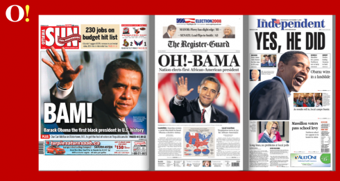
The Register Guard, Oregon
The headline treatment was engaging and stopped me to take a second look. I like the headline – it’s fun and it gives the spirit of ‘awe’ and excitement that the country is feeling. This photo calms me, this photo reassures me.
Obama looks calm and measured, thoughtful and poised. He looks prepared for the job.
The Independent, Massillon, Ohio
Several papers used this headline ‘Yes, he did’ and this paper selected a photo that matched the words perfectly. This is playful and fun and shows a side of Obama that we don’t see in a lot of the photos displayed in other papers.
The Ottawa Sun
Ottawa’s tabloid newspaper The Ottawa Sun took a fun and humorous approach by showing Obama and the word BAM! on the front. It caught my eye and made me laugh. And it was the only paper I saw that did something like this. But I kept thinking about the chef Emeril who yells BAM! and wondered if the connection meant something that I wasn’t getting? Powerful and eye grabbing, but what does it really mean?
Finally, the Yale Daily News front page
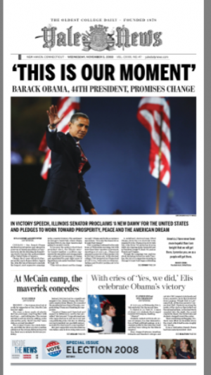
Reed Reibstein, of the YDN, sends us his newspaper’s front page , and comments of how it came to be. A classic, elegant approach, showing the YDN’s design flexibility, which allowed the editors to drop some of the usual visual features of their page one to make this one look special, as it did.
Here is how Reed put it:
First, you will notice that we rearranged the front page, with the teaser bar moving to the bottom and Cross Campus disappearing altogether (only to pop back in on page 3 in black and white). I was concerned about changing the front’s architecture like this, but it really was not a once-a-month or even a once-a-year kind of event, but a once-in-a-lifetime one that merited such big play. The nameplate still sat proudly at the top at full size (unlike some other papers’ variations).
I wanted our front to really highlight the fact that we were able to send reporters all around the country (Chicago, Phoenix, Nebraska, Virginia, and Wasilla, Alaska!), so instead of a poster front with one story or no stories at all, we made sure to have three stories start. We all also agreed that we wanted the page to feel deeply rooted in the traditions of news design, to emphasize our status as a newspaper of record, so there was unfortunately not the chance to be as experimental as some other publications.
Overall, I do like the headline and its treatment and the size that we were able to go with for this, but it’s nothing too different—the exciting aspect is more in the writing than the design in this case.
But the rest of the issue had some more creative aspects, from a poster front for our Election B section to a full-page map of the electoral college.
The Obama Victory and Indian Newspapers
To view how newspapers in India displayed news of Obama victory:
http://newspaperdesign.ning.com/group/indiannewspapers/forum/topics/see-how-indian-newspapers

Dear all: I am at home in Tampa, and should become a grandfather again today——my 10th grandchild, and fourth grandson, will be born today. In the days ahead, I am helping my daughter Elena with her other two children, so my apologies if TheMarioBlog is not updated as frequently as we are used to! I will update the “baby report” as well.
TheMarioBlog posting #136