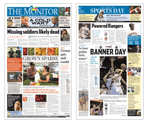
It’s easy to tell why The Monitor is one of the most successful newspapers in America.
From their state of the art new presses, to the ambitious leadership and devoted newsroom staff, everything about the way this south Texas daily serves their community seems right. But perhaps the most impressive and telling key to their success is their unwavering commitment to giving their readers exactly what they want.
It was with this baseline of thinking that the Monitor commissioned Garcia Media first to evaluate their product, then to give them guidance as they undertook the effort to create a product that would offer more relevance and value to their readers. From the very beginning, it was clear that the plans in McAllen were not about personal agendas or industry accolades. They simply wanted to update and improve their newspaper to satisfy the evolving demands of its readers.

The McAllen, Mission, Edinburg, Pharr metropolitan area is one of the five fastest growing areas of the United States. The population of McAllen, alone, grew by just over 48 percent between 1990 and 2000 and is expected to have grown by a nearly similar percentage between by the 2010 Census. The population of Hidalgo County, which constitutes the paper’s primary circulation area, is 85 to 87 percent Hispanic, a demographic directly reflected in the newspapers subscriber base. Because of this, when putting the paper together each day the editors and staff pay close attention to stories that are “of particular interest” to Hispanic reade. The Latin influence is also evident in the colors and the energy of the community.
The first evaluation of the newspaper revealed a product rich in content, but lacking in some of the tools to help today’s hurried readers get their information better and faster. The navigation of the paper needed to be improved. Integrated editing techniques need to be introduced to layer stories and bring out their relevance. And to make all of this happen, processes would have to change, there would have to be better planning and stories would have to be thought out more.
This wasn’t simply an exercise in changing typography or picking colors, although that was part of it. The navigation that was added to the front page now gives readers an opportunity to see what else that day’s paper has to offer. Sidebars were introduced to enhance stories and to communicate their relevance faster. Refers to the web were worked in to create truly multimedia experience where readers can read the story in print and “do” more with it online. Finally, the content strategy changed to consider the evolving new media audience that they have known so well. Front page decisions are not based on what “belongs there,” but simply what are the most interesting and relevant stories that day, and what are people talking about. The result is an exciting mix of local news and sports, entertainment, reader submitted stories and photos, and a newspaper that’s all about “you.”
It’s a testament to the publisher, Olaf Frandsen, Steve Fagan, editor and Marcia Caltabiano, managing editor, whose leadership and vision kept the newsroom excited and positive about the changes that were forthcoming . This was a newsroom with no egos and no drama, just a desire to tell better stories. The mantra in the budget meetings became “why should our readers care about this story?” Extra effort was put into every story pitched to make sure it answered this very simple, but important question. And a staff, made up of experienced journalists and recent college-grads continue to work together daily to ensure that every story meets this criteria.
Has it been easy? Not at all. Everyone has had to work harder and longer. But the spirit and desire to do better work is there, as is the realization that good storytelling is a process that takes time and effort. This effort is already clear in the story selections, the packaging and ultimately in the overwhelming positive reactions from the only audience that matters to them, theirs.