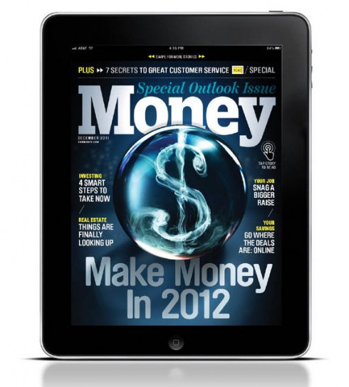
TAKEAWAY: Money magazine has invested time and creativity in a great looking iPad app that I recommend you sample. Following quickly in the footsteps of its print redesign, this tablet edition is elegant, clean and functional.


As with the print redesign, design director Neil Jamieson tells us the story behind the new iPad tablet edition in the Society of Publication Designers website. I found very interesting that he mentioned this:
Our print redesign at Money coincided with the big push over here at Time Inc to get all the company’s titles up and running on both the iPad and 16×9 ratio devices (kindle fire, nook color, samsung galaxy etc). The timing couldn’t have been better as it meant that we where able to work out the navigation and structural logic of the print with the design of the tablet in mind and vice versa. This meant that rather than the tablet being a reaction to the print, the design/architecture and logic of one was able to inform the other.
In that statement, emphasize the reference to: “The timing couldn’t have been better as it meant that we where able to work out the navigation and structural logic of the print with the design of the tablet in mind and vice versa.”
It is that way that all news apps should be planned.
I am presently working on the chapter titled Look & Feel for my digital book, Storytelling in the times of the iPad, and I start by writing that an app must give us a sense of anticipation, that first impression that counts so much not just in tablet design, but also when we buy food at the supermarket or a pair of shoes or gloves.
We must like what we see. We must feel invited. We must immediately get a sense of direction and know where to go from there.
The new Money app does that immediately, and does it well.
You may read all of the details of the redesign in the wonderful SPD piece.
But I must call attention to one area of particular interest, which I think advances
tablet design, just as it should be.
“Spreading it Out”


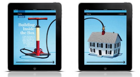
Jamieson calls it “spreading it out”—moving across screens as needed to tell the story.
Indeed, we must not look at the limited and smallish canvas of the iPad screen as the limit. We must imagine that there is room at the top, the bottom, the left and the right, just a swipe or a scroll away.
The Money app does this, and when you see the various combined screens side by side you feel like you would like to take them and hang them on your wall.
Jamieson writes that “Having the ability to use as many cells as we need to tell a story has been liberating for our design and photo teams. We try and let our cells breath so the content is easy to read and the viewer knows where to look. We often run the photos across multiple cells for greater impact. The the seamless effect keeps the reader advancing through the app. “
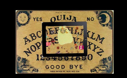
It is sort of like playing the Ouija board, for those who may remember that fun game. You place your fingers on the planchette, a small heart shaped piece of wood, and let them move in whichever directions over letters of the alphabet, or numbers, or words like hello and goodbye. I remember playing Ouija board on rainy days in Miami during hurricane season as a teenager.
What the Ouija board effect does for the app designer, I believe, is to guide orientation beyond the confines of the small screen.
The designers at Money Magazine have shown that the tablet allows us to think of the large landscape, then lets our fingers guide us to every corner of it.
Skip, hop, up and down was never more practical and fun.