TAKEAWAY: It is Monday and here are some interesting pages we like. In design, it is those first 10 seconds that count. These pages manage to get our attention.

Update #1: Monday, July 30, Kuala Lumpur, 22:46
The cover that seduces

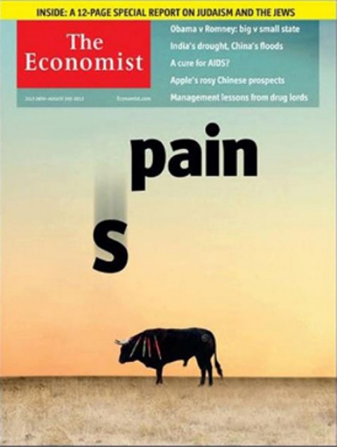
The Economist cover as it has appeared

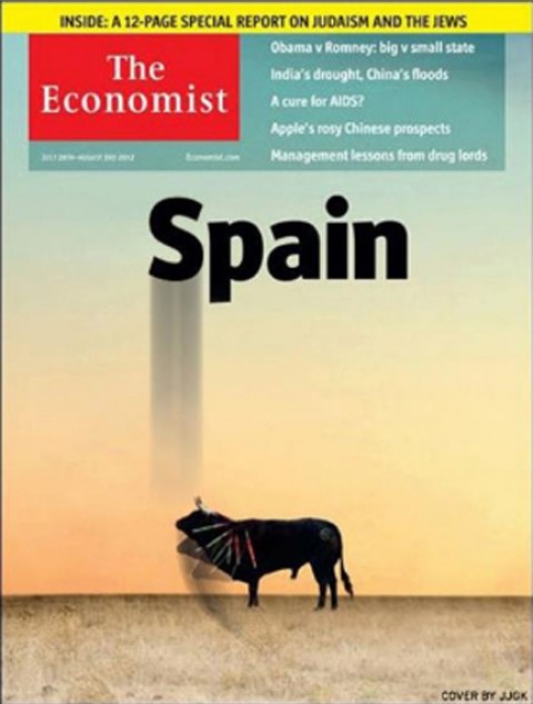
The Economist cover as remade by Spanish designer Jose Juan Gamez Kindelan
It is Monday and here are some interesting pages we like.
The latest issue of The Economist puts Spain on the cover, and how effective this is, a play on words. I understand that many Spanish readers are not too happy with a cover that accentuates the actual “pain” they are going through, or perhaps the use of the iconic bull, which is always so visually tied to the country of my ancestors.
However, if the purpose of a cover is to seduce, and if it can do it while sporting creativity and simplicity, then this cover from The Economist does it excellently well.
Here is a follow up to the story of this cover:
Norbi Baruch, the Argentinean designer, has published an interesting note about this cover from The Economist on his own blog, but he has been gracious to send us this text for our blog, which I translate here from the Spanish:
A few days ago I had a chance to get a preview of the cover that The Ecoomist would publish, and I became very interested. It was a very strong visual take that tried to change the sense of the typical Iberian symbology. I was sure that this cover would create controversy.
On the cover one could see a bull with a sort of attitude of resignation, not understanding the play of words proposed by the cover design. Beyond the debatable creative tool with the play on the word pain, the impact of this cover was guaranteed merely with the use of the bull there.
That night, the design director of the Spanish daily, Marca, Jose Juan Gamez Kindelan, found the cover and decided to modify it, simply to make himself feel good, perhaps with a little less pain. “I was ready to go to bed when I deided to take one more look to my emails, Facebook, etc. As I ran my fingers over the mouse, I could not help seeing the recent edition of The Economist.”
That is how Gamez Kindelan starts his story in the blog Visualmente.
“My first impression was negative. I don’t like to see this play of words, playing with the pain, and the bull, and, this is not the right time for this….and, less of all, coming from The Economist.”
So, it is interesting to see how suddenly, just based on emotions, he took the cover and started to change it , to do his own version: He had to tell his own story.
“Without losing a minute, I took the image of the cover to Photoshop…the effect of the movement of the letter S, which is the dynamic part of the illustration, helped me to synthesize the message: in less than five minutes, the bull was attacking the letter S, placing it back where it belongs, from where it should have never escaped.”
Bild and the Olympics


In its Sunday editions, Bild of Germany carried one of its double page graphics, this time related to shoes worn by famous Olympic athletes thru the years.
I show you here both the way the double page appeared in the print edition, and on the iPad.
Of special interest
The New York Times tries responsive design: a preview of things to come, we hope.
http://theagenda.nytimes.com/
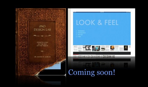
The iPad Design Lab: Storytelling in the Age of the Tablet

Video walkthrough of the iPad prototype of iPad Design Lab

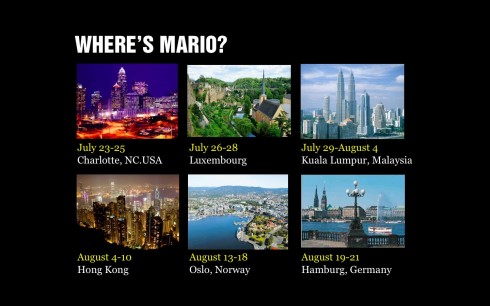
Mario Garcia’s upcoming speaking engagements:

WAN-IFRA World Editors Forum, Kiev, Ukraine, Sept. 2-5
http://www.wan-ifra.org/events/64th-world-newspaper-congress-19th-world-editors-forum
Cumbre Mundial de Diseño en Prensa 2012: Mexico City; September 24-26
http://www.cmdprensa.com/mx2012/
SND (Society of News Design) Cleveland; Oct. 11-13
http://cle.snd.org/