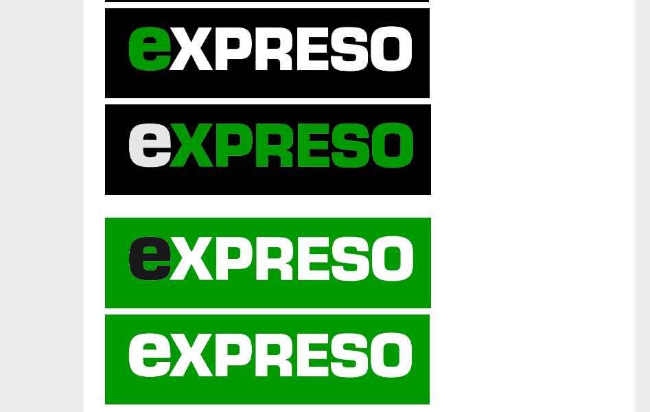
Different new versions for logo usage. Color palette.
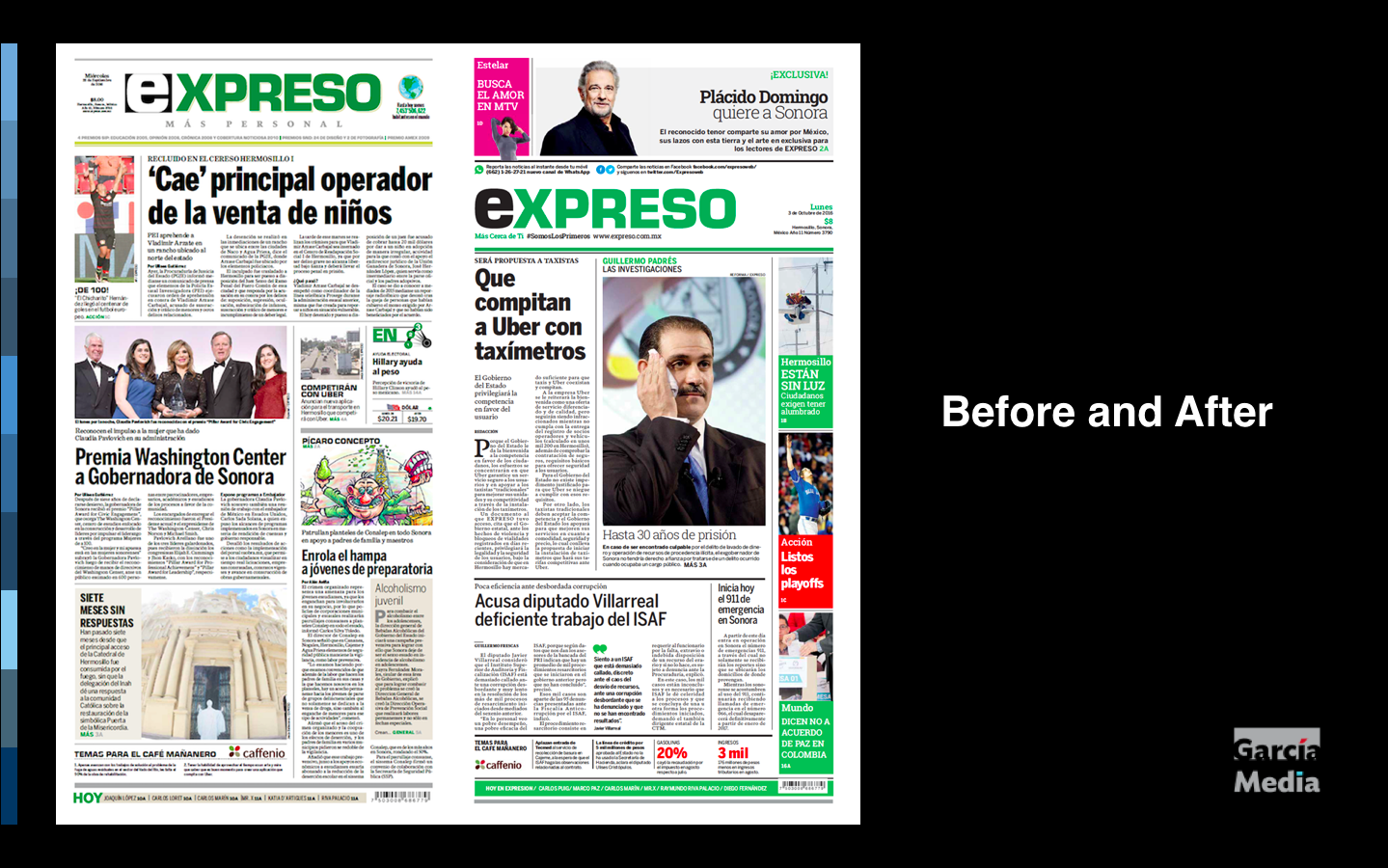


The redesign of the front page: before and after
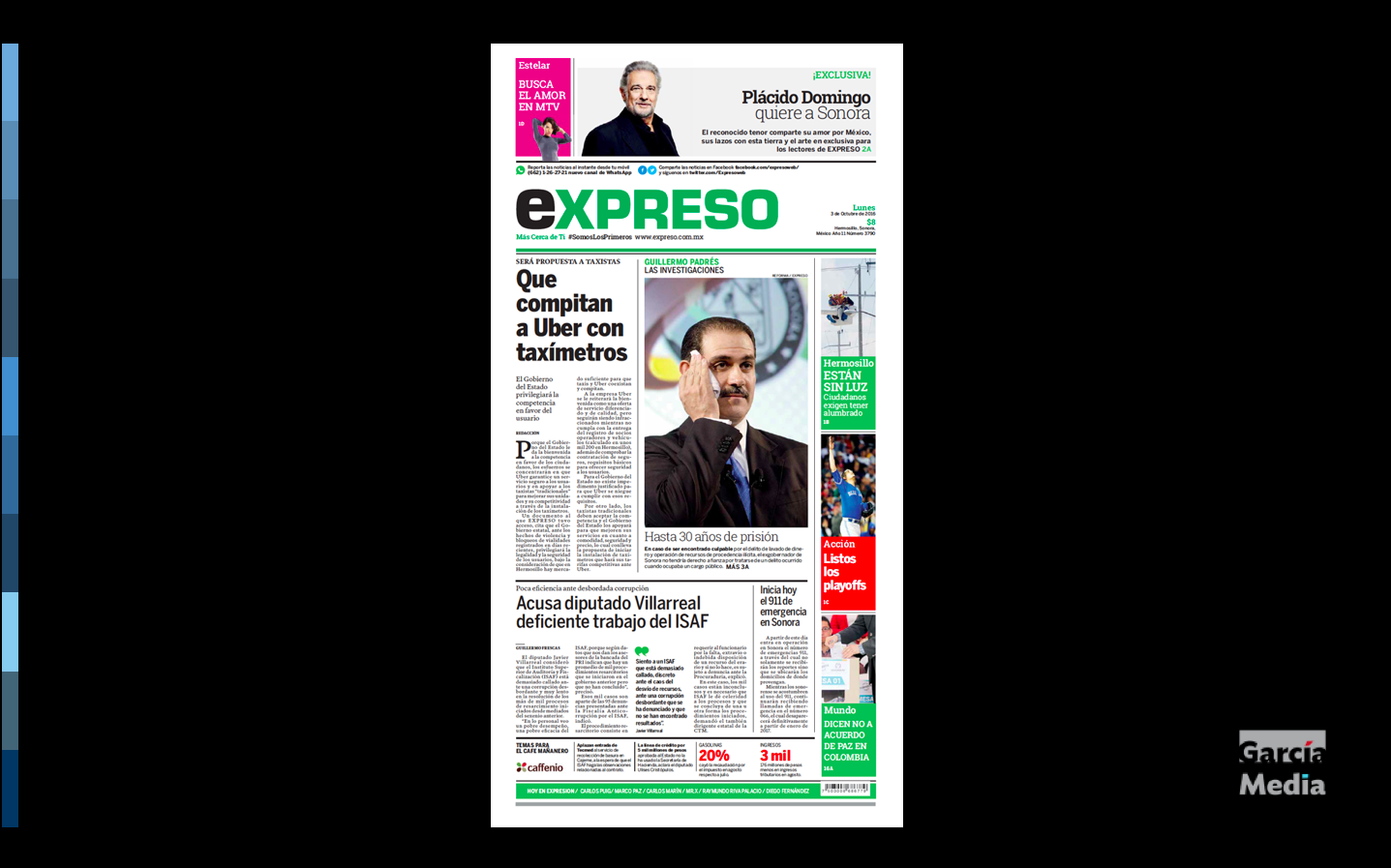
Expreso is a relatively young newspaper. In fact, it was born already with an online edition in 2005. From the start, it has been a dynamic, bold and daring newspaper that tries to stay as young as its readers. And it is that desire for constant change that has inspired this new redesign.
We at Garcia Media have been honored to accompany the Expreso team with this relaunch. Our senior art directors Rodrigo Fino and Paula Ripoll directed the project.
Highlights of the project:
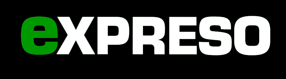
Tweeking of the logo:
The team decided to simplify the Espreso logo, but maintaining the original Eurostile font.
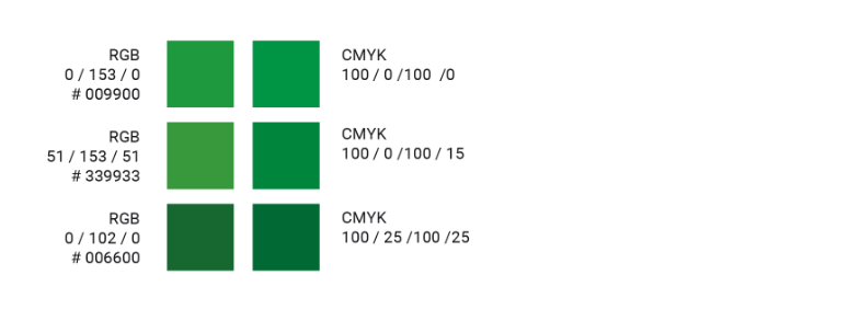
Color Palette
Emphasis on green, with consistent hues of it across platforms.
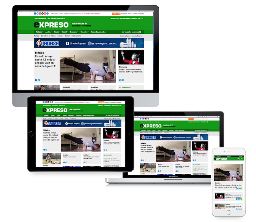
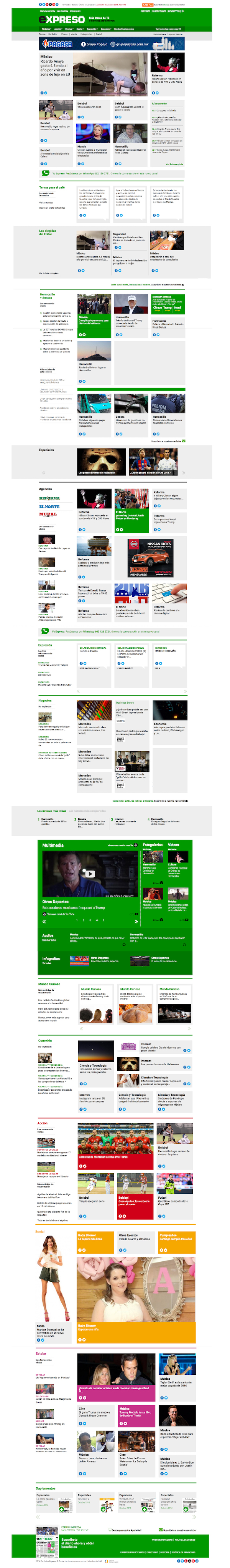
Responsive web design
The digital publication of Expreso is responsive across platforms. A new four-column grid was created for online presentation.
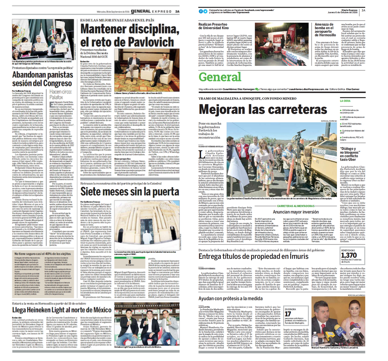
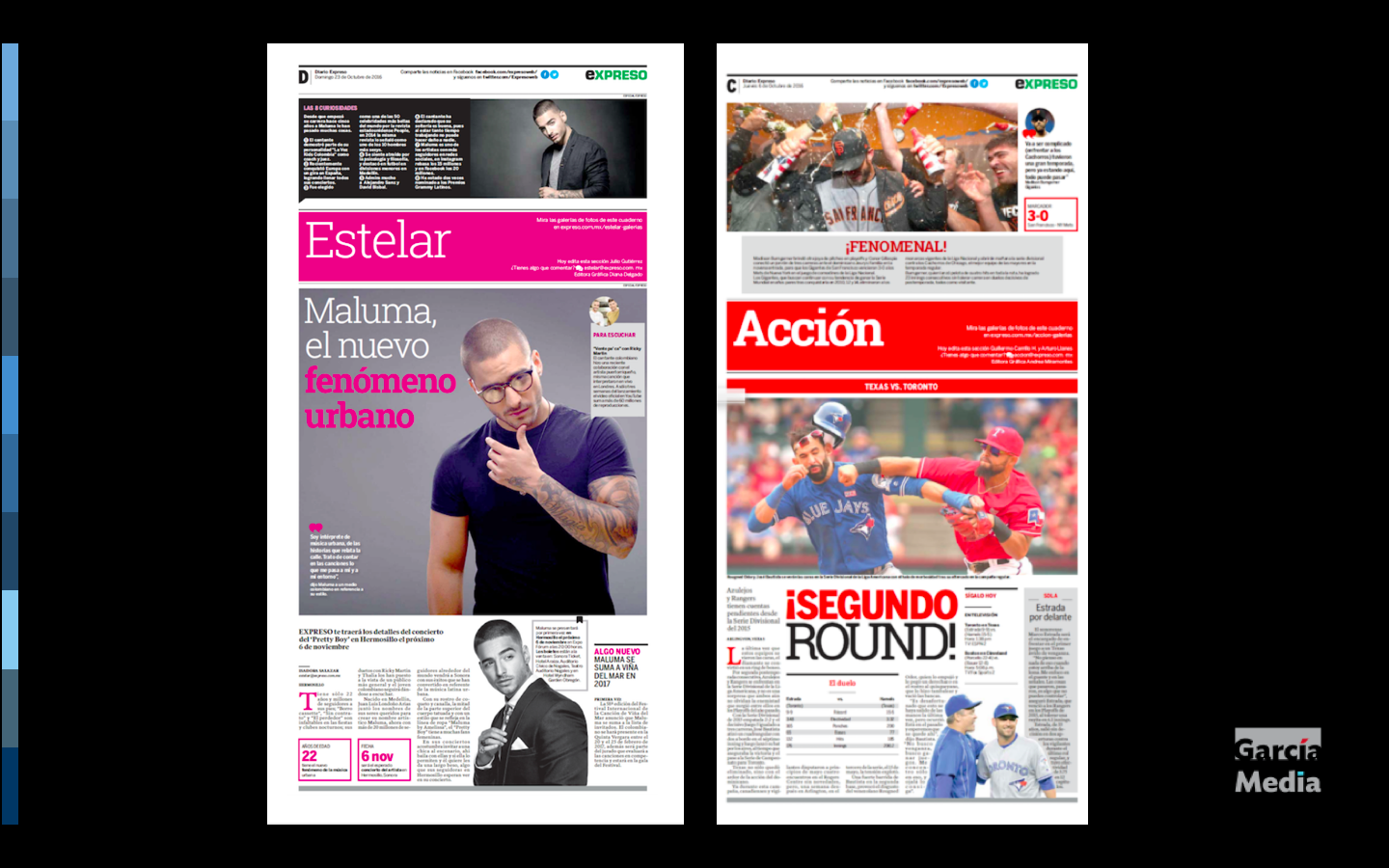
Clean design through inside pages
A key part of this project was an effort to create better hierarchy and to clean up inside pages to expedite the readers’ journey across every page of the printed newspaper.
For the Spanish case study by Rodrigo Fino:
http://www.garciamedia.com.ar/blog/la-marca-del-cambio/
The best of Columbia University Journalism students
Take a look:
https://medium.com/columbiajourn
Peges We Like