TAKEAWAY: The first iPad app for India’s Malayala Manorama premieres this weekend. We take you through the steps leading to it and show you early sketches of our trials and errors. PLUS: Join WoodWing’s Xperience seminar in Amsterdam, May 24-25
This blog post will be updated throughout the weekend: Update 5, San Francisco, Friday, April 8, 21:30
Update: here screen shots of the first official edition of Malayala Manorama app
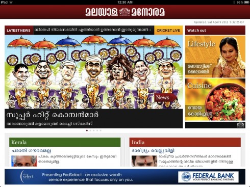
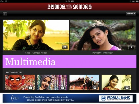

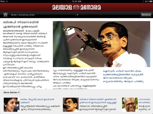
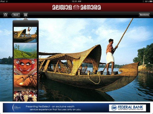
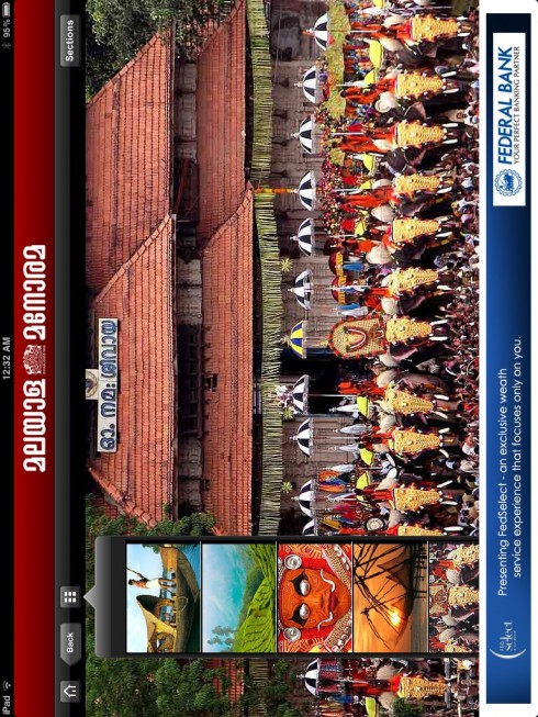

The door screen to the new Malayala Manorama iPad app, as colorful as the region where it is created: beautiful and scenic Kerala
Malayala Manorama is published in one of India’s most scenic regions, Kerala.
It is read by over 12 million readers daily. We have accompanied the Malayala Manorama team with their print redesign, and now we were honored to be called upon again to assist with the creation of its first iPad app, which premieres this weekend (Saturday).
Here is how Mariam M. Mathew, chief operating officer – Manorama Online, describes this historic moment for Malayala Manorama, and the process that led it to its new iPad app:
For the 123-year old Malayala Manorama the transition to the iPad was easy. We have been pioneers in adopting new story telling techniques and technologies. The Malayala Manorama has a huge presence in the Online medium as well as the Mobile space. Tablets are closest to the newspapers in the digital world and allow readers to have a richer experience newspaper with a flick. We are a journalism focused company and we feel the iPad presents a wonderful opportunity to be great storytellers We are really excited to work with Mario to launch Malayala Manorama’s iPad edition. Mario understands us because he redesigned the Malayala Manorama some years ago. Mario brings his rich experience to the iPad and is easily able to capture the newspaper strengths to the iPad.
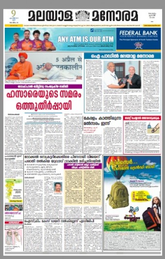
Front page of the Saturday printed edition of Malayala Manorama tells about the premiering of the iPad app.
For the talented team of Malayala Manorama, it all began, as is usually my practice, with a two-day workshop.
What happens in this workshop?
Each project is unique and special, but some of the agenda items we follow when we conduct these workshops for news app creation are the same. I usually start with an overall presentation (constantly updated) of how news iPad apps develop globally. This sets the tone, allows for discussions of “what may work for us in this particular case” and offers a larger view of the excitement, challenges and solutions ahead.
Here is my list of workshop items that I want to make sure we get through by the end of the two-day workshop:
1. What is the DNA of the existing publication that will now have an iPad app?
2. Review of the content to single out specific areas of interest that will transfer to the app.
3. Storytelling: how will the content be displayed on the app?
4. First, the information architecture component of the app is discussed, planned and mapped out.
5. Second, with the help of the technical people in the workshop, we try to create some screens to see how information architecture would carry.
6. Grid creation for both horizontal/vertical
7. Navigation is diagrammed
8. Once we have some screens to look at: landing page, article page, multimedia pages, we have a discussion.
9. Advertising modules created.
10. End of the workshop: we have a working digital document from which to start the task of creating the rest of the app.
The workshop images
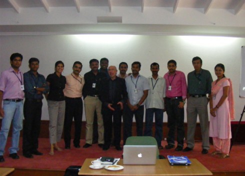
The entire Malayala Manorama iPad app creation team: Kerala, 2011
Here I will show you our early stages of developing the app for Malayala Manorama.
The grids
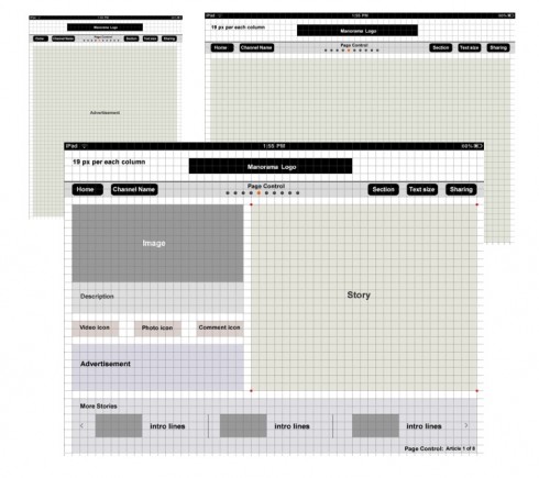
Notice that one early step is the creation of grids to guide the design process. This is imperative, just as it would be in print, but even more so here, a technical necessity to facilitate placement of elements on screen.
The navigation
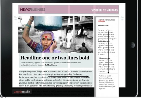
From the start, we begin to experiment with navigation techniques: will this app allow the user to go to top news updates at any time? If so, how will that window appear? At this stage in the workshop, we were thinking that perhaps there would be a latest news pop up window, an idea that was abandoned much later in the process.
Putting flesh on the bones of that grid
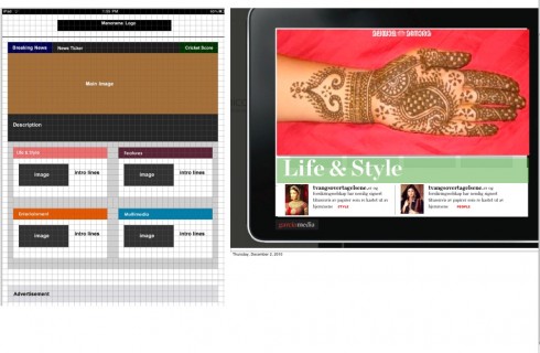
By now, we are happy with the initial grid, so the designers start putting boxes on the screen, for a first glimpse at look and feel; how would it work vertically and horizontally?
Screen design starts
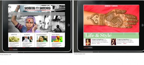
Now we begin to experiment with look and feel: what would the user see first, second and third; hierarchy, ease of navigation; interplay of elements all begin to be part of the discussion
Color palette
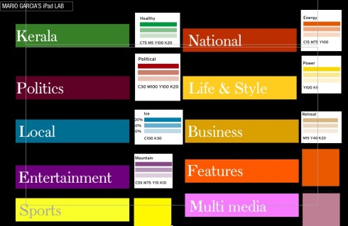
The color palette is important, and here we start a discussion of how various colors may be used to identify specific sections of the app.
Multimedia screen
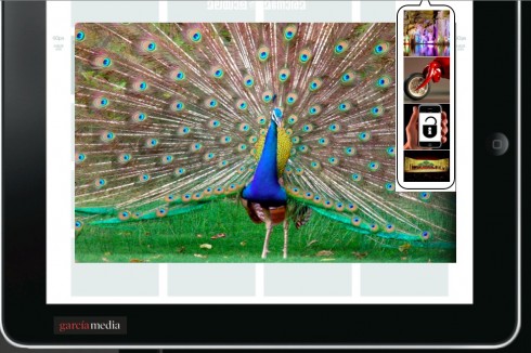
First glimpse at how a multimedia page would look, and how we would navigate the user to other multimedia components within the app.
One of the prerequisites to make sure that the iPad creation runs smoothly is the appointment of a project leader. At Malayala Manorama, it was Santhosh George Jacob. He coordinated all efforts, from editorial to technical to advertising, and he was the point man for all communications with me, as we were exchanging emails, reviewing pdfs of screens and continuing the dialog daily throughout the process. Here Santhosh summarizes his experience:
For me working for the I Pad project was all about getting back to the basics. As someone who was a print journalist in the early days of profession and later migrated to the web, I view the tablet as something very close to print. It is the ultimate convergence experience by conceiving the good things from both print and online.
However, the tablet is something which gives you a chance to rethink and redefine the old school journalism for the benefit of the new gadgets. Its fun, touch, feel and involvement.
The workshop directed by Dr. Garcia gave us a chance to be exposed to the new world. He understands user requirements fast and design product accordingly.
Post workshop development of the app
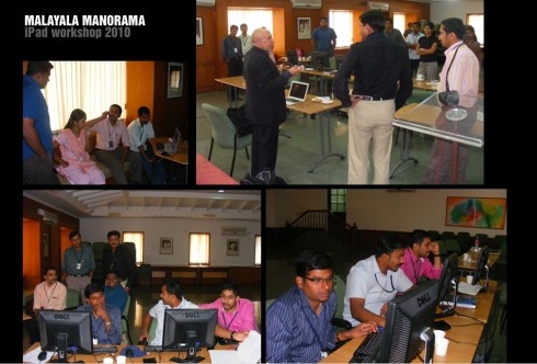
Scenes from our work together at Malayala Manorama : entire iPad app team shown here
Once the workshop was completed the most energetic part of the work began, with the team adapting various screens to fit the daily needs of “simulated” exercises. In addition, tweaking everything from the typography to the color palette.
For three weeks prior to this week’s launch, the team has already carried out a “soft launch” and, to our surprise, many users already access this not completed version of the app from around the globe.
Notice in the following examples how we progressed from workshop experiments to the more real screens you see below for various sections:
Vertical treatment for door screen

Vertical landing screen
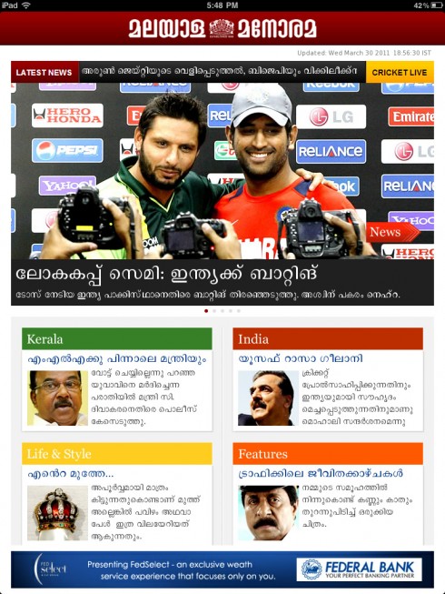
Horizontal gallery screen
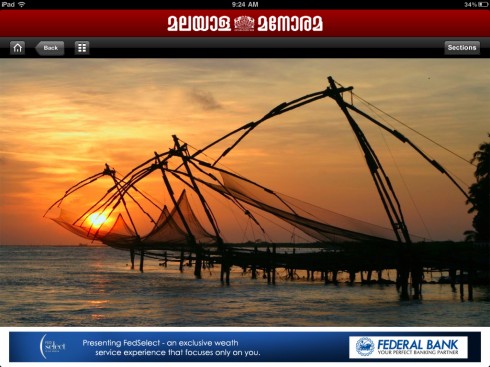
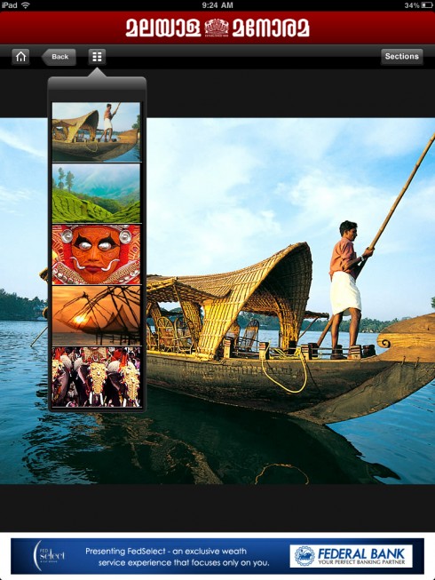
Vertical gallery screen
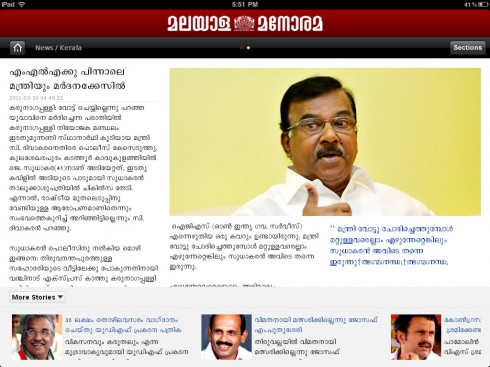
Article read screen horizontal
A template presenting a variation on the horizontal article read mode
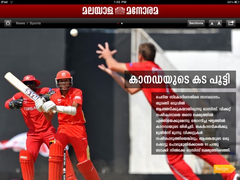
Multi media screen horizontal
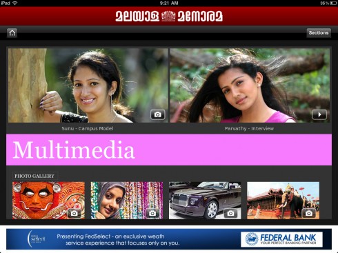
Multimedia screen vertical
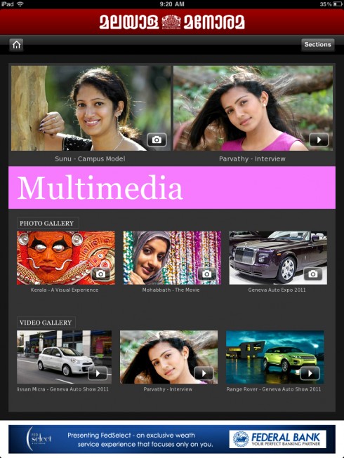
Section opener screen horizontal
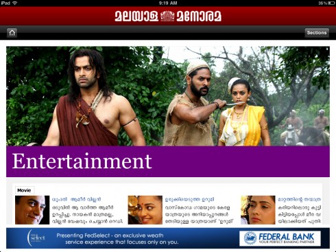
Section opener screen vertical
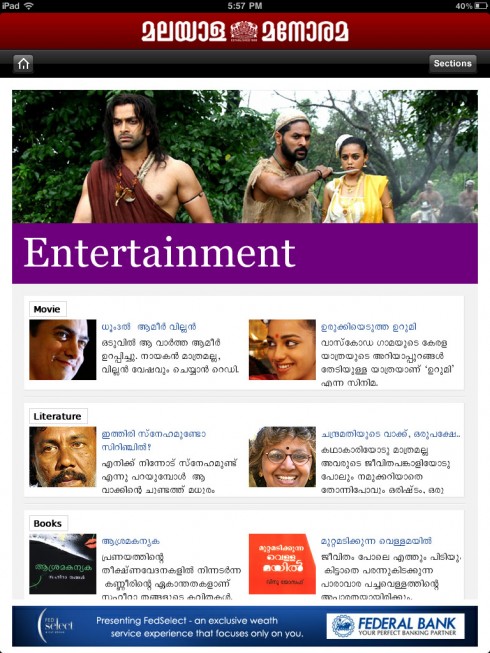
Content and landing page decisions
Notice various simulations for landing page here carried out on real time, with real stories, but one thing is very different: the Malayala Manorama app is a unique and dedicated app. It does not mimic exactly the contents of the printed and/or online editions. Instead, it seeks those stories that may have a greater appeal to its global audience.
As you can see in these examples, all from the past week:
In one example, a political cartoon (by the newspaper’s well recognized cartoonist) leads the page visually. Another example deals with a very local story, and uses a photograph; a third example shows us a drink for a story the increasing drinking habits among residents in Kerala. “We decided to lead with this story because the consumption of hard liquor is increasing multiple fold. The Government is the sole retail distributor for alcohol in the state and the revenues are almost double that of the spending for development projects,” project leader Santhosh said.
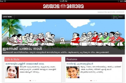
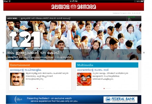
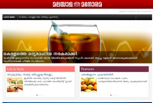
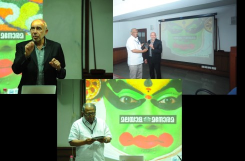
That important and much awaited for moment: presenting the first showing of the door screen on the iPad itself to Malayala Manorama editor in chief , Mr. Mammen Mathew
Our previous postings about Malayala Manorama
The making of an iPad app in forever green Kerala
https://garciamedia.com/blog/articles/the_making_of_an_ipad_app_in_forever_green_kerala_india
Kerala: an enchaned land with millions of newspaper readers
https://garciamedia.com/blog/articles/kerala_an_enchanted_land_with_millions_of_newspaper_readers
WoodWing’s Xperience seminar May 24-25

I am honored to be one of three keynote speakers at the upcoming WoodWing Xperience seminar in Amsterdam May 24-25
I did a previous keynote for a WoodWing Tour function in London in 2010.
For those interested in attending, here is more information:
May 24-25, 2011, Amsterdam, Netherlands
http://xperience.woodwing.com
WoodWing launches Open Format for Interactive Publications
The launch of ofip is an initiative of WoodWing Software aimed at developing a standardized data format for interactive publications, such as digital magazines, newspapers, books and brochures.
For more information:
http://www.ofip.info/Open_Format_for_Interactive_Publications/Home.html
TheMarioBlog post #748