All this week we have been posting items of interest from Dubai, including samples of the many and interesting printed newspapers that now call the city of the future home.
Today, as I try to do each Saturday, I compile your comments and emails to highlight some that are particularly insightful. By the way, I continue to be surprised that, while not many of our readers of TheMarioBlog post actual comments for all to see, many write emails directly to me. This is fine, but I hope you don’t mind if I share your email commentary with your fellow readers. In each case, I am only using the first name and city of the person writing.
Two emails stand out this week:
Jonathan J., of Dubai, writes:
“I have followed your stories from Dubai this week with great interest. I am sorry to inform you that Emarat al Youm does not look much like the sample pages you showed. Why is the original design not followed?
Rachita G., of Dubai, writes:
“Have you seen Business 24/7 lately? It started out as a beautiful tabloid design, but it has turned into a highly simplistic product. I am sorry to see that happen.”
Here is my take on the topic of design sustainability.
I agree with both of you that neither one of these newspapers exhibits the degree of design craftmasnship and inventiveness of the original prototypes. But I have to say that some aspects of my own product in Dubai, Gulf News, are not the same as we had prototyped them, although in this case I am retained to visit four times a year and not only assist with the evolution of the design, but also monitor its progress. This helps.
However, prototypes represent some degree of fantasy; the published edition represents reality.
Prototypes are prepared by skilled designers and art directors, in the best working conditions, usually without that oppressing deadline, and, to be honest, in a pressure-free environment where creativity rules the day.
Having said that, there are some strategies that can be used to guarantee that erosion of an original design concept is minimal.
Here are some tips that have worked for me:
1. Build a prototype that is based on the realities of the newspaper’s daily production, its human resources and technology.
2. Incorporate the strong foundation of what I call the Fabulous Four:
—Story Structures: create a systematic approach to how each type of story is told in the newspaper. Usually, I create six to eight of these.
=Typography: create a systematic approach to how typography will be utilized for every detail, from the smallest photo credit under a photograph, to the biggest headline on othe day a major breaking news occurs.
—Page architecture: nothing can be more important and easier to systematize than the grid the newspaper will follow.
—Color palette: Give the designers a range of colors that will become part of the newspaper’s brand, but that will, through continued use, offer visual consistency to the product.
3. Make sure the prototype is more like a regular laid out newspaper than an art directed one. Remember, the talent pool involved in the creation of the prototype might NOT be there to carry the day to day production.
4. Create templates and styleguides that ensure that these basic foundations are explained clearly to all who will work with them.
Yes, it would be wonderful to have The-Year-After-Pill, so that the prototype concept would perpetuate itself. Such is not the case. In the best environments, the daily editions evolve beyond the prototype, becoming stronger and better.
I can reassure you that few prototypes look the same one year after they have been executed, but if the foundation of the Fabulous Four is there, a good 80% of the concept remains.


LUCIE LACAVA ON THE NATIONAL

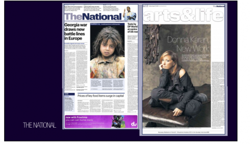
During our The Dubai Report week (August 1) we reviewed The National, the new daily in the UAE, published in Abu Dhabi.
Our email brings us a note from a designer we admire much, Lucie Lacava:
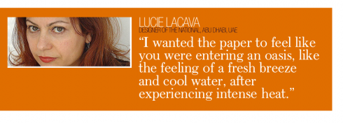
“ It was a pleasure to read your blog on newspapers in Dubai, and especially your thoughts on The National. I chose a very cool colour palette, because it is so hot here, I wanted the paper to feel like you were entering an oasis, like the feeling of a fresh breeze and cool water, after experiencing intense heat.
“I think the resemblance to the old Guardian comes from the headline font. But if we compare the two papers side by side they are quite different. I was looking for a generic, ubiquitous font, very much like, but not Helvetica. If it feels like you’re in London it’s actually a good thing since the majority of readers here are expats from the UK.
Thank you so much for the extremely positive review! I’m glad you like the paper. “

https://www.garciamedia.com/blog/articles/nine_dailies_two_languages_publishing_newspapers_in_the_city_of_the_future
![]()
In Miami, where the after effects of tropical storm Fay continue to be felt: it rains heavily at times and many of the streets and even sidewalks are full of water. The sun appears momentarily, then goes away.
![]()
Monday: A Three-Minute-Interview with veteran designer Frank Ariss, who created the legendary design of the Minneapolis Star-Tribune in 1969, using only Helvetica.
TheMarioBlog posting #73