It happens everyday across newsroom, design studios, architects’ offices and even between a couple as they settle for what wallpaper to choose for their bathroom.
Making visual choices is never easy.
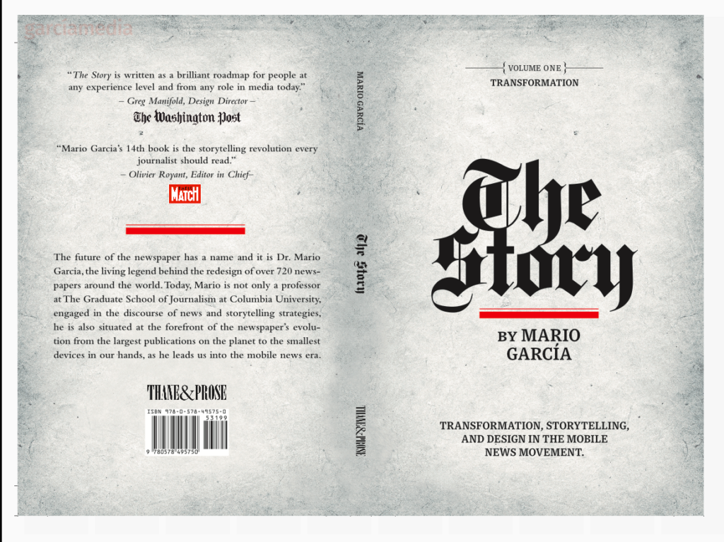
While in India the past few days, one young woman approached me to have a copy of my new book, The Story, autographed. While I was signing the book, she suddenly asked: What made you choose Old English type for the title of the book on the cover?
Good question and one that I get often. After all, this is a very now book, about mobile storytelling, so why use a font that we associate with old newspapers and magazines?
Internally, our Garcia Media art director, Paula Ripoll, and publisher, Thane Boulton, of Thane & Prose, also discussed this issue. In the end, we all agreed that the use of Old English would be a great way to salute the rich past of all things print, while extending a stronger hand to the future and all the possibilities of mobile journalism.
It was not easy. I looked at the models in front of me and I admit that until the last minute I questioned whether we were making the right choice to push a new title that was intended primarily for mobile consumption.
I kept reminding myself and the team: The only thing that has not changed in the 50 years in the business is that if you have a good story, half the battle is won. I also think that when we think newspapers today—this may change in 20 years—we think nameplates set in the Old English font.
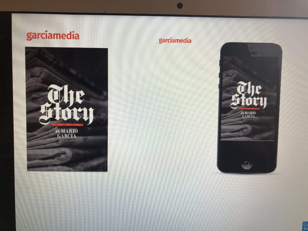
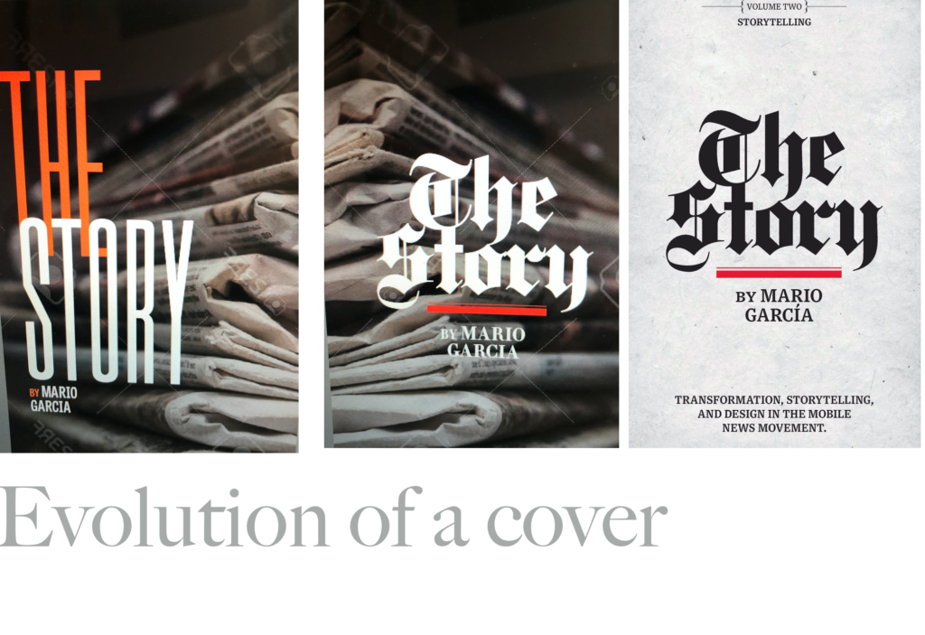
Take a look here at the final cover concepts we considered!
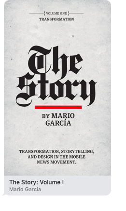
I ‘d like to think that we made the right choice. Today, of course, I could not imagine The Story cover any differently.
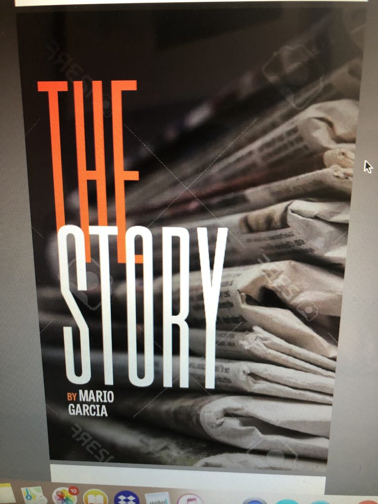
Then we tried the Old English type while leaving the rest the same. We thought that this could be a book about reporting from the 80s or 90s. We liked the visuals , but not the message the cover sent. So, back to the drawing board, but we were now hooked on the Old English.
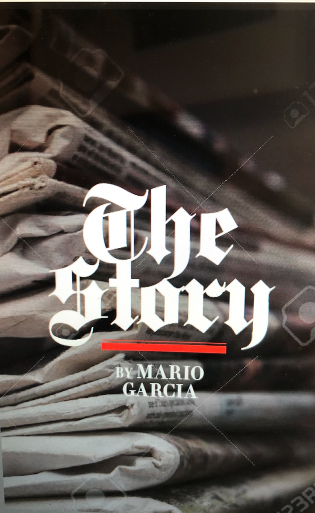
We were almost there, just abandon the illustration of the stack of newspapers and we would get our cover, so we kept experimenting…..
Finally, the cover of The Story was here!
Ironically, making design choices is one of the most challenging aspects of the designer’s work, and, yet, it can be the most fun too.
My advice to designers that I work with, and my students specifically: Don’t fall in love and get attached to one idea too much, or you may be disappointed!
Start the year with The Story
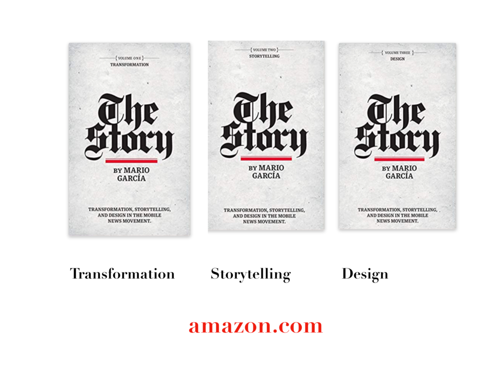
A good read to start the year 2020: The full trilogy of The Story now available–3 books to guide you through a mobile first strategy. Whether you’re a reporter, editor, designer, publisher, corporate communicator, The Story is for you! https://amazon
Mario’s speaking engagements
March 13, 2020
Keynote presentation at the National Media College Association Spring Convention, New York City, NY
March 27, 2020
Keynote
New York Press Association (NYPA), Saratoga Springs, NY.
TheMarioBlog post # 3187