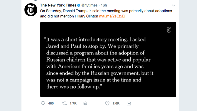
The New York Times is beginning to use more “art” with its Twitter links to stories its team has published.
Take a look at this one today, related to the latest Russia-election intrusion story:

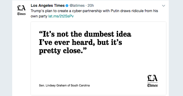
Recently, the Los Angeles Times also made use of a quote, in this case with black type against a white background:

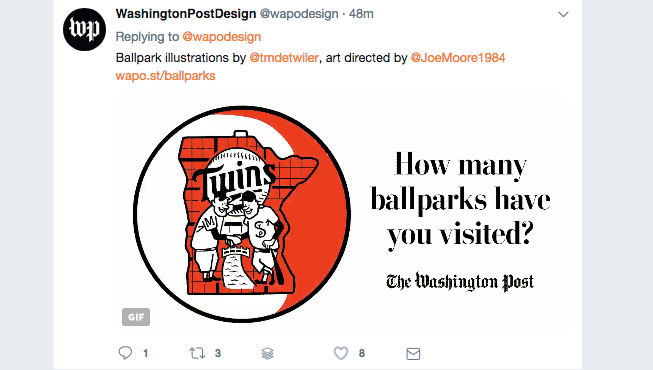
This one from The Washington Post is quite fun, animated with great graphics:

I also like how The Guardian promotes its “tell us a story confidentially” campaign:

So, as you can see, the “type attack” lives well in social media, too.
For more about type attacks:
https://garciamedia.com/blog/type_attacks_can_come_to_rescue_of_that_front_page/
https://www.garciamedia.com/blog/articles/designing_mondays_front_page_for_mas_por_mas
https://garciamedia.com/blog/articles/pprint_design_its_those_small_details_that_count_p