Updated Saturday, Oct. 23, 10:53 Miami, FL time
TAKEAWAY: The all caps versus lowercase in lettering debate takes to the road. Indeed, the federal government is even getting involved, requiring cities across the USA to change street-name signs from all capital letters to capital and lowercase letters. The government says that makes them easier to read. Well, editors and art directors had the same idea many years ago!
All caps or lower case? The debate is old
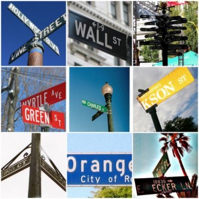
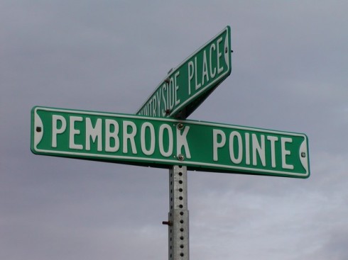
Easier to read the signs on top: Monroe and LaSalle : Pembrooke Point sign must change soon
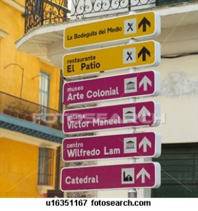
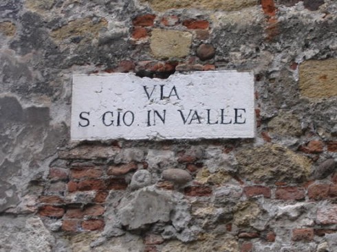
A variety of street signs from around the world; indeed, the ones in lowercase are easier on the eyes; but, oh, those charming European street signs in Gothic letter——perhaps not so easy to read if one is navigating a new city, but the charm and style are undeniably appealing.
Only “italics” have a more prominent place in that always busy and hot corner of the newsroom where debate of type-related things is discussed. Yes, we have heard it all about italics: they are feminine, moody, slanted and hard to read, never use in sports pages, only use for commentary material——the list goes on.
But, alas, the second hottest point of typographic angst is using all caps versus lower case for headlines.
Now, the federal government takes the debates
out to MAIN STREET (or should that be Main Street?), requiring cities across the USA to change street name signs from all capital letters to capital and lowercase. Easier to read, says Uncle Sam.
Amen. We agree. Oak Avenue is much easier than OAK AVENUE, and Martin Luther King Boulevard, nicer and easier than MARTIN LUTHER KING BOULEVARD!
What took them so long?

Diagram taken from Kevin Larson’s presentation showing the word-shape or “Bouma” model.
We have known for decades that it lowercase is easier to read than uppercase, and research from reading psychologists tends to agree. The big debate is why! A long-standing model has been the word-shape, or “Bouma,” model, in which in which the exterior shape of the word is used to recognize the word. From this model, the shape of lowercase characters allows for this recognition of shapes much better than all capital letters.
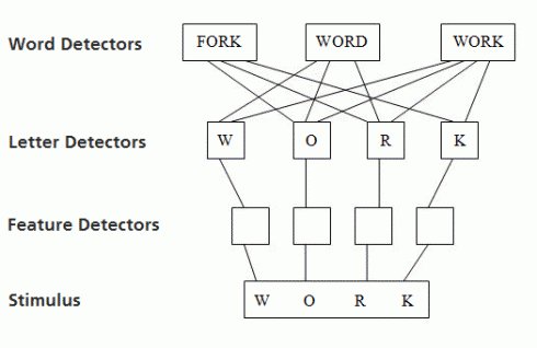
Diagram taken from Kevin Larson’s presentation showing the parallel processing model.
But scientific research from a leading reading psychologist, Kevin Larson of Microsoft, argues that the word-shape model is outdated. In one of the The Art, Technology, and Science of Reading. He also discusses the value of typeface choice (the flavor of the text) and good typography (the pleasantness of reading, not the speed).
Brings back the memories
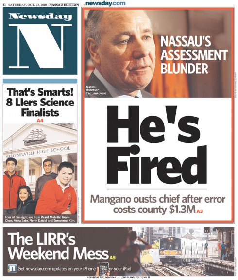
Newsday: crisp and easy to read lowercase lead headline
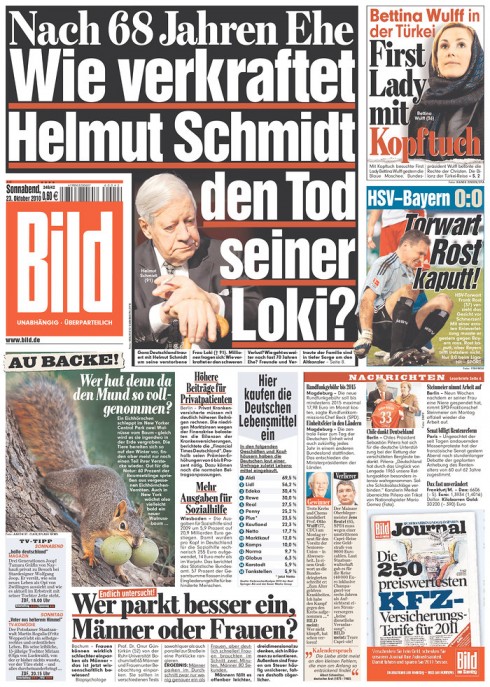
The over the top Bild of Germany goes lowercase for its lead story
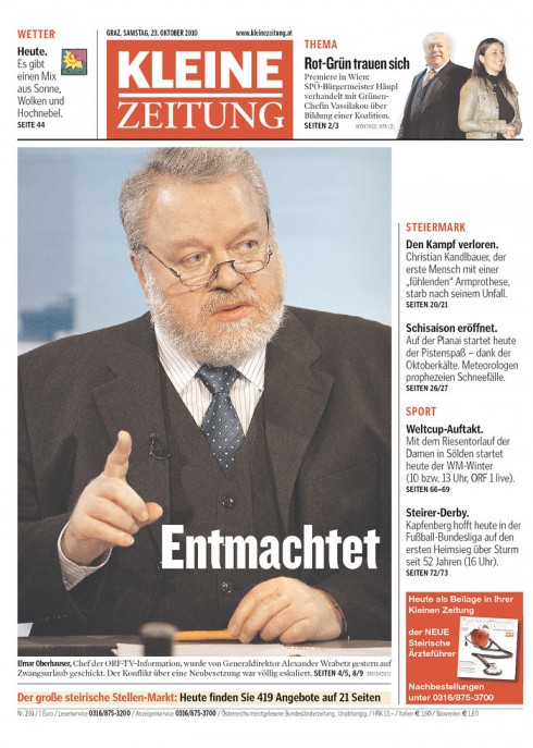
Always elegant, but direct and appealing, Austria’s Kleine Zeitung: lowercase letters do it for lead head.
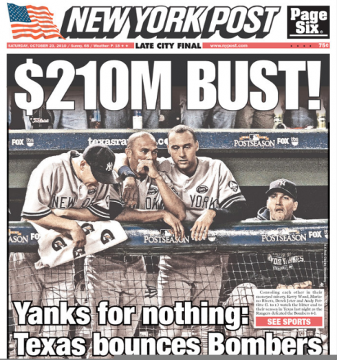
New York Post: all caps, followed by lowercase summary; caps are its front page trademark

Belgium’s Niewsblad: appealing to the masses, and screaming the story in all caps. Works for them!
I remember that when we wanted to convince someone of the all caps versus lowercase impact and difference, we would write a word in all caps on a piece of paper, then take scissors and cut that piece of paper in half: if you only had the TOP of the page in the all caps version, it would be difficult to make out the meaning of the word; when the word was in lower case, the shape of the letters was more defined and therefore it was easier to read.
However, as in all discussions about type: the rule is not 100% sound, and we must make allowances for exceptions.
A couple of words in all caps to emphasize robustness in a headline will not hurt things. An entire headline in all caps, or a total concept of only all caps headlines, that is a different story.
Size has something to do with it. Caps work best in bigger sizes, which tabloid front page designers worldwide have known forever.
My own test
Here I am in recovery room after eye surgery Thursday: now up and around and seeing the world better than in all caps

And here I am today Saturday, completing a 5-mile walk in sunny Miami (no running for two weeks, so walking must do!)
How appropriate that this discussion of caps versus lower case should surface this week, when I myself had minor eye surgery to remove an annoying cataract from my right eye.
I had this surgery on Thursday, and I am fine and seeing the world so much better, as if life sent me a postcard to remind me of how beautiful my surroundings can be.
The day of the surgery I had a patch on my right eye, of course. And because total disconnect was out of the question, I did come to my computer and to my iPad to do some light reading.
Indeed, lowercase type was much easier for a temporarily sidelined one-eyed reader.
As for the names on the streets, it should be interesting to see how the cities react to the requirement.
But, a good thing is already happening: the debate of caps versus lowercase comes down to Main Street, and people who never gave a thought to such things can now think about them.
Make that thought all lowercase.
For further reading of interest:
The theory that lowercase letters are easier to read than caps
http://typophile.com/node/73596
TheMarioBlog post #661