TAKEAWAY: The world of news design loses one of its most influential practitioners, one that all of us learned much from, especially that change is always possible, and design restraint is a virtue.

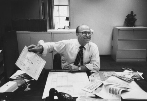
Lou Silverstein (1919-2011). Photo: The New York Times
He represented all that design represents in the midst of a newsroom where the word design may not have necessarily be the first thing in the editors’ mind. I imagine that to be the design director for The New York Times——especially the Times of the 1970s——is the equivalent of being a fashion coordinator in a convent where all the nuns wear the same black and white habit.
But Lou Silverstein, who died last week at the age of 92, managed to make his impact felt, and the Times today is more airy, more typographically pleasing, and, a design award winner, because of his efforts.
I remember bringing Lou to share stories and tips with our groups at The Poynter Institute for Media Studies
. He was always prepared, humble and even the biggest visual achievements that he brought to the Times, he explained in terms of his team, and his editors, and how it was always a team effort that led to every change.
Lou was a gentleman who taught us all valuable lessons in his gentle way. I remember quoting him in my first book, Contemporary Newspaper Design, and using examples of his Times’ pages weekly for my newspaper design classes at Syracuse University. Like good design itself, Lou’s lessons did not come in splashy packages, but more likely in the nuances of how a little white space went a long way on a text-heavy op ed page; or how the style of the typography used for a columnist’s sig helped create contrast. It is as if Lou Silverstein did his handy design work in a workshop far removed from the big stage. Ironically, his newspaper occupies one of the biggest stages, still today.
He made it all look easy. He made it all look possible. He taught us that elegance and subtlety are perhaps some of the most underrated elements of newspaper design.
His lessons are timeless.
For more on Lou Silverstein:
From The New York Times:
Louis Silverstein, Who Gave a Bolder and Airier Look to The Times, Dies at 92 Mr. Silverstein helped devise a bigger, more visually expansive New York Times and in doing so, influenced the redesign of newspapers from coast to coast.
http://nyti.ms/sxwynr
A tribute from India’s The Hindu
http://www.thehindu.com/news/article2684770.ece
Imprint: Louis Silverstein: godfather of modern newspaper design
http://imprint.printmag.com/branding/louis-silverstein-godfather-of-modern-newspaper-design/
From Charles Apple
http://apple.copydesk.org/2011/12/02/news-design-legend-louis-silverstein-passes-away/
http://www.flickr.com/photos/54000959@N06/6053589184/
Newspaper front page on stage

Photo by Sara Krulwich of The New York Times, as it appeared on the Times tablet edition, Dec. 3, 2011
That infamous outlaw couple Bonnie & Clyde are having their Broadway turn in a big musical that just opened. I was reading the not so positive review by the New York Times’ critic Ben Brantley, which was accompanied by this image of a scene where a car (complete with emanating smoke) appears on stage under a big double decker headline done in the typical style of the 1930, when the bloody action takes place. Perhaps the musical does not capture the spirit of the real Bonnie & Clyde story, but this headline certainly does: all caps, serifs and those “ears” around the nameplate of the fictitious newspaper.
As for the musical itself, here is a highlight from the Bentley review, in which Bentley addresses that famous outlaw Clyde himself:
“…Clyde, honey, t’ain’t nothing you can do to raise the pulse of something that’s as near to dead as the show you’re in.”
Ouch!
If you go:
Bonnie & Clyde, the musical
At Gerald Schoenfeld Theater
236 West 45th Street,
New York City, NY
(212) 239-6200
Of special interest today
Cuba creating its own Facebook like social network

Image taken from El Nuevo Herald’s website, www.elnuevoherald.com
Seeing it as a Cuban American, I believe that the announcement today that the Cuban government has created its own social network, called Redsocial, is progress. Anything that promotes interaction, people talking to each other and exchanging ideas is “dangerous” for the so in control Cuban government, but probably a breath of fresh air in a rather suffocating environment for the Cuban people. What is ironic is that so many Cubans in the island are already in the real Facebook. In fact, journalism students from two universities regularly communicate with me via Facebook.
Its success will depend, in part, on how much freedom is allowed the Cubans who publish details of their life on the new Redsocial.
And I wonder if the words LIKE and UNLIKE are options in a place where those choices are not usually available. ADAPT seems to be a more accurate word.
We will keep an eye out on Redsocial. Red means network in Spanish.
Read more about it here:
http://www.forbes.com/sites/kerryadolan/2011/12/01/cuba-creates-its-own-facebook-like-social-network/
Mapping Touchscreens for Touch
http://www.rosenfeldmedia.com/books/mobile-design/mapping_touchscreens_for_touch/index.php
Highlight: “While they have many similar characteristics (few physical buttons, user mostly interacting with a piece of glass) the ergonomic considerations for tablets are quite different than smartphones, mostly because one-handed use is very difficult. Instead, people use tablets in a variety of ergonomic configurations. From curling up with it like a book, to holding it like a clipboard, to propping it up in a kitchen while cooking – the variety of ways people use tablets make it difficult to recommend a single set of heuristics about navigation and content placement.”
Fonts In Use – BostonGlobe.com
http://fontsinuse.com/bostonglobe-com/
Some more detail on the website’s typography, which we discussed in an earlier blog post:
https://garciamedia.com/blog/articles/the_new_boston_globe_website_innovative_functional_sets_the_pace