This is the weekend edition of TheMarioBlog and will be updated as needed. The next blog post is Monday, Sept. 28.
Talking type is also of interest to almost every designer I have ever met worldwide. While selecting a font for a project can be one of the most challenging aspects of the project, there is no question that it is also one of the more fulfilling. We have worked with many of the Hoefler fonts over the years.
In fact, it was another such occasion that made us get in touch with Jonathan a few days ago, since one of our projects in Argentina appeared to be perfect for the use of Retina, which, unfortunately, is no longer available for license.
We plan to have a further conversation with Jonathan and will update this blog accordingly.
A list of the Most Recommended Fonts for Newsprint
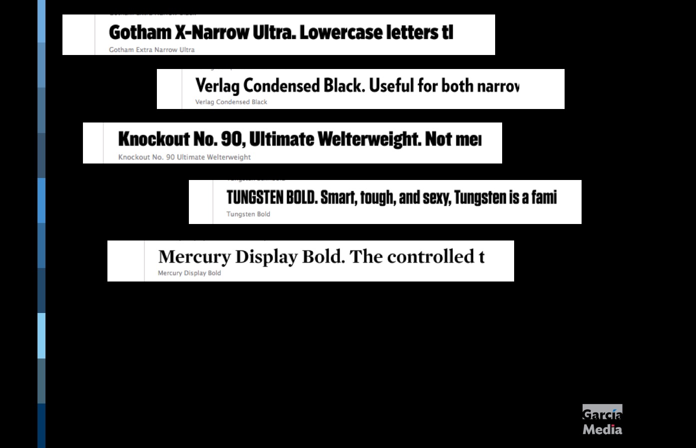
Also interesting news from Hoefler: The font studio has recently put together a list of recommended typefaces for newsprint, which all designers should find useful. This spans agate, text, and headlines.
Here is a link to that list:
http://www.typography.com/collections/newsprint/
Highlights from the list:
I like all the fonts on that list, but my short list from it, based on fonts we have used successfully through the years:
Gotham X-Narrow Ultra—Clean, sturdy and economical.
Knockout No. 90—ideal for making a statement with big, bold headlines (as in tabloid newspapers that depend on streets sales).
Verlag Condensed Black. Great elegant and the sans serif with something extra.
Tungsten Bold—a font that is very legible, strong and works well for tabloid newspapers using a lot of headlines set in all caps.
Mercury Display, an elegant serif, evokes tradition, highly legible. Says class.
While on the subject of fonts
Which font would you date?
http://www.wired.com/2015/09/love-font-much-dont-date/?mbid=nl_92415
First graph:
IF I WERE going to date a typeface, it would probably be something like Franklin Gothic bold condensed. The font is undeniably masculine—sans-serif, solid, reliable. If it were a human, it’d be the type of guy who would fix my broken sink and play football in the backyard on Thanksgiving. I’m not alone here. Lots of women find Franklin Gothic to be a total dreamboat.
Pope Francis visits New York, Washington, DC
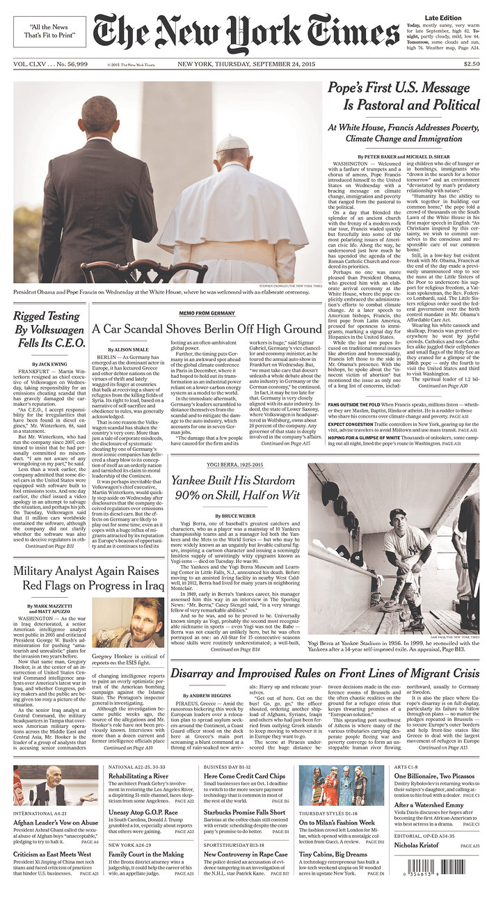
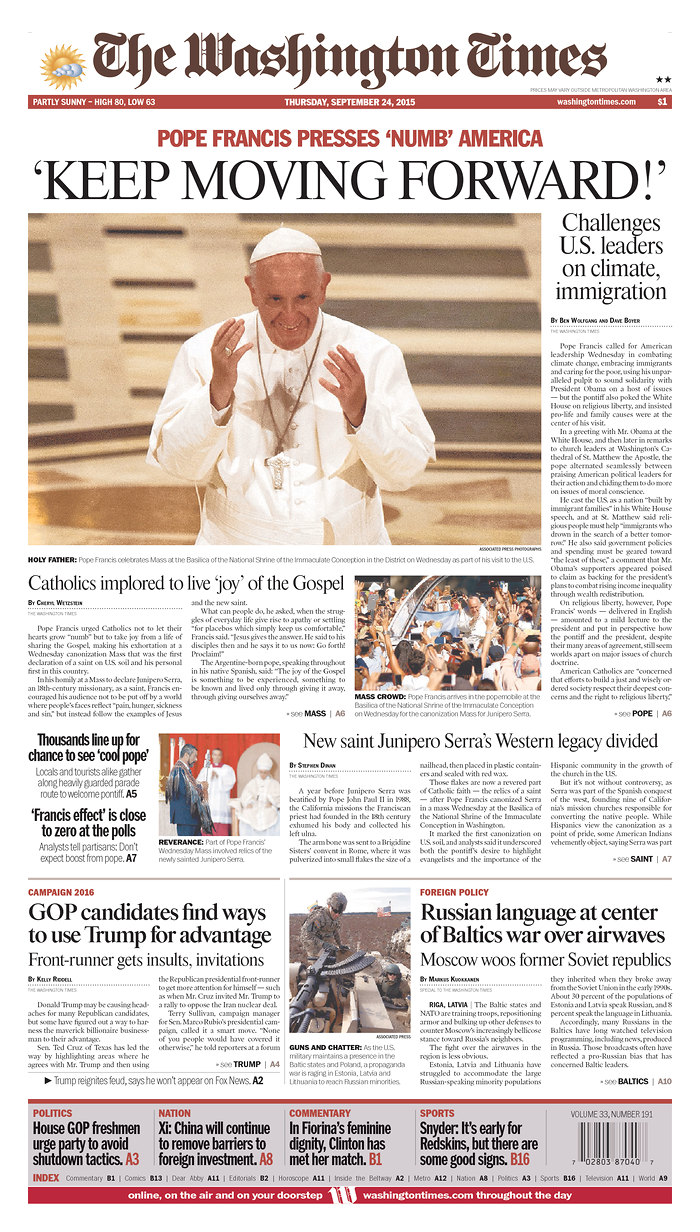
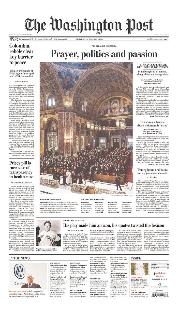
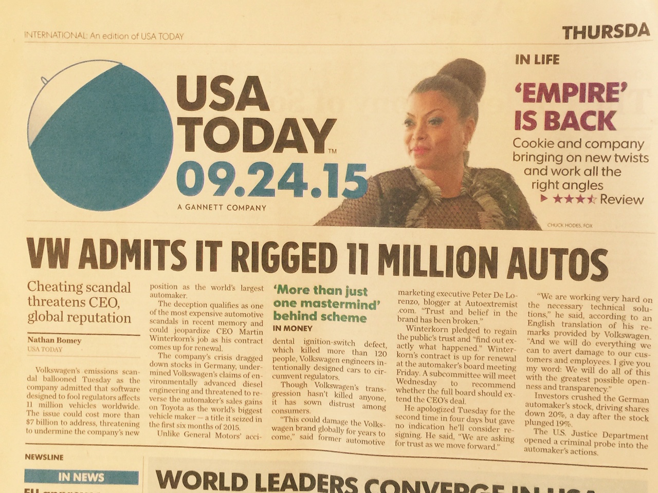
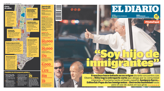
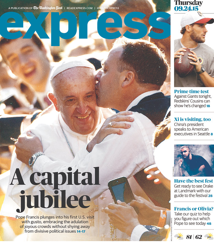
Here are some selected front pages from New York City and Washington DC reporting the Holy Father's visit.
Interesting that USA Today decided to put the Pope's cap right on its logo!
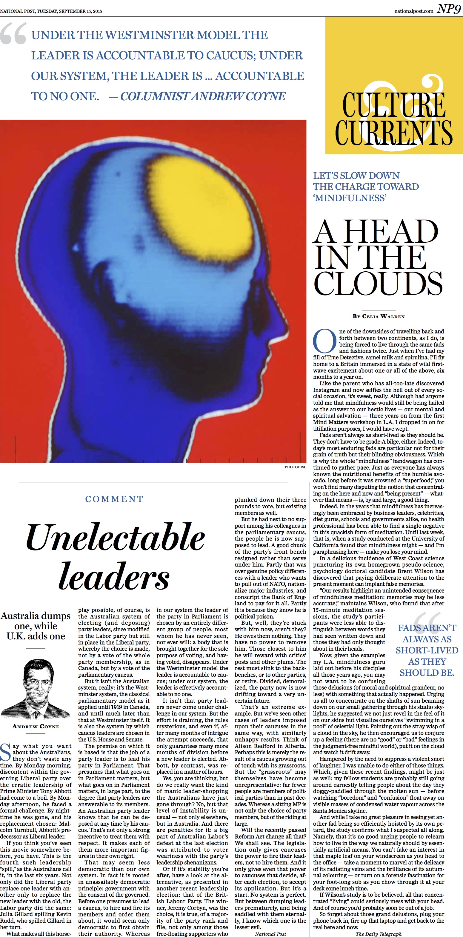
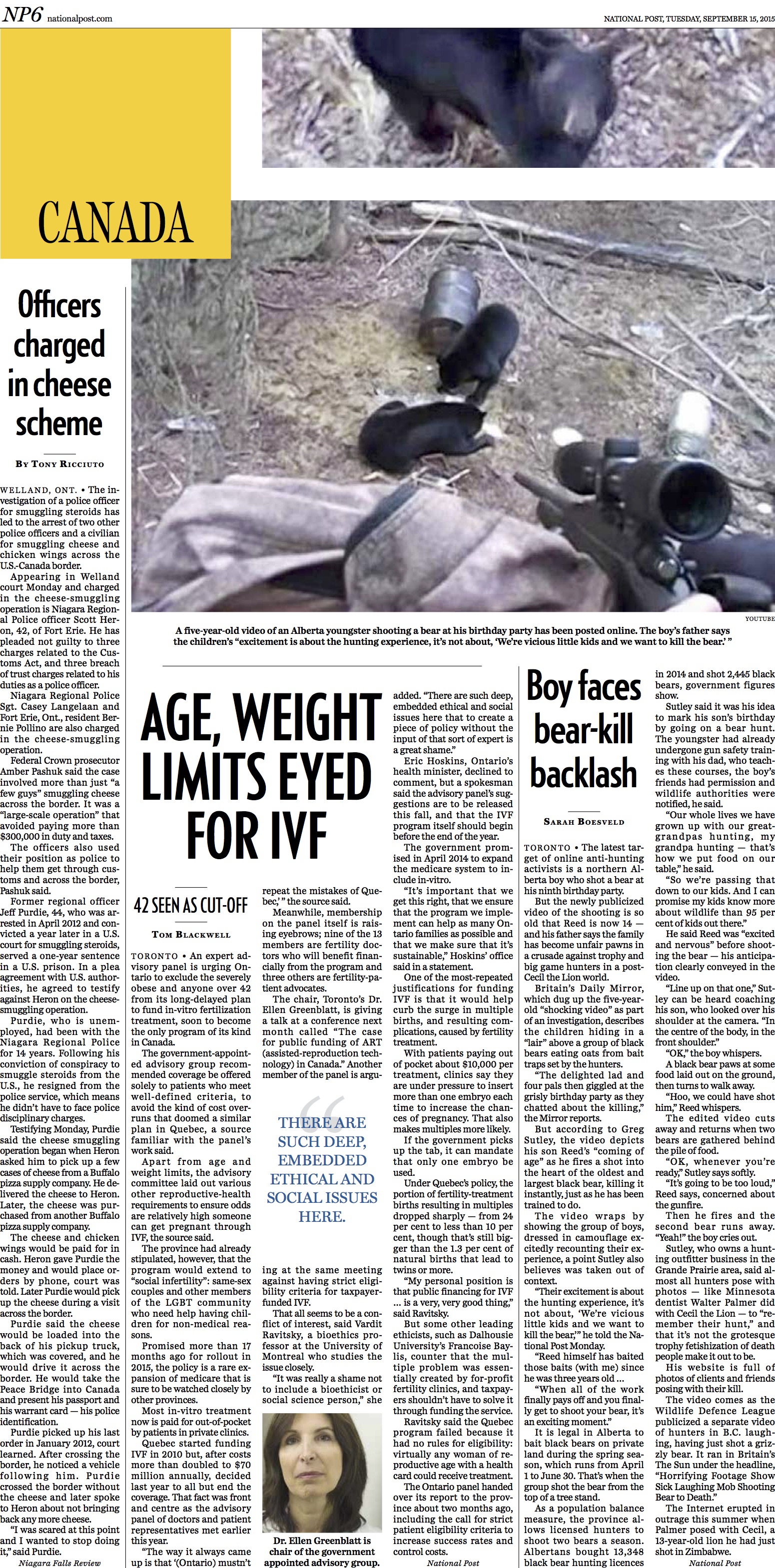
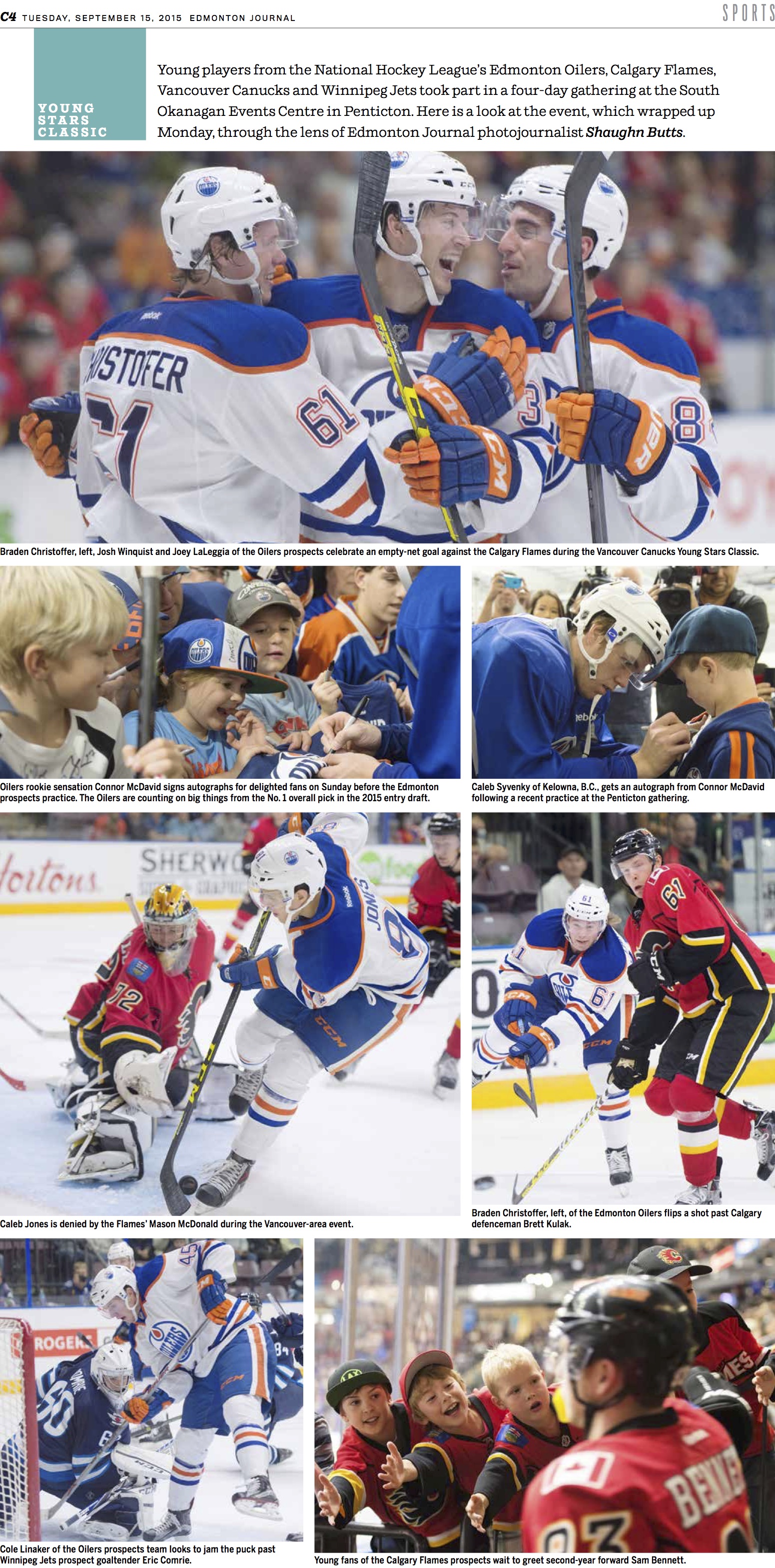
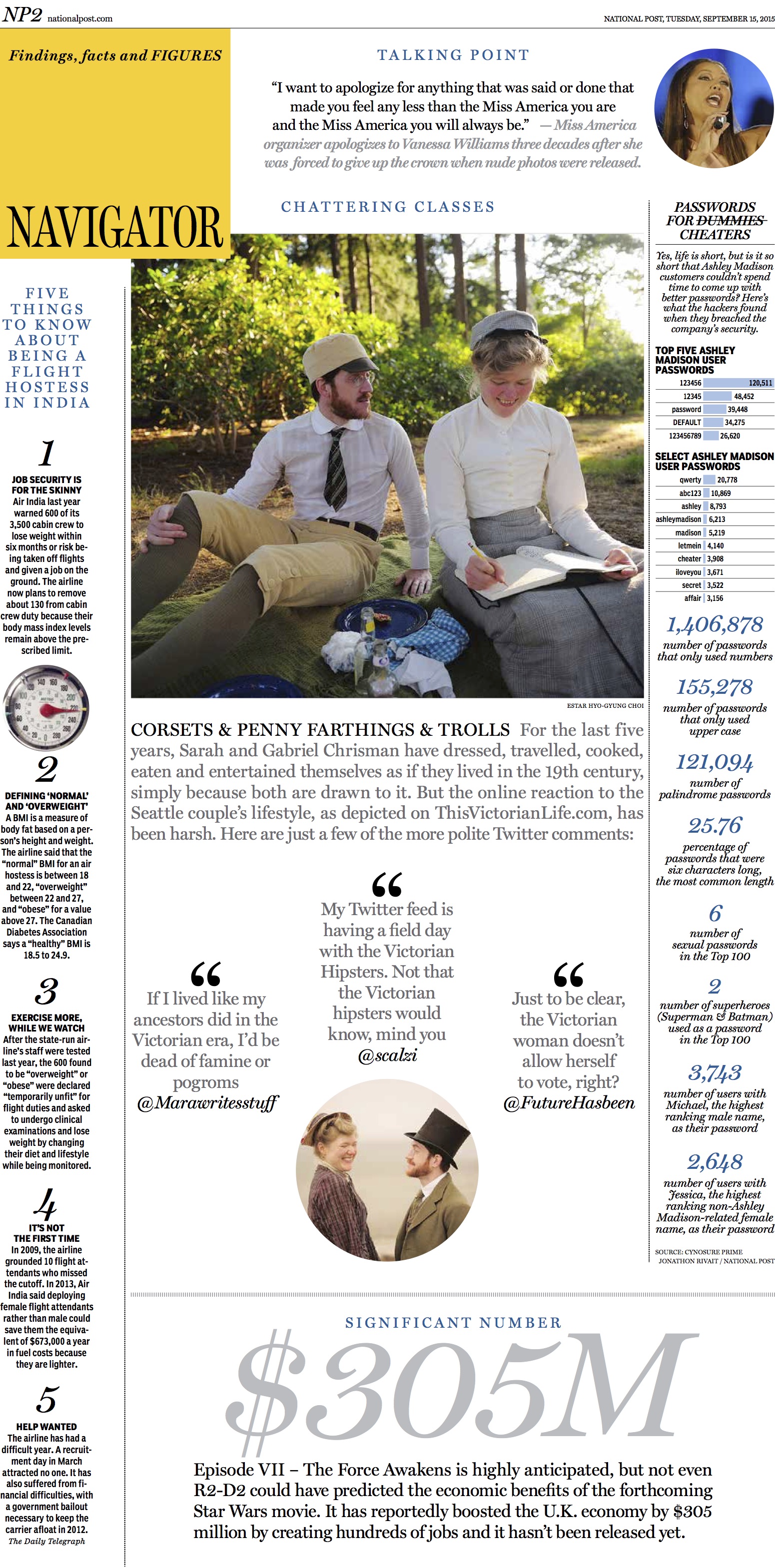
Follow up: The Edmonton Journal rethink
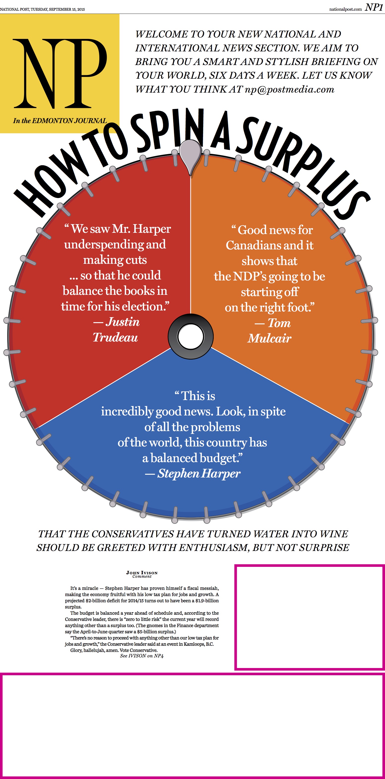
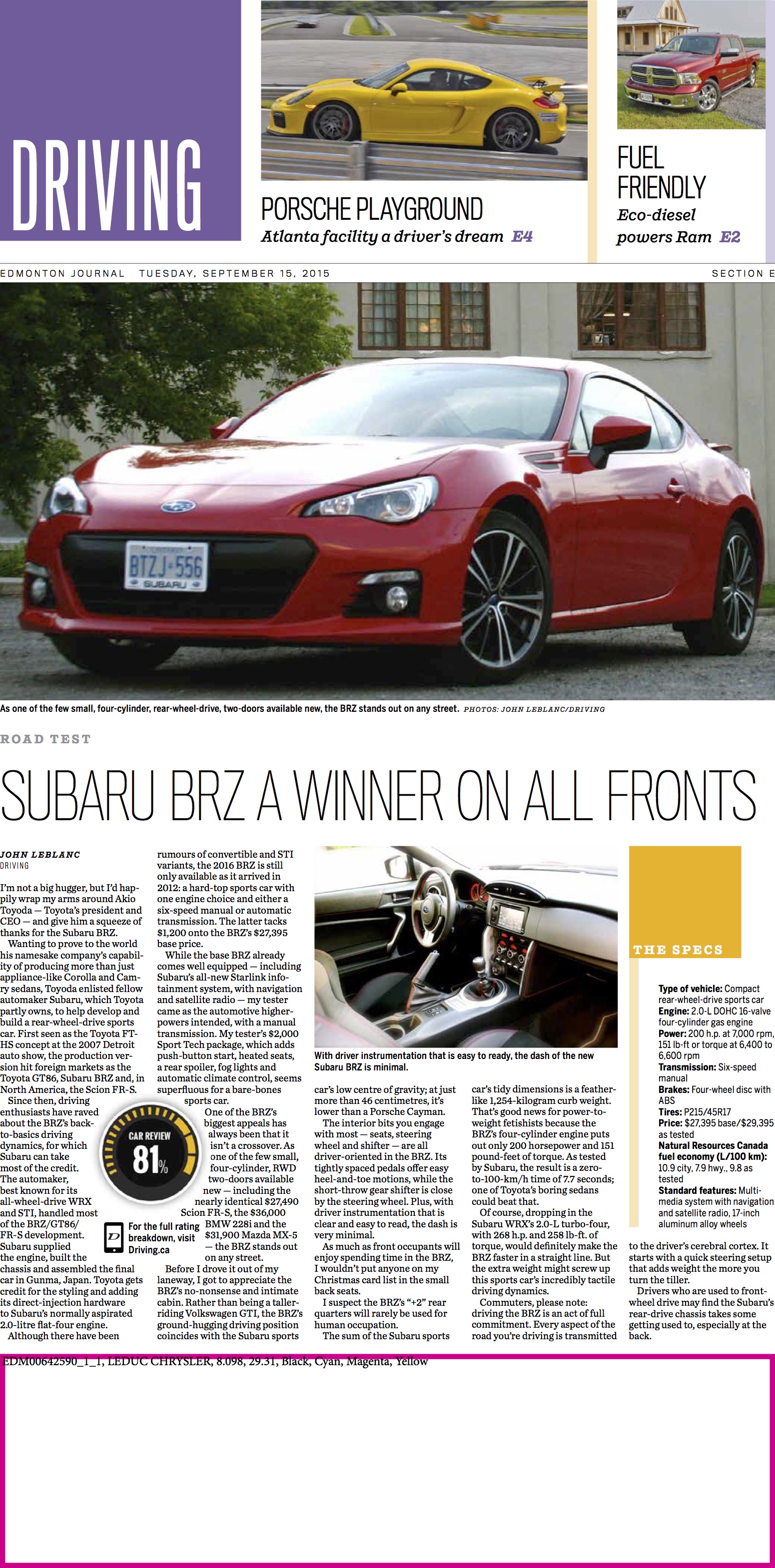
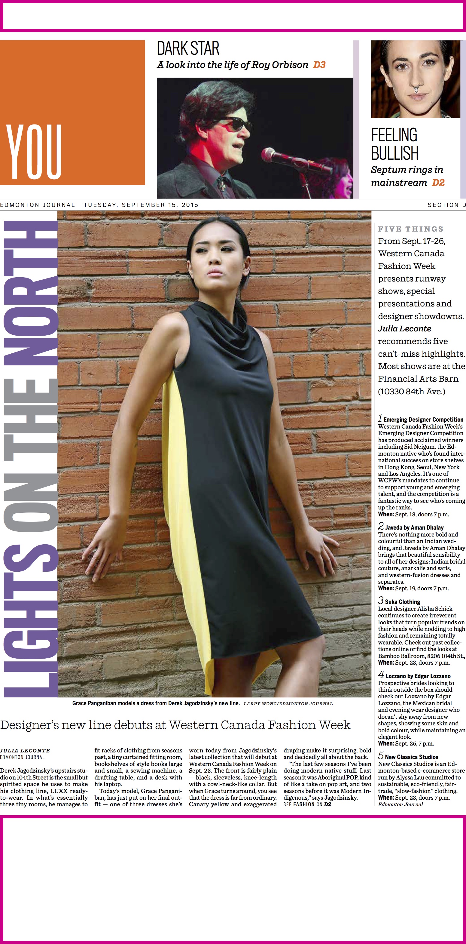
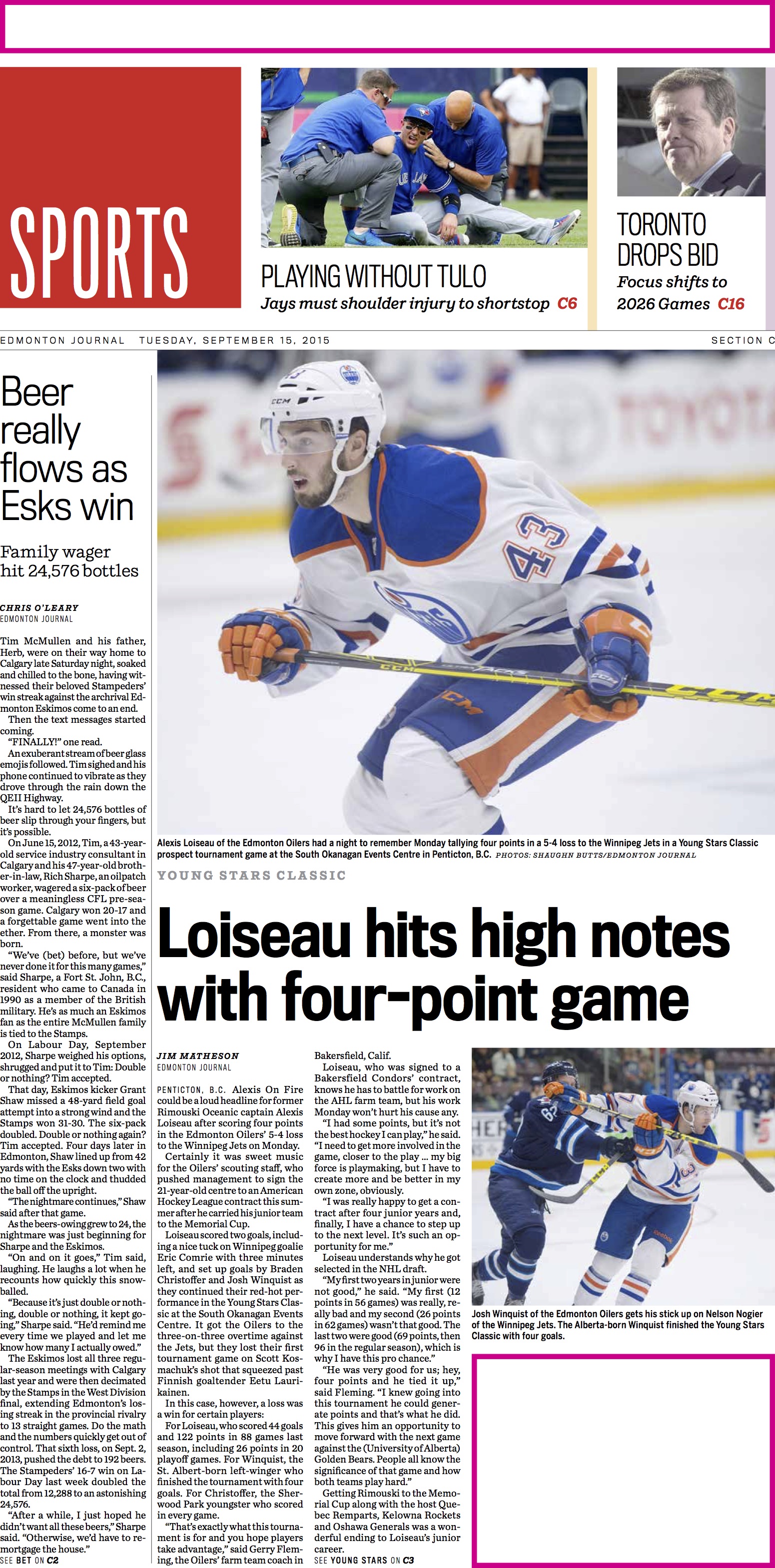
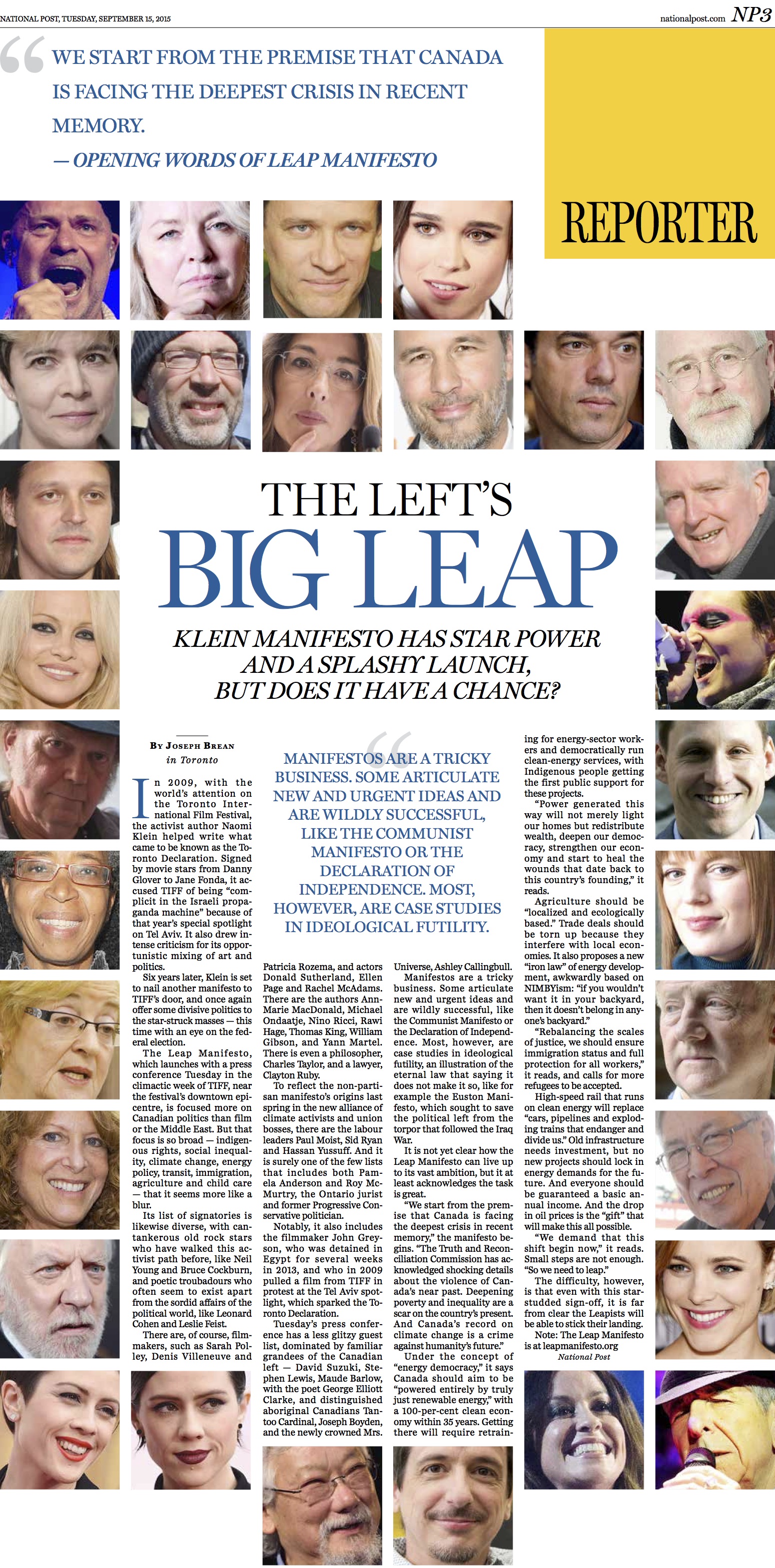
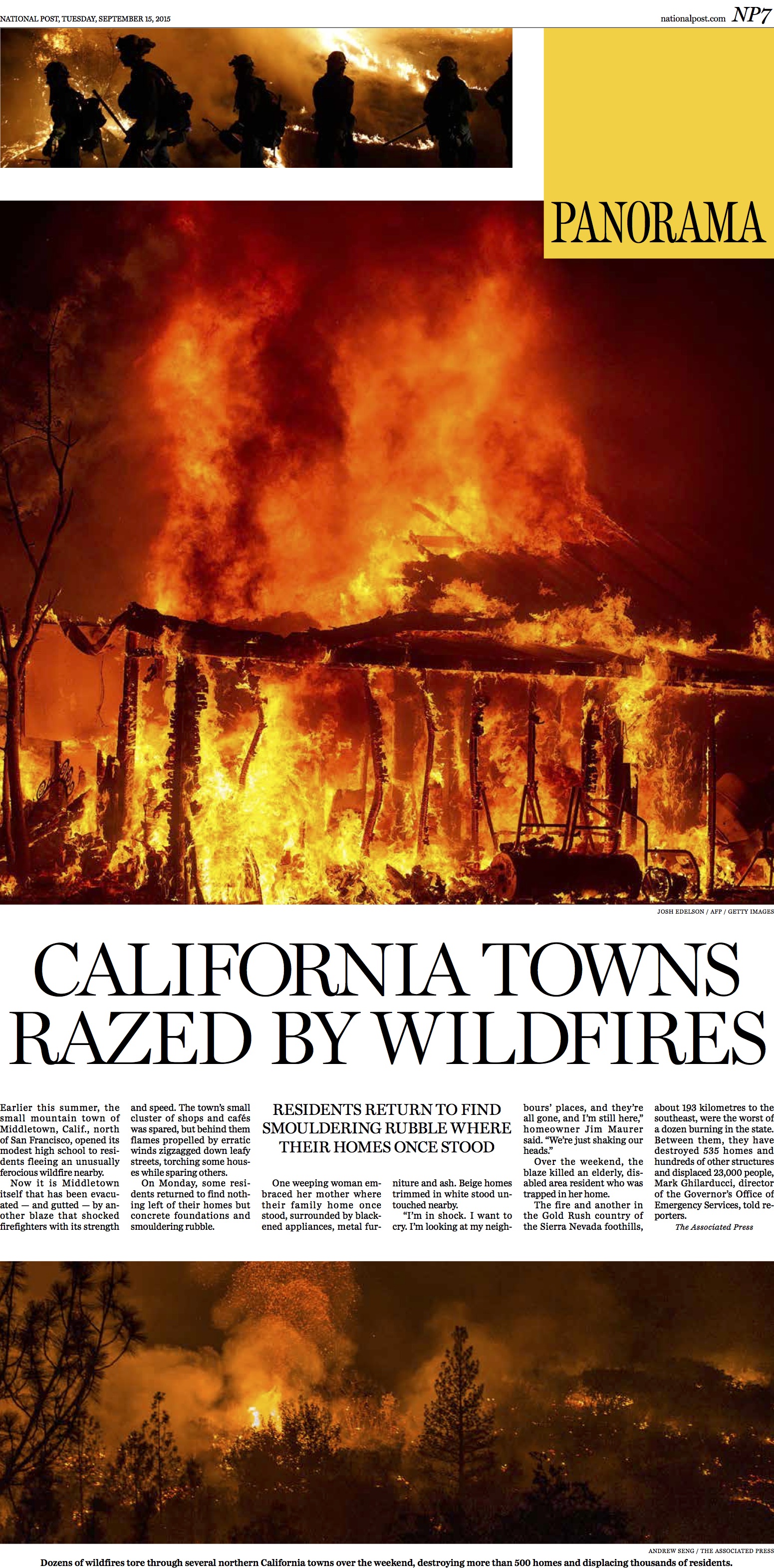
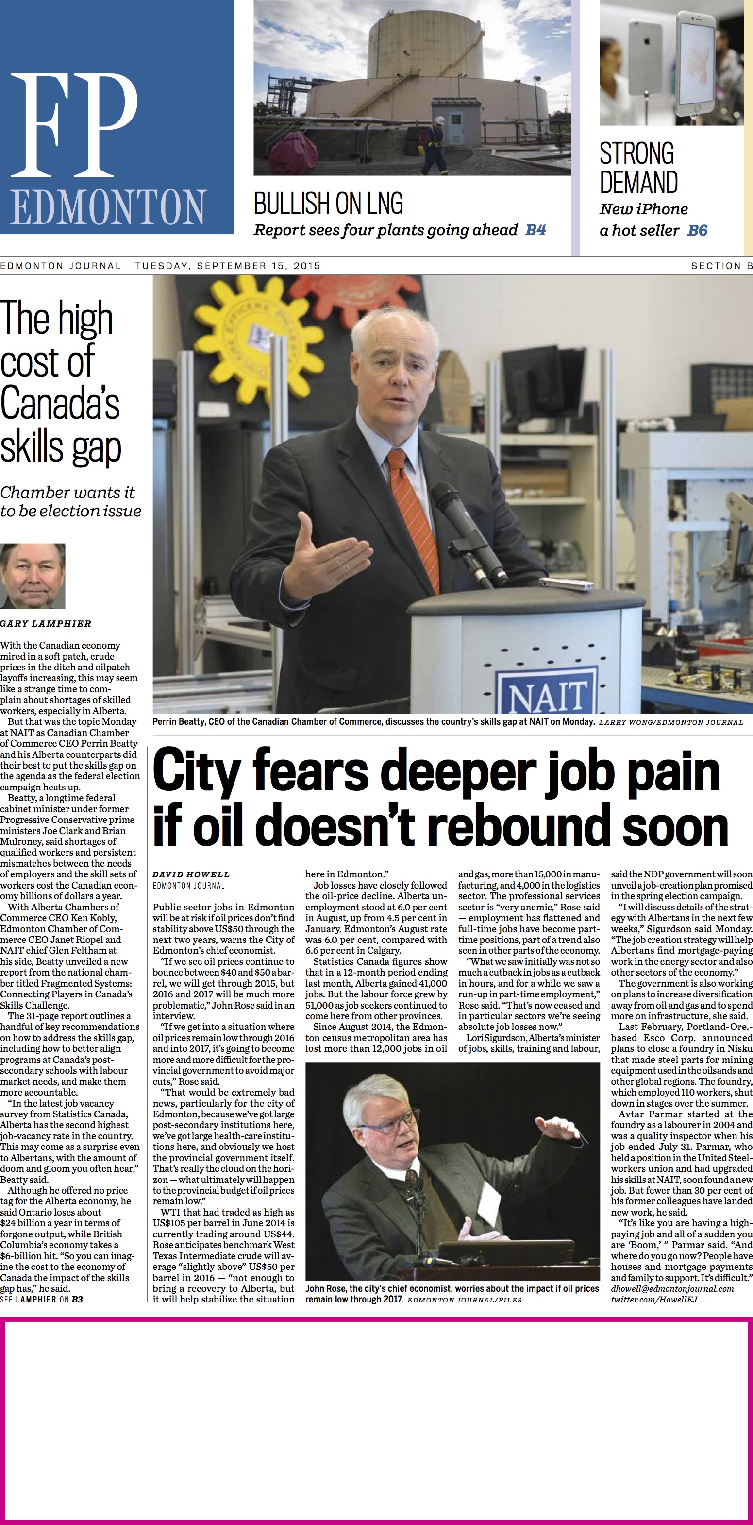
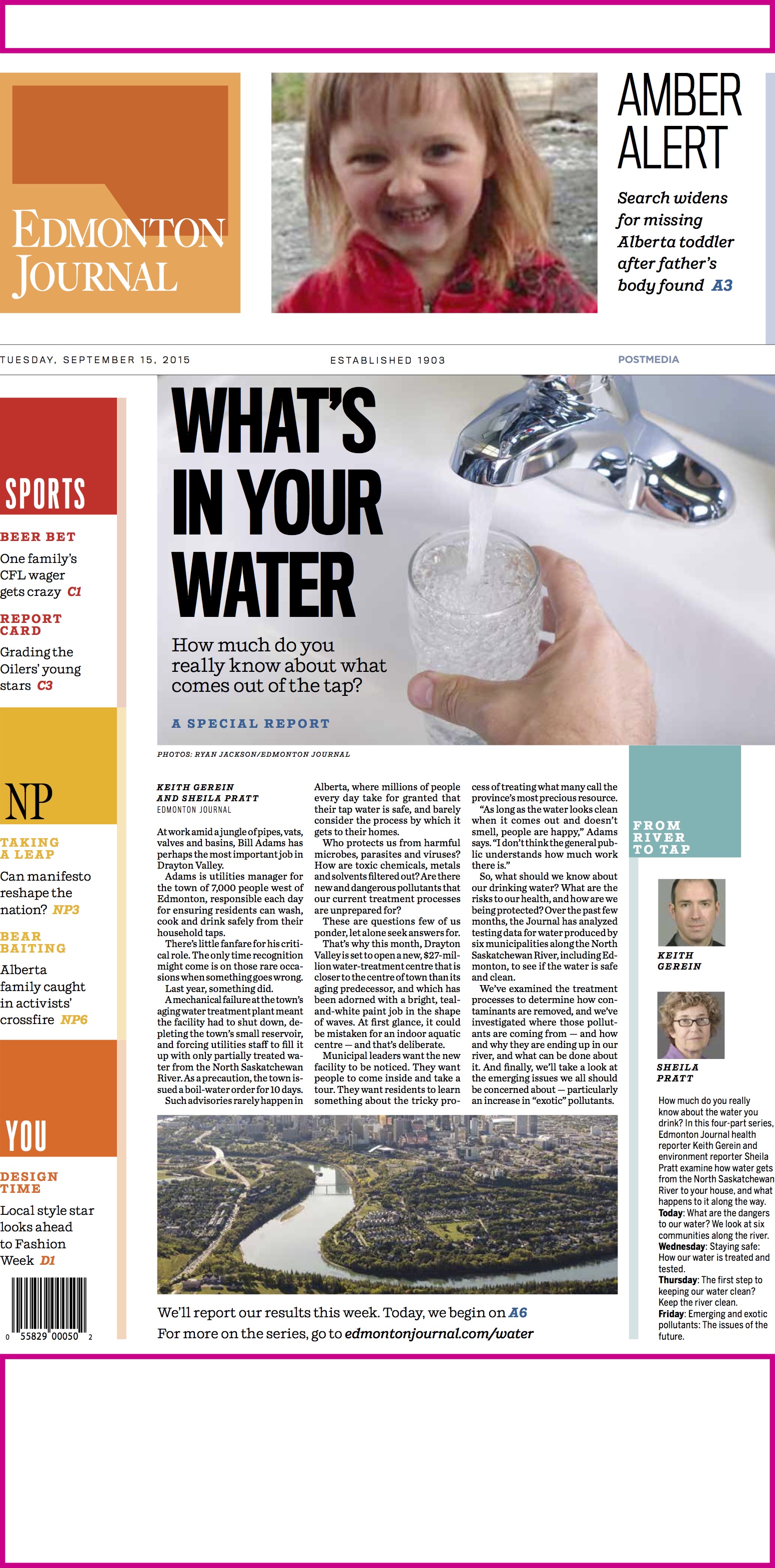
Earlier this week we blogged about The Edmonton Journal becoming the fourth of the Postmedia (Canada) titles launching a new product in a project that we at Garcia Media have accompanied them. Here are sample pages since the relaunch!
For the previous blog:
https://garciamedia.com/blog/edmonton_journal_its_a_new_look_strategy
