TAKEAWAY: Hubs and responsive design can be effective solutions, but they should be fused with a good dose of surprise.

From I Love Lucy; Courtesy: newlantern.com
Responsive design leaves some people feeling, well, unresponsive.
Those two words—responsive design—- resonate in meetings worldwide, and, personally, in my workshops, not five minutes go by before someone in the team asks my opinion of responsive design.
Now I know where to send them: the glorious piece by Joe Zeff headlined “In Response to Responsive Design.”
It is not that Joe has all the answers—-nobody does.
It is not that Joe dislikes responsive design—-not at all as seen in this paragraph of his blog:
“That’s not to say that responsive HTML isn’t valuable, because it is. Real-time content delivery demands HTML to minimize the lag between conception and consumption, and to reach as many customers as possible. At its best, responsive HTML achieves many of the ideals of a well-designed page: order and brand identity, reinforced through consistent typography and color.”
At the core of Joe’s reasoning is something more important than responsive design itself.
We all know that the lure of responsive design is how practical it seems to make matters pertaining to the design of all digital platforms—perfectly rectangular layouts that quickly adapt to resize and reformat to fit your phone, computer and tablet.
Who can be against such practical ease of production?
That is the part we, too, like: responsive design is practical, it goes for the formula, not for the element of surprise. In rough economic times, responsive design and formulas generally can be attractive lifesavers.
Once upon a time with a cropping wheel…..
Old timers like me remember when the production of a printed newspaper or magazine was an almost complete serendipitous affair.
In the days of pica rulers, cropping wheels, paper dummies, glue pots and the blank sheet staring you as you started your design, there was not much of a formula.
One had to start from scratch, nothing I would advocate returning to.
With computers, things became easier, cleaner, less messy, and a little more formula oriented. It was the start of the template-based design operation.
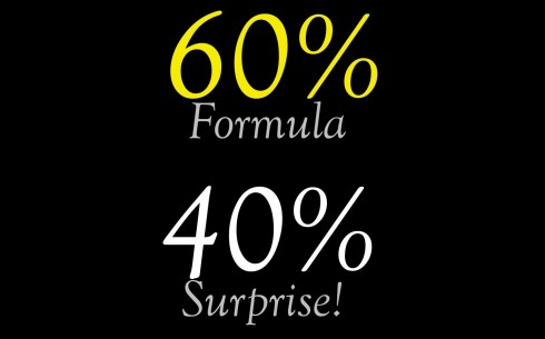
I remember writing and saying: A newspaper should be about 60% formula and 40% surprise.
I still think that this is a practical way of looking at editorial design.
Our publications today would never get off the ground if it was a 100% surprising adventure each day or week or month.
However, like Joe, I appreciate the surprise element, the idea of content guiding the direction of the design, how the page/screen will look, how the storytelling for this specific content will best be served by how it is presented.
And in today’s environment we have many forces conspiring against that, two that I can think of are “hubs” and, in a way, “responsive design”.
There is a push——I am not implying malicious forces here—-to robotize some of our processes. Of course, some of these forces are mandated by economics. Nobody doubts that these are tough times. Doing more with fewer people does not lend itself to spending much time in the Serendipity Lounge.
But we should not create assembly lines, via hubs, where I imagine a designer a la Lucy in that famous episode where she can’t keep up with the chocolates passing in front of her too quickly. Many good professionals are doing the unimaginably good in these tough situations. But it can’t last, and formats and templates—NOT the content—- may end up ruling the day.
With responsive design production ease and practicality may be ideal, but we must insist on room for the surprise element.
One should not eliminate the other. It does not have to be.
We must achieve a good balance, and continue to think of the 60-40 formula.
Surprises are most likely to attract and retain audiences than formulas.
Our challenge in the immediate future, as Joe Zeff also points out, is to make sure that we emphasize content/storytelling surprises which are served well by the formulas that responsive design and template-driven hubs offer.
A winning fusion, in my view.
Of related interest
Take a look at these two new responsive sites recently launched
The World Wildlife Fund’s photo-driven approach (http://worldwildlife.org/)
The Daily Orange, the student newspaper of Syracuse University, created by the same visual design team who worked on The Boston Globe (http://dailyorange.com/).
Our previous blog posts on responsive design:
https://garciamedia.com/blog/articles/an_interview/
https://garciamedia.com/blog/articles/creating_the_next_generation_website_mobilista_2_workshop/
https://www.garciamedia.com/blog/articles/the_new_boston_globe_website_innovative_functional_sets_the_pace/
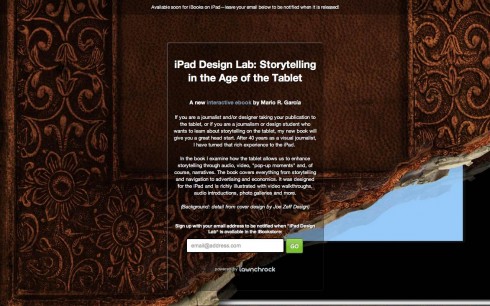
Sign up to get information on my new digital book
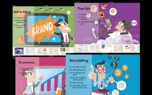
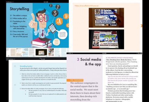
Assorted screens from the book: top, chapter openers all of which are color coded and carry illustrations by Luis Vazquez, of the Gulf News of Dubai; second image, opener of Storytelling chapter, and two inside screens.
As we get closer to publication date for The iPad Lab: Storytelling in the Age of the Tablet, we are now set up so that you can give us your email address and you will automatically be informed when the book is ready for download.
I admit it is an exciting time for us at Garcia Media and for me personally, as my first digital, interactive book, The iPad Design Lab: Storytelling in the Age of the Tablet, gets much closer to publication.
Now you can leave your email address so that you will be updated and informed the moment the book is read for download.
As I review this final version of the book—-is it ever final, especially with a digital book that can be easily updated?—-I am happy with what I see, the result of 8 months of hard work, assisted by my very able co pilot Reed Reibstein, who has edited and art directed the book.
The book’s audience is anyone with an interest in tablets—-including people NOT directly involved in the media but who use the iPad and would like to know more about the thinking that goes behind getting stories, features and visuals into the new platform.
The premise of this book is that the emphasis should be on storytelling. But we know that most of the news apps today emerge from the content that is published in their sister print publications. My book aims at describing how this content can be adapted especially for the tablet, where multi sensory, interactive experiences are possible.
As such, the book is ideal for practitioners of our craft at every level, from reporters, designers and editors, to publishers and managers. At the same time, the book is especially crafted to be a college textbook and companion in any number of university courses, from writing/editing to design and even business courses.
I hope you share our excitement. I urge you to leave us your email address so that you can be kept updated about publication date:
Simply go here:
comingsoon.ipaddesignlab.com
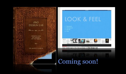
Video walkthrough of the iPad prototype of iPad Design Lab
SPD: Speaker Series Begins with “News You Can Use”

(Joe Zeff Design Illustration, courtesy of SPD)
Tickets are now available for the Society of Publication Designers’ first Speaker Series event of the fall, “News You Can Use,” scheduled Sept. 10.
For more information:
http://www.spd.org/2012/08/speaker-series-begins-with-new.php
SND Scandinavia Space 2012 conference
Still time to get a spot to attend the SNDS conference in Copenhagen, Sept. 27-29;
For more information:
SNDS workshop ever. Read all about SPACE 2012 here:
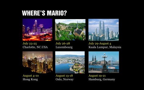
Mario Garcia’s upcoming speaking engagements:
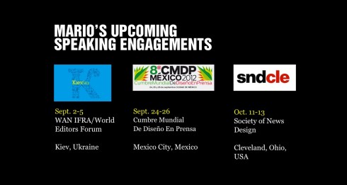
WAN-IFRA World Editors Forum, Kiev, Ukraine, Sept. 2-5
http://www.wan-ifra.org/events/64th-world-newspaper-congress-19th-world-editors-forum
Cumbre Mundial de Diseño en Prensa 2012: Mexico City; September 24-26
http://www.cmdprensa.com/mx2012/
SND (Society of News Design) Cleveland; Oct. 11-13
http://cle.snd.org/