This is the weekend edition of TheMarioBlog and will be updated as needed. The next blog post is Monday, Dec. 2 , and I will be reporting from Hamburg, Germany.
There was a time when you open your morning newspaper and that front page was a mirror full of surprises. You had slept when a lot of those stories happened.
Not anymore.
Nowadays, if we come in touch with the printed edition of a newspaper, the eyes wander from one headline to the next, looking for something you didn’t know about. That was my experience as I picked up a copy of The Wall Street Journal at the Delta Sky Lounge this week.
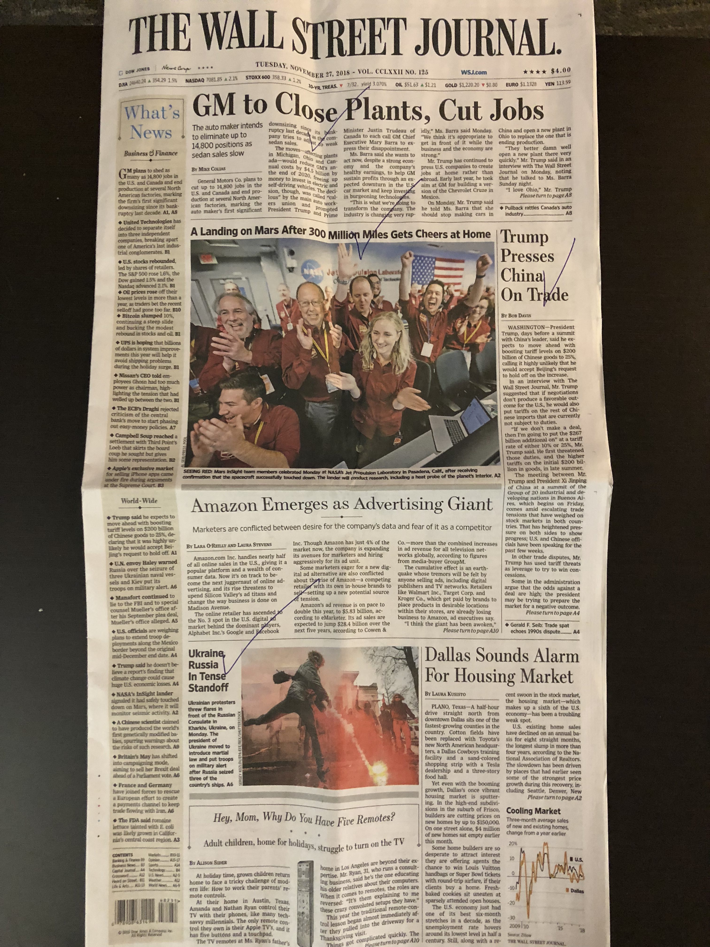
Here is that front page, by the way. I have put a checkmark next to the headlines of stories I already knew well:

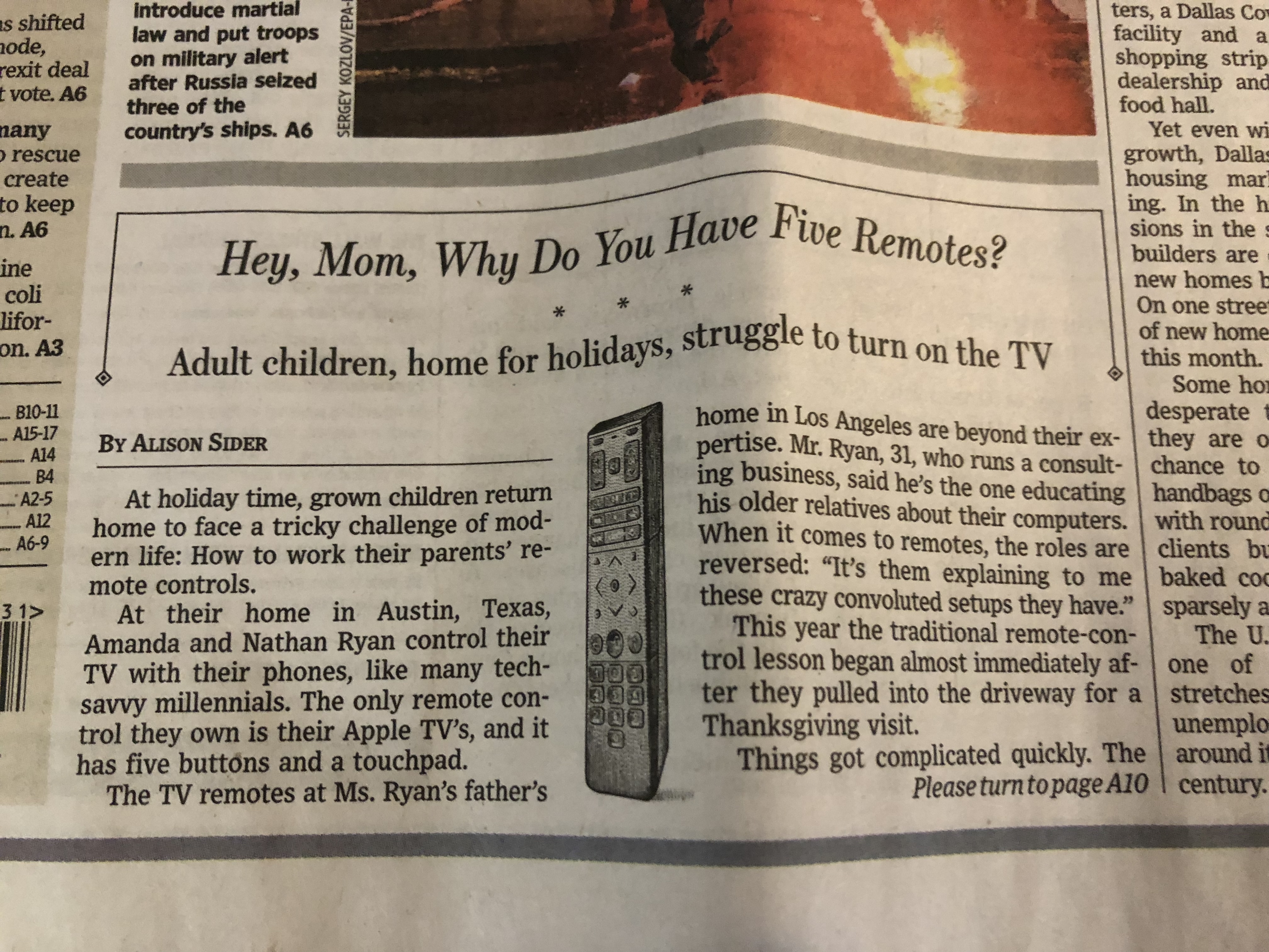
I knew about every single story there, except for one, the one that read:
Hey, Mom, Why Do You Hae Five Remotes?

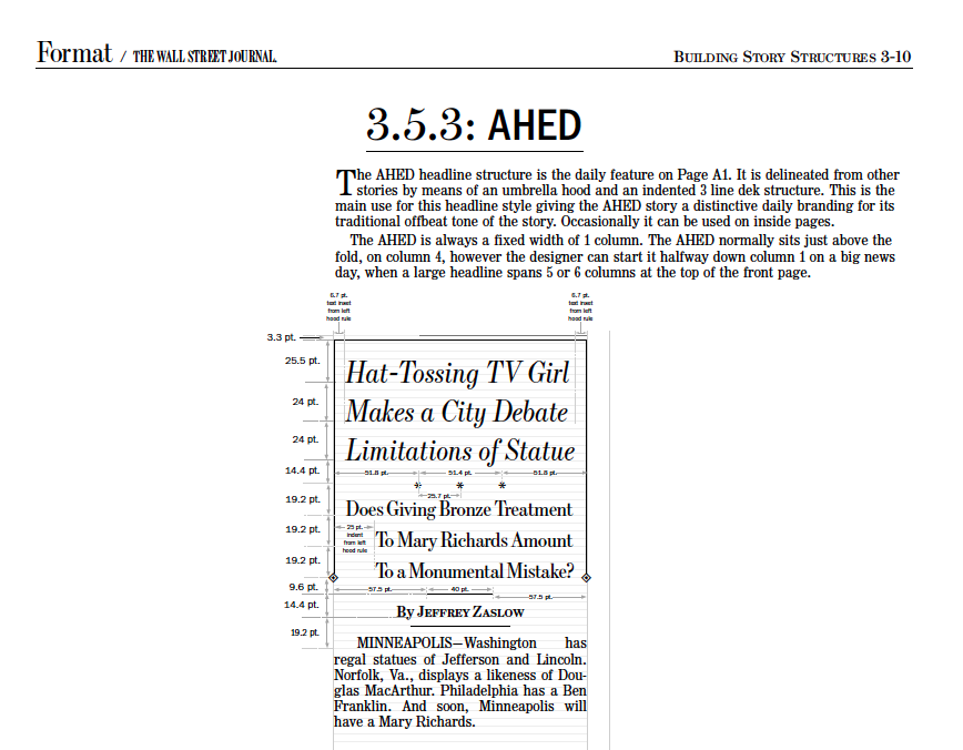
That was the story below the fold, what the WSJ filks refer to as the A-head, perhaps because the box above it with the diamonds hanging at the bottom is in the shape of a letter A.
I remember how meticulously editors of the WSJ guarded that spot when we were redesigning the newspaper in the late 1990s. The A-Head story has been there for decades. It is the off the cuff story, what other newspapers refer to as the “honey” story, the one that makes one spouse jump with joy while reading the morning paper and tell her partner:
“Hey, honey, did you read this story…..”
Here is the configuration of the A-Hed story as per the WSJ Styleguide:

Well, perhaps the honey story should be required front page material for every printed newspaper in the globe.
It engages.
It feels fresh.
It is the one story that you have not seen around for the past 12 hours.
In this case, the story in the WSJ was all about adult children who come to visit their parents and are at odds with how to handle the old folks’ TV remote controls.
Funny. Engaging. And, no, I had not seen that story anywhere until I found it here. The invisible story.
I have been an advocate and fan of honey stories for decades. Well, it must be a requirement if you still have a printed edition of your newspaper.
Readers always welcome surprises.
Behold the A-Hed, the honey story and any other surprise the editor can offer us on Page One.
Pages We Like

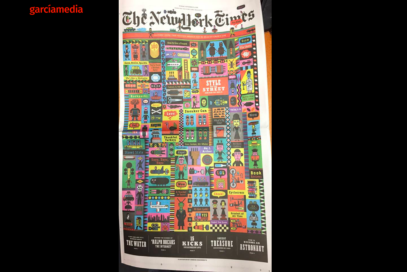
The NY Times’ Kids Section is a favorite. This time, designer Debra Bishop, has come up with a stunning concept for kids of all ages.. Cover art by Henning Wagenbreth. Fun, and, I am sure, not just for the kids in the house.