Update #1: San Jose, California, Thursday, Jan. 10, 07:11
TAKEAWAY: Mario R. Garcia and Jon Wile recount the lessons they learned while working on the Silicon Valley Business Journal. PLUS: Reed Reibstein takes a close look at the identity system, type palette and iPad style guide for SVBJ.
Tomorrow in TheMarioBlog: Our coverage of the Silicon Valley Business Journal concludes, with a look at storytelling in the modern media ecosystem
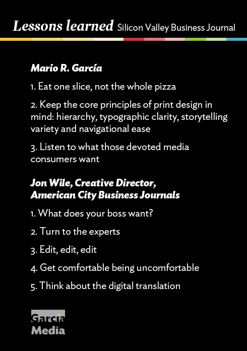
Mario R. Garcia: Lessons I learned from American City Business Journals
During the course of our work with the team of American City Business Journals, and, specifically, the Silicon Valley Business Journal, we learned valuable lessons we recall as the first edition of the newly rethought edition has appeared.
Lesson 1: Eat one slice, not the whole pizza
First—and this is a reminder more than a lesson, as we learned the basic lesson some 500 redesigns and 30 years ago!—even though projects may seem unsurmountable at first, it is a matter of not looking at the entire pizza, but the one slice you can digest.
This is how I approached this project. I did not think of the 40 titles that will eventually undergo change, but just the one. Now the San Jose model will be the guiding light for the rest.
Lesson 2: Keep the core principles of print design in mind
Second, there are some basic principles of the design of a printed newspaper that are the same, no matter the format, frequency of publication or audience:
Hierarchy: A designer must communicate the relative importance of each item on a page to the reader in a few seconds. Each page of the new Silicon Valley Business Journal adheres to this principle. Headlines are bigger and bolder at the top, diminishing in size as the reader moves down the page. Also at play here are the weight of headlines and the mix of serif and sans-serif.
Typographic clarity: While fonts must be as aesthetically pleasing as one can make them, it is even more important that type be easy to read. Our work in this area for the Silicon Valley Business Journal demonstrates this principle. By mixing what we consider to be just the right fonts, we have developed both readability and good aesthetics. (See more detailed information on SVBJ’s type palette below.)
Storytelling variety: One of the first strategies we tackled in the earliest workshop for Silicon Valley Business Journal has been to create clearly identifiable storytelling formats. With these, readers will be able to identify a lead story, as opposed to a secondary or compact story, a brief, an interview, a list or a photo story.
Navigational ease: This is key since many of our readers bring a digital mentality to print, no doubt. A good map to the journey starts on page one, but it cannot be just a senseless table of contents. Instead, a well thought-out navigator emphasizes a select number of stories that the reader must know. And it also includes those stories that I refer to as the bonbons in the box—the take-them-or-leave-them part of the week’s content, but that still may be informative, entertaining and even provide readers with good cocktail party conversation or tips for the best mojito in town.
Lesson 3: Listen to what those devoted media consumers want
Third among the lessons learned: We had very thorough focus groups with various groups of readers of the Silicon Valley Business Journal. They were among the most informative I have attended (and, believe me, I have seen hundreds of sometimes rather tedious focus groups). I learned that SVBJ readers are fond of their newspaper, devoted to their newspaper and read it across platforms. No surprises here.
What surprised me and my colleagues were the revelations from many of those youngish habitual readers of the SVBJ: When asked how much time they spend consuming news, I recall them saying between 60 and 90 minutes, and some even longer.
Behold these devoted media consumers. I remember when we in this business would celebrate if readers spent 37 minutes—that was the top figure in the ‘80s—with our newspapers. This means that there is tremendous value in what the media quartet can do to keep a brand, a product and its content, in front of an audience. It is a win-win situation for all.
It is, I believe, my most important lesson from this project.
We in newsrooms have not begun to explore the concept of brand extensions seriously enough.
The new Silicon Valley Business Journal is a reminder to spearhead such thoughts and put them into action.
Jon Wile: The lessons I learned
Jon Wile is the creative director of American City Business Journals. He collaborated closely with Garcia Media on this project, bringing his great professional with all aspects of news design expertise to bear.
Mario Garcia has redesigned 658 newspapers in his career; I now have one under my professional belt. With that in mind, here are some lessons I learned on this project:
Lesson 1: What does your boss want?
This reinvention project was up and running for about six months when I joined American City Business Journals in the newly created position of Creative Director. I struggled the first few weeks to grasp certain elements of the redesign because I had missed some of the initial workshops between ACBJ and Garcia Media. I tried to jam through ideas that had already been brought up or veered too far from the core mission. In a moment of clarity, my boss, Emory Thomas, sent me a long e-mail explaining his thoughts and expectations for the redesign/reinvention. The light bulb finally went off! From that moment on the project made more sense; my questions became sharper and my designs more poignant.
Takeaway: Ask your boss for his or her thoughts up front. Communicate early and often to clarify redesign goals. Understand the goals of the project.
Lesson 2: Turn to the experts
I know my way around typography and color, but there were members of the Garcia Media team who were far more knowledgable in this area than I was. Initially, I was too timid to ask questions about things I didn’t know, but the more comfortable I became with the project, the more I began to ask questions. I learned a great detail about the finer details of sophisticated typography and now will be a better teacher because of it.
Takeaway: Never be afraid of admitting that you don’t know everything. Ask questions and seek explanations. You will be a better designer because of it.
Lesson 3: Edit, edit, edit
Every time I redesigned or tweaked something, the pages improved and the visual identity of the redesign became more clear. We produced a 24-page shadow issue to see how all the pieces worked, and we continued to refine after seeing the results. Working with Reed Reibstein and Mario made the pages better. Getting feedback from my boss and editors and publishers of ACBJ made the pages better. Even showing pages to my girlfriend, Kristen, made them better.
Takeaway: Don’t design in a vacuum! Everyone you know is a reader and consumer of news, so test the redesign on them.
Lesson 4: Get comfortable being uncomfortable
There were times when I would design something and publishers and editors at ACBJ felt that it should be done differently. Talking through the situation and understanding their concerns was crucial in coming up with design solutions that everyone liked. There are going to be people in your company who know more than you about the audience, the product and the institution. Use their knowledge to your advantage and make your designs stronger because of it.
Takeaway: The design of a major project like this is never truly yours, so don’t think that it is. Understand that criticism usually makes the product better, as long as you understand the how and why of the criticism.
Lesson 5: Think about the digital translation
You can no longer redesign a printed newspaper and not think about the digital translation. As Mario has chronicled many times in this blog, readers are turning to the “media quartet” to satisfy their hunger for news. I worked closely with Will Hortman (UX director for ACBJ) and his team to determine how elements of the print design could translate to the web site. Font selections, colors, logos and other design principles were discussed so we could maximize the branding and design identity across platforms. Will’s input helped steer print design decisions so the implementation across platforms was more unified.
Takeaway: Use design and branding commonalities to inform readers that they are interacting with your product, regardless of platform.
Reed Reibstein: Looking closely at the details
Reed Reibstein is an art director & project manager with Garcia Media
Now that we have seen the new Silicon Valley Business Journal and the evolution of its design, we should take a deeper look at some of the constituent elements—the identity system, the type palette, and the iPad style guide.
Identity system
One of the greatest challenges of this project with ACBJ was developing an identity system that could work for all the more-than-forty titles in the group across the U.S., from Albany to Wichita. We had to create a memorable Business Journal logo that could exist both atop the front page and on its own as the representative of its market.
To accommodate the wide range of applications where a modern media company’s logo must appear, we felt it was more important to develop identity elements that could evoke the brand rather than a single, inflexible logo that had to work everywhere. Therefore, each title will have three icons: what we call the nameplate, the strip, and the monogram. The nameplate is the most prominent, appearing on the front page and homepage of the Business Journal, while the other two are to be used in more limited circumstances as accents.
Tomorrow’s blog post will review how the identity system applies to print and digital alike.
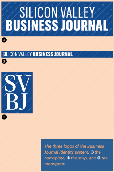
There are four elements that are common to all three icons and form the core of the Business Journal identity system. The first is a rectangular container that sets the logos off from the environment. The second is the pinstripes, thin diagonal lines that suggest elegance and sophistication. They also evoke classic business attire, underscoring the Business Journals’ professionalism. The third is the signature color of each Business Journal—either Sapphire (blue), Ruby (red), or Emerald (green). The fourth is the typography, which matches the type palette used in the print and digital editions. The sans-serif Graphik Extra Condensed is the modern and neutral choice for both the nameplate and strip, while Acta Headline gives the monogram a classic feel.
Type palette
Speaking of the type palette: As with the identity system, the onus was on our team to select typefaces that could (1) work with our new design and communicate its energy and newsiness, (2) work for all forty-plus titles, and (3) work both in print and on the web. We ultimately selected three type families: Acta by Dino dos Santos for DSType, Graphik by Christian Schwartz for Commercial Type, and Guardian Agate Sans by Paul Barnes and Christian Schwartz for Commercial Type.
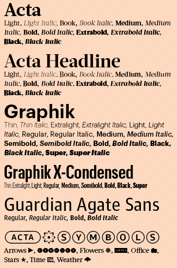
The full type palette for American City Business Journals
Acta is the main player, as the serif used for headlines and body text. It has an unusual enthusiasm for a newspaper typeface—though not too much to allow the words to speak without interference.
For secondary information, such as bylines, info boxes, subheads and page flags, we selected Graphik as the cool counterpoint to Acta’s ebullience. We employ the Extra Condensed width for a sophisticated touch in labels.
Given the amount of small “agate” text in the Business Journals, we needed an eminently legible type family optimized for the harshest conditions. We found that in the open apertures and ink traps of Guardian Agate Sans, which appears in the Lists and Leads.
iPad style guide
Given the cutting-edge nature of this project, it made sense to develop the style guide for iPad rather than only print. Using the Adobe Digital Publishing System, the team at ACBJ will be able to update the style guide across all markets easily and quickly as more papers take on the Project Pinstripe design and elements evolve. For those who do not yet have iPads, we can easily distribute PDFs as well.
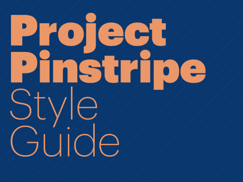
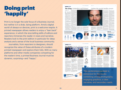
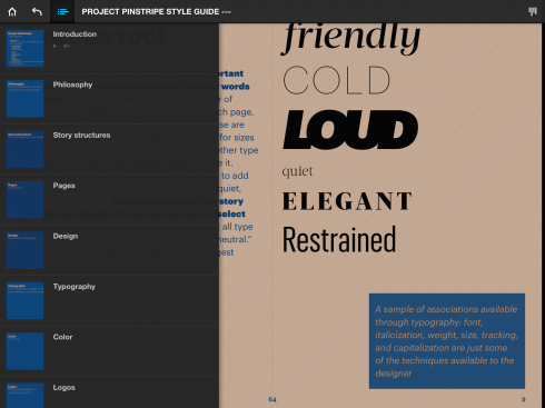
Screens from the iPad style guide for ACBJ’s “Project Pinstripe”
This style guide was a bit different than the last iPad style guide we created for Gulf News of Dubai. We wrote more explanatory text than is typical for a style guide so that Business Journal staff across the country will be able to not just implement the updated design, but also understand as much as possible the thinking behind each decision. It is also written for all Business Journal staffers—designers, yes, but also editors, reporters, photographers, copy editors and advertising associates. It begins with Business Journal philosophies for journalism and serving the readers, and only later delves into the nitty-gritty of design. This style guide is not made to be admired for a day and then forgotten; it is to be a living document, able to evolve as the Business Journals do.
Previous posts on the Silicon Valley Business Journal
The new Silicon Valley Business Journal is here!
A new start for the Silicon Valley Business Journal in 2013
The design of the Silicon Valley Business Journal, from prototype to reality
Page of the Day
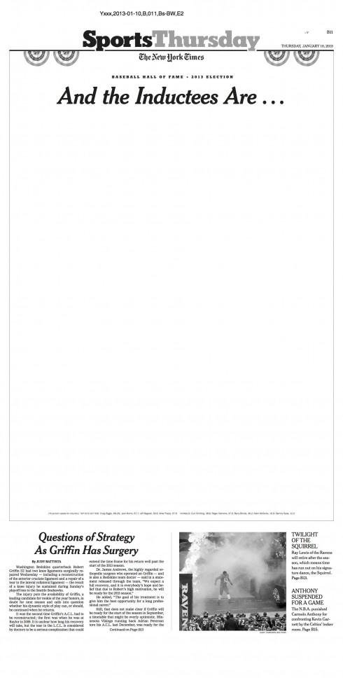
Today’s opening sports page of The New York Times is special, with lots of white space, but what a terrific way to tell the story of how not a single baseball player got inducted into the Baseball Hall of Fame. Voters for the Hall of Fame rejected the candidacies of Barry Bonds and Roger Clemens for alleged use of performance enhancing drugs. For complete story go here: http://www.nytimes.com/2013/01/10/sports/baseball/no-players-elected-to-baseball-hall-of-fame.html?ref=sports&_r=0

Take advantage of our iPad Design/Ad Lab workshops

Do you want to take your brand to the next level by creating a tablet edition? Garcia Media can help. We now offer one- to two-day iPad Design Lab workshops on demand to jumpstart your presence on this exciting new platform. We also offer iPad Ad Lab workshops to develop engaging advertising models for your app. Contact us for more information.

Purchase the book on the iBookstore
The EPUB version of book is HERE:
Now available: The EPUB version of iPad Design Lab: Storytelling in the Age of the Tablet, ready for download via Amazon.com for Kindle:
http://tinyurl.com/8u99txw.
Here is how you can get the book:
The original version of the book is the multitouch textbook version available on the iBookstore for iPad (iOS 5.0 and up): https://itunes.apple.com/book/ipad-design-lab/id565672822. This version includes video walkthroughs, audio introductions to each chapter, swipeable slideshows, a glossary and a sophisticated look and feel.
Apple only sells multitouch textbooks in certain countries at this time, unfortunately. Copies are available in at least the following countries: Australia, Austria, Belgium, Canada, Finland, France, Germany, Great Britain, Greece, Italy, Latvia, Luxembourg, The Netherlands, Poland, Portugal, Romania, Slovakia, Spain, and the United States.
For those in other countries and without an iPad, we have made the book available in a basic edition for other platforms. This basic edition includes the full text of the original, along with the images and captions, but lacks the other features such as audio and video. It is available on the following platforms in many countries:
Amazon Kindle: http://amzn.to/SlPzjZ
Google Books: http://bit.ly/TYKcew
Take a video tour of iPad Design Lab
“iPad Design Lab” trailer on Vimeo.
Read the Society of Publication Designers’ review of The iPad Design Lab here:
http://www.spd.org/2012/10/must-read-ipad-design-lab.php
Garcia Interactive: a world of information

Keep up with Mario Garcia Jr.. via Garcia Interactive: helping transform online news since 1995.
www.garciainteractive.com