TAKEAWAY: It’s elegant, sleek and effective. The new Yahoo News Digest app also leads in highlighting the need for curated news content at certain times of the day.




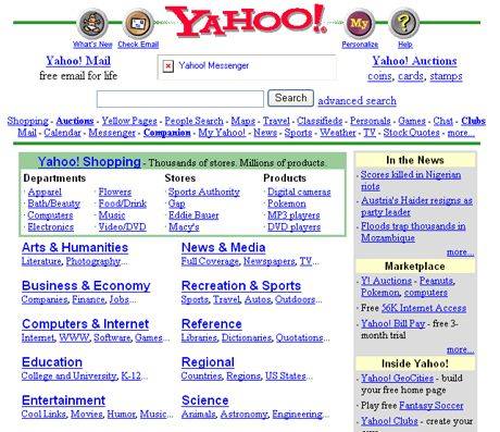
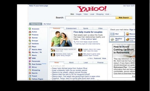
These are early version of Yahoo.com: crowded and without a sense of order and hieararchy
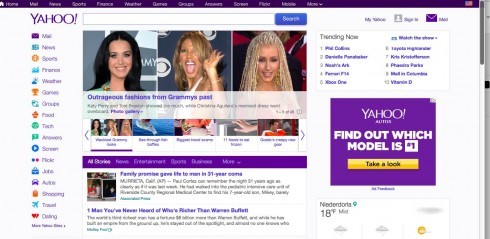
The current Yahoo website: much improved since early days
Once upon a time there was a website so busy that it looked like the window of a hardware store: the perennial 25 hammers, 1000 nails and assorted other tools, all parading before your eyes.
That website was Yahoo.
It had no sense of hierarchy, as all elements had pretty much the same weight and sense of importance on the screen.
With time, Yahoo cleaned up its home page and made it easier to navigate, creating a center of visual impact through one image and, overall, making attempts to improve the visual train wreck that the original was.
Now, Yahoo has launched its news app, Yahoo News Digest, and it is sleek, elegant and even minimalist—-a word would have never associated with Yahoo’s previous visual detours.
But, beyond the visual presentation, what is interesting about the Yahoo News Digest is that it emphasizes curated content which we know audiences crave for. The emphasis is in what the Yahoo editors think “you must know”. What you will get with Yahoo News Digests is about 10 or so news stories from Yahoo’s network, twice a day: once in the morning, and once in the evening, not too different from how metropolitan newspapers traditionally planned their editions.
This reinforces three points I constantly make in my work with newsrooms globally:
1. Today’s audience has a big appetite for news and information, and so they appreciate the constant flow of information.
2. Today’s audience also wants a bit of the curated, or “static” editioning that comes two or three times a day, at a specific time and in which they get a reassurance from the editors of their favorite news source about stories they ought to know about.
3. Today’s audience, constantly saturated by the never ending flow of information, wants a sense of finality at some points during the day: my workout has come to an end, the movie is finished, I have gotten to the last page of the newspaper or magazine.
Satisfying the audiences’ needs as described here is one of the most interesting challenges facing editors and designers in the newsroom.
Yahoo News Digest shows us the way.
A lecture about change
For those interested in listening to the lecture I gave last week to welcome journalism students back at Columbia University’s Graduate School of Journalism, here is a link:
Embracing and Promoting Change
http://new.livestream.com/cujs/designyourstory
TheMarioBlog post # 1421