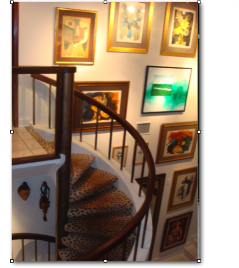
There I stood, in the middle of the atrium of my house, talking to Robert John Dean, with whom I have the pleasure to work on some “rethinking” of the interior spaces of the place we have called Villa Tortuga since we built it 24 years ago. The “tortuga” name is there because just when we were ready to break ground and to start construction, the inspectors found plenty of turtle eggs in the back of the property, close to the Hillsborough River, and so plans had to be changed——should I say “rethought”—as I could not build a pool in what is officially described as protected wetlands. Of course, the plans were redrawn and we went from anger to admiration as we began to enjoy the beauty of the century-old tress in the back, and the presence of cardinals and other colorful birds, not to mention the occasional alligator that comes to rest by the river, never, so far, daring to come too close to the house.
Robert and I have worked side by side as we rethink the spaces of Villa Tortuga, look at artwork and move and replace furniture. In most cases, we are working with existing items. My wife Maria and I had a lot of fun drawing the original plans of the house with architect Wade Setliff. It has been described as a fun house, a party house, and, for us, it was the home where we raised four children and welcomed several grandchildren.
Maria died last January. ,I have worked with Robert to give the house that she loved a new style. Maria loved antiques; I prefer a more contemporary, minimalist look.
The project has taught me much. As a designer, I watch Robert closely, and try to see how the work he does parallels what I do. Today our conversation was about that importnat moment when a decision has to be made, or, better yet, the moment when it is imperative that someone makes a decision for the project to proceed successfully.
“You can discuss a room, a piece of art or a sculpture only so much, then somebody has to decide and execute the idea,” he said. How true. We both agreed that the worst projects—newspaper or house——is one where the design is by committee, nobody seems to decide, and therefore the decision is made.
As we turned to placing several paintings by the late Ecuadorian artist, Guayasamin, on the big wall of the atrium, Robert and his associate, Roger Duffala, first sketched the concept on paper (not necessarily a Moleskin notebook, but I forgive them!), then discussed it with me. This is what I call “the sketching phase” with my clients. In this case, I am the client. Robert and Roger showed me their sketch and I saw how they had decided to mix other artists with Guayasamin, something that had never occurred to me. In confess more than a bit of apprehension.
I felt like that editor whose page 2 content I am suggesting be moved to Section B, and he knows that this may be the thing to do, but he cannot imagine it, and has never done it that way, and is totally afraid, and skeptical. I know I conveyed that feeling to Robert and Roger. So I took a step back, and remembered the number of times a good idea has been killed at that sketching stage by an editor who did not want to see it even tested.
The thought of me acting like that editor of my worst nightmares made me react quickly: “Sure,” I said, “go ahead, give it a try.”
Two hours later, there it was. Yes, Guayasamin suddenly met Cuban artist Orestes Larios Zaak at an intersection between Quito and Havana, but who cared? It looked magnificent as if the two artists had planned to meet on my wall, share a mojito and discuss the plight of the South American Indian (Guayasamin’s theme) and Cuban eco systems, which is for what Larios is world renowned.
Robert tried to describe how wonderful it looked. “You don’t need to say a word, ” I said. It is spectacular. I am just sorry that I have had those pieces for 15 years and never thought of displaying them that way.
What designer has not heard the editor who suddently sees the idea on paper and exclaims: “Wow, how come I never thought of that?”
By the end of today, all the art work that I have owned for years had found a new spot on the walls of the house. In the process, each had assumed a new life, a different personality. I took a look around the house and it felt like I was attending a class reunion: old friends, seen differently.
In the process of making these changes in my house, I have seen myself on the other side of the designing process: listening to the expert, evaluating ideas, conquering my fears, trying desperately to abandon preconceived notions, and sometimes catching myself acting like some of the editors whom I have thought of as non receptive.
The new Villa Tortuga should be ready for launch sometime in mid August. I recommend the exercise to all designers out there.
And, yes, Robert found two or three ceramic pieces that Maria had made and they are now right at the entrance of the house. Maria would be proud.
WE SEND YOU:
http://www.rjdean.com/villa001.html
http://www.larioszaak.com/en_int_elar_premios.htm
http://www.guayasamin.com/pages/index.html

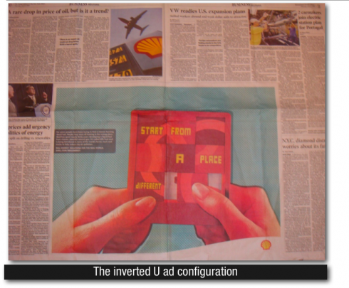
AD WEEK: The International Herald Tribune is one of many European newspapers utilizing the double page, inverted U-shape ad configuration. The ad rises strongly from the bottom of the page, with editorial content surrounding it; in most cases, the advertiser pays for the equivalent of the two full pages. Visibility for such ads is strong. Although the Herald Tribune is printed in a broadsheet format, the same inverted U-shape strategy can be utilized across two pages of tabloid or Berliner format newspapers.
WHERE IS MARIO? Teaching a session for the Summer Fellowship Program at The Poynter Institute, St. Petersburg Florida