This is the weekend edition of TheMarioBlog and will be updated as needed. Because I start my second summer vacation now, the next blog post will be Monday, July 10.
EyeTrack has become a valuable and reliable method to test how readers consume news. By providing accurate recordings of how eyes move on a page or screen, we can become aware of the impact that how we create hierarchy for news truly works. I have been involved with EyeTrack research since 1991 when I first conducted the first Poynter EyeTrack research with my colleague Dr. Pegie Stark. That first study was about the impact of color on printed newspapers. We teamed up again to do Poynter EyeTrack studies for online reading (2007). Then in 2012, with colleague Sara Quinn, to test how eyes moved on tablet screens.
Now, Dr. Christian Fortanet has spent three years working on a doctoral dissertation focused on the use of EyeTrack for how readers consume news on smartphones, thus completing a full cycle of EyeTrack and various news platforms.
I find Fortanet’s study so robust and full of valuable information that I have decided to present the highlights via TheMarioBlog, starting today and continuing in the fall–when I know all of you have returned from vacations and will be more likely to dive into this great information to apply it with your own projects.
Dr. Pegie Stark, who is now Creative Director BAY magazine, Tampa Bay Times, had this to say about the new study:
“How exciting to see Christian exploring smartphone navigation with eye tracking as his research tool. This is a much needed study as we see visual storytelling becoming more and more robust on smart phones. I think we journalists are in the beginning stages of understanding how to produce content for the smart phones. This study helps us understand how to write, edit and design on these wonderful devices.“And I am not surprised to learn that content is king, and that it drives the reader’s actions. Bravo!”
The finest mobile experience is to intuitively find what we are looking for when we pick up a new device. Christian’s important analysis underscores what works well, and why. Bravo.
The facts
–Title: Eyetracking: Experimental study of news consumption on smartphones. Case study: El Pais Digital
-The dissertation was presented at the University of Alicante, Spain, Faculty of Social Sciences, as part of the requirements for the doctorate degree. It is written in Spanish with a summary in English.
–Summary: The purpose of this general objective is to:–
—Identify the variables that affect the design and usability of smartphones, according to the professional and academic opinions of these known experts in the field.
–Create a ranking of variables that shows the level of importance of the factors that are most worth investigating, the factors for which leading specialists express greatest curiosity and which are therefore of greatest interest to the digital sector.
–Establish parameters that help to guide the classification of the metrics that will be described and compared in the experimental phase and the subsequent results section.
-The dissertation includes 339 pages, complete with illustrations.’
To contact Fortanet directly:
The study
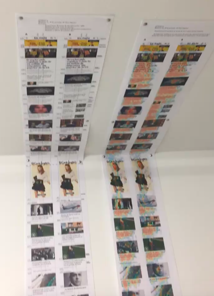
This short video clip shows the strip that was included in Fortanet’s study, as he has it taped to the ceiling of his office at the University of Alicante.
What is most helpful about this study is that it goes directly into such areas of discovery as:
—Where the eyes move first when the user sees the home page of El Pais Digital. El Pais is the highest circulation newspaper in Spain, and one of the most respected.
–The time spent on each news item.
–The difference that placement/hierarchy of elements made.
–The importance of the size of elements and its placement.
The findings
Today we will share two of the findings in the Fortanet study.
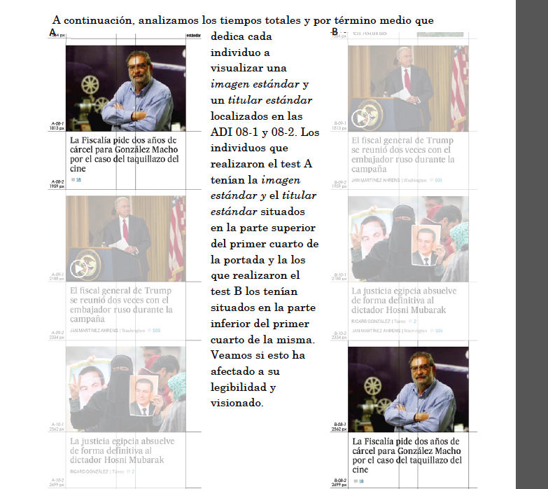
–For purposes of his study, Fortanet has divided the entire home page of El Pais Digital into four units.

–Fortanet created two models, referred to as A and B, so that he could alter the positioning of the elements to test if such change made a difference.
Content is king
If there is one theme that has resonated with the EyeTrack Research we have done at Poynter for print, online and tablets, and the new Fortanet research with smartphones, it is that content is king and that the content of the story is a greater determinant of how the reader will see it than the actual positioning.
The eyes seems to center on left of screen
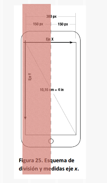
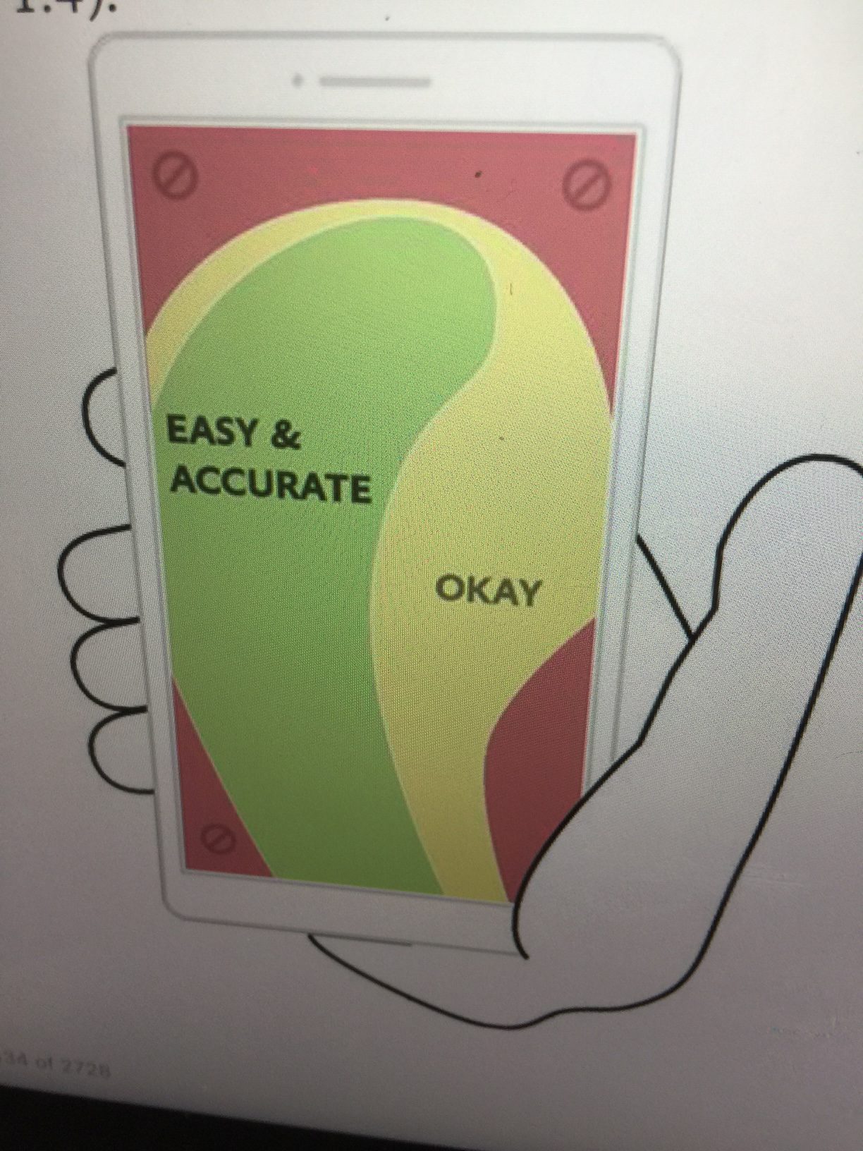
Fortanet’s study seems to corroborate what we had read in the recent book, Designing for Touch by Josh Clark, that, indeed, it is the left hand side of the screen where the eyes go first. Fortanet clarifies that most of the subjects in his study were right handed and thus their thumb would usually be covering the right hand side of the screen, thus the prominence of the left side for initial visual impact.’
What the eye skips
I am not surprised at all about this next finding: when approaching the home page of El Pais Digital, the eyes did not dwell much on the logo or the banner ad that followed it.
Instead, the readers went immediately to the content.
The logo of the site barely gets any attention, which makes sense since the logo is familiar and well known. Same thing applies to the digital folio, time a story was posted, etc. The majority of the fixations go for the main news story on the screen.
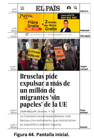
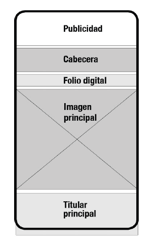
Here we see that Fortanet has included: Advertising, Logo El Pais Digital, Folio, Main Image, Main Headline, all within the first screen that readers see:
Some early conclusions
The results of this study from Christian Fortanet for the University of Alicante offers us valuable insight for us to continue to look at smartphones as the platform of choice for a large number of news consumers. According to a Reuters study, 53% of all news readers are accessing news on their mobile telephones.
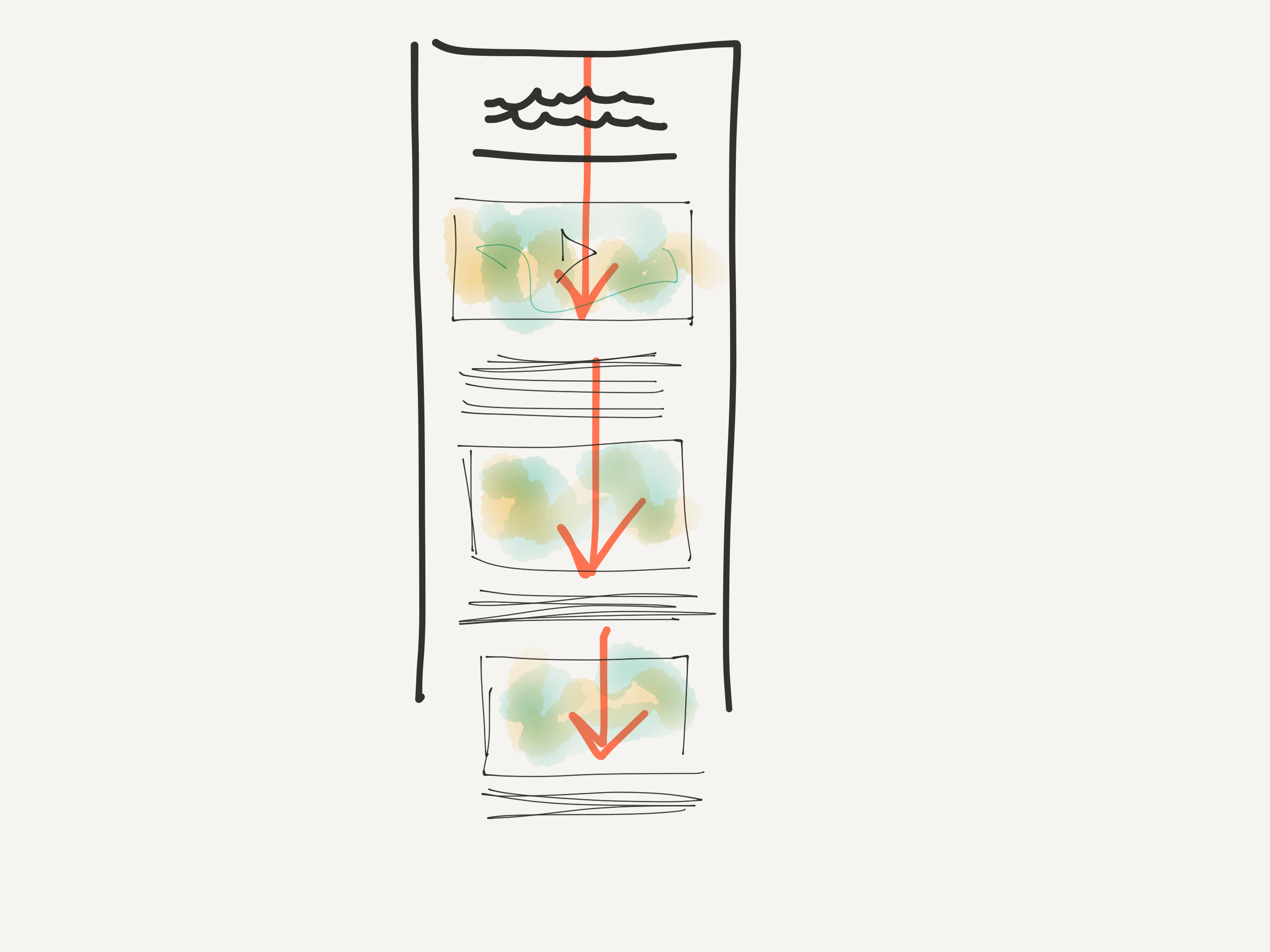
Specifically, we now have proof that when it comes to touch, it is all about vertical movement, or scrolling as a preference, boosting our efforts to concentrate on linear, more visual storytelling.
To be continued
We will continue to reveal findings of the Fortanet study in September as part of a 3-segment sequence.
In Spanish—En Español
Con los ojos bien abiertos
http://www.garciamedia.com.ar/blog/con-los-ojos-bien-abiertos/
Of related interest
This is a clip of an interview with Christian Fortanet and I by the Spanish radio network, Ser (in Spanish):
The Poynter EyeTrack Research series
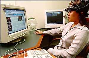
The Poynter Institute has a rich and pioneering history in the use of EyeTrack technology to test how readers consume news in various platforms. Here is a photo from our 1991 study of color perception. EyeTrack technology has advanced much since this image was taken, with the glasses used by test subjects becoming lighter and less cumbersome than what we see here.
The results of the 1991 study were published in a book co-authored by my colleague Dr. Pegie Stark and myself.
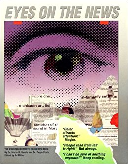
1991—EyeTrack and how readers perceive color on printed newspaper pages
Highlight:
Most people enter a newspaper page through the dominant photo, then move to headlines, cutlines and secondary elements before reading the story. That study established design principles still followed in newspapers around the world
2007–EyeTrack and how readers read online news
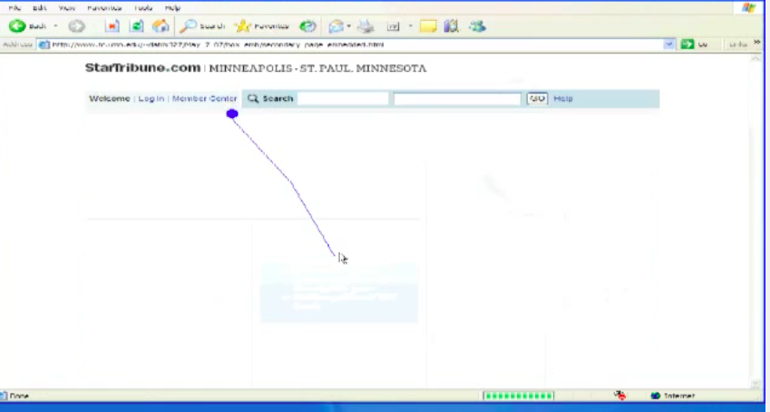
Highlight:
While testing our participants’ eye movements across several news homepage designs, Eyetrack III researchers noticed a common pattern: The eyes most often fixated first in the upper left of the page, then hovered in that area before going left to right. Only after perusing the top portion of the page for some time did their eyes explore further down the page.
2012–EyeTrack and how readers read news on tablets

Highlight:
“In our test, each subject was handed an iPad in a scientifically randomized orientation — portrait or landscape — to look through three photo galleries. They were asked not to turn the tablet after it was handed to them. Participants who were given an iPad in landscape orientation swiped horizontally 93% of the time. In portrait, they swiped horizontally 82% of the time. This is statistically significant (p<0.001) evidence for a horizontal inclination and indicates that the swipe direction isn’t just a random behavior.”
Also:
Looking back at EyeTrack: Poynter’s history of studying reader habits
Poynter EyeTrack Facebook Page:
https://www.facebook.com/search/top/?q=Poynter%20Eye%20Track%20
Our new Garcia Media Latinamerica newsletter

http://mailchi.mp/cfd764fffeeb/sipconnect2017-conclusiones-del-dr-mario-garca?e=c62e1a6dc6
Published in Spanish, the newsletter will appear regularly to update our clients and friends about our activities.
If you would like to subscribe, please contact Paula Ripoll, our Senior Art Director in Buenos Aires:
paularipoll@garcia-media.com.ar
