I heard it several times during the course of my times pent with the La Presse+ team:
We began with a blank page, and no preconceived notions of what this product should be like.
For designers, this is always a special occasion, and so it was for La Presse+’s Benoit Giguère,Senior Director, Design, Interactivity and User Experience. While Benoit was coming into the project with a general graphic design background, some digital, but mostly print, the La Presse project allowed him to go into an adventure in unchartered territory.
“I knew one thing: the most worrisome trend is declining propensity to read among future generations. Not only is readership slumping, but in all respects, the younger generations are abandoning print newspapers as their source of news and information,” he said.
Benoit added that the digital tablet is a revolutionary tool that provides consumers with a completely new way of accessing news and information.
“It’s nothing less than the birth of a new medium. Tablets are radically changing how we get our news, combining the best of all the traditional media platforms—print, sound, photos and video—and adding interactivity to the mix. So we need to fully rethink how we tell stories and deliver news on this new tool. While text will always retain it importance as a narrative tool, it is no longer the primary lead-in to a news story.”
What were some design specifics that had to be considered
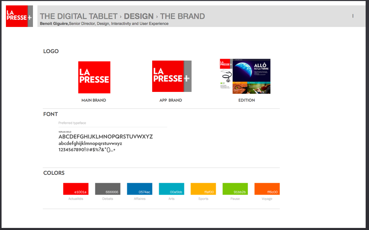
Brand presence—
“In the digital realm, a brand isn’t a logo attached to an interface or a home screen. The brand is omnipresent in every moment of the consumer/user’s digital life.
“Every digital iteration of the product must be consistent. It has to speak with the same voice. Whether it’s a button, a video signature, a dialog window, a pop-up or an alert message, the brand is no longer on the interface. It IS the interface, and the idea is to make the user forget the underlying operating system.”
The role of storytelling
Benoit explains that storytelling in the tablet becomes a multi-sensory experience.
“Storytelling is now integral to the brand: you can no longer keep the content separate from the container. Telling the story differently : From n”ow on, news and information sources have one primary mission: “speak” to more than one of our senses. They must engage “the eye, the brain and the fingers. Visuals have edged out headlines as the incentive to browse.
Hierarchy and a layering system for how news events are presented
The expectations of tablet users center around three important principles:
—Curated content, to see what the editors have selected for them.
—All the latest available news, including breaking news.
—Photo, video and data journalism content, not just text.
“Visuals have edged out headlines as the incentive to browse.
An article’s headline need no longer serve as the driver to click or touch through: for the home screen of its app, La Presse+ decided to devote the full tablet surface to a single story, with the story itself often in video form.”
Layers of information
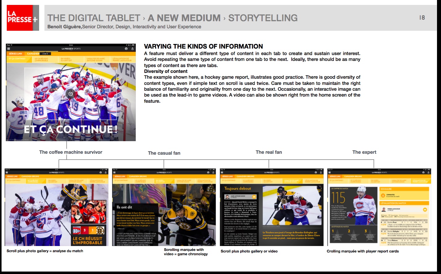
We often discuss the two tempos for news in this blog: leaning forward and leaning back. The La Presse+ creative team is well aware of this, and of the different needs of readers at certain times of the day.
In fact, I found it fascinating that they have separated users at various times under the following labels:
—The coffee machine survivor
—The casual fan
—The real fan
—The expert
The tablet edition of La Presse+ offers the same story with various approaches, depending on the interest of the user and the time he wishes to spend on a certain story.
The templates
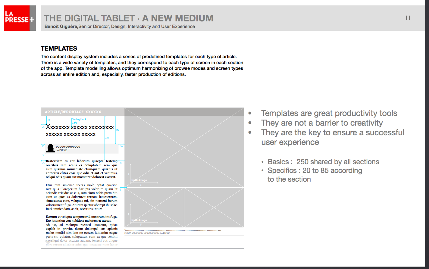
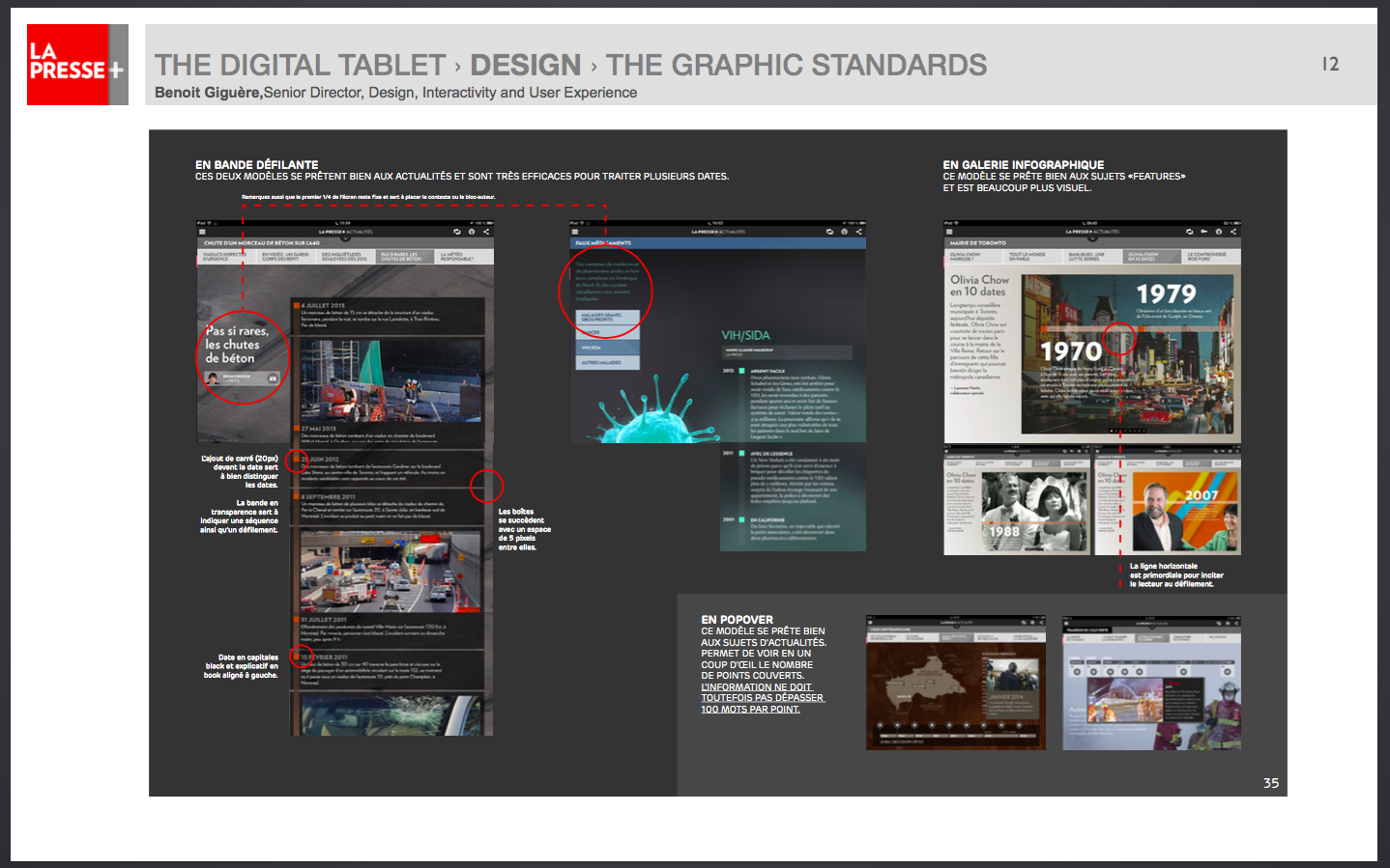
The content display system includes a series of predefined templates for each type of article. There is a wide variety of templates, and they correspond to each type of screen in each section of the app. Template modelling allows optimum harmonizing of browse modes and screen types across an entire edition and, especially, faster production of editions.
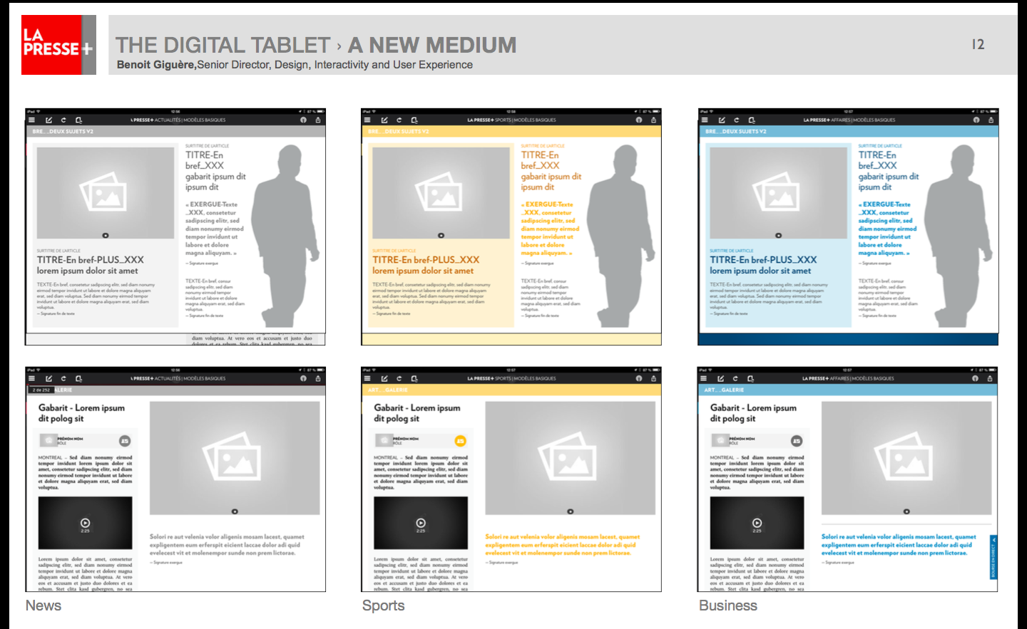
The use of color as a navigational guide
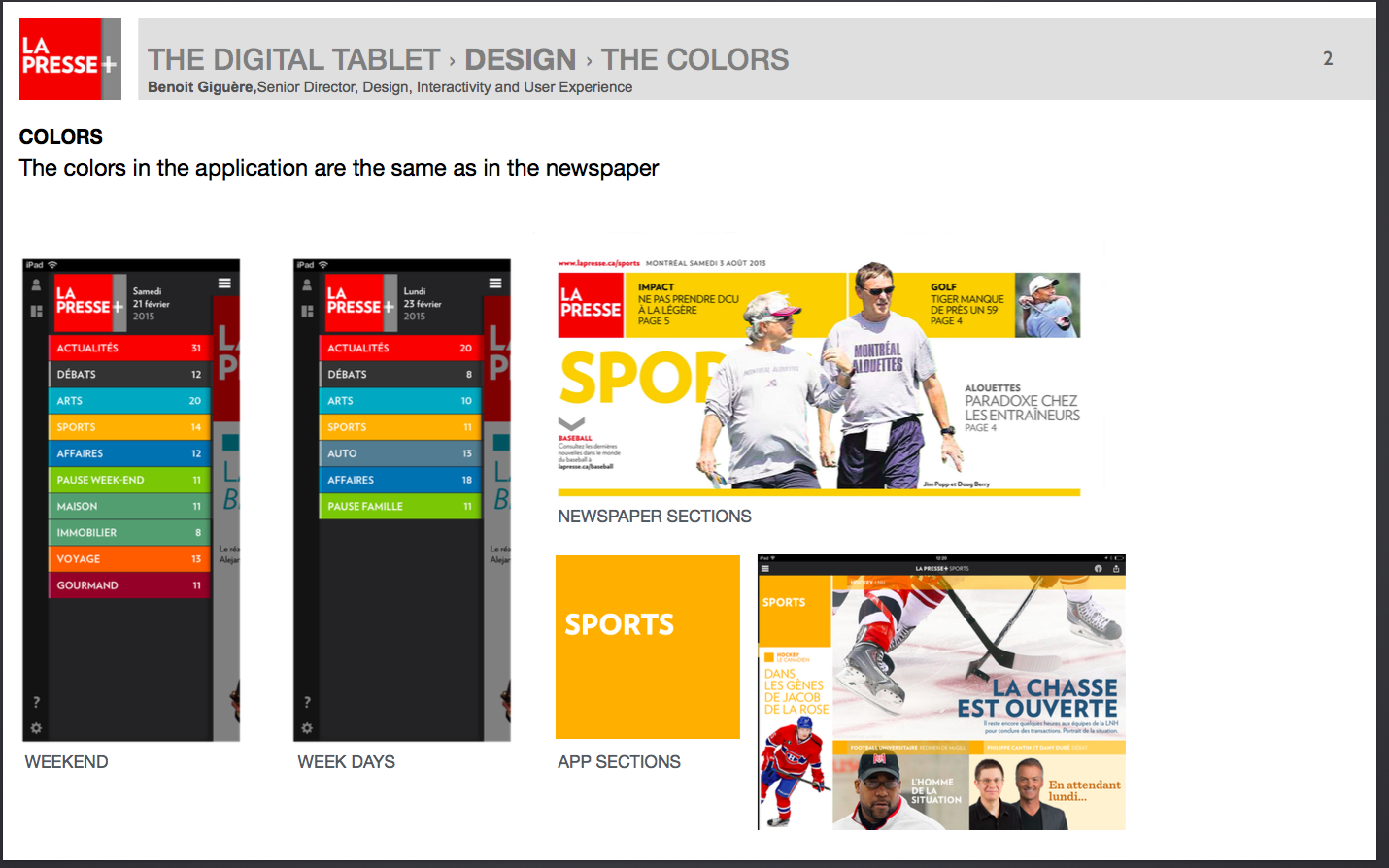
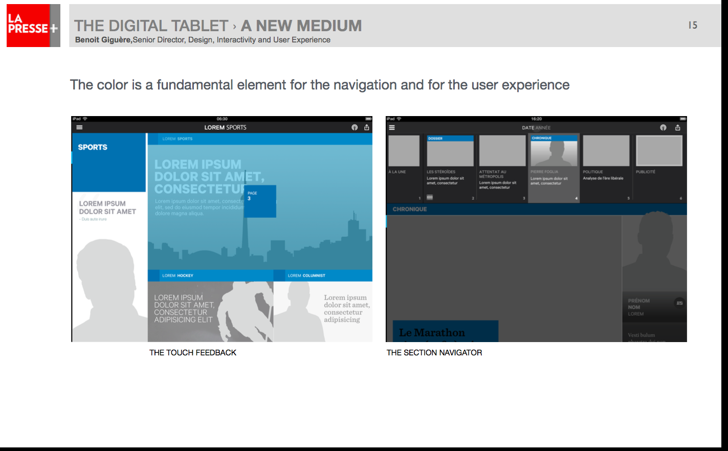
The color is a fundamental element for the navigation and for the user experience. Color coding helps the process of navigation.
The carousel
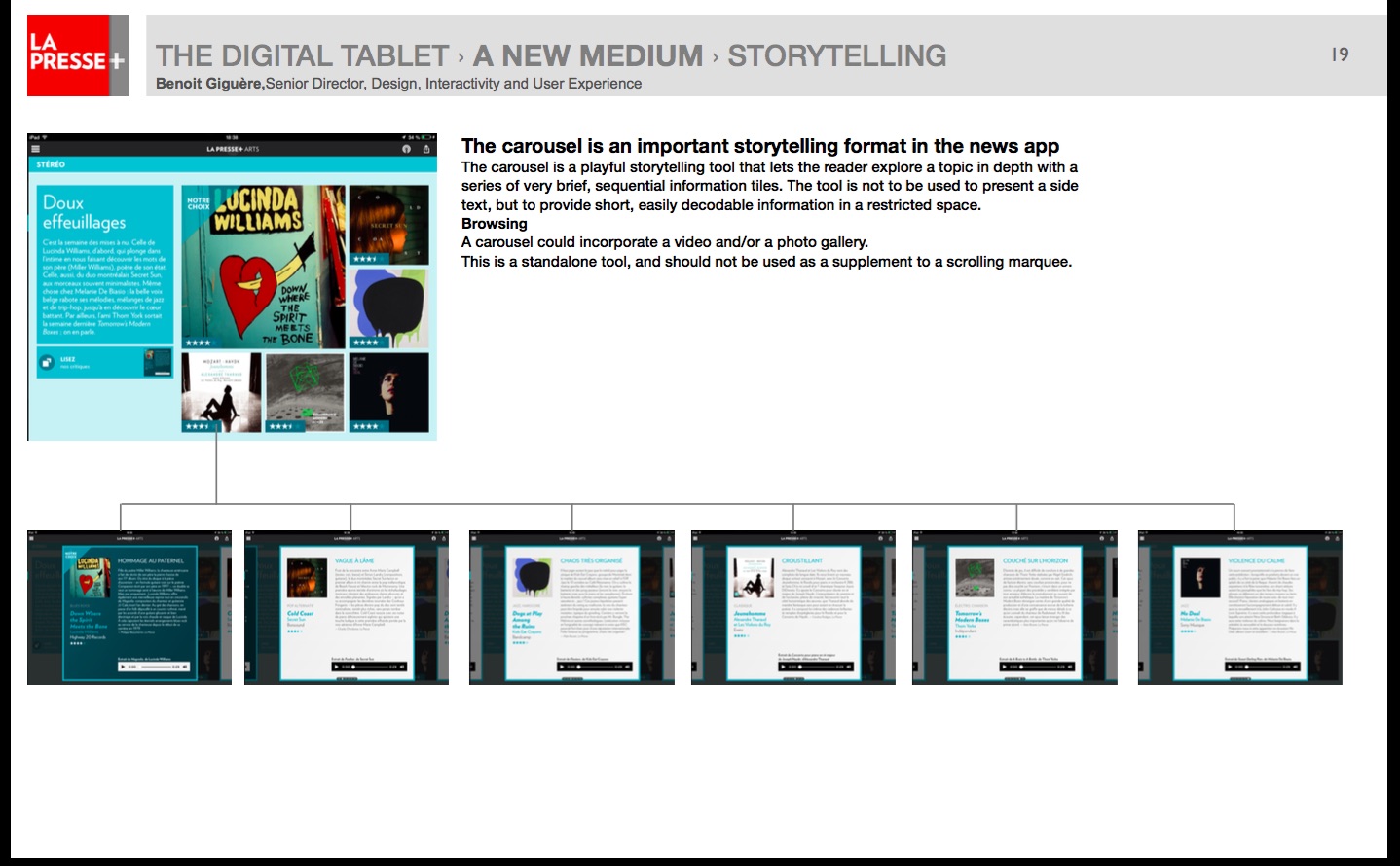
La Presse+’s creative team found out through testing that users prefer to swipe via a carousel to advance into a story.
In Benoit’s words:
“The carousel is a playful storytelling tool that lets the reader explore a topic in depth with a series of very brief, sequential information tiles. The tool is not to be used to present a side text, but to provide short, easily decodable information in a restricted space.”
He adds that a carousel could incorporate a video and/or a photo gallery. This is a standalone tool, and should not be used as a supplement to a scrolling marquee.
Photo/video as storytelling tools
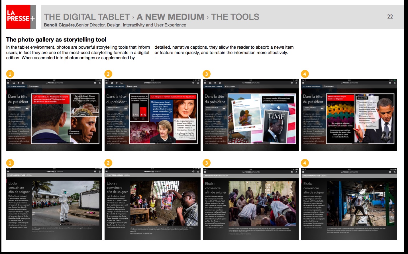
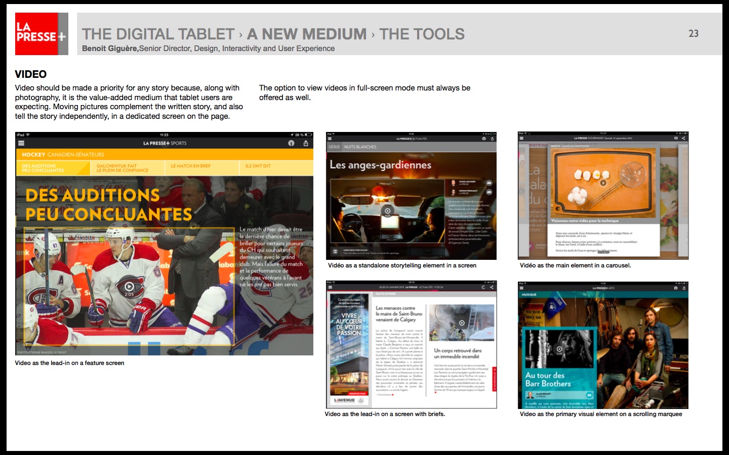
In the tablet environment, photos are powerful storytelling tools that inform detailed, narrative captions, they allow the reader to absorb a news item users; in fact they are one of the most-used storytelling formats in a digital or feature more quickly, and to retain the information more effectively.
Pop ups–keeping the finger happy
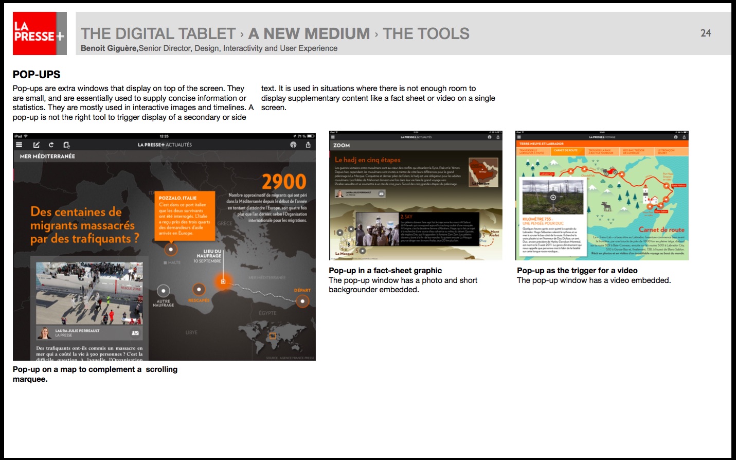
Pop-ups are extra windows that display on top of the screen. They are small, and are essentially used to supply concise information or statistics. They are mostly used in interactive images and timelines.
These are what I often refer to as “whispers” which provide additional information in a summarized format, but that can also introduce a video, a photo gallery or other content/visual enhancements to a story.
The interactive graphic
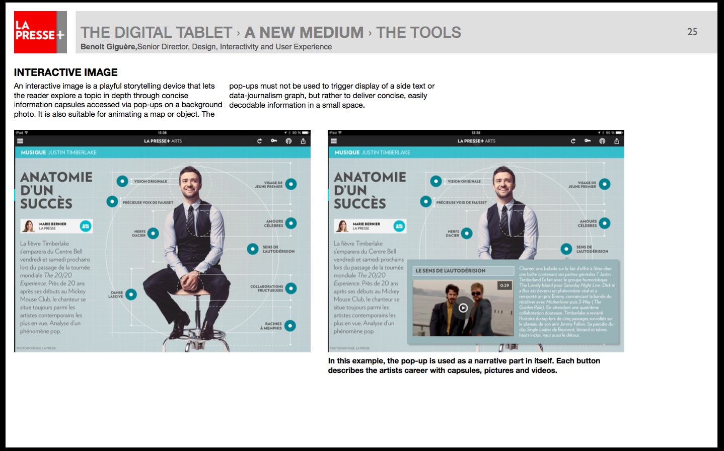
These are a favorite with tablet users everywhere. An interactive image is a playful storytelling device that lets the reader explore a topic in depth through concise information capsules accessed via pop-ups on a background photo. It is also suitable for animating a map or object.
Data journalism and graphs
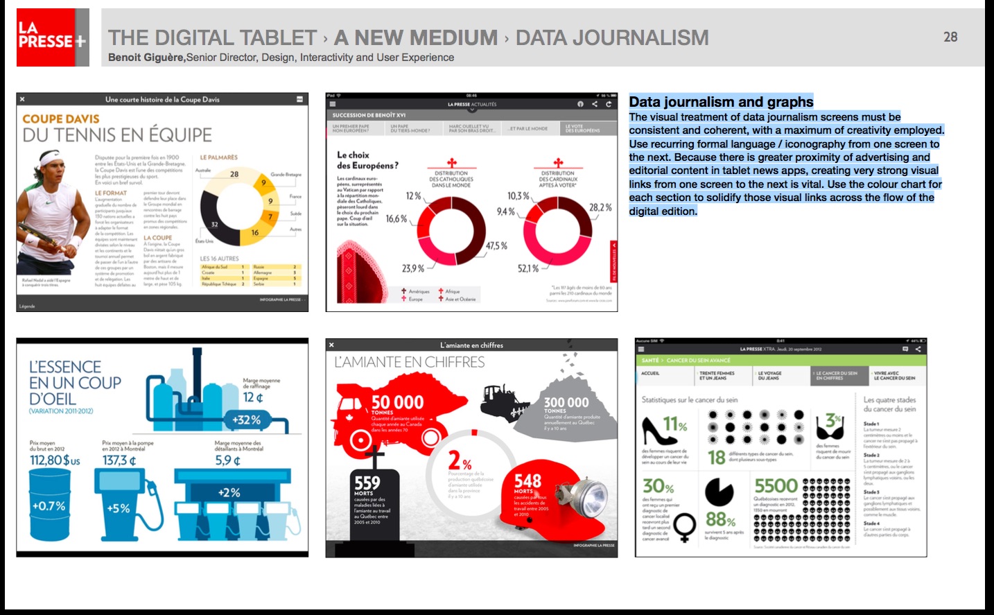
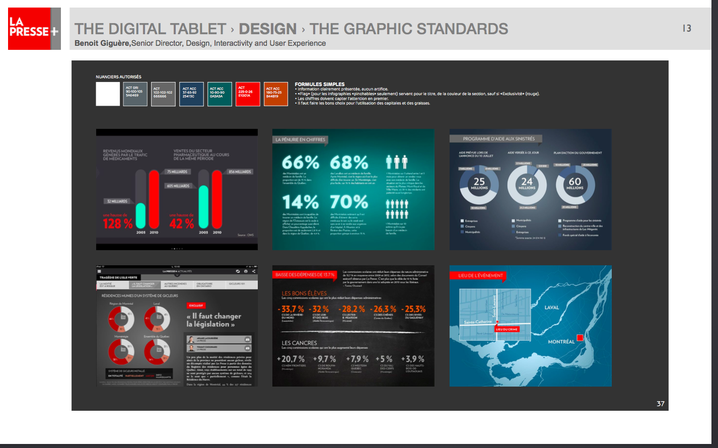
The visual treatment of data journalism screens must be consistent and coherent, with a maximum of creativity employed. Use recurring formal language / iconography from one screen to the next. Because there is greater proximity of advertising and editorial content in tablet news apps, creating very strong visual links from one screen to the next is vital. Use the color chart for each section to solidify those visual links across the flow of the digital edition.
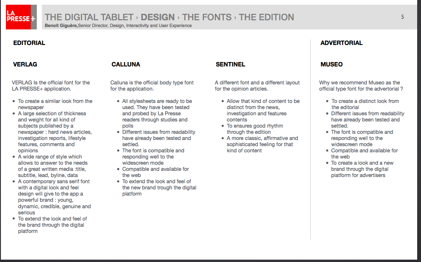
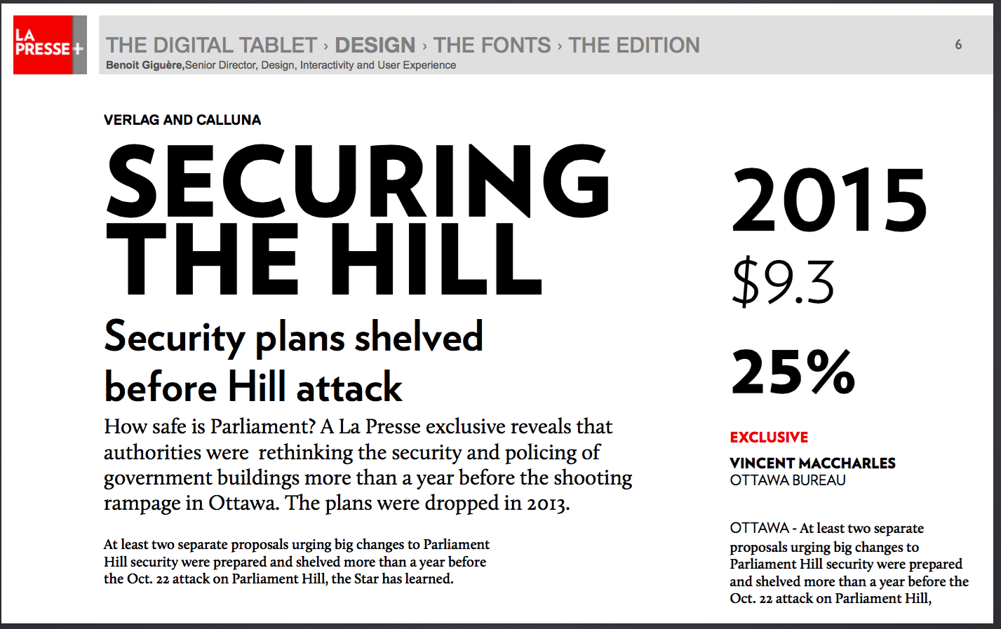
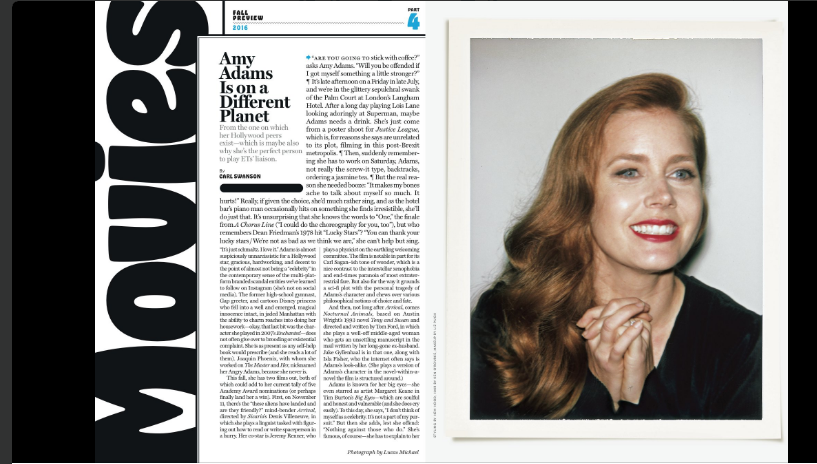
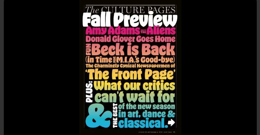
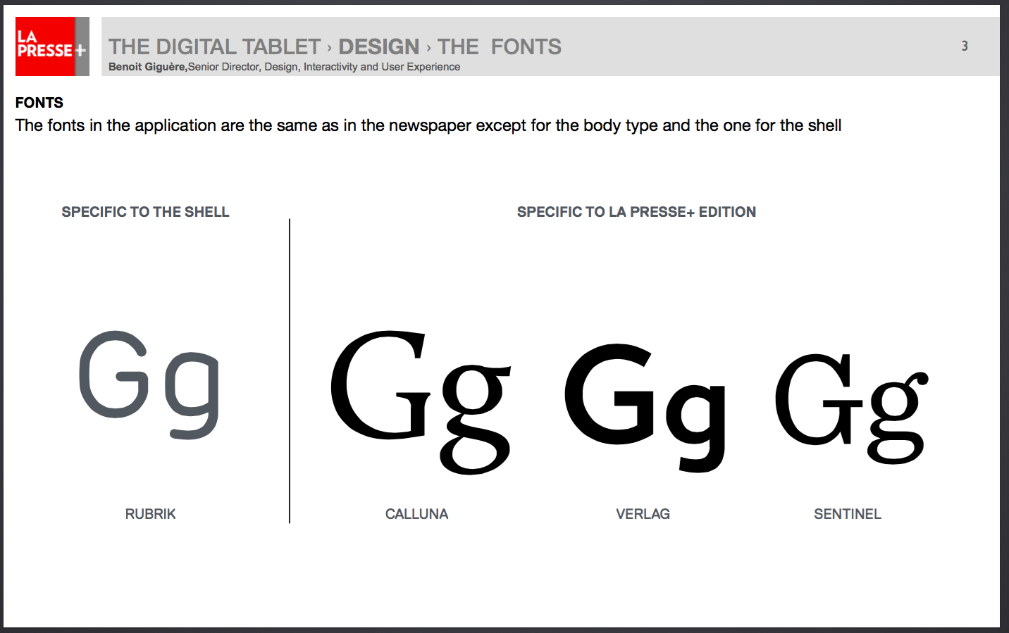
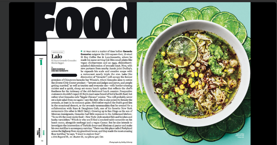
The typographic palette for La Presse+
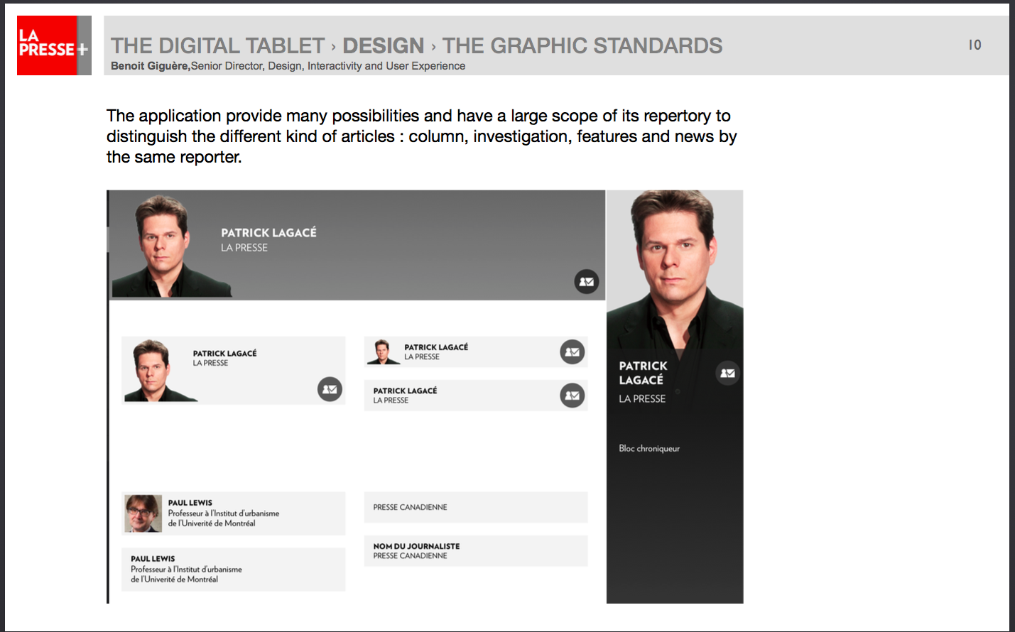
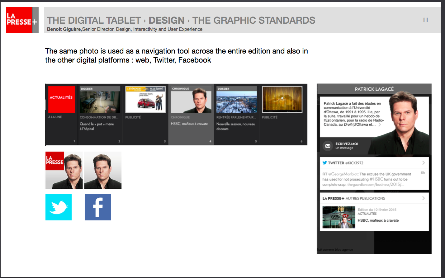
The Graphic Style Standards
Related content
La Presse+ tablet edition gets a 30% rise in readership since axing weekday print edition
Coming up
Tomorrow:
La Presse+: A Success story, part 5-the audience's reaction