This is the weekend edition of TheMarioBlog and will be updated as needed. The next blog post is Monday, May 12.
Update #1: While flying JFK to ATL on Delta 465, Friday, May 9, 09:34

Kevin Spacey's message was just perfect for the IBM crowd, and I am hoping conferences where publishers, editors, journalists and designers gather will tend an invitation to Spacey, since his messages about the need for change and disruption resonate with exactly the same themes I emphasize in my own workshops.
There is much for us storytellers to derive from the Spacey talk to the IBM technical types and how he went about creating change and presenting network execs with a different manner for the the way content is delivered.
How can we translate Spacey's messages to what we do?
The House of Cards’ factor
Spacey used the example of his own very successful show and explained that the concept was so unique and created such disruption, that it was tough to sell to the networks that were operating by the old rules.
When he was pitching House of Cards, every network wanted a plot, and a pilot. Spacey knew that there would be no plot (as we know it), and definitely no pilot.
Instead, House of Cards weaves together what Spacey refers to as
“little stories weaved into big stories”.
Heck, this is something that we try to emphasize in multimedia storytelling:
–Begin with the big picture of the story you wish to tell, then break it into segments. Let the words, and the visuals work in segments to tell that story.
–Don't think long narrative. Think long narrative with interruptions. The interruptions come via video, audio, photos, infographics, and goodies that enhance the story and keep the impatient reader interested and focused.
Disruptive times offer opportunity
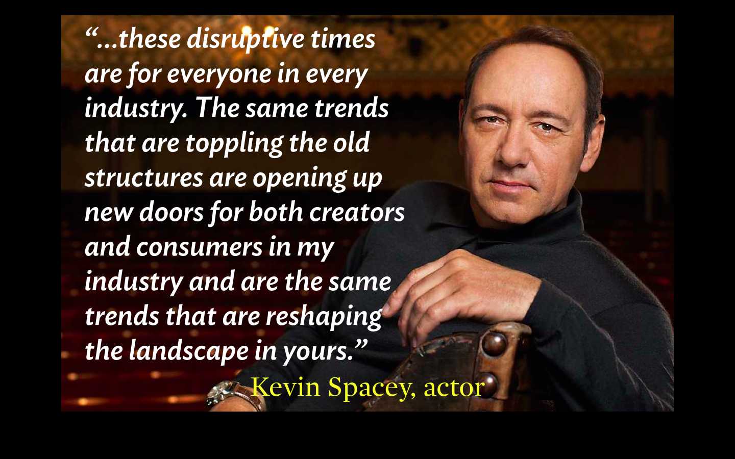
“…. these disruptive times are for everyone in every industry. The same trends that are toppling the old structures are opening up new doors for both creators and consumers in my industry and are the same trends that are reshaping the landscape in yours.”
Technology empowers
Another trend, says Spacey, is that technology is empowering the risk takers.
“All across the board, technology is giving consumers greater power, more information, and it’s creating an increased urgency for business to innovate. It’s no longer about just connecting with people. It’s more than that. It’s about engaging with customers one on one in their own space and time.”
The risk takers are rewarded
“Place your bet on those who never settle. Place your bet on those who are never afraid to take a chance. Place your bet on those who try to anticipate what their audiences want before they even realize it. … We should all aspire to be innovative. We all need to be a step ahead of our audiences, to surprise them, to break to boundaries and to take them to new places. Because if there is one thing that overlaps between business and art, it’s that the risk takers are rewarded.”
Will someone please invite Kevin Spacey to one of our conferences?
Let's hope the organizers of the next big media conference are reading this, seeing the Kevin Spacey presentation and getting ready to invite him to bring his type of thinking to what we do.
See video of the Kevin Spacey talk to IBM:
Of related interest
http://millennialceo.com/innovation/kevin-spacey-storytelling-age-disruption/
Lean back this weekend

A reader-focused redesign: 10 good questions with the LA Times’ Jimmy Orr
http://www.youtube.com/watch?v=aS1IPYalTt0&feature=
We talked with Jimmy Orr, managing editor of digital, to discuss what problems the Times was trying to solve with the redesign, why their topic-specific blogs do well, and which metrics matter.
One question/answer from the interview:
Where did you spend most of your attention with the redesign? What “problems” were you trying to solve with this design?
JIMMY ORR: Easy. We wanted to decrease the bounce rate. Increase Time Spent on Site. Increase pageviews per Visit. Increase video views. Increase shares. Increase loyalty. Overall, it’s about engagement. We want our readers to spend more time here. We knew that our previous design was prohibitive.
We had to think about our mobile readers. They had to be in the forefront — not an add-on. We had to think mobile-first. Very soon (in the next few months), more than half our traffic will be on mobile. We’re almost there and it’s not going back. So we had to think of these very important readers.
Our own review of the latimes.com
https://www.garciamedia.com/blog/new_los_angeles_times_website_innovative_inspiring
Beyond responsive: three mobile website design tricks becoming trends
Highlight:
The Los Angeles Times has a new-look website: a responsively designed effort from the same chaps behind sites for The Verge, Hearst and Mashable.
But apart from being mobile-friendly in its responsiveness, it also features a number of mobile-first design elements that we’re increasingly seeing across a number of websites. Are publishers finally putting their money where their mobile-first mouths are?
Why we should celebrate journalism of the past, present and future
http://www.theguardian.com/media/greenslade/2014/may/07/journalism-education-universityofsheffield
What the best journalists have in common is that they tell us things that we didn't even know we didn't know. That's a worthwhile activity even when nobody seems to be listening. As when the unpaid “citizen journalists” (as nobody called them) of the Rochdale Alternative Paper conducted an investigation into the child-abusing behaviour of politician Cyril “Mr Rochdale” Smith back in 1979.