This is the weekend edition of TheMarioBlog and will be updated as needed. The next blog post is Monday, January 28.
It was a ritual each semester for me and my students when I taught at Syracuse University’s Newhouse School of Public Communications. The course was titled Introduction to the Graphic Arts, and it was, hallelujah, required of every student in the School. The Newhouse School was one of the very few in the country that required an introduction to visual journalism of all its students, including those majoring in advertising and public relations.
I taught that class in a small auditorium that sat about 120 students. The first major assignment: design a book cover. Why?
In my view, a book cover is a small canvas, but one where a student of design can apply almost everything that is covered under design essentials: type, color, space, distance, art direction. You can imagine how loaded my arms would be on the day those book covers were due and I had to take them home to grade.
It was hard work, but, alas, it was in that assignment that I would forever be surprised by the talent of students who had no idea of design before they took this course. In some cases, I confess that a few journalism students decided to go for careers involving design and art direction, which made me very proud.
The state of book cover design today
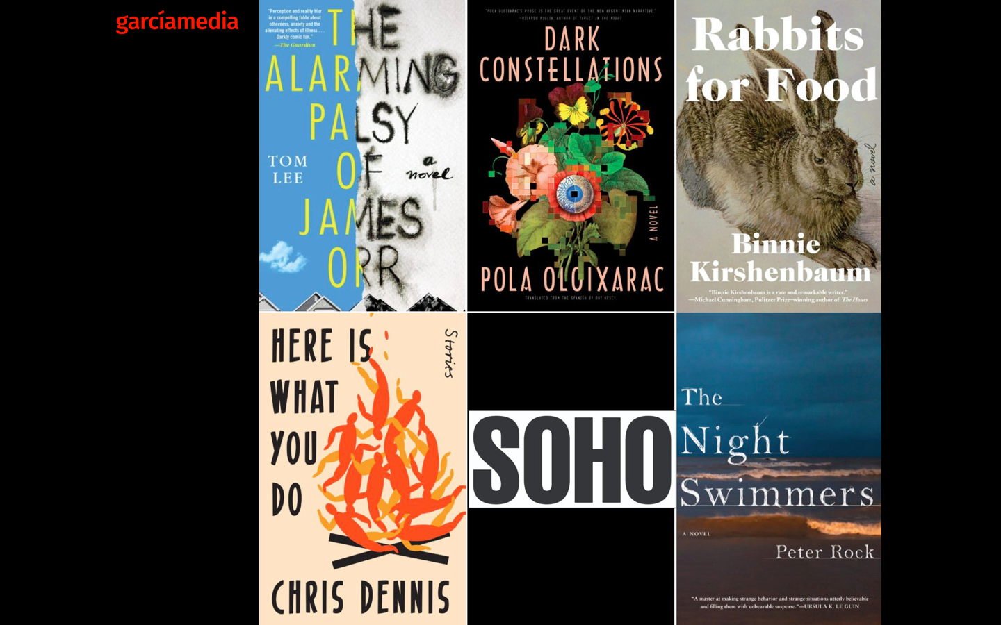
I was intrigued about book cover design so I decided to take a look at covers of books that are reviewed currently, the new crop of titles of 2019. Some are great, with covers that invite. Some, well, not so seductive visually, although the content may be great. I always pity the author of a book whose art directing may have ruined the impact of the message. It happens. Take a look here:


However, as I am not a book design expert, I turned to two New York City friends who are, James Reyman and Ina Saltz.
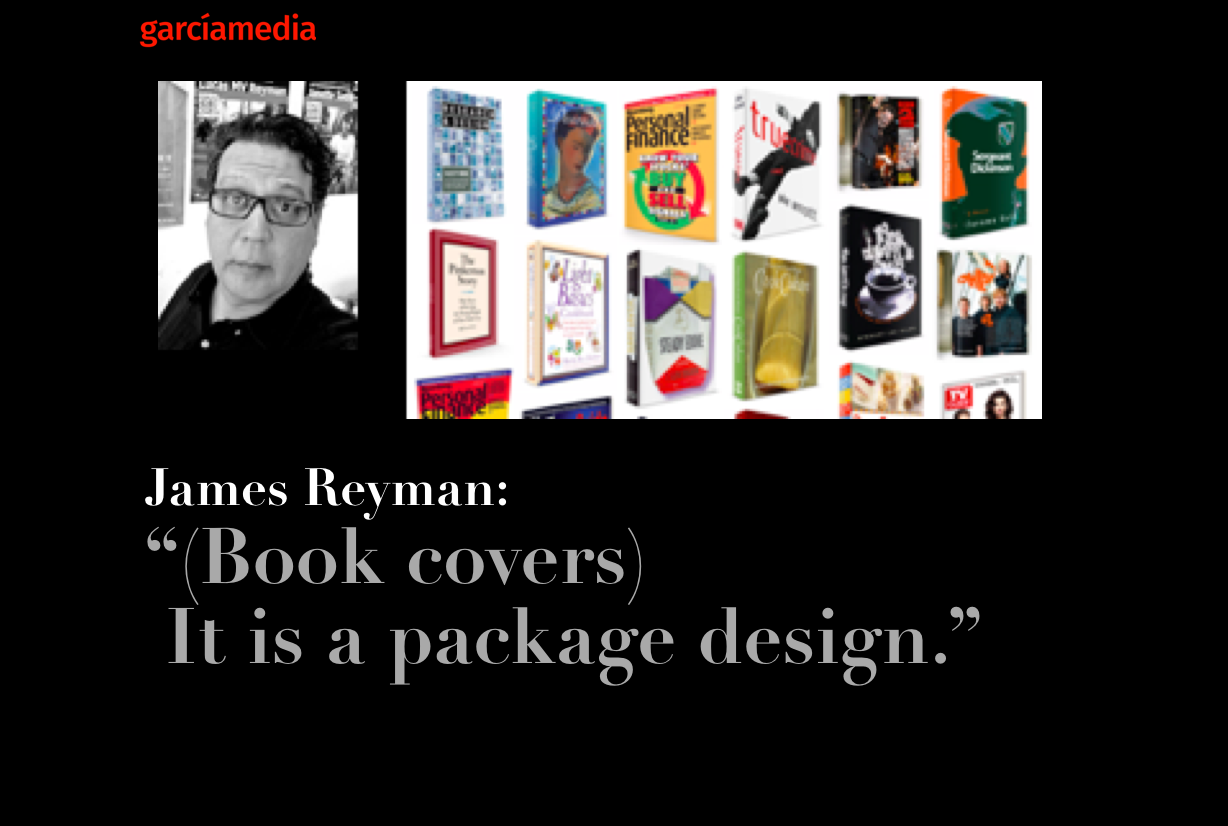
James Reyman: “Book design is an invitation.”

James Reyman’s studio is one of the busiest places in New York City when it comes to book design. James is the principal and creative director of the James Reyman Studio. His clients include Dow Jones. The Washington Post, TV Guide, Bloomberg, The New York Times, Money Magazine, Harper Collins, among others. James teaches magazine design for the Columbia Publishing Course, at Columbia University, as well as typography at The Fashion Institute of Technology.
Here are some of James’ thoughts and evaluations of book covers:
I am a big lover of book jacket design. I love walking through a bookstore looking at the covers.
Book jacket design is, to me, an invitation, with secrets, to the contents of the book. It is a package design. You will see beautiful typography and clever imagery from the best jacket designers. A jacket entices the reader to look inside and read the book. It draws the potential reader in.
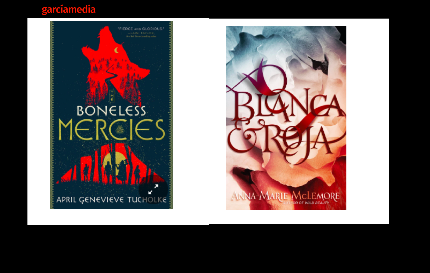
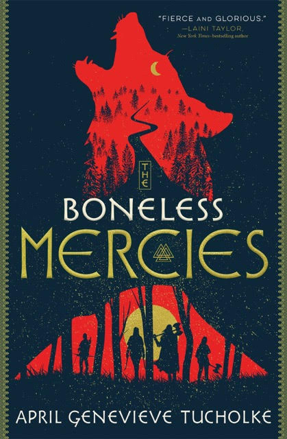
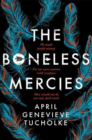
The Boneless Mercies, jacket by Will Staehle is intriguing; the Wolf, the winding road, the moon, the characters (women?) who have weapons of death in their hands. A lot to look at there and much to invite a reader in. Nicely done.

Interestingly enough there is another version of the book (Boneless Mercies) out with jacket design by Jack Noel. His version is less menacing but interesting and visually appealing with its feathers in a negative color.

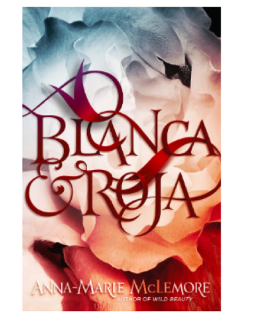
The Blanca & Roja jacket, designed by Daniella Mazzelo di Bosco is an example of the secrets in the cover. First the reader is dazzled by the beautifully drawn, winding typography. The type, in a blood red color, seems to be sitting on tissues or sheets but upon closer inspection, we see two swans intertwined. Very well done.

The Elephant in the Room jacket is not appealing to me. The odd, wide, word spacing throws me off. It might just be related to the book’s contents as is the different size and weight type.

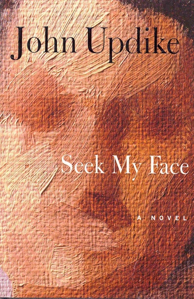
Here are some jackets I really love. Seek my face, designed by Chip Kidd. Such a mesmerizing image! Definitely intriguing!
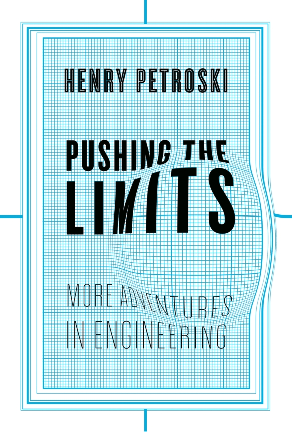
Here are 3 by Chip Kidd, Kafka on the Shore, by Murakami. An arresting image. Makes me want to read it. (I did!) Also 1Q84 also designed by Chip. Pushing the Limits was also designed by Chip.
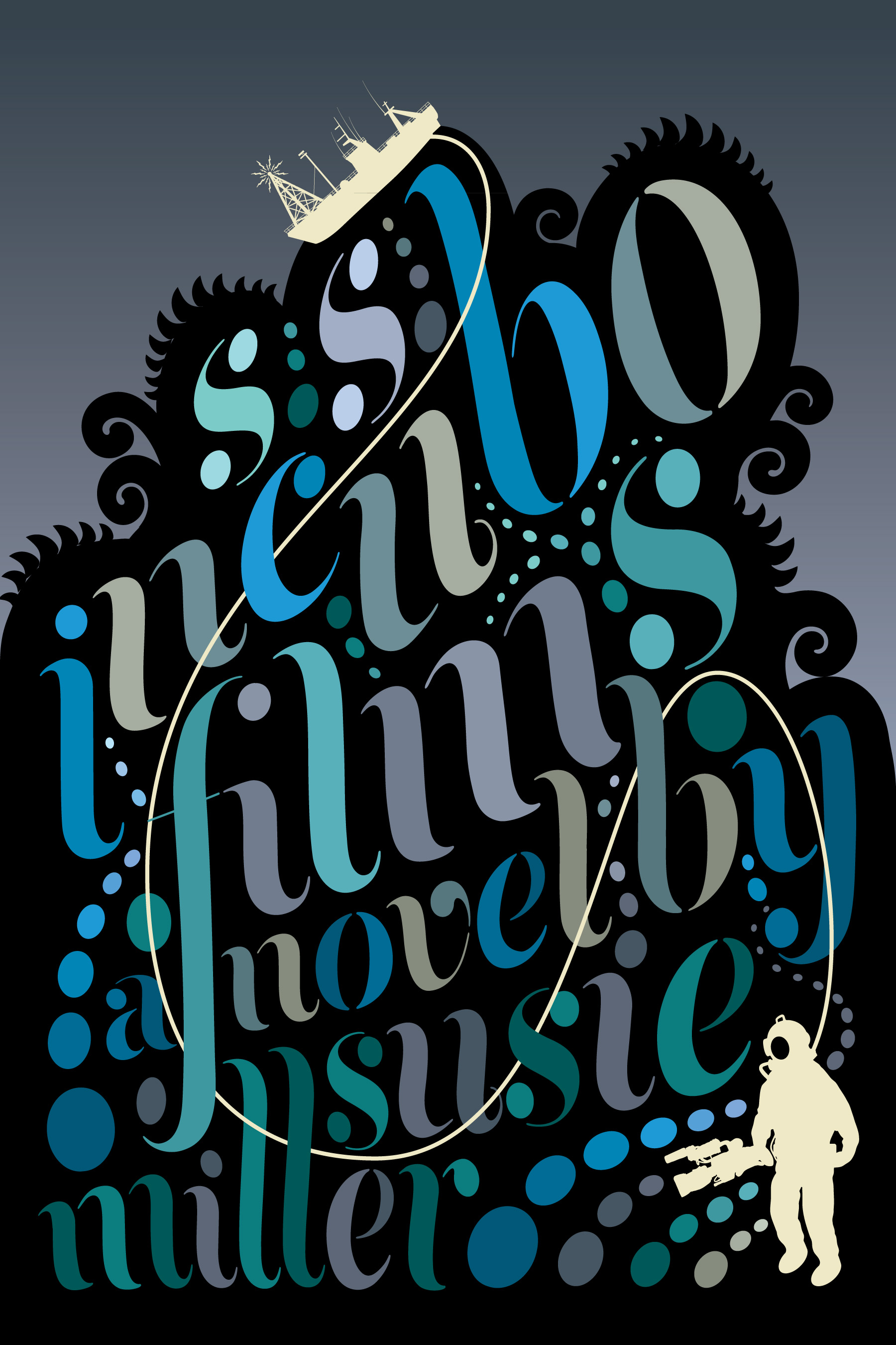
Roberto De Vicq is another designer that pays so much attention to details and typography. He produces absolutely gorgeous book jackets. Here are 3 of his designs: SS Incubo Films, Astonishing Splashes of Color and Tell the Wolves I’m home. All beautiful covers.
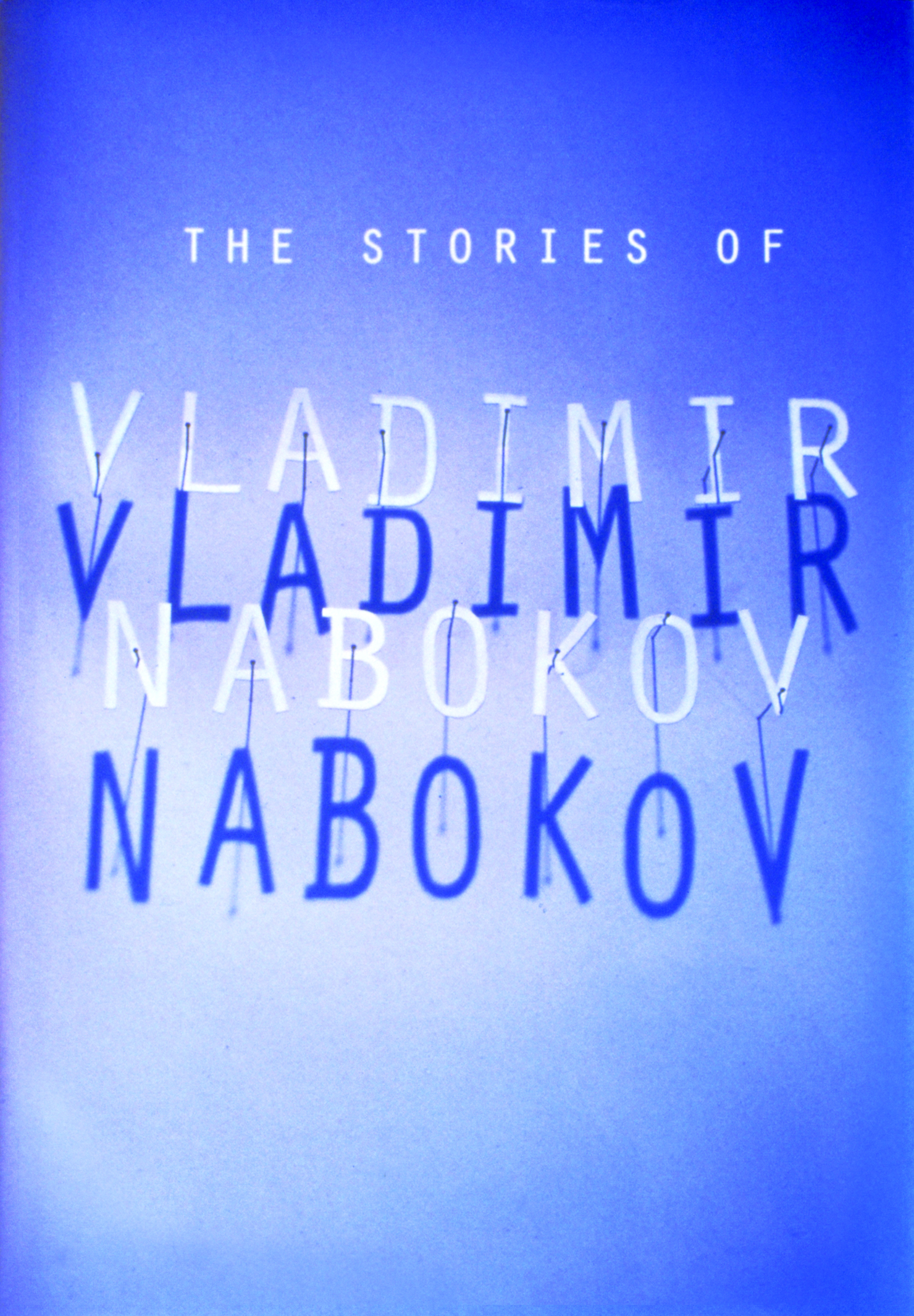
Stephen Doyle has also produced beautiful jackets. His jacket for the Stories of Vladimir Nabakov shows the individual letters of the author’s name cut out and pinned to a wall, the same way the butterflies that Nabokov collected, were. A compelling cover.
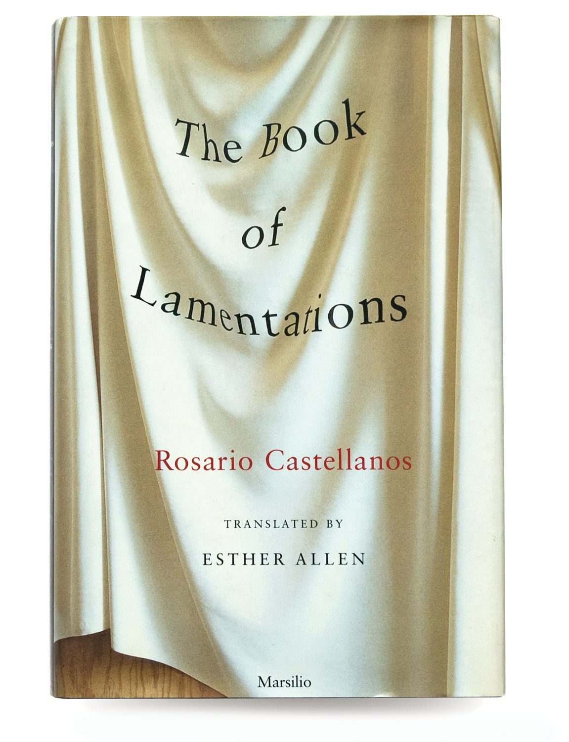
Book of Lamentations is also designed by Stephen Doyle .
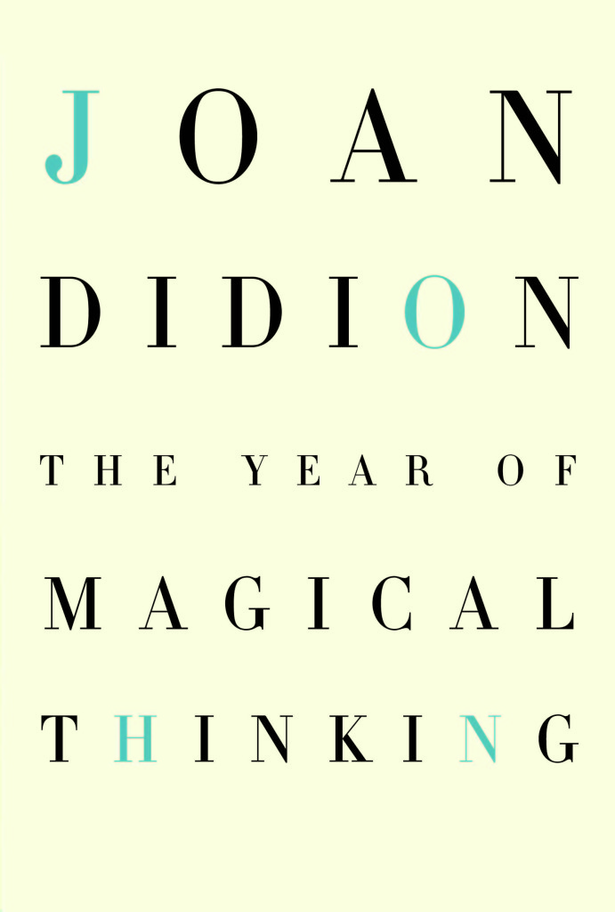
Carol Carson has also designed beautiful and appealing jackets with secrets. Here is her cover for Joan Didion’s, The Year of Magical Thinking. This was a very personal book by Didion. Her husband John Dunne had passed away and he had a huge impact on her life. Carol found the letters JOHN, in the books title and called them out in a different color. Fascinating cover.
Covers by James Reyman
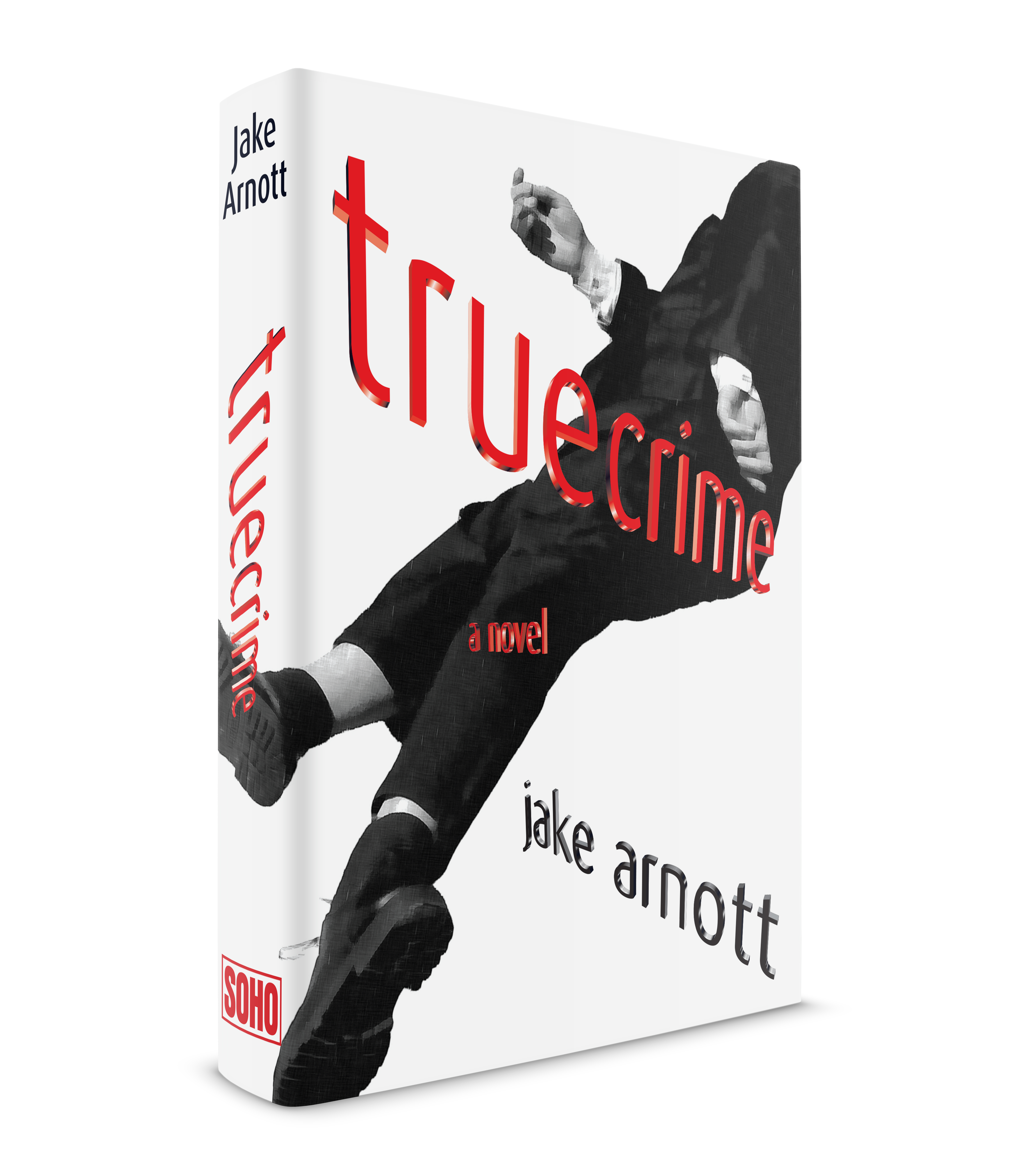
Here are a couple of my book jackets I designed for Soho Press: Truecrime by Jake Arnott and Desired by Maryse Conde (illustrated by Vivienne Flesher). Always interesting (not easy) to work on. Plus I got to work with the great publisher, Juris Jurevics, a time I will always treasure.
Ina Saltz: “…..provoke a response, create a memorable moment..”

Ina Saltz is an art director, designer, author, photographer and Professor at The City College of New York, whose areas of expertise are typography and editorial design. In addition to her four books which she has authored and photographed or co-authored, she has written over 50 articles on typography and design for professional design magazines.
I asked Ina some specific questions about book cover design:
Despite the old adage, we DO judge books by their covers. Being human, we can’t help ourselves…we DO form an instant impression of a book cover based on a complex fusion of factors. So the book cover designer has a very important task: how to make the best possible impression, with the most impact, and how best to convey the content, mood and tenor of the book’s content. The book cover is more than a simple poster; it must motivate the reader to take a leap of faith and to dive into the book’s world.
What is different about designing book covers today?
In today’s marketplace, a book cover has to work harder than ever. The ideal book cover must communicate effectively in many situations: for example, it must stand out from the others in a crowded bookstore, or in an online setting, or even as a tiny thumbnail on a mobile device.
Despite dire predictions of the death of long form reading and of print based media in general, books remain surprisingly popular. While many choose to read books on their devices, the experience of holding a book in one’s hands and turning the pages, the tactile and sensory experience of reading a book still has an undeniable allure. As a professor of design, I like to poll my students to see what young adults are thinking about and what matters to them. It seems that even with the many choices they have to consume information, the experience of reading a “real” book still appeals (though they’d much rather have their textbooks be digital!)
What are a book cover designer’s top priorities?
A good book cover designer must make important choices: which typefaces to use, their color, weight, width, size, and contrast with the background; selecting or commissioning an image or images, choosing between photography and illustration, finding a type-only solution, how to use color, leaving space or packing the space; a complex image or a simple one; the placement and arrangement of typographic elements, in relation to the image. Does the composition draw the reader in? Does the image float or bleed off the edges? Are there a lot of words, or very few? Are the typographic elements working WITH the other elements to send one strong message or are they fighting one another?
Do you have favorite book covers?
There are so many notable book covers past and present that it is almost impossible to come up with a list of favorites, but here are three of mine:
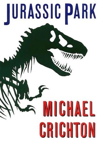
The cover for Jurassic Park, designed by Chip Kidd, became an instant classic whose elements were used in the film version. The stark black silhouetted rearing skeleton of a Tyrannosaurus rex says it all, and the compressed type treatment adds to the anxiety. It’s worth mentioning here that the book cover designer must please not only the many constituents in the publishing company (especially the publisher and the sales managers) but also the author, especially an already-famous one like Michael Crichton, hence the size of his name. Book designers might create as many as thirty versions of their design before a full approval means the cover goes to press. Yes, thirty!

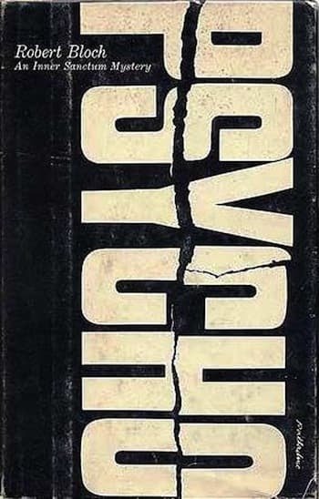
I love the original 1959 cover of Psycho, designed by Tony Palladino. Here the single super-bold word PSYCHO in white is torn or cracked and runs as an enormous vertical, pushing directly against the edges of the cover. Tremendous impact and tension, conveyed simply by a single word. The power of typography!

And how can we not adore the charming iconic cover of The Cat in the Hat, designed in 1957 by, you guessed it, Dr. Seuss himself, aka Theodore Geisel. The cat is twiddling his thumbs off to the left side of the cover, he’s looking us in the eye with a mischievous smile. The primary color scheme (hat and bowtie in red) is punchy, and the type plays happily along, charmingly askew. Looking at this cover, we instantly know that a fun adventure awaits.

Ina Saltz takes a look at current book covers
Boneless Mercies: The howling wolf silhouette is strong but the illustration is trying too hard to say too many things. Inside the wolf’s head there is a winding road, you must leap over the title to see silhouettes of possibly refugees or hunters in a wooded triangle with a full moon, something that looks like zippers along the edges (why?) and type that is thin and odd, which bisects the image. What is the unexplained symbol inside the C? The stacked THE gets lost in the road. Overall, confusing.

Blanca & Rosa: Way way way too many flourishes make the title nearly impossible to decipher.

We Are Displaced: the execution of this concept could have been so much better. The mix of typefaces is not harmonious. The image placement inside the title is awkward. The different treatment of the word “displaced” is jarring.

The Elephant in the Room: Again, this could have been executed in a better way. I see what the designer was trying to do with the increasing size of the type around the middle. This unfortunately results in the word ROOM being much larger than the rest of the title. (A good designer should always seek to emphasize the most important words.) In the subtitle, this conceit of diminishing width forces the word SMALLER to be bigger than the key word FAT. Also: it is difficult for stacked upper and lower case letters to fit together without creating awkward spaces, and there are many here as a result. All caps would have made a better choice. And the belt is skimpy, it looks like an afterthought. It could have been much bolder as a counterpoint to the type.

Of the six fiction covers, the standout is “The Alarming Palsy of James Orr,” with its vertical color-blocked background and the typographic transformation of the title, conveying the mood of “alarming palsy”. At the bottom, a hint of rooftops similarly burn or disintegrate. I also admire the Matisse-like illustration of the “human bonfire,” although I wish the book cover designer had hired someone to create an actual cutout title instead of using a typeface that emulates paper cutout letters. I am intrigued by the beautiful drawing of the rabbit but put off by the title “Rabbits for Food” although the conflict may be what the designer intended. It does provoke a response.

And that is exactly what a good book designer should do: provoke a response, create a memorable moment.
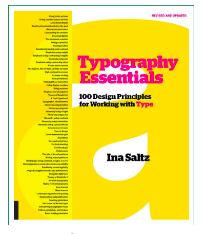
Ina Saltz new typography book:
Order your copy here:
https://www.amazon.com/Typography-Essentials-Revised-Updated-Principles/dp/1631596470/ref=sr_1_1?ie=UTF8&qid=1548266978&sr=8-1&keywords=Ina+Saltz+Type+Essentials
TheMarioBlog post #2988
