
Designer profile: Mario Garcia
Newspaper Design: “Just as other designers have a signature style readily identifiable in their design projects, Mario Garcia’s work is characterized by having no fixed style. He does not work with a pre-established toolkit. Graphically, he is like a chameleon, adapting perfectly to each situation.”
Designer profile: Lucie Lacava
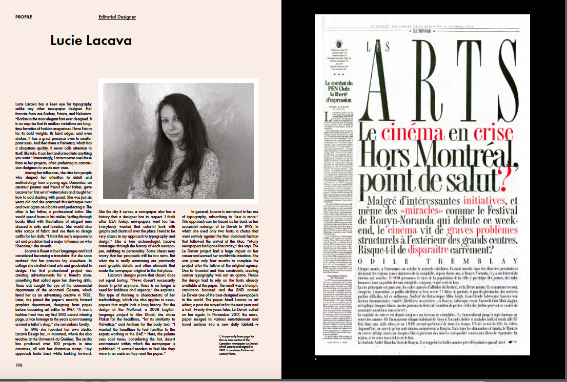
Newspaper Design: “Like a true archaeologist, Lucie rummages through the history of each newspaper, imbibing its personality.”
Designer profile: Antoni Cases
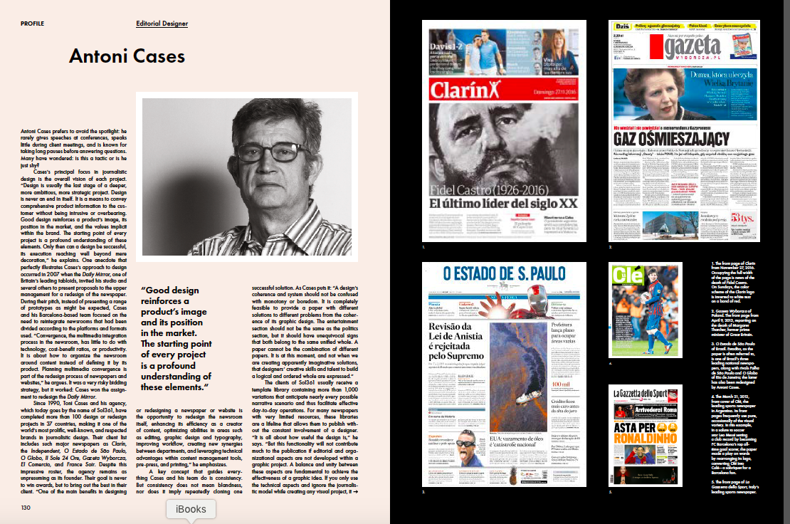
Newspaper Design: “A key concept that guides everything Cases and his team does is consistency. But consistency does not mean blandness.”
Designer profile: Javier Errea
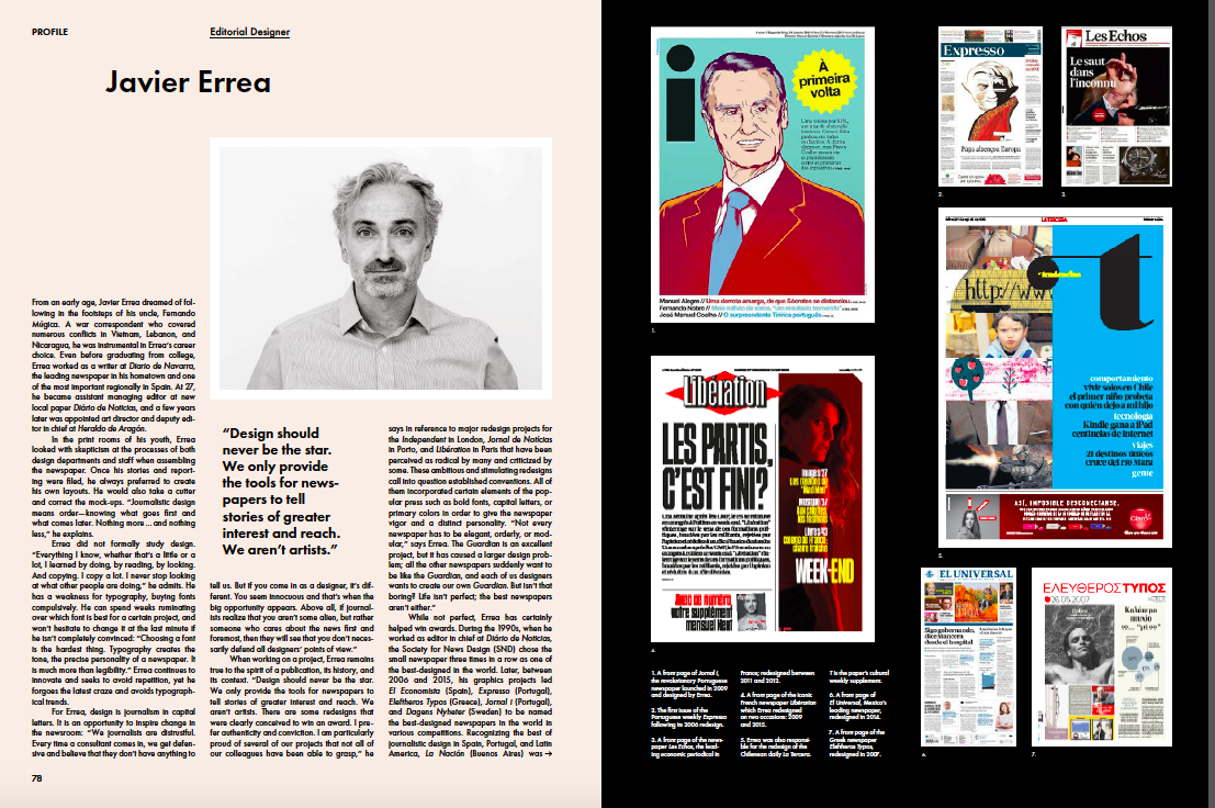
Newspaper Design: “For Errea, design is journalism in capital letters. It is an opportunity to inspire change in the newsroom.”
Designer profile: Mark Porter
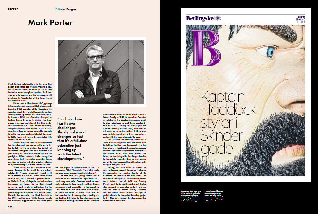
Newspaper Design: “He no longer defines himself as a news designer but rather a media designer and storyteller. He is fundamentally, a person who develops systems of visual identification.”
The essays
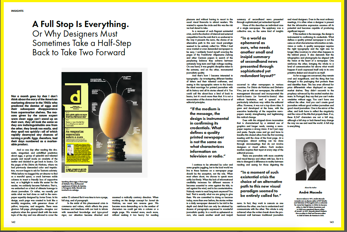
A highlight of Newspaper Design is the fact that the “template” that Errea has used allows for case studies, profiles of designers, but also essays which allow him and others to get into the more philosophical aspects of design, touching upon topics that we tend to discuss when we lean back, perhaps during a cocktail hour after a seminar or conference, or, of course, in academic discourse.
“It is essential to defend them (newspapers)in the face of passing fads and misguided whims. And it is also necessary to raise a voice and remember that journalism can and should be published in various formats because each one contributes to the whole.”
-Content Needs Form: What Newspapers can Learn from Magazine Design
“A brighter future for print is in the multi sectioned Saturday and Sunday editions in which a newspaper offers far more than the kind of news you can read online and under very different reading conditions than a crowded train on your way to work.”
-The dilemma of the snake: considerations on responsive journalistic design
“Silicon Valley has pushed us designers into the realm of responsive design, with the user deciding if they want their reading interface to be vertical or horizontal. This freedom has forced designers to combine the verticality of printed books and newspapers with the digital horizontality of televisions and computers.”
-A full stop is everything: Or why designers must sometimes take a half step
“If the medium is the message, the design is instrumental in confirming its credentials. What defines a quality printed newspaper is not the same as what characterizes information on television or radio.”
-People not platforms: Designing news experiences for a social age
“As news designers, we must go back to the reader. Perhaps build a mental image of their day or week, and see what we are able to achieve.”
In case you have not rushed to order your own copy, I hope these two blog posts will make you put Newspaper Design on your list. The book is a catalog of ideas, a cornucopia of the best of design, and, as a reference book, a great one to keep on your coffee table to inspire conversations, especially for those who simply consume the news and will, upon seeing this book, will realize that while the pages look perfectly choreographed in a painless way, there is much thought, planning and talent that is required to deliver them.
Errea’s love letter to print is also an inspiring bit of visual poetry for all of us.
Getting the book
Newspaper Design :Editorial Design from the World’s Best Newsrooms
Editors: Gestalten & Javier Errea
Format: 24.5 x 33 cm, 9-3 / 4 x 13 inches
Features: Full color, hardcover, stitch bound, 288 pages
Price: € 49.90 (D) / £ 50 / $ 69
ISBN: 978-3-89955-536-3
European Release: June 28, 2018
International Release: July 31, 2018
PREVIEW PAGES ONLINE
https://shop.gestalten.com/newspaper-design.html
The book can be obtained from the Gestalten webshop.
Product link:
https://gestalten.com/products/newspaper-design
Mario’s Speaking Engagements
August 2, Digital House (Facebook workshop), Buenos Aires

October 6, 20, 27–King’s College, New York City
The Basics of Visual Journalism seminars
Garcia Media: Over 25 years at your service
TheMarioBlog post #2865
